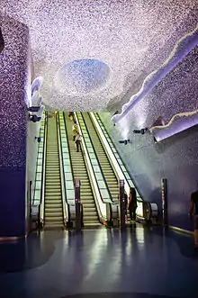
Art Stations of the Naples Metro
The Art Stations of Naples Metro are some stops of Naples Metro in which special attention was paid to making the environment beautiful, comfortable and functional.
With the construction and expansion of numerous metro lines the municipality of Naples developed the project Stations of Art (also known as Hundred Stations Plan), with which it was intended to entrust the planning of metro stops to well-known contemporary artists and architects. Then, with a resolution (resolution of 19 May 2006 Number 637), the Campania region issued guidelines to be applied to the design and construction of a station.
The Art Stations, distributed along the lines 1 and 6 of the Metro network, include more than 180 pieces of art created by 90 international authors and by some young local architects, allowing them to combine different architectural styles. On November 30, 2012, the Toledo station was elected as the most beautiful of Europe by The Daily Telegraph; while the Materdei station resulted at 13° place.[1]
The Art Stations, as well as (as mentioned above) to be beautiful to look at, and comfortable to hang out, have also aims to redevelop the surrounding areas (such as Piscinola, Scampia or Chiaiano) and push the construction of new buildings (such as the Hospital of the Sea or the Citadel of the Book).
Features
Communication
The functionality is provided by the easy accessibility to all segments of users, made possible by an increase in the service areas for the rapid identification of a station.
The latter, in fact, is made easily recognizable thanks to a system of communication and orientation, making use of visual signals, sound or customized (such as info point), which represent the unifying character of the system.
The signage is clear and uncluttered, in order to allow the users to be able to move independently within the station (also allowing a hurried user the instantaneous planimetric orientation) exploiting in an optimal manner every service offered by the structure.
The information is presented according to a precise plan that integrates dynamic works of art, signage and architectural space.
Quality and comfort
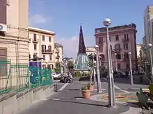
The pleasantness of the stations is ensured by high levels of architectural quality, together with the redevelopment of the surrounding area.
Inside the stops are finished with works that protect the cleanliness and comfort of the environment, the latter in particular should be a standard of quality recognized only by choosing plants that give rise to an elegant, comfortable, clean, and modern.
This is useful also to entice the user to assume correct behavior.
Materials
The sensation of space produced by the structure is of significant importance in the stations, and it is determined by the quality of the used materials.
The use of the material, processing, the color, grain and texture determine the different functions of the complex; chosen materials are especially linked to local tradition (in this case, the tuff) and make the architectural work immediately perceptible and recognizable by the user, especially by the residents of the area.
Finishes, decorations, written objects then determine the expressive character of the environment of the station (docks, mezzanine, connecting corridors), and similarly define the uniqueness of the image work.
Structure
Generally, Art Stations are designed according to specific technical standards, which require the presence of three functional elements like the docks, the mezzanine and technical rooms.
The following text was prepared by Campania region and sums up well the structure and unity of art stations:
[...] A representation of the space of functions that are loaded with symbolic values is expressed through a reading of the context that considers:
- identify the exact nature of the duties;
- functions identified by the structures that make the space not only in terms of construction and static but also in the time needed to make their character perceptually ;
- the expressive use of the facilities to "tell" the space that is going to be [...].
Thus the aim of the architectural design is to foreshadow a structure for a purpose which justifies the meanings of the project itself. When speaking of the objective characters that are the foundation of the design strategy, reference is:
- the place, understood as the set of elements that constitute the "data" of the project and closely interrelated to the need which it was intended;
- functions that space is structured into two components: quantitative and qualitative.
Lighting
The light is able to give plastic expressiveness to the individual functions and also represents an enrichment with respect to the minimum necessary to meet the need for sun.
Well-controlled use of light may play a role in the organization of non-trivial paths and spaces within the ports, ensuring (as already mentioned) an immediate guidance to the public.
The natural light must also be measured with the aid of filters, and regulators must be integrated with the artificial lighting in such a way as to ensure the comfort of the user and the perception of natural environments.
Security
Careful consideration is given to the safety of infrastructure, in fact the safety of the passengers and staff that the plant and adjacent areas from fire and other disasters is guaranteed.
For this purpose was therefore established a Safety Plan that states:
You have [...]
- Highlight the presence of monitoring and control of the areas and signaling pathways to follow;
- Ensuring a level of optimal illumination even in case of emergency (lack of the main source of electrical energy);
- Ensure the operation of mobile phones throughout the station (preparation of systems network coverage for underground stations);
- Set up systems for visual monitoring of the areas open to the public (loading / unloading paths mechanized, assault risk points along the route), the warning systems by users in the event of aggression and systems access control station (for areas open to the public and to the technical staff);
- Provide monitoring / alarm to detect the illicit transportation of weapons (cutting or fire) at the inputs and the presence of suspect objects into the station.
Line 1
Garibaldi
.jpg.webp)
Università
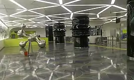
Università (University) Station, designed by architects Karim Rashid, was inaugurated on March 26, 2011, thirty feet below street level, at the intersection between Piazza Giovanni Bovio and Corso Umberto I.[2]
The metro stop, eclectic and full of color, has been designed to symbolize digital and information. In fact, Rashid said that he imagined spaces "that embodies the knowledge and language of the new digital era, which transmit ideas of simultaneous communication, innovation and their mobility of the Third Technological Revolution." In fact, next to the steps leading to the station, were put ceramic tile on which you can find many words coined since the 1960s as "network", "operating","laptop", "database" "interface" or "software".[2]
The station hall is characterized by very striking panels and colors, the materials used to produce them are Corian and mirrored steel. In the interior there is a strong contrast between the two main colors, fuchsia pink and lime, which are also useful for direct the user to the docks.[2]
In the lobby there are numerous works of art. Beyond the turnstiles there is the artwork Conversational Profile, two large cylindrical pillars in which it is possible to see two faces in profile, symbolizing the dialogue and communication between human beings. The second artwork, Ikon, is a large light box, in which several three-dimensional figures seem to float. Instead, among the black pillars and the light box stands Synapsi (or Synopsis), a sculpture in brushed steel which refers to human intelligence and the neural network of the brain.[2]
Municipio
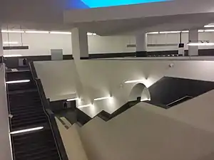
Toledo
