Stephen Banham
Stephen Banham is an Australian typographer, type designer, writer, lecturer and founder of Letterbox, a typographic studio.
Banham was born in Melbourne in 1968. In 2003 he completed a Master of Design (Research) and in 2019 was awarded a PhD for his work on the proposition of the 'typographic lens'. Banham has been lecturing in the field of typography since 1990.
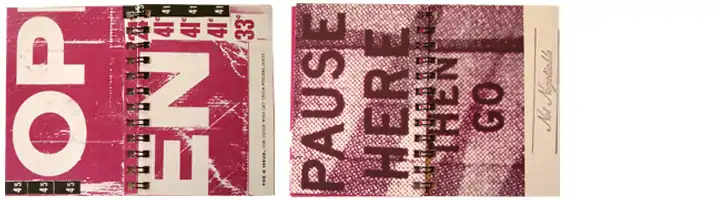
In 1991 he printed the first small issue of Qwerty, the first in a series of six experimental spiral-bound issues.[1]
Here is a passage from that interview:
It’s hard to believe now, but there was very little happening in Australia in terms of typography in 1990. I began teaching typography at about this time and I would constantly see my students copy entire designs straight from Emigre or other international publications. I knew that we could create our own typographic language here so I began Qwerty. It was a series of six publications – q, w, e, r, t and y – each one a7 in size [74 x 105 mm]. This size wasn’t because I wanted to create a precious art book. It was simply the only way I could afford to have 24 pages up on a single sheet. Things were quite tough then – one week I had only $a300 in my bank account and I had the choice of paying the rent or sending the first issue to press. Over the next five years, I released the other issues. It received a lot of interest in the international design press and showed my students by example that one can create typographic work that reflects aspects of one’s own culture, though now I don’t agree with that early rather nationalistic notion of identity.[2]
Banham has also been a contributor to, or featured in, design publications including ''Baseline magazine, Emigre, Adbusters, Face, Typo, Eye, Monument, Desktop, Grafik, Comma amongst others. Perhaps more importantly, Banham has brought discussion of the cultural and social aspects of typography to a wider public, arguing these points in daily broadsheets such as the Age and The Australian newspapers. He has spoken at design events in New York, Lebanon, Qatar, New Zealand, England, Spain and Australia. In 2011 he was inducted into the International Society of Typographic Designers (ISTD).
Professional research
In 1996 he produced Ampersand the first of a five-part series by the same name. These featured extended texts on the social significance of typography not possible in the small A7 format of Qwerty. This was then followed by Rentfont (1997) featuring an experimental typeface Futures, made entirely from logotypes. In 1998 Banham produced Convoy, a comment on the commodification of graphic design. Assembly (1999) was an exploration of the visual memory of a child in relation to corporate identity. This involved the individual interviewing over 600 schoolchildren. Grand (2001) investigated the relationship between typefaces and socio-economic environments by noting and analysing every instance of typography across a 1000 metre area of the Melbourne central business district.
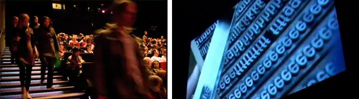
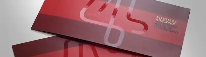
In 2005 Banham began a series of forum events discussing the social role of typography and graphic design. Known as Character these events were held alongside the State of Design Festivals attracting up to 500 people at a time. These events took a different form each year. First appearing as an open discussion format looking into the branding of cities (2005), The politics of graphic design (2005), The role of accident in design (2006) and 26 Letters a Second – typography and the moving image (2007) which featured the Australian premiere of Helvetica, including a discussion with Gary Hustwit who was brought out for the event. In 2008 The fifth Character event saw the publishing of Characters and Spaces in partnership with the State of Design Festival. This free booklet, bound within the festival program, featured one city block of Melbourne's design secrets from the stories behind corporate identities through to art and architecture. Character 6 (2010) saw the Australian premiere of the documentary film TypeFace from Chicago, along with a discussion on the 'slow design' movement in graphic design and the resurgence in craft.
After three years or writing and research, Thames and Hudson published Characters: Revealing cultural stories through typography' (2011) Stephen Banham's extensive look into the cultural significance of typography with an emphasis on the most public of typographic forms, signage. Although the book uses Melbourne as its case study, the idea of viewing a city through a 'typographic lens' is a universal one. The book was co-published by the State Library of Victoria. In 2011 Banham was made a Creative Fellow at the State Library of Victoria.
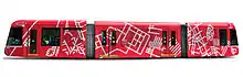
In 2012 Banham curated and designed Cluster' an exhibition exploring the thematic 'clusters' of street naming. With this project he proposed that this was in fact one of the first forms of 'urban branding' in that it was aspirational in tone. As part of the 2015 Melbourne Festival he was selected one of the Melbourne Art Trams, on which he featured an assortment of these cluster forms. His interest in this is both typographic (as they are glyph-like forms) as well as cartographic (as they are map-like forms).
From 2008 onwards, Banham has produced the typographically themed Oblique series. Orbit Oblique (2008) was a typographic tribute to the animals lost in space research (1949–1990) during the space race. The second Utopia Oblique (2009) was based around the utopians who have used language and/or typography to express their ideal notion of society. In 2016 he published Cashcow Oblique, which centred on a typographic survey of the marks used by real estate developers through the current real-estate boom. It took the form of a poster, folded down to a small book format. 1000 copies were printed and distributed free all across Melbourne.
Throughout 2018 Banham designed 200 square metres of bronze typography for Brisbane Anzac Square, featuring special 'OO' ligatures, indicative of the Queensland town names that are listed across these commemorative screens. In the same year, Banham was the designer in a team of three academics who produced Sans Forgetica, the first typeface to have been designed along the psychological principles of 'desirable difficulty' and 'disfluency' in order to trigger memory whilst reading small passages of text. As Banham states 'Within the typeface design we have incorporated two key elements – an unconventional back-slant along with gapping, designed to anticipate the reader’s desire to complete the letter-shapes. This is what makes this typeface memorable and unique'. This continues to be a research trajectory for Banham and his colleagues.


Typographic design
Letterbox has operated a micro-foundry since 1996 producing a wide variety of typefaces including Berber, Terital United and Kevlar (with Wendy Ellerton), Morice (with Morice Kastoun), Bisque (With Niels Oeltjen), League (with Niels Oeltjen), Gordon and Brunswick Black (with Lan Huang and Clair Ghyzel). The studio has undertaken many bespoke typefaces for clients including Virgin Money, Argyle Pink Diamonds and the University of West Australia (UWA).
External links
- - Official site
- - A comprehensive and up-to-date list of articles on the Letterbox site
- - A comprehensive list of projects on the Letterbox site
- - Information on the three-year book project 'Characters' written by Stephen Banham
| Authority control |
|---|