Checkbox
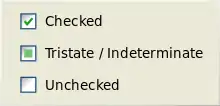
A checkbox (check box, tickbox, tick box) is a GUI widget that permits the user to make a binary choice, i.e. a choice between one of two possible mutually exclusive options. For example, the user may have to answer 'yes' (checked) or 'no' (not checked) on a simple yes/no question.

Check boxes are shown as ☐ when unchecked, or ☑ or ☒ (depending on the GUI) when checked. A caption describing the meaning of the checkbox is normally shown adjacent to the checkbox. Inverting the state of a checkbox is done by clicking the mouse on the box, or the caption, or by using a keyboard shortcut, such as the space bar.
Often, a series of checkboxes is presented, each with a binary choice between two options. Then the user may select several of the choices. Contrasting is a radio button, in which only a single option is selectable from several mutually-exclusive choices.
Tri-state checkbox

Some applications use checkboxes that allow an indeterminate state in addition to the two provided by a normal checkbox. This third state is shown as a square or dash in the checkbox, and indicates that its state is neither checked nor unchecked. This is most often used when the checkbox is tied to a collection of items in mixed states. The indeterminate state cannot usually be selected by the user, and switches to a checked state when activated.
For example, a checkbox presented to select files to send via FTP might use a tree view so that files can be selected one at a time, or by folder. If only some of the files in a folder are selected, then the checkbox for that folder would be indeterminate. Clicking on this indeterminate checkbox would select all or, less commonly, none of the contained files. Continuing to click on the checkbox would alternate between checked (all sub-directories and files selected) and unchecked (no sub-directories or files selected).
Some tri-state checkbox implementations allow the user to toggle among all states, including the indeterminate state, by remembering the mixed state of the items in the collection. This serves as an undo feature.
Not actionable
Setting or clearing a checkbox changes the checkbox's state with no other side-effects. Violating this guideline by associating additional actions with the change of state frequently confuses users, because they are used to configuring data in entry controls such as text boxes, radio buttons, and checkboxes and then invoking an action control such as a push button to initiate the action to process the data.[1][2]
One common exception is to enable or display additional user input elements whose relevance depends on the checkbox state. In other situations toggle switch is typically used instead of a checkbox.
HTML
In web forms, the HTML element <input type="checkbox"> is used to display a checkbox.
Unicode
- U+2610 ☐ BALLOT BOX
- U+2611 ☑ BALLOT BOX WITH CHECK
- U+2612 ☒ BALLOT BOX WITH X
References
- "Check Boxes". msdn. Retrieved February 5, 2010.
- Nielsen, Jakob (September 2004). "Checkboxes vs. Radio Buttons". Jakob Nielsen's Alertbox. Retrieved February 5, 2010.
External links
 Media related to Check boxes at Wikimedia Commons
