Grid (graphic design)
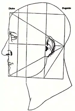
In graphic design, a grid is a structure (usually two-dimensional) made up of a series of intersecting straight (vertical, horizontal, and angular) or curved lines (grid lines) used to structure content. The grid serves as an armature or framework on which a designer can organize graphic elements (images, glyphs, paragraphs, etc.) in a rational, easy-to-absorb manner. A grid can be used to organize graphic elements in relation to a page, in relation to other graphic elements on the page, or relation to other parts of the same graphic element or shape.


The less-common printing term "reference grid," is an unrelated system with roots in the early days of printing.
History
Antecedents
Before the invention of movable type a system based on optimal proportions had been used to arrange handwritten text on pages. One such system, known as the Villard Diagram, was in use at least since medieval times.[1]
Evolution of the modern grid
After World War II, a number of graphic designers, including Max Bill, Emil Ruder, and Josef Müller-Brockmann, influenced by the modernist ideas of Jan Tschichold's Die neue Typographie (The New Typography), began to question the relevance of the conventional page layout of the time. They began to devise a flexible system able to help designers achieve coherency in organizing the page. The result was the modern typographic grid that became associated with the International Typographic Style. The seminal work on the subject, Grid systems in graphic design by Müller-Brockmann, helped propagate the use of the grid, first in Europe, and later in North America.
Reaction and reassessment
By the mid-1970s instruction of the typographic grid as a part of graphic design curricula had become standard in Europe, North America and much of Latin America. The graphic style of the grid was adopted as a look for corporate communication. In the early 1980s, a reaction against the entrenchment of the grid, particularly its dogmatic use, and association with corporate culture, resulted in some designers rejecting its use in favor of more organic structure. The appearance of the Apple Macintosh computer, and the resulting transition away from type being set by typographers to designers setting type themselves resulted in a wave of experimentation, much of it contrary to the precepts of Tschichold and Müller-Brockmann. The typographic grid continues to be taught today, but more as a useful tool for some projects, not as a requirement or starting point for all page design.
Grid use in web design
While grid systems have seen significant use in print media, interest from web developers has only recently seen a resurgence. Website design frameworks producing HTML and CSS had existed for a while before newer frameworks popularised the use of grid-based layouts. Some grid systems specify fixed-width elements with pixels, and some are 'fluid', meaning that they call for page element sizing to be in relative units like percentages, rather than absolute units like pixels or points.[2]
The W3C published the CSS Grid Layout Module Level 1 to define a two-dimensional grid-based layout system.[3]
There are also CSS frameworks that include their own grid system:
Grid Use in Print Design:
The print design has always used grid systems to organize and structure content. They started as helper lines for written books. Artists used grid systems to layout the content – text and images – in a manner that makes reading and absorption easier. Newspapers, books, magazines, and classifieds, etc., all use different grid systems that make the optimum use of space for better reading and presentation.[4]
Software
Most desktop publishing software and professional publishing software and other office software including word processors displays grid layout as an option.
References
- "Archived copy". Archived from the original on 2013-05-30. Retrieved 2013-06-17.CS1 maint: archived copy as title (link)
- Marcotte, Ethan (March 3, 2009). "Fluid Grids". A List Apart.
- Tab Atkins Jr.; Elika J. Etemad; Rossen Atanassov (14 December 2017). "CSS Grid Layout Module Level 1". World Wide Web Consortium. Retrieved 10 July 2019.
- "What is a grid system?".
- Baines, Phil and Haslam, Andrew. Type & Typography, second edition. New York: Waston-Guptill Publications, 2005. ISBN 0-8230-5528-0.
- Burnhill, Peter. Type spaces: in house norms in the typography of Aldus Manutius. London: Hyphen Press, 2003. p. 101.
- Elam, Kimberly. Grid Systems: Principles of Organizing Type. New York: Princeton Architectural Press, 2004. ISBN 1-56898-465-0.
- Hochuli, Jost. Designing Books: Practice and Theory.
- Hurlburt, Allen. Grid: A Modular System for the Design and Production of Newspapers, Magazines, and Books. Wiley: 1982. ISBN 0-471-28923-X.
- Le Corbusier The Modular I.
- Müller-Brockmann, Josef. Grid Systems in Graphic Design. Niggli: 1996. ISBN 3-7212-0145-0
- Ruder, Emil. Typography. Hastings House: 1981. ISBN 0-8038-7223-2.
- Rudolf Bosshard, Hans. The Typographic Grid. Niggli: 2002. ISBN 3-7212-0340-2.
- Khoi Vinh, Oh Yeeaah! Grids are good, South by Southwest Conference Presentation, 2007.
- Antonio Carusone, Designing Grid Systems For Flash.
- Marcotte, Ethan (March 3, 2009). "Fluid Grids".
- Capo, Daniele (April 5, 2009). "Dividing a segment in n parts in a medieval, yet late-modern, fashion."
External links
- The Grid System Looking at the technical aspect of grids in practice, with many resources.