International Typographic Style
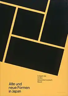
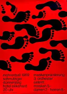
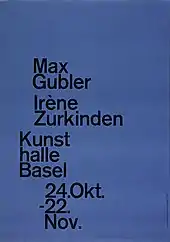
The International Typographic Style, also known as the Swiss Style, is a graphic design style that emerged in Russia, the Netherlands, and Germany in the 1920s and was further developed by designers in Switzerland during the 1950s.[1] The International Typographic Style has had profound influence on graphic design as a part of the modernist movement, impacting many design-related fields including architecture and art. It emphasizes cleanness, readability, and objectivity.[2] Hallmarks of the style are asymmetric layouts, use of a grid, sans-serif typefaces like Akzidenz Grotesk, and flush left, ragged right text. The style is also associated with a preference for photography in place of illustrations or drawings. Many of the early International Typographic Style works featured typography as a primary design element in addition to its use in text, and it is for this that the style is named.[3][4] The influences of this graphic movement can still be seen in design strategy and theory to this day.

History


The style emerged from a desire to represent information objectively, free from the influence of associated meaning. The International Typographic Style evolved as a modernist graphic movement that sought to convey messages clearly and in a universally straightforward manner. Two major Swiss design schools are responsible for the early years of International Typographic Style. A graphic design technique based on grid-work that began in the 19th century became inspiration for modifying the foundational course at the Basel School of Design in 1908. Shortly thereafter, in 1918 Ernst Keller became a professor at the Kunstgewerbeschule Zürich and began developing a graphic design and typography course. He did not teach a specific style to his students, rather he taught a philosophy of style that dictated "the solution to the design problem should emerge from its content."[5] This idea of the solution to the design emerging from the problem itself was a reaction to previous artistic processes focused on "beauty for the sake of beauty" or "the creation of beauty as a purpose in and of itself". Keller's work uses simple geometric forms, vibrant colors and evocative imagery to further elucidate the meaning behind each design. Other early pioneers include Théo Ballmer and Max Bill.
The 1950s saw the distillation of International Typographic Style elements into sans-serif font families such as Univers. Univers paved the way for Max Miedinger and collaborator Edouard Hoffman to design the typeface Neue Haas Grotesk, which would be later renamed Helvetica. The goal with Helvetica was to create a pure typeface that could be applied to longer texts and that was highly readable. The movement began to coalesce after a periodical publication began in 1959 titled New Graphic Design, which was edited by several influential designers who played major roles in the development of International Typographic Style. The format of the journal represented many of the important elements of the style—visually demonstrating the content—and was published internationally, thus spreading the movement beyond Switzerland's borders. One of the editors, Josef Müller-Brockmann, "sought an absolute and universal form of graphic expression through objective and impersonal presentation, communicating to the audience without the interference of the designer's subjective feelings or propagandist techniques of persuasion."[6] Many of Müller-Brockmann's feature large photographs as objective symbols meant to convey his ideas in particularly clear and powerful ways.
After World War II international trade began to increase and relations between countries grew steadily stronger. Typography and design were crucial to helping these relationships progress—clarity, objectivity, region-less glyphs, and symbols are essential to communication between international partners. International Typographic Style found its niche in this communicative climate and expanded further beyond Switzerland, to America.
One of the first American designers to integrate Swiss design with his own was Rudolph de Harak.[7] The influence of International Typographic Style on de Harak's own works can be seen in his many book jacket designs for McGraw-Hill publishers in the 1960s. Each jacket shows the book title and author, often aligned with a grid—flush left, ragged-right. One striking image covers most of the jacket, elucidating the theme of the particular book. International Typographic Style was embraced by corporations and institutions in America from the 1960s on, for almost two decades. One institution particularly devoted to the style was MIT.[8]
Associated movements
During 1900s other design based movements were formulating, influencing and influenced by the International Typographic movement. These movements emerged within the relationships between artistic fields including architecture, literature, graphic design, painting, sculpting etc.
De Stijl was a Dutch artistic movement that saw prominence in the period between 1917-1930.[9] Referred to as neoplasticism, this artistic strategy sought to reflect a new Utopian ideal of spiritual harmony and order. It was a form of pure abstraction through reduction to the essentials of form and colour, employing vertical and horizontal layouts using only black and white and primary colors. Proponents of this movement included painters like Piet Mondrian, Vilmes Huszar and Bart van der Hoff as well as architects like Gerrit Rietveld, Robert van't Hoff and J.J.P. Oud.
Bauhaus was a German-based movement that emphasized purity of geometry, absence of ornamentation and the motto 'form follows function'. This was a school of thought that combined craftsmaking with the fine arts and was founded by Walter Gropius. The goal was to work towards the essence of the form follows function relationship to facilitate a style that could be applied to all design problems; the International Style.
Constructivism was an art/architectural philosophy that emerged from Russia in the 1920s. The style develops by assorted mechanical objects that are combined into abstract mobile structural forms. Hallmarks of the movement include geometric reduction, photo-montage and simplified palettes.
Suprematism, which arose in 1913, is another Russian art movement similarly focused on the simplification and purity of geometric forms to speak to values of spirituality.
All of these movements including the International Typographic styles are defined by reductionist purity as a visually compelling strategy of conveying messages through geometric and color based hierarchies.
Notes on theory
The Bauhaus mantra of 'form follows function' applies to design in the spirit of the International Typographic movement. The movement was structured by focusing on detail, precision, craft skill, systems of education and approach, technical training, high standards of print and the innovative application of lettering.[10] The theory revolves around critically approaching the development of a system specific to the design problem presented.
For example, a father of the style Ernst Keller argued that a design solution should always be respectful of its content.
A good comparison is the structure that defines a math problem. You only use specific equations for specific types of problems. You similarly only can work through these equations in specific ways. With the International Typographic and other related philosophies, a design context is critical to deriving a response.
Characteristics of style
Each design done with International Typographic Style in mind begins with a mathematical grid, because a grid is the "most legible and harmonious means for structuring information."[5] Text is then applied, most often aligned flush left, ragged right. Fonts chosen for the text are sans serif, a type style believed to "[express] the spirit of a more progressive age" by early designers in the movement.[5] Objective photography is another design element meant to present information clearly, and without any of the persuading influences of propaganda or commercial advertising. Such a strong focus on order and clarity is drawn from early pioneers of the movement believing that design is a "socially useful and important activity... the designers define their roles not as artists but as objective conduits for spreading important information between components of society." [5]
See also
- International style (architecture)
- Helvetica
- Max Bill
- Adrian Frutiger
- Armin Hofmann
- Richard Paul Lohse
- Josef Müller-Brockmann
- Paul Rand
- Emil Ruder
- Jan Tschichold
References
- "Lessons From Swiss Style Graphic Design – Smashing Magazine". Smashing Magazine. Retrieved 2015-12-11.
- Encyclopædia Britannica, International Typographic Style
- Encyclopædia Britannica, Arts & Entertainment: graphic design, THE INTERNATIONAL TYPOGRAPHIC STYLE
- "International Poster Gallery". Archived from the original on 2008-05-12. Retrieved 2008-04-23.
- Meggs, Philip B.; Purvis, Alston W. (December 2005). Meggs' History of Graphic Design (4th ed.). John Wiley & Sons, Inc. p. 356. ISBN 9780471699026.
- Meggs, Philip B.; Purvis, Alston W. (December 2005). Meggs' History of Graphic Design (4th ed.). John Wiley & Sons, Inc. p. 364. ISBN 9780471699026.
- Meggs, Philip B.; Purvis, Alston W. (December 2005). Meggs' History of Graphic Design (4th ed.). John Wiley & Sons, Inc. p. 370. ISBN 9780471699026.
- Meggs, Philip B.; Purvis, Alston W. (December 2005). Meggs' History of Graphic Design (4th ed.). John Wiley & Sons, Inc. p. 372. ISBN 9780471699026.
- ".. :: The International Typographic Style Timeline :: ." smearedblackink.com. Retrieved 2015-12-12.
- "Swiss Style: The Principles, the Typefaces & the Designers - Print Magazine". Print Magazine. Retrieved 2015-12-12.
Further reading
- Fiedl, Frederich, Nicholas Ott and Bernard Stein. Typography: An Encyclopedic Survey of Type Design and Techniques Through History. Black Dog & Leventhal: 1998. ISBN 1-57912-023-7.
- Hollis, Richard. Swiss Graphic Design: The Origins and Growth of an International Style, 1920-1965. Yale University Press: 2006. ISBN 0-300-10676-9.
- Müller-Brockmann, Josef. Grid Systems in Graphic Design. Niggli: 1996. ISBN 3-7212-0145-0.
- Ruder, Emil. Typography. Hastings House: 1981. ISBN 0-8038-7223-2.