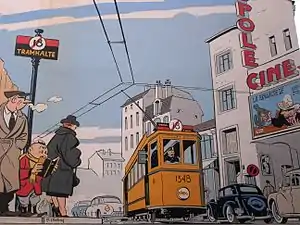
Ligne claire
Ligne claire (French for "clear line", pronounced [liɲ klɛʁ]; Dutch: klare lijn and Italian: linea chiara) is a style of drawing created and pioneered by Hergé, the Belgian creator of The Adventures of Tintin. It uses clear strong lines all of the same width and no hatching, while contrast is downplayed as well. Cast shadows are often illuminated, and the style often features strong colours and a combination of cartoonish characters against a realistic background. All these elements together can result in giving comics drawn this way a flat aspect. The name was coined by Joost Swarte in 1977.[1]

History
Hergé started out drawing in a much looser, rougher style which was likely influenced by American comic strip artists of the late 1920s and 1930s, such as Gluyas Williams[2] and George McManus. However the precise lines which characterize most of his work are firmly in place early on (e.g. the colored version of The Blue Lotus (released in 1946) is based on the original black and white newspaper version from 1934–35 and not redrawn).[3] Ligne claire was also influenced by Japan's shin-hanga style, one aspect of the Japonisme movement that swept Europe after the opening up of Japan to European influence in the 1860s.
For Hergé, the style was not limited to the drawings but extended to the story: the plot must be straightforward. Much of the "Brussels school" started to use this style, notably Edgar P. Jacobs, Bob de Moor, Roger Leloup, and Jacques Martin,[3] many of whom also worked for Tintin magazine.
The ligne claire style achieved its highest popularity in the 1950s, but its influence started to wane in the 1960s and was seen as old-fashioned by the new generation of comic book artists. In the late 1970s, it experienced a resurgence of interest, largely due to Dutch artists like Joost Swarte[3] and Theo van den Boogaard, who had come up through the Dutch underground comics scene, as well as the French artist Jacques Tardi. Henk Kuijpers was also successful in his application of the style.
Throughout the 1980s, Yves Chaland, Ted Benoit, Serge Clerc and Floc'h relaunched the ligne claire style in France. This incarnation was a very stylistic and artistic variation, which the artists also utilized for illustrating posters and LP covers etc. Swarte dubbed this variant "atoomstijl" ("atomic style").[4][5]
Contemporary use of the ligne claire is often ironic or post-modern. For example, Van den Boogaard used the simple, clear style to set up a conflict with the amorality of his characters, while Tardi used it in his Adèle Blanc-Sec series to create a nostalgic atmosphere which is then ruthlessly undercut by the story. A recent serious clear line artist is the Dutchman Peter van Dongen, who created the Rampokan series about the Dutch colonisation of Indonesia.
Ligne claire is not confined to Franco-Belgian comics. It has also been popular with Italian artists such as Vittorio Giardino,[3] Spanish artists such as Paco Roca and Francesc Capdevila Gisbert ("Max"), British artists such as Martin Handford, Bryan Talbot and Garen Ewing, Norwegian artists such as Jason, American artists such as Chris Ware, Geof Darrow, Jason Lutes, and Jason Little, and Italian-Australian artists such as Ilya Milstein.
Notable ligne claire books/series
Hergé
- The Adventures of Tintin
- Jo, Zette and Jocko
- Quick and Flupke
Others
- Jommeke – Jef Nys
- The Adventures of Freddy Lombard – Yves Chaland
- Alix – Jacques Martin
- Barelli – Bob de Moor
- Berlin – Jason Lutes
- Bingo Bongo et son Combo Congolais – Ted Benoît
- Blake and Mortimer – Edgar P. Jacobs
- César and Jessica
- Franka – Henk Kuijpers
- Hector and Dexter (a.k.a. Coton et Piston and Katoen en Pinbal) – Joost Swarte
- Julian Opie's Portraits – Julian Opie
- Kurt Dunder
- Le Monde d'Edena – Moebius
- Nofret – Sussi Bech
- Professor Palmboom – Dick Briel
- The Rainbow Orchid – Garen Ewing
- Jimmy Corrigan, the Smartest Kid on Earth – Chris Ware
- Shutterbug Follies – Jason Little
- Spike and Suzy (a.k.a. Bob and Bobette, Willy and Wanda, and Suske en Wiske) – Willy Vandersteen
- Tintin pastiches – Yves Rodier
- Where's Wally? – Martin Handford
- Yoko Tsuno – Roger Leloup
- How to Understand Israel in 60 Days or Less – Sarah Glidden
- Sjef van Oekel – Theo van den Boogaard
- The Property – Rutu Modan
See also
- Franco-Belgian comics
- Marcinelle school – a contemporary, contrasting style
References
- Pleban, Dafna (7 November 2006). "Investigating the Clear Line Style". ComicFoundry. Archived from the original on 5 March 2016. Retrieved 24 October 2019.
- Heer, Jeet. "Barnaby and American Clear Line Cartooning." Barnaby Volume One by Crockett Johnson. Fantagraphics Books, 2013.
- Fingeroth, Danny. The Rough Guide to Graphic Novels. Rough Guides, 2008. ISBN 1843539934 (p. 25).
- In Search of the Atom Style Paul Gravett, 2009
- Atoomstijl.nl
External links
| Wikimedia Commons has media related to Klare lijn. |
- Klare lijn international – News on ligne claire comics (in French)
- Hergé & The Clear Line: Part 1
