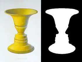
Negative space
Negative space, in art, is the space around and between the subject(s) of an image. Negative space may be most evident when the space around a subject, not the subject itself, forms an interesting or artistically relevant shape, and such space occasionally is used to artistic effect as the "real" subject of an image.


Overview
The use of negative space is a key element of artistic composition. The Japanese word "ma" is sometimes used for this concept, for example in garden design.[1][2][3]
In a two-tone, black-and-white image, a subject is normally depicted in black and the space around it is left blank (white), thereby forming a silhouette of the subject. Reversing the tones so that the space around the subject is printed black and the subject itself is left blank, however, causes the negative space to be apparent as it forms shapes around the subject. This is called figure-ground reversal.
In graphic design of printed or displayed materials, where effective communication is the objective, the use of negative space may be crucial. Not only within the typography, but in its placement in relation to the whole. It is the basis of why upper and lower case typography always is more legible than the use of all capital letters. Negative space varies around lower case letters, allowing the human eye to distinguish each word rapidly as one distinctive item, rather than having to parse out what the words are in a string of letters that all present the same overall profile as in all caps. The same judicious use of negative space drives the effectiveness of the entire design. Because of the long history of the use of black ink on white paper, "white space" is the term often used in graphics to identify the same separation.
Elements of an image that distract from the intended subject, or in the case of photography, objects in the same focal plane, are not considered negative space. Negative space may be used to depict a subject in a chosen medium by showing everything around the subject, but not the subject itself. Use of negative space will produce a silhouette of the subject. Most often, negative space is used as a neutral or contrasting background to draw attention to the main subject, which then is referred to as the positive space.
Use
Considering and improving the balance between negative space and positive space in a composition is considered by many to enhance the design. This basic, but often overlooked, principle of design gives the eye a "place to rest," increasing the appeal of a composition through subtle means.
The use of negative space in art may be analogous to silence in music, but only when it is juxtaposed with adjacent musical ideas. As such, there is a difference between inert and active silences in music, where the latter is more closely analogous to negative space in art.
Negative space in art, also referred to as "air space", is the space around and between objects. Instead of focusing on drawing the actual object, for a negative space drawing, the focus is on what's between the objects. For example, if one is drawing a plant, they would draw the space in-between the leaves, not the actual leaves. This technique requires one to forget about a conceptual meaning of an object and forces them to observe through shapes, rather than drawing what they may think an object looks like.
See also
References
- "FAQ: 'Ma' and 'Mu' - Japanese Gardens Forum - GardenWeb". Forums.gardenweb.com. Retrieved 2009-11-11.
- "ArtLex's Ne-Nz page". Artlex.com. Archived from the original on 1999-05-04. Retrieved 2009-11-11.
- "A Note for MA: Space/Time in the Garden of Ryoan-Ji - Iimura". Mfj-online.org. Retrieved 2009-11-11.
External links
| Wikimedia Commons has media related to Negative space. |
