Postage stamp design
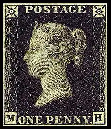
Postage stamp design is the activity of graphic design as applied to postage stamps. Many thousands of designs have been created since a profile bust of Queen Victoria was adopted for the Penny Black in 1840; some designs have been considered very successful, others less so.

A stamp design includes several elements required for it to accomplish its purpose satisfactorily. Most important is the denomination indicating its monetary value, while international agreements require a country name on almost all types of stamps. A graphic design is very nearly universal; in addition to making counterfeits harder to produce and aiding clerks in quick recognition of appropriate postage, postal customers simply expect stamps to carry a design.
Denomination

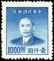
The fundamental purpose of a stamp is to indicate the prepayment of postage. Since different kinds and sizes of mail normally pay different amounts of postage, the stamps need to carry a value. In a very few cases, the denomination has been omitted; for instance, during the tumults of 1949 China, undenominated stamps were issued, so as to allow the price of a stamp to fluctuate on a daily basis depending on the value of the gold yuan.
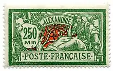
The usual form of the denomination is a number, optionally preceded or followed by a currency symbol. Many early stamps wrote the denomination out in words, but the Universal Postal Union later required that stamps on international mail use Arabic numerals, for the benefit of clerks in foreign countries. A number of recent stamps have substituted a textual description of the rate being charged, such as "1st" for first-class letters, or "presorted ZIP+4" to indicate a particular type of bulk mail. Another form of nonnumerical denomination is that used for rate change stamps, in which the timing and politics of the rate-setting process is such that the stamps must be printed before the rate is known. In such cases, the preprinted stamps simply state "A", "B", etc., with the equivalent rate being announced just before they go on sale.
Canada also uses a non-numerical denomination, the mark "P" printed over a maple leaf, on its domestic postage rate stamps. The letter "P" stands for "Permanent" which indicates that the stamp is always accepted regardless of the current domestic postal rate. Anytime the domestic rate changes, the permanent value stamps already in circulation continue to be accepted and the new rate applies to the purchase of new permanent value stamps.[1]
Semi-postal stamps are usually denominated with two values, with a "+" between, the first indicating the actual rate, and the second the additional amount to be given to a charity. In a very few cases a country has had a dual currency, and the stamps may depict a value in both currencies.
Country name

The second required element, at least for stamps intended to be used on international mail, is the name of the country. The first postage stamps, those of the United Kingdom, had no name. In 1874 the Universal Postal Union exempted the United Kingdom from its rule which stated that a country's name had to appear on their postage stamps, so a profile of the reigning monarch was all that was required for identification of the UK's stamps.[2] To this day the UK remains the only country not required to name itself on its stamps. For all other UPU members, the name must appear in Latin letters.

Many countries using non-Latin alphabets used only those on their early stamps, and they remain difficult for most collectors to identify today.
The name chosen is typically the country's own name for itself, with a modern trend towards using simpler and shorter forms, or abbreviations. For instance, the Republic of South Africa inscribes with "RSA", while Jordan originally used "The Hashemite Kingdom of Jordan", and now just "Jordan". Some countries have multiple allowed forms, from which the designer may choose the most suitable. The name may appear in an adjectival form, as in Poșta Română ("Romanian Post") for Romania. Dependent territories may or may not include the name of the parent country.
Graphic design
The graphic element of a stamp design falls into one of four major categories:
- Portrait bust - profile or full-face
- Emblem - coat of arms, flag, national symbol, posthorn, etc.
- Numeric - a design built around the numeral of value
- Pictorial
The use of portrait busts (of the ruler or other significant person) or emblems was typical of the first stamps, by extension from currency, which was the closest model available to the early stamp designers.
Usage pattern has varied considerably; for 60 years, from 1840 to 1900, all British stamps used exactly the same portrait bust of Victoria, enclosed in a dizzying variety of frames, while Spain periodically updated the image of Alfonso XIII as he grew from child to adult. Norway has issued stamps with the same posthorn motif for over a century, changing only the details from time to time as printing technology improves, while the US has placed the flag of the United States into a wide variety of settings since first using it on a stamp in the 1950s.

While numeral designs are eminently practical, in that they emphasize the most important element of the stamp, they are the exception rather than the rule.
By far the greatest variety of stamp design seen today is in pictorial issues. The choice of image is nearly unlimited, ranging from plants and animals, to figures from history, to landscapes, to original artwork. Images may represent real-world objects, or be allegories or abstract designs.

The choice of pictorial designs is governed by a combination of anniversaries, required annual issues (such as Christmas stamps), postal rate changes, exhaustion of existing stamp stocks, and popular demand. Since postal administrations are either a branch of government or an official monopoly under governmental supervision, the government has ultimate control over the choice of designs. This means that the designs tend to depict a country as the government would like it to be perceived, rather than as it really is. The Soviet Union issued thousands of stamps extolling the successes of communism, even as it was falling apart, while in the US the only contemporary stamp hinting at the unrest of the 1960s is an issue exhorting Americans to support their local police.
In some cases, overt political pressure has resulted in a backlash; a famous example is that of the US in the late 1940s, when the US Congress had direct authority over stamp design, and a large number of issues were put out merely to please a representative's constituency or industry lobbyists. The resulting uproar resulted in the formation of an independent Citizens' Stamp Advisory Committee that reviews and chooses from hundreds of proposals received each year. Occasionally the public is polled for its choice of design, as with the US Elvis stamp of 1993, or some issues of the Celebrate the Century series.
Many countries have specific rules governing the choice of designs or design elements. Stamps of the UK must depict the sovereign (typically as a silhouette), while stamps of the US may not visibly depict any person who has been dead for less than 10 years, except for ex-Presidents, who may appear on a stamp one year after their demise. The choice of postage stamp color may be specified, acting as a sort of color code to different rates.
Most countries issue commemorative issues from time to time, perhaps to celebrate some special event, with designs relating to the event. While they are legitimate postage stamps, and often used for routine post, they are intended to appeal particularly to stamp collectors. Stamps that are collected without being used are paid for, but the purchaser chooses not to use the postal service purchased, leaving 100% clear profit. First day covers, often containing more stamps than are required for postage, are an additional source of revenue. This source of money is not inexhaustible, as excessive stamp issues go unpurchased.
Some countries, usually poorer ones, produce many special issues intended purely for collectors from other countries. These stamps are designed for visual appeal, with attractive brightly coloured designs on interesting topics, often large and of unusual shape. Themes have included space-related subjects from a country with no space program, polar animals from a country on the equator, Western rock stars from a conservative Muslim country, and so forth. International organizations of philatelists discourage the practice, not wanting collectors to be discouraged by floods of stamps which will never have any rarity value. See stamp program for more detail.
Textual elements
_Israel_stamp.jpg.webp)
Nearly all stamps have some amount of text embedded in their design. In addition to the expected denomination and country name, textual elements may include a statement of purpose ("postage", "official mail", etc.), a plate number, the name of a person being portrayed, the occasion being commemorated, the year of stamp issue, and national mottoes.
Occasionally designs use text as their primary design element; for instance, a series of US stamps from the 1970s featured quotations from the United States Declaration of Independence. In general however, text has come to be used more sparingly in recent years.
Countries with multiple languages and multiple scripts may need to write the material multiple times. Labuan is an early example; more recently, stamps of Israel include its name in Hebrew, Latin, and Arabic characters.
In addition to text woven into the description, stamps may also have inscriptions in the outside margin. These are almost always at the bottom, and are usually the name of the printer and/or designer. Occasionally a textual description of the design is found in the margin, while in recent years, the lower left margin has become a common place to include the year of issue. Philatelists count changes in these marginal inscriptions as distinct types of stamps.
Hidden elements and "secret marks"
Sometimes designers include tiny elements into a design, sometimes at the request of the stamp-issuing authority, sometimes on their own. Stamps may have a year or name worked into a design, while the US stamp honoring Rabbi Bernard Revel has a minute Star of David visible in his beard.
Secret marks are small design alterations added to distinguish printings unambiguously. These usually take the form of small lines or marks added to clear areas of a design. Chinese stamps of the 1940s have secret marks in the form of slightly altered characters, where two arms might be changed to touch, when previously they were separate.
Shape and size

The usual shape of a postage stamp is a rectangle, this being an efficient way to pack stamps on a sheet. A rectangle wider than tall is called a "horizontal design", while taller than wide is a "vertical design".
A number of additional shapes have been used, including triangles, rhombuses, octagons, circles, and various freeform shapes including heart shapes, and even a banana shaped stamp issued by Tonga from 1969 to 1985.
The usual size ranges from 10 to 30 mm in each direction, experience having shown this to be the easiest to handle. Many countries use only a limited selection of dimensions, to simplify automated machinery that handles stamps.
The smallest postage stamp on record was issued by Mecklenburg-Schwerin in 1856, and was a square, with sides measuring 10 millimeters.
The biggest stamps in history were used in the United States from 1865 and measured 52 by 95 millimeters, but were used exclusively for mailing newspapers.
Design evolution
Stamp design has undergone a gradual process of evolution, traceable both to advances in printing technology and general changes in taste. Design "fads" may also be observed, where a number of countries tend to imitate each other. This may be driven by printing houses, many of which design and print stamps for multiple countries.

For instance, although multi-color printing was always possible, and may be seen on the earliest stamps of Switzerland, the process was slow and expensive, and most stamps were in one or two colors until the 1960s.
From time to time postal administrations also try experiments. For instance, the US tried issuing very small stamps during the 1970s, as a cost savings measure. They were extremely unpopular, and the experiment was abandoned.
While modern tastes tend to favor simpler designs, some countries have also put out "retro" designs, using modern techniques to mimic the more elaborate designs of the past, perhaps even with anachronistic elements. A 2004 example is the Lewis and Clark stamps of the US, whose frames are classic 19th-century, surrounding full-color portraits of a quality not available until the latter half of the 20th century.
Design process
Once a general subject has been chosen, the postal administration typically contracts an outside artist to produce a design.
In working up a design, the artist must take into account the rules and constraints as mentioned above, and perhaps additional requirements, such as membership in a series of related designs.

In addition, the artist must consider the consequence of working on a small "canvas"; for instance, traditional paintings often reduce into an amorphous blur, and so the stamp designer will opt to pick a single interesting and/or characteristic detail as the center of the design. Similarly, a stamp consisting of simply a portrait will mean little to many users, and the artist may opt to include a visual element suggesting the person's accomplishments, such as an architect's most famous building, or simply add the word "architect" somewhere in the design.
The artist then submits one or more designs for the postal administration's approval. The accepted design may undergo several rounds of modification before entering the production process. The design may also be abandoned, perhaps if circumstances have changed, such as a change of government.
Designs may also be modified as a result of other considerations; for instance, the design of a US stamp honoring Jackson Pollock was based on a photograph showing him smoking a cigarette, but not desiring to be promoting, the cigarette was removed from the design. In general, stamps are not photographic reproductions of the subjects they depict.
Design successes and failures
In the end, successful stamp designs receive relatively little notice from the general public, but considerable praise from the philatelic press. Publications such as Linn's Stamp News will headline the most interesting new stamps on their front page, and report the results of popularity polls.
On the other side, design errors regularly get through the multiple stages of review and checking. Errors have ranged from minute points of rendition (such as the subtly reversed ears on an Austrian stamp of the 1930s), to misrepresentations of disputed territory in maps, to mistaken text ("Sir Codrington" on 1920s Greece), to the truly spectacular, such as the US "Legends of the West" sheet using the picture of the wrong person. See stamp design error for further detail.
Another category of failure includes designs that are simply rejected by the stamp-buying public. The 1981 anti-alcoholism stamp of the US is a well-known example; it consists merely of the slogan "Alcoholism: You Can Beat It!", which must have looked good during the design process, but affixed to the corner of an envelope it suggests that the recipient is an alcoholic in need of public encouragement, and few people ever used this stamp on their mail.
References and sources
- References
- Post, Canada. "What are PERMANENT stamps?". www.canadapost.ca. Retrieved 2020-09-11.
- Bruce Petersen (2006-05-16). "Smithsonian National Postal Museum". Arago.si.edu. Retrieved 2013-06-17.
| Wikimedia Commons has media related to stamps. |
- Sources
- Williams, Louis N., & Williams, Maurice (1990). Fundamentals of Philately (revised ed.). American Philatelic Society. ISBN 0-933580-13-4.CS1 maint: multiple names: authors list (link)