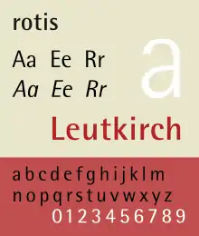
Rotis
Rotis is a typeface developed in 1988 by Otl Aicher, a German graphic designer and typographer. In Rotis, Aicher explores an attempt at maximum legibility through a highly unified yet varied typeface family that ranges from full serif, glyphic, and sans-serif. The four basic Rotis variants are:
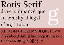
- Rotis serif (antiqua) — with full serifs
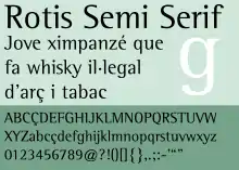
- Rotis semi-serif (semi-antiqua) — with hinted serifs
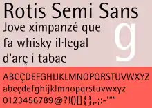
- Rotis semi-sans (semi-grotesque) — with zero serifs but with stroke width variation
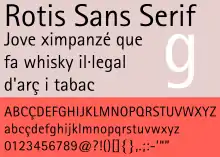
- Rotis sans (lineale humanist sans-serif) — with zero serifs and with minimal variation on stroke width
 | |
| Category | Font superfamily; humanist sans-serif |
|---|---|
| Designer(s) | Otl Aicher |
| Foundry | Agfa |
| Variations | Rotis serif Rotis semi-serif Rotis semi-sans rotis sans |
| Shown here | Rotis semi-sans |
Monotype Originals Rotis versions
When the Rotis fonts were reissued under the Monotype Originals label, the fonts support include support of ISO Adobe 2 character set, OpenType features. The Rotis font names are capitalized.
Rotis Serif
It includes 55 Roman, 56 Italic, 65 Bold fonts.
Rotis Semi Sans
It includes 45 Light, 46 Light Italic, 55 Roman, 56 Italic, 65 Bold, 75 Extra Bold fonts.
Rotis Pro
It includes support of ISO Adobe 2, Adobe CE, Latin Extended characters. In addition, separate fonts for Greek and Cyrillic characters were also created. Greek and Cyrillic fonts support ISO Adobe 2 and Latin Extended characters, and support super/sub-script OpenType feature.
Rotis II Sans (2011)
It is a version of Rotis Sans designed by Monotype Imaging senior designer Robin Nicholas, and freelance designer Alice Savoie. It expands the original with extra three font weights (Light, Semi Bold, and Black) and italics, along with revised letter spacing and kerning, a new set of numerals with similar height to the capitals.[1][2]
The family includes 14 fonts in seven weights, with complementary italics. OpenType features include access all alternates, case-sensitive forms, numerators/denominators, fractions, standard ligatures, localized forms (OpenType Pro fonts only), proportional/tabular figures, scientific inferiors, superscript/subscript, stylistic alternates, stylistic sets 1, 2 and 3 (OpenType Std fonts only). It supports ISO Adobe 2, Adobe CE, Latin Extended characters (OpenType Pro fonts only).
Naming convention
The typeface is named after Rotis, a hamlet belonging to the German town of Leutkirch im Allgäu, where Otl Aicher lived. However, Aicher named the font "rotis", in minuscules, since Aicher thought of capital letters as a sign of hierarchy and oppression.
When the fonts were reissued by Monotype Imaging in 2011, though, the font names were capitalized to "Rotis". This also affected fonts published by downstream foundries.
Uses
- Björk used this font for the artwork of her album Homogenic and all its corresponding singles.
- McAfee use the typeface until 2005.
- The metro of Bilbao (Metro Bilbao) uses this typeface in its logo and signage, which were also designed by Aicher himself.
- The city of Montreal uses Rotis Semi-Sans. However, it was modified slightly to spell out the word Montréal.[3]
- University Centre at Blackburn College in Lancashire and the college campus it is affiliated with both use Rotis in logos and signage.
- The Leibniz University of Hannover uses Rotis Sans in official documents and signage.
- The Vrije Universiteit Brussel uses Rotis Sans as its corporate typeface.
- ABS-CBN uses Rotis Semi Serif as its corporate typeface and the typeface for some of its companies beginning in 2000. Since 2014, ABS-CBN uses a modified version of the font for its corporate logo.
- Accenture used Rotis in their wordmark and advertising until 2017.[4]
- Assessment and Qualifications Alliance (AQA) also uses Rotis on their website and on their publications.
- The Anglican Church of Canada uses Rotis Semi-Serif for its wordmark.
- The Finland-based firm Nokia also used this font in their packaging, user manuals and advertising, although this has mostly been replaced with their own font, Nokia Sans, for their phones' user interface and promotional materials.
- The Commonwealth Services Delivery Agency, Centrelink (the government provider of social security/welfare in Australia), uses this typeface in their logo.
- Sound Transit uses Rotis Semi Serif for its light rail, commuter train and bus station signs[5]
- Auckland City Council used Rotis for traffic signage.
- PNC Financial Services, the sixth-largest bank in the United States, uses Rotis Semi Serif for its corporate logo and Rotis Sans Serif for their PNC Grow Up Great initiative, complemented by FF DIN for headlines and body copy.
- Singapore's highway and street signage uses Rotis Semi Sans.
- It is one of the primary components of FRISK Software's corporate identity.
- Also based in Auckland, New Zealand's largest architecture firm Jasmax uses Rotis in all of its documents.
- The Rotis family is also used in book publishing, one example being Naomi Klein's No Logo which uses the semi-serif face. Open Source Press uses Rotis Sans Serif for all their books' body text, and Semi Serif for the headers.
- The University of California, San Diego use the semi-serif face as its primary display type.
- ERCO, the German based lighting fixture manufacturer, uses semi-sans for their logo and literature.
- The company zebris Medical GmbH uses the font in their Logo and CI.[6]
- The Rotis font family is used by the kitchen company bulthaup.[7]
- The State University of New York College of Environmental Science and Forestry uses the Rotis family of fonts as one set of their official typefaces.[8]
- The inscriptions on the gravestone of Manchester impresario Anthony H. Wilson, designed by Peter Saville and Ben Kelly, are in Rotis Serif.[9]
- Scandinavian Airlines uses Rotis as their logotype written in silver letters along the sides of their aircraft.
- The serif face is the primary brand font for Teavana (TEA), a North American loose leave tea retailer
- The font is also used in the game Bubble Witch Saga.
Not all review of Rotis have been favourable. Prominent typeface designer Erik Spiekermann commented that "Rotis is not a typeface. It has some great letters, but they never come together to make words that don't look contrived or uncomfortable. It looks best on gravestones and similar large architectural applications."[10] He has also joked that he wants the design on his gravestone.[11]
References
- Font News: Rotis II Sans, expanded and improved
- "Monotype Imaging Announces the Rotis II Sans Typeface Family". Archived from the original on 2012-05-10. Retrieved 2012-08-28.
- "Connection".
- "Greater than Before".
- Two Twelve Harakawa Inc.; Maestri Design Inc.; Jon Bentz Design (September 2004). "Typography" (PDF). System-Wide Signage Design Manual, Second Edition. Sound Transit. p. DS-17. Archived from the original (PDF) on June 13, 2010. Retrieved October 18, 2014.
- "Zebris Medical GMBH - Home".
- www.bulthaup.com
- http://www.esf.edu/communications/logo/ESF_Visual_Identity_Standards.pdf
- http://creativereview.co.uk/cr-blog/2010/october/peter-saville-anthony-wilson-headstone Archived 2012-03-14 at the Wayback Machine
- Spiekermann & Hoefler; Bierut. "I Hate ITC Garamond (comments on article)". Design Observer. Retrieved 6 November 2014.CS1 maint: multiple names: authors list (link)
- Spiekermann, Erik. "Rotis now has a Black weight, so my gravestone will have more punch". Twitter. Retrieved 23 November 2015.
- Blackwell, Lewis. 20th Century Type. Yale University Press: 2004. ISBN 0-300-10073-6.
- Fiedl, Frederich, Nicholas Ott and Bernard Stein. Typography: An Encyclopedic Survey of Type Design and Techniques Through History. Black Dog & Leventhal: 1998. ISBN 1-57912-023-7.
- Macmillan, Neil. An A–Z of Type Designers. Yale University Press: 2006. ISBN 0-300-11151-7.
External links
| Wikimedia Commons has media related to Rotis. |
- Rotis Font Family & Packages
- Rotis II Sans family
- Is Rotis a typeface? - Robin Kinross and Erik Spiekermann on rotis
- Rotis am Ende?