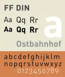
FF DIN
FF DIN is a sans-serif typeface in the industrial or "grotesque" style. It was designed in 1995 by Albert-Jan Pool, based on DIN-Mittelschrift and DIN-Engschrift, as defined in the German standard DIN 1451. DIN is an acronym for Deutsches Institut für Normung (German Institute of Standardisation).[2] It was published by FontShop in its FontFont library of typefaces.[3][4]
 | |
| Category | Sans-serif |
|---|---|
| Designer(s) | Albert-Jan Pool[1] |
| Foundry | FontFont |
FF DIN has an unadorned appearance with high x-height and a large series of weights.[5] It became very popular: as of September 2017, it remained the best-selling typeface on MyFonts.[6]
History
At a 1994 meeting of the Association Typographique Internationale trade association in San Francisco, Pool encountered Erik Spiekermann, who encouraged him to design a revival of DIN 1451 for release by FontFont, the type foundry Spiekermann had just established.
While based on the DIN 1451 standard lettering, FF DIN has additional weights and a far wider character set.[7][8] It includes ranging (old style) figures and several refinements that allow it to perform better as a print and screen text face. Spiekermann wrote in 2009 that "Albert’s brief was to take the regular weight and subtly make it a good typeface. He did it so well that it looks exactly like the original, but much better, especially in smaller sizes. Albert also added weights...FF DIN looks as if DIN had always had those weights because Albert didn’t let his ego interfere with the job."[9]
The family includes five font weights in two widths, normal and condensed, each with italics. The entire family includes extended characters such as arrows, fractions, euro sign, lozenge, mathematical symbols, extra accented Latin letters, and superscript numeral figures. Alternate glyphs include rounded dots, old style figures, and alternate cedilla. With time Eastern European, Greek and Cyrillic character sets have been added as well.
Distinctive characteristics
- Square dot with extra whitespace above the lower case i
- Rounded/extended shoulder of the lower case r
- Straight leg of the uppercase R
- Straight spur of the lower case a
- The geometric apostrophe with the bottom slant
- Lower-case L with a curl
- Slanted form is an oblique, rather than a true italic.[10]
- Alternate characters: single-storey italic 'a', round dots.
FF DIN Round
In summer 2010, FontFont introduced a completely new drawn round version called FF DIN Round, including five weights: light, regular, medium, bold, black.[11] Assisted by Ivo Gabrowitsch of FontShop International, Albert-Jan Pool wrote a brochure named FF DIN Round – digital block letters.[12] It provides additional information on both the design and the history of round sans serif typefaces. FF DIN Round Pro also includes a Cyrillic character set for all weights.
Popular usage outside of Germany
- The New York City Ballet logo uses FF DIN.[13]
- Identity of the 2008 London Design Festival.[14]
- FF DIN Condensed was formerly used as webfonts throughout the technology news site The Verge.[15]
- Posters for the film The Wolf of Wall Street use FF DIN.[16]
- The Swiss university ETH Zurich uses FF DIN Pro for posters, brochures and leaflets.[17]
- jetBlue Airways uses FF DIN Bold for its logo.[18]
- CBS Sports uses FF DIN as the typeface for television chyrons and scorekeeping.[19]
References
- "FontFont Focus: FF Din". Issuu. FontFont. Retrieved 22 July 2020.
- Jan Middendorp (2004). Dutch Type. 010 Publishers. pp. 188–191. ISBN 978-90-6450-460-0.
- Berry, John. "dot-font: Industrial-Standard Typefaces". Creative Pro. Retrieved 16 July 2016.
- Peters, Yyves. "FF DIN interview with Albert-Jan Pool and Inka Strotmann". FontShop. Retrieved 2 December 2017.
- Pool, Albert-Jan (2007). "FF DIN, the history of a contemporary typeface". In Spiekermann, Erik; Middendorp, Jan (eds.). Made with FontFont: type for independent minds (1st ed.). New York: Mark Batty Publisher. pp. 66–73. ISBN 0977985040.
- "Best Sellers". MyFonts (archived). Archived from the original on 16 September 2017. Retrieved 2 December 2017.
- "Albert-Jan Pool - Können Serifen funktional sein? (German)". YouTube. Typographische Gesellschaft München – tgm. Retrieved 13 February 2017.
- Jan-Pool, Albert. "Funktionale Serifen?". Design Made In Germany (archived). Archived from the original on 6 February 2013. Retrieved 13 February 2017.
- Spiekermann, Erik. "Comments on Typophile thread". Typophile. Archived from the original on April 10, 2009. Retrieved 13 July 2015.
- Paul Shaw (April 2017). Revival Type: Digital Typefaces Inspired by the Past. Yale University Press. pp. 199–200. ISBN 978-0-300-21929-6.
- Baird, Richard. "East Sydney Early Learning Centre". Fonts in Use. Retrieved 2 December 2017.
- Pool, Albert-Jan. "FF DIN: Digital Block Letters" (PDF). FontShop. Archived from the original (PDF) on 30 March 2017. Retrieved 14 December 2016.
- "New York City Ballet Font". Font Meme. Retrieved 16 March 2019.
- "FF DIN in use :: A FontFont Focus by FontShop". Dinfont.com. Retrieved 2012-10-10.
- "The Verge Logo and Website". Fonts In Use. 2013-11-19.
- "The Wolf of Wall Street movie posters". Fonts In Use. 2014-01-08.
- "Font in creative design". 2014-09-21.
- "jetBlue Font". Font Meme. Archived from the original on 12 September 2018. Retrieved 12 September 2018.
The jetBlue logo is simply its logotype set in FF Din Bold in blue.
- http://www.cbssportsnetwork.com/sites/logos/CBS_Sports_Network_Logo_style_guide.pdf
- Blackwell, Lewis. 20th Century Type. Yale University Press: 2004. ISBN 0-300-10073-6.
- Fiedl, Frederich, Nicholas Ott and Bernard Stein. Typography: An Encyclopedic Survey of Type Design and Techniques Through History. Black Dog & Leventhal: 1998. ISBN 1-57912-023-7.
- Macmillan, Neil. An A–Z of Type Designers. Yale University Press: 2006. ISBN 0-300-11151-7.
- Spiekermann, Erik; Middendorp, Jan: Made with FontFont, Book Industry Services (BIS): 2006, ISBN 978-90-6369-129-5
- DIN 1451-2: Schriften–Serifenlose Linear-Antiqua–Verkehrsschrift. Deutsches Institut für Normung, 1986-2002.
- ACLU Identity Guidelines
External links
- FontShop International’s FF DIN typeface
- FF DIN weights overview and in use examples
- FontFeed: Introduction of FF DIN Round
- FF DIN Family History
- Fonts in Use
- Albert-Jan Pool on Flickr (includes many examples of DIN and DIN-style lettering)