Whitney (typeface)
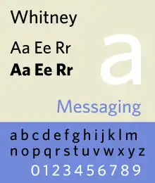
Whitney is a family of sans-serif digital typefaces designed by American type designer Tobias Frere-Jones.[1] It was originally created for New York’s Whitney Museum as its institutional typeface.[2] Two key requirements were flexibility for editorial requirements and a design consistency with the Whitney Museum's existing public signage.
 | |
| Classification | Neo-grotesque/Humanist sans-serif |
|---|---|
| Designer(s) | Tobias Frere-Jones |
| Foundry | Hoefler & Frere-Jones |
Typographical context
Whitney bridges the divide between editorial mainstays such as News Gothic (1908), which is an American gothic typeface, and signage application standards such as Frutiger (1975), which is a European humanist typeface. Moreover, “its compact forms and broad x-height use space efficiently, and its ample counters and open shapes make it clear under any circumstances.”[3]
Variants
- Whitney Condensed
- Whitney Narrow
Use
- Whitney Museum
- Discord[4]
- The Walt Disney Company
- SketchUp[5]
- Bridgewater Associates (one of the largest hedge funds in the world)[6]
- Kodak[7][8]
- Boston University[9]
- University of Texas Health Science Center at San Antonio[10]
- New Zealand Transport Agency[11] Publications and advertising[12]
- NYU Langone Medical Center Stationery Guidelines[13]
- Canadian Partnership for Consumer Food Safety Education (CPCFSE) – Be Food Safe Campaign[14]
- American Nerd is a book by Benjamin Nugent whose book cover uses Whitney[15]
- Delta Air Lines (used in logo and all branding)[16]
- Sam's Club has used Whitney for advertising and promotions since their 2006 rebranding. In-store signage at Sam's Clubs that have been built or renovated since the rebranding are also typeset in Whitney.[17]
- The University of British Columbia [18]
- Endeavor
- Mitt Romney used Whitney Semibold together with Mercury for his 2012 US Presidential election bid.[19]
- ColdwellBankerHomes.com - one of the largest real estate broker websites launched in 2015 uses Whitney font [20]
- Castleton University (used on its website for texts of articles)[21]
- St John Ambulance [22]
References
- "Sale & Assignment of Type Fonts". New York State Unified Court System. Retrieved 31 October 2019.
HTF hereby agrees to use its commercially best efforts to ensure that TFJ [Tobias Frere-Jones] shall receive a Design credit wherever the Fonts are displayed...nothing herein shall be interpreted as obligating HTF to require or enforce the display of a TFJ design credit
- Whitney | Hoefler & Frere-Jones
- typography.com/fonts/font_overview.php?productLineID=100026
- see this post
- "A brand new brand for SketchUp | SketchUp Blog". blog.sketchup.com. Retrieved 2018-05-11.
- see Bridgewater Associates
- see Brand Identity Standards
- Whitney is the preferred typeface for all Kodak communications.
- see Brand Identity Standards
- see Branding Standard
- see Visual identity guidelines
- All publications produced by the NZTA – such as project newsletters – should be in Whitney. All manuals and posters should also be produced in Whitney. Whitney has been chosen for its legibility and versatility. All recruitment, display, public notice, tender notice and roading advertising should be in Whitney.
- see Branding
- Brand Identity Preventing foodborne illness is a major public health challenge. The CPCFSE is committed to educating consumers on four simple practices they can use to fight foodborne bacteria and reduce their risk of becoming sick: Clean, Separate, Cook, and Chill.
- see American Nerd
- "Delta Airlines Style Guide" (PDF). Archived from the original (PDF) on 2012-09-15. Retrieved 29 April 2020.
- see UBC Brand Basic (Logos) Whitney is the institutional typeface used in all UBC Brand signatures and applications.
- See ColdwellBankerHomes.com
- Typography
- https://archive.org/details/sja-brand-guidelines-14-07-2016-3
External links
- Whitney Font in the Hoefler & Frere-Jones catalog
This article is issued from Wikipedia. The text is licensed under Creative Commons - Attribution - Sharealike. Additional terms may apply for the media files.