Frutiger (typeface)
Frutiger (pronounced [ˈfruːtɪɡər]) is a series of typefaces named after its Swiss designer, Adrian Frutiger.[3] Frutiger is a humanist sans-serif typeface, intended to be clear and highly legible at a distance or at small text sizes. A very popular design worldwide, type designer Steve Matteson described its structure as "the best choice for legibility in pretty much any situation" at small text sizes, while Erik Spiekermann named it as "the best general typeface ever".[4][5]
 | |
| Category | Humanist sans-serif |
|---|---|
| Designer(s) | Adrian Frutiger |
| Foundry | Linotype |
| Date released | 1976[1] |
| License | Commercial[2] |
| Variations | Frutiger Next |
Distinctive characteristics

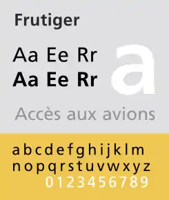
Characteristics of this typeface are:
- Lowercase
- square dot over the letter i; double-storey a, single-storey g. Wide, open apertures on letters such as a, e and s. Very high x-height, increasing its clarity.
- Uppercase
- Wide A with a very low centre bar, though less obvious in bold weight. Q with a stroke below the circle only. Univers-like M, square and with centre strokes descending to the base of the letter.
- Figures
- diagonal serif on the 1; closed 4.
- Oblique
- The slanted version is an oblique in which the letterforms are slanted, rather than a true italic. Some versions not drawn by Frutiger do add a true italic (see Frutiger Next below).
The typeface in its original incarnation uses the Frutiger numbering system.
History
Frutiger is a sans-serif typeface by the Swiss type designer Adrian Frutiger. It is the text version of Frutiger's earlier typeface Roissy, commissioned in 1970/71[6] by the newly built Charles de Gaulle Airport at Roissy, France, which needed a new directional sign system, which itself was based on Concorde, a font Frutiger had created in the early 1960s.
The beginning of Frutiger starts from Concorde, a sans-serif font Frutiger was commissioned to design in 1961-4 by the minor metal type company Sofratype. Frutiger was asked to create a design that would not be too similar to his previous Univers, a reinvention of classic 19th-century typefaces. In practice the design was drawn by his colleague (and fellow Swiss in Paris) André Gürtler as Frutiger was busy. Frutiger wrote of it: "I felt I was on the right track with this grotesque; it was a truly novel typeface." Gürtler too wrote of feeling that the design was innovative: "this style didn't exist in grotesques at the time, except for Gill Sans." Despite Frutiger and Gürtler's enthusiasm, the design failed to sell well and was discontinued with the end of the metal type period: Frutiger wrote that Linotype, who bought Sofratype, "weren't aware of the fact that with Concorde they had a totally up-to-date typeface."
Some years later, Frutiger was commissioned to develop a typeface for Roissy Airport. Frutiger had earlier created an alphabet inspired by Univers and Peignot for Paris Orly Airport, but found the experience a failure due to lack of control and the insistence that all text be in capitals only. As a result, he proposed a modified version of Concorde, refining it following research into legibility. The Roissy typeface was completed in 1972.[7] Impressed by the quality of the Roissy airport signage, the typographical director of the Mergenthaler Linotype Company approached Frutiger in 1974 to turn it into a typeface for print.[7]
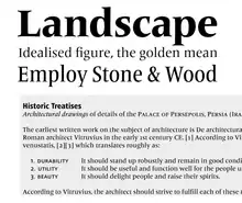
In designing the typeface's predecessors Concorde and Roissy, Frutiger's goal had been to create a sans-serif typeface with the rationality and cleanliness of Univers but the organic and proportional aspects of Gill Sans. According to Frutiger, "What was important, was total clarity – I would even call it nudity – an absence of any kind of artistic addition."[6] Designing Frutiger as a print version of Roissy, this principle resulted in a distinctive and legible typeface. The letter properties originally suited to the needs of Charles de Gaulle: a modern appearance and legibility at various angles, sizes, and distances. Ascenders and descenders are very prominent, and apertures are wide to easily distinguish letters from one another.[8] Improvements on Roissy included better spacing.
The Frutiger family was released publicly in 1976 by the Stempel type foundry in conjunction with Linotype. Frutiger became extremely popular for uses such as corporate and transportation branding. In 2008 it was the fifth best-selling typeface of the Linotype foundry.[9]
Frutiger Linotype
This is a version of the original Frutiger font family licensed to Microsoft. This family consists of Frutiger 55, 56, 65, and 66. It does not include OpenType features or kerning, but it adds support to Latin Extended-B and Greek characters, with Frutiger 55 supporting extra IPA characters and spacing modifier letters. Unlike most Frutiger variants, Frutiger Linotype features old-style figures as the default numeral style.
Frutiger Linotype can be found in Microsoft products featuring Microsoft Reader and in the standalone Microsoft Reader package.
ASTRA-Frutiger
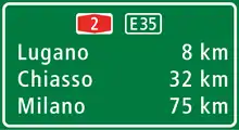
This is a variant of Frutiger used by ASTRA (acronym of the Amt für Strassen, the Swiss Federal Road Office) as the new font for traffic signs, replacing VSS in 2003.[10] It is based on Frutiger 57 Condensed, but with widening ascenders and descenders, which are intended to give the eye a better hold than the earlier version did.
A family of two fonts were made, called ASTRA-Frutiger-Standard/standard and ASTRA-Frutiger-Autobahn/autoroute.
Frutiger Next
The Frutiger family was updated in 1997 for signage at the Alte Pinakothek in Munich. The new version, Frutiger Next, changed a number of details and added a true italic style in place of the oblique roman of the original.
Frutiger Next was commercially available in 2000 under Linotype. The family include six font weights, with a bonus Ultra Light weight in the OpenType version. It supports ISO Adobe 2, Adobe CE, and Latin Extended characters. OpenType features include small caps, old style figures, superscript and subscript, ordinals, proportional lining figures, and case forms. Font names are no longer numbered with the Frutiger system. Frutiger Black was renamed to Frutiger Next Heavy, and Frutiger Ultra Black was changed to Frutiger Next Black. Condensed fonts no longer include italic variants. In addition to italic type, characters such as the cent sign (¢), the copyright symbol (©), the ampersand (&), the at sign (@), the sharp S (ß), Omega (Ω), and the integral symbol (∫) were redesigned. Cyrillic letters had not been produced until Frutiger Next W1G.
While Frutiger Next added considerably to Frutiger's feature set, it added a modish 1990s true italic (not drawn by Frutiger) instead of the sharper oblique Frutiger preferred for sans-serif typefaces throughout his career, over Frutiger's objections. In his autobiography, Frutiger commented that in resigning himself to it "Maybe I was too soft to say what I really felt...I didn't have the strength and patience anymore."[11]
Frutiger Next Greek (2005)
This is a variant of Frutiger Next designed with Eva Masoura for Linotype, originally published as a TDC2 2006 entry.
Frutiger Next W1G (2009)
This is an expanded version of Frutiger Next W1G. It added Greek (from Frutiger Next Greek) and Cyrillic character sets, but advertised OpenType features were reduced to superscript and subscript. Only an OpenType version has been produced.
Frutiger Arabic (2007)
This is a font family designed by Lebanese designer Nadine Chahine as a companion to Frutiger in consultation with Adrian Frutiger. It is based on the Kufic style, but incorporates aspects of Ruqʿah script and Naskh in the letter form designs, resulting in what Linotype called "humanist Kufi". The fonts consist of Basic Latin and ISO-Latin characters derived from the original Frutiger family, with Arabic characters supporting presentation forms A and B. Four font weights were produced.
Frutiger Serif (2008)
This is a serif font family designed by Adrian Frutiger and Akira Kobayashi. It is a re-envisioning of the metal type version of Meridien, a typeface first released by Deberny & Peignot during the 1950s.
The family consists of roman and italic fonts in five weights and two widths each.
Neue Frutiger (2009)
This is an expanded version of the original Frutiger family designed by Adrian Frutiger and Akira Kobayashi. Unlike the original family, the Frutiger numbering scheme is not used.
Initial release of the family has twenty fonts in ten weights and one width, returning to complementary obliques. It supports ISO Adobe, Adobe CE, and Latin Extended characters. OpenType features include subscript and superscript.
Neue Frutiger Condensed (2010)
On April 7, 2010, Monotype Imaging Holdings announced condensed versions of the Neue Frutiger fonts. Designed by Akira Kobayashi, the expansion of the family includes twenty fonts in the same weight and style combination as the original release, in OpenType Pro font format.[12][13]
Neue Frutiger W1G (2011)
This version supports Greek and Cyrillic characters.
The family includes forty fonts in ten weights and two widths, with a complementary oblique.
Neue Frutiger 1450 (2013)
It is a version of Neue Frutiger compliant with the German standard DIN 1450, designed by Akira Kobayashi.[14][15]
The family includes eight fonts, in four weights (book, regular, medium, bold) and one width, with a complementary oblique.
OpenType features include denominator/numerator, fractions, ligatures, localized forms, ordinals, proportional figures, subscript/superscript, scientific inferiors, stylistic alternates (two sets), ornaments, kerning.
Neue Frutiger World (2018)
In 2018, Monotype introduces Neue Frutiger World with several characters more than 150 languages, in Latin, Greek, Cyrillic, Georgian, Armenian, Hebrew, Arabic, Thai and Vietnamese. Additionally, in Chinese, Japanese, and Korean characters.[16]
Similar types
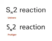
Adobe's Myriad and Microsoft's Segoe UI are two prominent typefaces whose similarities to Frutiger have aroused controversy. Frutiger described Myriad as 'not badly done' but said that the similarities had gone 'a little too far'. However, in an interview, Adrian Frutiger commended the work of Myriad's co-designer, Robert Slimbach: "except the unnecessary doubt concerning Myriad, his work is also very good."[17] Additionally, the italic style of Myriad is cursive, while the original version of Frutiger uses a slanted Roman style rather than a true italic.
In the 1970s, Frutiger designed Icone, a wedge-serif design with mild stroke modulation, which has many similarities in basic letter structure to Frutiger, and in overall effect to Albertus.[18][19]
Awards
Use in branding

The Frutiger font is used as an official typeface by many institutions around the world. A number of these are listed here.
Universities and colleges
- Cornell University uses Frutiger as its secondary typeface, along with Palatino.[22]
- The German Karlsruhe Institute of Technology uses Frutiger as its official typeface.[23]
- The London School of Economics service uses Frutiger as its official typeface.[24]
- Ohio University uses Frutiger as its official typeface, along with Galliard.[25]
- The University of Iceland uses Frutiger as its official typeface.[26]
- The University of Lausanne uses Frutiger as its official typeface.[27]
- Heriot-Watt University uses Frutiger as one of its official typefaces, along with Garamond.[28]
- The University of Miami uses Frutiger (Linotype) as its primary sans-serif typeface.[29]
- The University of Southern California uses Frutiger as its official typeface, along with Caslon 540.[30]
- National University of Singapore uses Frutiger as its primary typeface, with Times New Roman as its secondary.[31]
- California Institute of Technology uses Frutiger as one of its two "primary fonts," along with Adobe Garamond.[32]
- The University of Southern Denmark uses Frutiger as its secondary typeface, with Trajan as its primary.[33]
- Utrecht University uses this font in official communication, along with Bembo.[34]
Companies and organizations
- Alcatel-Lucent used Frutiger in its logo.[35]
- Amtrak uses Frutiger for signage and as a display type in printed documents, as well as for numbering on some of its fleet.[36]
- The Citizens Advice service uses Frutiger as its official typeface.[37]
- Connexions in the UK uses Frutiger as its official typeface.[38]
- The Hong Kong Institute of Certified Public Accountants in Hong Kong uses Frutiger as its official typeface.[39]
- Kieser Training AG and Kieser Training Australia use Frutiger as their official typeface.[40]
- England's National Health Service uses Frutiger as its standard typeface.[41]
- Polaroid used a slightly modified Frutiger in its logo.[42]
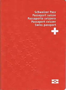
- Rotary International uses Frutiger as its official primary font.[43]
- UBS, a Swiss financial services company.[44]
- Since 2006, the World Health Organization uses the font in its logotype.[45]
- Pokemon also uses this font in their cards.
Other uses
- Bay Area Rapid Transit, a rapid transit system serving the San Francisco Bay Area, uses Frutiger for all signage.[46]
- The Port Authority of New York and New Jersey uses Frutiger 65 for signage and wayfinding at its airports.[47] This font is also used for signage at Amsterdam Airport Schiphol and Port Columbus International Airport.[48]
- BC Ferries uses Frutiger for all of its signage.
- The Dutch emergency services use Frutiger for their vehicle striping.[49]
- The Finnish Defence Forces uses Frutiger as its official typeface.[50]
- The US National Park Service uses Frutiger as one of two fonts across the entire agency.[51]
- Zarząd Transportu Miejskiego, the transport authority in Warsaw, Poland uses Frutiger since the 2014 information system change caused by launching the second metro line [52]
- DirecTV, a satellite television provider, uses this font as one of their font choices in the Closed Caption settings, with 2 variants known as Frutiger 1 and Frutiger 2.
Michael Bierut commented on its common use in wayfinding systems: "Frutiger has been used so much for signage programs in hospitals and airports that seeing it now makes me feel that I'm about to get diagnosed with a brain tumor or miss the 7:00 to O'Hare."[53]
Other 'Frutiger' fonts
A number of other designs by Frutiger carry his name without having any connection to the Frutiger typeface itself. They are listed here for reference.
Frutiger Stones (1998)
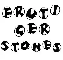
This is a family of casual fonts inspired by natural elements. Using polished pebbles as the boundary, the family consists of regular, positive, and negative fonts. Frutiger Stones Positive is Regular without the stone outline, while Negative is a reverse fill of the Regular.
Frutiger Symbols (1998)
This is a family of symbol fonts. The fonts contain plants, animals, and stars, as well as religious and mythological symbols. The naming convention follows Frutiger Stones.
Frutiger Capitalis (2005)
This is a family of casual fonts that consists of regular, outline, and signs fonts. Frutiger Capitalis Outline is the outline version of Frutiger Capitalis Regular. Frutiger Capitalis contains ornamental glyphs of religions, hand signs, and astrological signs.
References
- Frutiger, Adrian. Typefaces: The Complete Works. pp. 24, 251.
- "Monotype Introduces Mosaic Platform Enhancements and Neue Frutiger World Typeface for Global Branding; Plans Font Discovery Technology Preview for Adobe MAX". Businesswire. 2018-10-10. Retrieved 2019-05-19.
- Kupferschmid, Indra (16 March 2015). "Between Frutigerization and tradition: diversity, standardization, and readability in contemporary typographic landscapes". Social Semiotics. 25 (2): 151–164. doi:10.1080/10350330.2015.1010319.
- Spiekermann, Erik. "Twitter post". Twitter. Retrieved 11 July 2015.
- Matteson, Steve. "Type Q&A: Steve Matteson from Monotype". Typecast. Retrieved 12 September 2015.
- Adrian Frutiger, Typefaces. The Complete Works, (Basel: Birkhäuser Verlag, 2008), p224.
- Adrian Frutiger, Typefaces. The Complete Works, (Basel: Birkhäuser Verlag, 2008), p250.
- Albert-Jan, Pool. "From Univers to Frutiger". Fonts In Use. Retrieved 11 July 2015.
- "Best-Selling Fonts of 2008 - Linotype Font Feature". Linotype.com. 2010-05-26. Retrieved 2011-03-10.
- "Frutiger honored with SOTA award". Microsoft. Retrieved 2011-03-10.
- Frutiger, Adrian (8 May 2014). Typefaces: The Complete Works (2 ed.). Walter de Gruyter. p. 260. ISBN 978-3038212607.
- New Condensed Version of the Frutiger Typeface Joins the Linotype Library of Fonts Archived 2012-05-10 at the Wayback Machine
- "New Condensed Version of the Frutiger Typeface Joins the Linotype Library of Fonts - Business Wire". Retrieved 20 September 2016.
- "Linotype News - Press Releases". linotype.com.
- "Neue Frutiger 1450". linotype.com.
- "Monotype Introduces Mosaic Platform Enhancements and Neue Frutiger World Typeface for Global Branding; Plans Font Discovery Technology Preview for Adobe MAX". Business Wire. Retrieved 2018-11-21.
- TYPO - Frutiger Archived November 1, 2007, at the Wayback Machine
- Shaw, Paul. "Overlooked Typefaces". Print magazine. Retrieved 2 July 2015.
- Frutiger, Adrian. "Icone". MyFonts. Linotype. Retrieved 10 September 2015.
- "United Nations Year of Dialogue among Civilizations". Tdc.org. Archived from the original on 2008-09-18. Retrieved 2011-03-10.
- "TDC2 2006 : Winning Entries". Tdc.org. Archived from the original on 2012-09-08. Retrieved 2011-03-10.
- "Cornell University Style Guide" (PDF). cornell.edu. Retrieved 2011-05-11.
- 3. Gestaltungsgrundlagen - Version 1.0, Stand 17. Dezember 2008 Archived 2014-03-02 at the Wayback Machine uni-karlsruhe.de (German)
- "LSE style guidelines - Information for staff - News - Staff and students - Home". .lse.ac.uk. 2010-04-23. Retrieved 2011-03-10.
- "OHIO: Compass | Branding OHIO". Ohio.edu. Retrieved 2011-03-10.
- "Archived copy" (PDF). Archived from the original (PDF) on 2012-03-03. Retrieved 2009-12-10.CS1 maint: archived copy as title (link)
- "UNIL Logo - Mode d'emploi". Unil.ch. Retrieved 2011-03-10.
- "University Brand Guide Lines" (PDF). www.hw.ac.uk. Retrieved 23 March 2014.
- "UM Visual Identity Guidelines: Typefaces and Fonts". .miami.edu. Archived from the original on 2011-02-20. Retrieved 2011-03-10.
- "USC Graphic Identity Program : Web Branding : Web Colors and Typefaces". Usc.edu. Archived from the original on 2011-03-04. Retrieved 2011-03-10.
- "Corporate Typefaces". National University of Singapore. Retrieved 3 July 2014.
- "Designer Specifications". Caltech.edu. Retrieved 2012-10-08.
- "Syddansk Universitets logo". University of Southern Denmark. Archived from the original on 29 November 2013. Retrieved 20 July 2014.
- "Huisstijl". Utrecht University. 28 August 2014. Retrieved 20 September 2016.
- "Corporate Identity: Lucent". ncrv.nl. Retrieved 2011-09-08.
- "Branding Guidelines" (PDF). Amtrak. 2009-04-23. Archived from the original (PDF) on 2015-02-26. Retrieved 2012-03-07.
- "CABlink login page" (PDF). Cablink.org.uk. Retrieved 2011-03-10.
- http://www.dcsf.gov.uk/everychildmatters/_download/?id=631%5B%5D
- "HKICPA Overview" (PDF). (document uses Frutiger throughout)
- "Kieser Training Australia | We grow on resistance". Kieser-training.com.au. 2009-10-21. Retrieved 2011-03-10.
- "The NHS typefaces". Nhsidentity.nhs.uk. Archived from the original on 2011-10-02. Retrieved 2011-03-10.
- "Polaroid logo font". Grant Hamilton. Retrieved 2009-08-16.
- "Tell Rotary's Story: Voice and Visual Guidelines". Retrieved 2016-01-11., p. 12.
- "UBS". Archived from the original on 2013-08-07. Retrieved 2014-03-03.
- World Health Organization (n.d.). "World Health Organization: Visual Identity Guidelines" (PDF). World Health Organization. United Nations. Retrieved 28 January 2018.
- "New signs at downtown SF stations part of ongoing BART wayfinding improvements". bart.gov. 2010-11-17. Retrieved 2011-04-04.
- "PA Airport Road Sign Manual" (PDF). Port Authority of New York and New Jersey. 2013-01-01. Retrieved 2017-10-04.
- Kuiper, Rik. "Richting-aanwijzer" (PDF). Quest Magazine. G+J Uitgevers. Retrieved 24 January 2013.
- "Typography". Archived from the original on 2012-09-08. Retrieved 15 September 2012.
- "Puolustusvoimat" (in Finnish). Mil.fi. Retrieved 2011-03-10.
- "Park-Produced Publications: Typography". National Park Service. Retrieved 3 November 2011.
- "Rynek Kolejowy". rynek-kolejowy.pl. Archived from the original on 2018-03-23. Retrieved 2018-12-27.
- Bierut, Michael. "Thirteen Ways of Looking at a Typeface". Design Observer. Archived from the original on 2015-10-17. Retrieved 5 December 2014.
Bibliography
- Meggs, Philip, and Rob Carter. Typographic Specimens: The Great Typefaces. Van Nostrand Reinhold: 1993, p. 163. ISBN 0-442-00758-2.
- Gibson, Jennifer. "Univers and Frutiger." Revival of the Fittest: Digital Versions of Classical Typefaces, Ed. Philip Meggs and Roy McKelvey. RC Publications: 2000, pp. 176–177. ISBN 1-883915-08-2.