Zuzana Licko
Zuzana Licko (born Zuzana Ličko, 1961) is a Slovak-born American type designer known for co-founding the graphic design company Emigre and for creating numerous digital typefaces, including Mrs Eaves.
Zuzana Licko | |
|---|---|
| Born | Zuzana Ličko 1961 (age 59–60) |
| Education | University of California, Berkeley |
| Known for | Graphic designer |
Notable work | Fonts & Emigre magazine |
| Movement | emigre |
Early life
Licko who was born in Bratislava, Czechoslovakia. Licko came to the United States when she was a child, along with her family. She studied architecture, photography and computer programming before earning a degree in graphic communications at the University of California at Berkeley.[1]
Licko's father was a biomathematician at the University of California, San Francisco. Through his job, Licko became involved with computers during the summer months, helping him with data processing work.[2] The first font she created on a computer was a Greek alphabet for her father.[3]
When she started her university education, her goal was to earn a degree in architecture, but she changed to a visual studies major because she felt architecture was too much like business school.[2] While at Berkeley, Licko took a calligraphy class, but struggled with it because she was forced to write with her right hand even though she was left handed. This experience influenced her in rejecting many of the traditions of type design when she started to explore the macintosh computer.[2]
In an interview featured in Eye, Licko described her creative relationship with her husband Rudy VanderLans:
We met at the University of California at Berkeley where I was an undergraduate at the College of Environmental Design and Rudy was a graduate student in photography. This was in 1982-83. After college we both did all sorts of design-related odd jobs. There was no direction. Then, in 1984 the Macintosh was introduced, we bought one, and everything started to fall into place. We both, each in our own way, really enjoyed this machine. It forced us to question everything we had learnt about design. We both enjoyed that process of exploration, of how far you could push the limits. Rudy is more intuitive; I’m more methodical. Yin and yang. It seemed to click, and still does.[4]
Emigre
In the mid-1980s, Licko and VanderLans founded Emigre, also known as Emigre Graphics. The magazine, Emigre, was created in 1984. This magazine Emigre Magazine designed and distributed original fonts under the direction of VanderLans, its editor. Licko was responsible for many successful Emigre fonts.
Licko was initially exposed to Macintosh computers with the first release in 1984.
I started my venture with bitmap type designs, created for the coarse resolutions of the computer screen and dot matrix printer. The challenge was that because the early computers were so limited in what they could do you really had to design something special. Even if it was difficult to adapt calligraphy to lead and later lead to photo technology, it could be done, but it was physically impossible to adapt 8-point Goudy Old Style to 72 dots to the inch. In the end you couldn't tell Goudy Old Style from Times Roman or any other serif text face'" (18).[5]
Apart from adding new typefaces as a form of content, Emigre was also created as a way to share the typefaces with other designers that liked and wanted to use Licko's creations. As technology advanced, Licko moved from bitmap fonts to high resolution designs and based the newer designs on the ones initially created for dot matrix printers.[6] In the mid-1990s, Licko worked on two notable revivals: Mrs Eaves, based on Baskerville, and Filosofia, based on Bodoni. Both are Licko's personal interpretations of their historical models and each features extensive ligatures. Mrs Eaves was named after John Baskerville's lover; it is a somewhat stylized revival of the Baskerville typeface. Along with ligatures, Licko stylized Baskerville through the use of small caps or "petite caps".[7]
Filosofia
Because of her admiration for the Didone serif typeface Bodoni, she designed and came up with several variations of Bodoni, in the form of digital font for computer type and some forms were also used for text. Before working with computers, Licko's favorite typeface was Bodoni with its "clean lines and geometric shapes and the variety of headline style choices." Licko avoided using Bodoni for long texts, "as the extreme contrast made it difficult to read at small sizes.’"[8] Bodoni influenced Licko’s work on Filosofia, one of her typefaces. Like other revivals of typefaces, Licko’s revival of Bodoni focused on geometry and symmetry. She also incorporated details like slightly rounded serif endings. Licko’s Filosofia was designed to be modified for use either in print or on a computer. There is a "Regular" version of the Filosofia family which is designed to be used in print. The Filosofia Grand is designed for display applications and is described as more refined and delicate. To create Filosofia, Licko studied different styles of Bodoni, including the original print work and recent revivals, such as ITC Bodoni. Although the samples of Bodoni did have an influence on her work, Licko instead recreated Bodoni with her mind, judging by eye to keep the original measurements.[8]
Mrs. Eaves
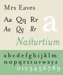
In Texts on Type, Licko writes about her take on Baskerville and what Mrs. Eaves meant to her: "In my rendition of this classic typeface, I have addressed the highly criticized feature of sharp contrast. To a great degree, the critics were wrong; it did not prevent Baskerville from becoming assimilated as a highly legible text face, and in fact, the high contrast between stems and hairlines became quite desirable, as is apparent in typefaces such as Baskerville, which followed in the lineage.[9]
Awards
Licko and her husband Rudy VanderLans won the Chrysler Design Award in 1994. Apart from winning this award, their work on Émigré also won the Publish magazine Impact Award in 1996. A year later, they got an American Institute for Graphic Arts Gold Medal Award. Soon after, in 1998 they were awarded the Charles Nyples Award in Innovation in Typography.[10]
The Society of Typographic Aficionados awarded Licko the 2013 SOTA Typography Award, citing her "intellectual, highly-structured approach to type design" and her contributions to the digital typography industry.[11]
Fonts designed by Licko
- Lo-Res (9, 12, 15, 22, 28; serif 22 & 21), 1985 FontShop
- Modula, 1985 Modula
- Citizen, 1986. Citizen
- Matrix, 1986 Matrix II
- Lunatix, 1988 Lunatix
- Oblong, 1988 Oblong
- Senator, 1988 Senator
- Variex, 1988 Variex
- Elektrix, 1989 Elektrix
- Triplex, 1989 Triplex
- Journal (original and text), 1990 JournalFontShop
- Tall Pack, 1990 Page Not Found
- Totally Gothic, 1990 Totally Gothic & Totally Glyphic
- Totally Glyphic, 1990 FontShop
- Matrix Script, 1992 Page Not Found
- Matrix Inline (original and script), 1992 FontShopFontShop
- Modula Tall, 1992 FontShop
- Narly, 1993 Narly
- Dogma (original, script & outline), 1994 DogmaFontShopFontShop
- Whirligig, 1994 Whirligig
- Base Nine and Twelve (serif & sans), 1995 Base 9 & 12
- Soda Script, 1995 Soda Script
- Modula Round sans, 1995 FontShop
- Mrs. Eaves (original & serif), 1996 Mrs Eaves
- Filosofia (original, grand & unicase), 1996 Filosofia
- Base Monospace, 1997 Base Monospace
- Hypnopaedia, 1997 Hypnopaedia
- Tarzana, 1998 Tarzana
- Solex, 2000 Solex
- Fairplex, 2002 FontShop
- Puzzler, 2005 Puzzler
- Mr. Eaves Sans and Modern, 2009. Mr Eaves Sans & Modern
- Base 900, 2010 FontShop
- Program, 2013 FontShop
Essays by Licko
- With Rudy VanderLans, Ambition/Fear, Emigre 11, edited by Rudy VanderLans, 1989. Page Not Found
- Discovery by Design, Emigre 32, edited by Rudy VanderLans, 1994. Page Not Found
- Ceramics and Type Design: Differently Similar, online at the Emigre website. Undated. Page Not Found
- Emigre: Graphic Design into the Digital Realm. ISBN 9780471285472
See also
- List of AIGA medalists
- List of Eye magazine issues
- First Things First 2000 manifesto
- Emigre 51: First Things First, 1999. Emigre Magazine #51
References
- Dooley, Michael. Graphic Design USA 18. "Critical Conditions: Zuzana Licko, Rudy VanderLans, and the Emigre Spirit." 1998.
- Cees W. De Jong, Alston W. Purvis, and Friedrich Friedl. 2005. Creative Type: A Sourcebook of Classical and Contemporary Letterforms. Thames & Hudson.
Further reading
- Gerda Breuer and Julia Meer, ed. (2012). Women in Graphic Design. Berlin: Jovis. pp. 197, 501, 502. ISBN 9783868591538.
External links
- Interview with Licko at emigre.com
- Emigre Fonts
- Licko’s Lab | Home
- Zuzana Licko and Rudy VanderLans
- List of AIGA medalists
- Emigre Fonts
- The Collection | MoMA
- Design Couples: Rudy VanderLans and Zuzana Licko
- Chrysler Design Institute - Zuzana Licko/Rudy VanderLans
- List of Emigre magazines
- Zuzana Licko
Notes
- Rubenstein, Rhonda. "Zuzana Licko." Eye magazine No. 43, Vol. 11, Spring 2002 "Zuzana Licko". Archived from the original on April 4, 2007. Retrieved April 14, 2007.
- VanderLans, Rudy, Zuzana Licko, Mary E. Gray, and Jeffery Keedy. Emigre: Graphic Design into the Digital Realm. London: Booth-Clibborn Editions, 1994.
- Sherin, Aaris. "Emigre Inc.." Grove Art Online. Oxford Art Online. Oxford University Press. Web. 7 Oct. 2016. <http://www.oxfordartonline.com/subscriber/article/grove/art/T2021626>.
- Eye, Number 43, Volume 11, Spring 2002.
- VanderLans, Rudy, Zuzana Licko, and Mary E. Gray. Emigre, Graphic Design Into The Digital Realm. Van Nostrand Reinhold Company, 1994.
- The Font Feed.Stephen Coles, September 29, 2005. http://fontfeed.com/archives/an-interview-with-zuzana-licko/
- http://typophile.com/node/12166.%5B%5D
- Cees W. De Jong, Alston W. Purvis, and Friedrich Friedl. 2005. Creative Type: A Sourcebook of Classical and Contemporary Letterforms. Thames & Hudson. (223)
- Heller, Steven, and Philip B. Meggs. Texts on Type: Critical Writings on Typography. New York: Allworth, 2001. Print.
- http://www.chrysler.com/design/design_influences/design_awards/1994/zlicko.html# Archived 2012-05-16 at the Wayback Machine
- "SOTA Typography Award Honors Zuzana Licko". The Society of Typographic Aficionados. 2013. Archived from the original on 22 March 2019. Retrieved 22 March 2019.