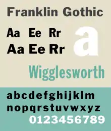
Franklin Gothic
Franklin Gothic and its related faces are a large family of sans-serif typefaces in the industrial or grotesque style developed in the early years of the 20th century by the type foundry American Type Founders (ATF) and credited to its head designer Morris Fuller Benton.[1] “Gothic” was a contemporary term (now little-used except to describe period designs) meaning sans-serif.
 | |
| Category | Sans-serif |
|---|---|
| Classification | Grotesque |
| Designer(s) | Morris Fuller Benton |
| Foundry | American Type Founders |
| Date released | 1902–1967 |
| Also known as | Gothic #1, Square Gothic Heavy, Gothic #16 |
Franklin Gothic has been used in many advertisements and headlines in newspapers. The typeface continues to maintain a high profile, appearing in a variety of media from books to billboards. Despite a period of eclipse in the 1930s, after the introduction of European faces like Kabel and Futura, they were re-discovered by American designers in the 1940s and have remained popular ever since. Benton's Franklin Gothic family is a set of solid designs, particularly suitable for display and trade use such as headlines rather than for extended text. Many versions and adaptations have been made since.
Probably the best-known extension of Franklin Gothic is Victor Caruso's 1970s ITC Franklin Gothic, which expands the series to include book weights similar to Benton's News Gothic in a high x-height 1970s style. It is in part bundled with Microsoft Windows.[2][3]
History

Franklin Gothic itself is an extra-bold sans-serif type. It draws upon earlier, nineteenth century models, from many of the twenty-three foundries consolidated into American Type Founders in 1892. Historian Alexander Lawson speculated that Franklin Gothic was influenced by Berthold’s Akzidenz-Grotesk types but offered no evidence to support this theory[4] which was later presented as fact by Philip Meggs and Rob Carter.[5] It was named in honor of a prolific American printer, Benjamin Franklin. The faces were issued over a period of ten years, all of which were designed by Benton and issued by A.T.F.[6]
- Franklin Gothic (1902)
- Franklin Gothic Condensed + Extra Condensed (1906)
- Franklin Gothic Italic (1910)
- Franklin Gothic Condensed Shaded (1912)
Many years later, the foundry again expanded the line, adding two more variants:
- Franklin Gothic Wide (1952) designed by John L. “Bud” Renshaw
- Franklin Gothic Condensed Italic (1967) designed by Whedon Davis
It can be distinguished from other sans serif typefaces by its more traditional double-storey a and especially g (double-storey gs, common in serif fonts, are rare in sans-serif fonts following German models, but were quite common in American and British designs of the period), the tail of the Q and the ear of the g. The tail of the Q curls down from the center of the letterform.
Hot metal copies
Barnhart Brothers & Spindler copied the face as Gothic #1, while both Linotype and Intertype, called their copies Gothic #16. Monotype’s copy kept the name Franklin Gothic, but because of the demands of mechanical composition, their version was modified to fit a standard arrangement. The Ludlow version was known as Square Gothic Heavy.[7]
Cold type copies
Due to the post-war popularity of Gothic faces, most producers of cold type offered their own versions of Franklin Gothic. These included:[8]
- Franklin Gothic — Alphatype, Autologic, Berthold, Dymo, Star/Photon, Mergenthaler, MGD Graphic Systems, Varityper
- Franklin — Compugraphic
- Pittsburgh — Graphic Systems Inc.
Digital copies
Digital copies have been made by Adobe, International Typeface Corporation, Monotype Imaging, and URW. Victor Caruso drew a multi-weight family for the International Typeface Corporation (ITC) in 1979 and in 1991, ITC commissioned the Font Bureau in Boston to create condensed, compressed and extra compressed versions of ITC Franklin Gothic. Bitstream’s version is called Gothic 744. Microsoft Windows has distributed "Franklin Gothic Medium," one of ITC's variants of the font, in all copies since at least Windows 95.
While ITC Franklin Gothic is the most common release, it has been criticised for modifying the structure of the family considerably. Calligrapher and design historian Paul Shaw argued that it was a failure for "mucking about with the distinctive Franklin Gothic g. In ITC Franklin Gothic...the ear on the g keeps popping up like a schoolchild overly eager to answer a question."[9]
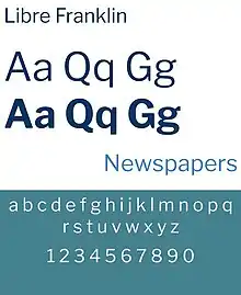
An open source interpretation of Franklin Gothic has been made by Impallari Type as Libre Franklin. Libre Franklin is available on Google Fonts .
Alternate Gothic
 | |
| Category | Sans-serif |
|---|---|
| Classification | Grotesque |
| Designer(s) | Morris Fuller Benton |
| Foundry | American Type Founders |
| Date released | 1903 |
| Re-issuing foundries | Monotype |
| Design based on | Franklin Gothic |
| Also known as | Gothic Condensed (Linotype + Intertype + Ludlow) |
Alternate Gothic was designed by M.F. Benton for A.T.F. in 1903. It is essentially a moderately bold condensed version of Franklin Gothic, made in three numbered widths. No.1 is the most condensed, 3 the least.
Hot metal copies
This face was copied by Monotype under the same name, #1 by Ludlow, Linotype and Intertype as Gothic Condensed. Ludlow’s Trade Gothic Condensed is very similar as well. Two variants were made:
Cold type copies
Alternate Gothic was copied by Compugraphic as Alpin Gothic.[11]
Digital copies
Digital copies have been made by URW, Elsner+Flake, and Monotype as CG Alternate Gothic #3.
Micah Rich and several contributors of The League of Moveable Type have made a popular OFL-licensed version of Alternate Gothic #1, League Gothic.[12]
League Gothic
League Gothic is a condensed sans-serif typeface released by The League of Moveable Type. The design of League Gothic was based on Alternate Gothic, a typeface originally designed by Morris Fuller Benton in 1903. Both No. 1 and No. 2 are available, each in a single semi-bold weight.[12]
Oswald
Oswald, by Vernon Adams, is a screen-optimized adaptation of Alternate Gothic No. 2, with six weights and no italics.
 | |
| Category | Sans-serif |
|---|---|
| Foundry | Impallari Type |
| License | SIL Open Font License |
| Design based on | Franklin Gothic |
| Website | https://fonts.google.com/specimen/Libre+Franklin |
Libre Franklin
Libre Franklin is an open source spinoff of Franklin Gothic made by the Argentine type foundry, Impallari Type. It has nine weights with italics.[13]
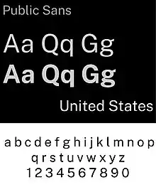
Public Sans
Public Sans is based on Libre Franklin and is made by the United States Web Design System and has numerous modifications. It has nine weights with matching italics and a variable weight axis.[14]
Oswald, League Gothic, Libre Franklin, and Public Sans are all licensed under the SIL Open Font License.
 | |
| Category | Sans Serif |
|---|---|
| Foundry | United States Web Design System |
| License | SIL Open Font License |
| Design based on | Libre Franklin |
| Website | https://fonts.google.com/specimen/Public+Sans |
Monotone Gothic
| Category | Sans-serif |
|---|---|
| Classification | Grotesque |
| Designer(s) | Morris Fuller Benton |
| Foundry | American Type Founders |
| Date released | 1907 |
| Design based on | Franklin Gothic |
Monotone Gothic was designed by M.F. Benton for A.T.F. in 1907. It is essentially a lighter, more extended version of Franklin Gothic. Only one weight was made and it was apparently never copied under that name by any other foundry. Digital versions of Franklin Gothic Light Extended are essentially knock-offs of this face.[15]
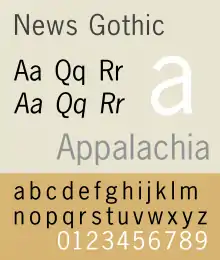
News Gothic
 | |
| Category | Sans-serif |
|---|---|
| Classification | Grotesque |
| Designer(s) | Morris Fuller Benton |
| Foundry | American Type Founders |
| Date released | 1908 |
| Design based on | Franklin Gothic |
| Also known as | Trade Gothic (Linotype), Record Gothic (Ludlow), Balto Gothic, (Baltimore Type & Composition Company) |
News Gothic was designed by M.F. Benton for A.T.F. in 1908 as a continuing effort to consolidate and systematize the 19th-century Gothic faces inherited from the company’s predecessors. It is essentially a medium weight companion to Franklin Gothic.
- News Gothic
- News Gothic Condensed
- News Gothic Extra Condensed
- News Gothic Extra Condensed Title
As with Franklin Gothic, the foundry expanded the line sometime later, adding two more variants:
- News Gothic Bold (1958) designed by John L. “Bud” Renshaw
- News Gothic Condensed Bold (1965) designed by Frank Bartuska
Particularly extensive designs in the same style were Trade Gothic from Linotype and Record Gothic by Ludlow.[16] [17] Benton Sans is a notable, and extremely comprehensive, modern revival.[18][19]
Lightline Gothic
| Category | Sans-serif |
|---|---|
| Classification | Grotesque |
| Designer(s) | Morris Fuller Benton |
| Foundry | American Type Founders |
| Date released | 1908 |
Lightline Gothic was designed by M.F. Benton for A.T.F. in 1908 as a lighter version of News Gothic, which makes it an ultra-light version of Franklin Gothic. Only one weight was made and it was apparently never copied under that name by any other foundry. Digital versions of Franklin Gothic Ultra-Light are essentially knock-offs of this face.
Hot metal variants
In 1921, M.F. Benton had the capitals of this face cast in different sizes on identical bodies, thus creating, ex nihilo, a lining Gothic which was sold under the name Lightline Title Gothic[20]
Usage
- New York University lists Franklin Gothic as an official font.[21]
- Franklin Gothic Condensed was the typeface used for subtitles in the Star Wars films,[22] but contrary to some reports, News Gothic and Univers are used for the opening crawl. The "A long time ago in a galaxy far, far away...." title card is set in Franklin Gothic, however.[23]
- Columbia College Chicago implements Franklin Gothic in its primary branding.[24]
- A custom cut of the font is used to display player numbers on the player kit in Indian Premier League.[25]
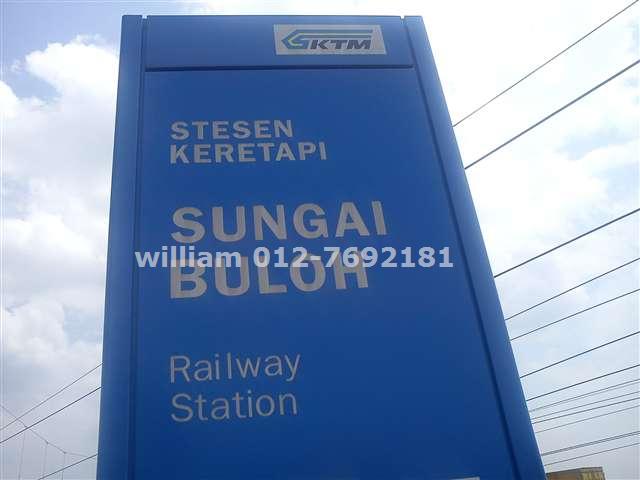
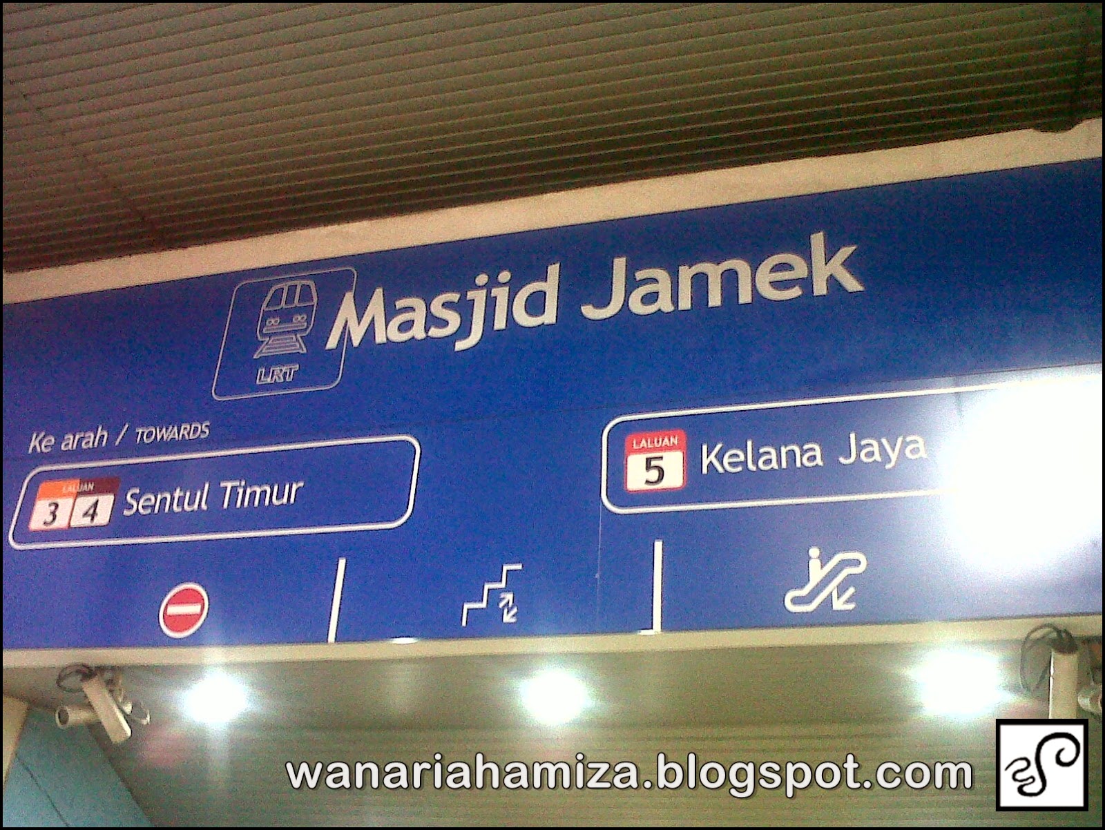
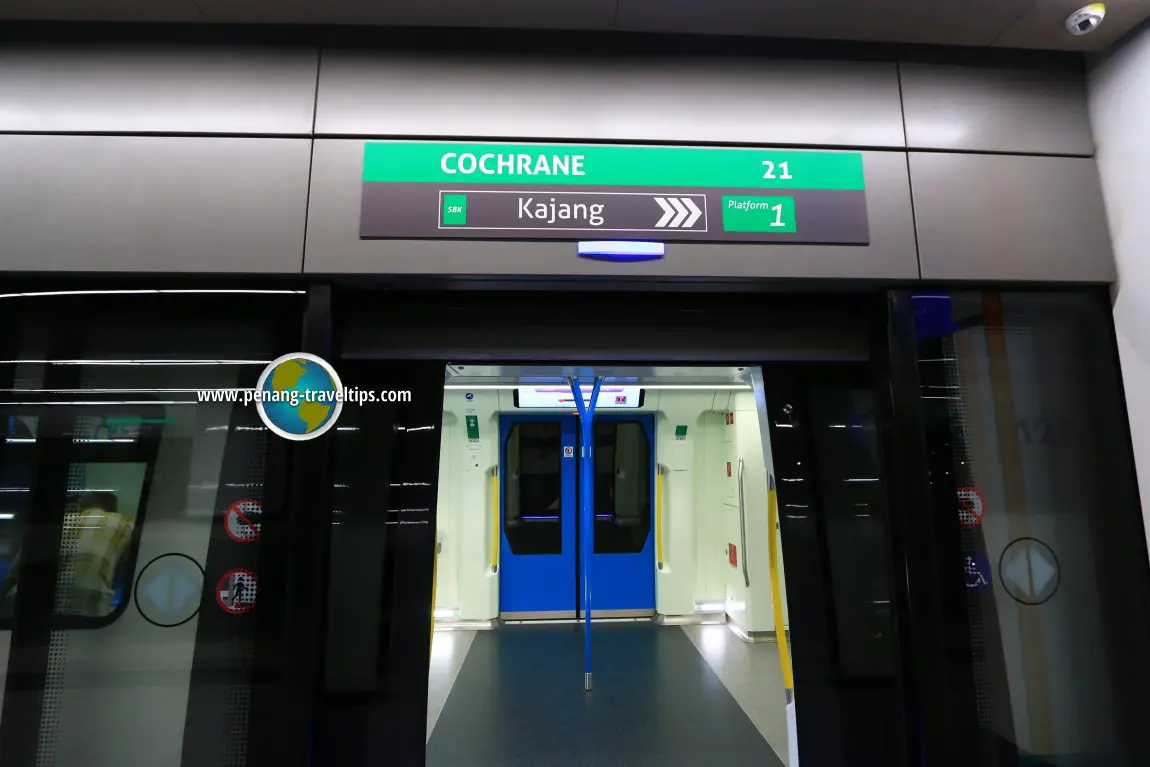
- Some stations on the Malaysian Railway network use the Franklin Gothic typeface on some of its stations' signages.[26][27] Some stations used Arial instead, while RapidKL stations use Trebuchet MS (or Arial Black on its newer stations[28]).[29] MRT Sungai Buloh-Kajang Line meanwhile adopts the Aller font.[30]
- The video game series You Don't Know Jack uses Franklin Gothic for almost all text (until Sagona, a Clarendon-based font, was also heavily used in Full Stream).
- Texas Vehicle Registration Plates from 1990 to 2000 used Franklin Gothic for the state name.
- Microsoft used Franklin Gothic Heavy and Franklin Gothic Book for the Windows 95, Windows NT 4.0, Windows 98, Windows 2000 and Windows ME logos.
- The band logo of the U.S. hip hop group Run-DMC is rendered in Franklin Gothic Heavy.
- Franklin Gothic Extra Condensed is used by the U.S. military on their uniforms.[31]
References
- Shen, Juliet. "Searching for Morris Fuller Benton". Type Culture. Retrieved 11 April 2017.
- "ITC Franklin Gothic". MyFonts. Retrieved 27 December 2017.
- "Franklin Gothic". Microsoft. Retrieved 27 December 2017.
- Lawson, Alexander S., Anatomy of a Typeface, Godine, Boston, 1990, ISBN 978-0-87923-333-4, pp. 295–307.
- Meggs, Philip and Carter, Rob, Typographic Specimens: The Great Typefaces, Van Nostrand Rheinhold, 1993, ISBN 0-442-00758-2, pp. 151.
- MacGrew, Mac, "American Metal Typefaces of the Twentieth Century," Oak Knoll Books, New Castle Delaware, 1993, ISBN 0-938768-34-4, pp. 142 - 143.
- MacGrew, "American Metal Typefaces of the Twentieth Century," pp. 142 - 143.
- Lawson, Alexander, Archie Provan, and Frank Romano, "Primer Metal Typeface Identification," National Composition Association, Arlington, Virginia, 1976, pp. 34 - 35.
- Shaw, Paul. "Flawed Typefaces". Print magazine. Retrieved 2 July 2015.
- MacGrew, "American Metal Typefaces of the Twentieth Century," pp. 10 - 11.
- Wheatley, W.F., "Typeface Analogue," National Composition Association, Arlington, Virginia, 1988, p. 5.
- "League Gothic - The League of Moveable Type".
- "Libre Franklin Font Combinations & Similar Fonts · Typewolf". Typewolf. Retrieved 2020-10-06.
- "Public Sans Font Combinations & Similar Fonts · Typewolf". Typewolf. Retrieved 2020-12-13.
- MacGrew, "American Metal Typefaces of the Twentieth Century," pp. 222 - 223.
- MacGrew, "American Metal Typefaces of the Twentieth Century," pp. 264 - 267.
- Coles, Stephen. "Record Gothic: fictional samples". Fonts in Use. Retrieved 29 August 2015.
- "Benton Sans". Font Bureau. Retrieved 29 August 2015.
- "Benton Gothic". Fonts in Use. Retrieved 29 August 2015.
- MacGrew, "American Metal Typefaces of the Twentieth Century," pp. 200 - 201.
- "Web Communication Standards: Core Identity Elements". New York University. Archived from the original on 20 August 2009.
- "Archived copy". Archived from the original on 2010-06-08. Retrieved 2010-08-18.CS1 maint: archived copy as title (link)
- "Archived copy". Archived from the original on 2011-04-13. Retrieved 2010-08-18.CS1 maint: archived copy as title (link)
- "Archived copy". Archived from the original on 2013-03-11. Retrieved 2013-03-14.CS1 maint: archived copy as title (link)
- "IPLT20.com - Clothing And Equipment Regulations". IPLT20. Archived from the original on 2015-07-03. Retrieved 2015-07-02.
- "Sungai Gadut KTM signboard". Retrieved 21 April 2017.
- "Sungai Buloh KTM/MRT signboard". Retrieved 21 April 2017.
- "Putra Heights LRT signboard". Retrieved 21 April 2017.
- "Masjid Jamek LRT signboard". Retrieved 21 April 2017.
- "Cochrane MRT station sign". TimothyTye.com. Retrieved 7 July 2018.
- https://www.ar670.com/2018/12/21/insignia-distinguishing-u-s-army-nametape-and-nameplate/
- Baines, Phil; Hastam, Andrew (2005). Type and Typography. Watson-Guptill Publications. ISBN 0-8230-5528-0.
- Lawson, Alexander S. (1990). Anatomy of a Typeface. Godine. ISBN 978-0-87923-333-4.
- Meggs, Phillip B. (2002). Revival of the fittest. RC Publications, Inc. ISBN 1-883915-08-2.
- Meggs, Phillip B. (1993). Typographic Specimens: The Great Typefaces. Van Nostrand Reinhold. ISBN 0-442-00758-2.
External links
| Wikimedia Commons has media related to Franklin Gothic. |
- ATF's 1912 specimen book, showing Franklin Gothic on pages 738 onwards and many contemporary types. Lightline from p. 668, Alternate from p. 722. Many sample advertising settings.
- ATF's 1923 specimen book (their legendary last major specimen before the Depression), Gothic types from p. 459. Lightline Gothic on p. 490.
- News/Trade/Franklin Gothic alternatives - survey by Stephen Coles