Display typeface
A display typeface is a typeface that is intended for use at large sizes for headings, rather than for extended passages of body text.[1]
Display typefaces will often have more eccentric and variable designs than the simple, relatively restrained typefaces generally used for body text.[2][3][4][5] They may take inspiration from other genres of lettering, such as handpainted signs, calligraphy or an aesthetic appropriate to their use, perhaps ornamented, exotic, abstracted or drawn in the style of a different writing system.[6][7][8]
Several genres of font are particularly associated with display setting, such as slab serif, script font, reverse-contrast and to a lesser extent sans serif.[9][10] Walter Tracy defines display typefaces in the metal type sense as "sizes of type over 14 point" and in design that "text types when enlarged can be used for headings, display types, if reduced, cannot be used for text setting."[11]
Historical background
For the first centuries of printing, display type generally did not exist. Printing was used primarily to print body text, although there might be use of some larger-sized letters for titling. Typefaces not intended for body text remained rooted in conventional letterforms: roman type, script typeface or blackletter. Signs were created as custom handlettering.[12]
The arrival of the poster and greater use of signage spurred the arrival of new kinds of letterform, both as lettering and in print.[12] Historian James Mosley has written that “big types had been cast in sand, using wooden patterns, for some centuries [by 1750] but there is evidence that English typefounders only began to make big letters for posters and other commercial printing towards 1770, when Thomas Cottrell made his 'Proscription or Posting letter of great bulk and dimension' and William Caslon II cast his 'Patagonian' or 'Proscription letters’.”[13][14][15]
New technologies, notably riveted "sanspareil" matrices made printing at large sizes easier from the beginning of the nineteenth century.[16] At the same time, new designs of letter began to appear around the beginning of the nineteenth century, such as "fat face" typefaces (based on serif faces of the period, but much bolder),[17][18] slab serifs (first seen from Vincent Figgins around 1817),[19][20] sans-serifs (already used in custom lettering but effectively unused in printing before the 1830s)[21] and new blackletter faces.[22] An important development that followed was wood type, which could be pantograph and allowed cheap printing of large type on posters. Many nineteenth-century display typefaces were extremely, aggressively bold and condensed in order to attract attention. Equally, some display typefaces such as Cochin and Koch-Antiqua have a particularly delicate build with a low x-height, and this style was very popular around the start of the twentieth century.[11]
With phototypesetting and digital printing methods allowing fonts to be printed at any size, it has become possible to use fonts in situations where before hand-lettering would be most common, such as on business logos and metal fabricated lettering. Many modern digital typeface families such as Neutraface, Neue Haas Grotesk, and Arno include both text styles and display companion optical sizes with a more delicate design.[23][24][25][26] Walter Tracy comments that in adapting a text face to display use such as in a headline "a judicious closing-up of the letters" improves the appearance.[11]
Styles of display typeface
Common genres of display typeface include:
- Lettering with a design intended to seem hand-drawn, such as script fonts or designs with swashes[27]
- “Shadowed”, “engraved”, “inline” or “handtooled” lettering, with a blank space in the centre intended to suggest three-dimensional letters in relief. An early genre of display type, inline sans-serifs were also very popular in lettering of the inter-war period.[28] "Shaded" or hatched designs have also been made which appear grey when viewed at a distance.[29]
- Unusual or abstract redesigns of the alphabet, such as those drawn by the Bauhaus school of design, Milton Glaser’s Baby Teeth or Indépendant.[30]
- “Distressed” lettering, intended to seem damaged or distorted, such as Shatter or Electric Circus[31]
- Ultra-light or ultra-bold adaptations of conventional letterforms, such as "fat face" types, Cooper Black or Gill Kayo
- Mixed case lettering that mixes upper- and lower-case letters in unexpected ways for an unconventional effect
- Reverse-contrast typefaces that invert the contrast of conventional writing, with the horizontals made thicker than the verticals.[32][33]
- Lettering made to suggest an aesthetic, such as modernism, the natural world, or another genre of lettering. Examples of the latter include use of stencil or embossing tape fonts to suggest an industrial aesthetic.
- “Mimicry” or “simulation” typefaces intended to suggest another writing system. These are often used by restaurants.[34][35]
A more prosaic genre of "display typefaces" is those intended for signage, such as Johnston, Highway Gothic, Transport and Clearview. These often have adaptations to increase legibility and make letters more distinct from each other. For example, Johnston and Transport have a curl on the lower-case ‘L’ to distinguish it from an upper-case ‘i'.[36] In German the term "Akzidenzschrift" (commercial or trade typeface) is used for faces not intended for body text but without implying a specific size range, so including small-size sans-serifs in uses such as on tickets. The famous sans-serif Akzidenz-Grotesk's name (literally commercial sans-serif) derives from this scheme).
Note that these genres may also be seen in custom lettering, with which this topic overlaps. Older examples of lettering are often custom-drawn, rather than fonts.[37][38][39]
Gallery
The following gallery shows the historical development of display type, from type similar to body text typefaces to the highly decorative types of the nineteenth century.
 1780 Norwegian notice using flourished blackletter type.
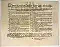
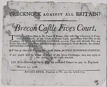 Challenge to a game of fives, 1786. Type is similar to Baskerville.
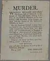 Murder poster 1796, using one inline initial.
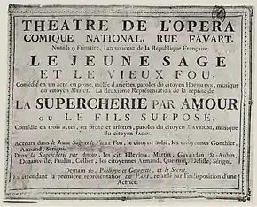 1797 notice of an opera by Méhul, Paris 1797.
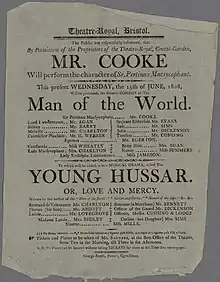 Theatre poster, Bristol 1808.
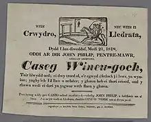 Welsh-language poster, Swansea 1818, using a bold italic inline "fat face" type.
 An energetic bold and italic "fat face" type in an 1831 poster.
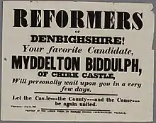 Fat face, slab-serif and sans-serif type, 1837.
See also
- Computer font, also known as a screen font
References
- David Consuegra (10 October 2011). Classic Typefaces: American Type and Type Designers. Skyhorse Publishing Company, Incorporated. pp. 1998–9. ISBN 978-1-62153-582-9.
- David Raizman (2003). History of Modern Design: Graphics and Products Since the Industrial Revolution. Laurence King Publishing. pp. 40–3. ISBN 978-1-85669-348-6.
- Eskilson, Stephen J. (2007). Graphic Design: A New History. New Haven: Yale University Press. p. 25. ISBN 9780300120110.
- Frere-Jones, Tobias. "Scrambled Eggs & Serifs". Frere-Jones Type. Retrieved 23 October 2015.
- Lewis, John (April 2007). Typography: Design and Practice. Jeremy Mills Publishing. pp. 13–17. ISBN 978-1-905217-45-8.
- Bruce Willen; Nolen Strals (23 September 2009). Lettering & Type: Creating Letters and Designing Typefaces. Princeton Architectural Press. pp. 66–79. ISBN 978-1-56898-765-1.
- Ellen Lupton; Julia Lupton (12 May 2009). Design Your Life: The Pleasures and Perils of Everyday Things. St. Martin's Press. pp. 165–174. ISBN 978-1-4299-9423-1.
- Mosley, James. "English Vernacular". Typefoundry (blog). Retrieved 14 December 2016.
- Mosley, James (1999). The Nymph and the Grot: the Revival of the Sanserif Letter. London: Friends of the St Bride Printing Library. pp. 1–19. ISBN 9780953520107.
- Mosley, James. "Comments on Typophile thread - "Unborn: sans serif lower case in the 19th century"". Typophile (archived). Archived from the original on 28 June 2014. Retrieved 15 October 2016.CS1 maint: bot: original URL status unknown (link)
- Tracy, Walter (2003). Letters of Credit: a view of type design. Boston: David R. Godine. pp. 50, 139–140, 180. ISBN 9781567922400.
- Mosley, James (1963). "English Vernacular". Motif. 11: 3–56.
- Mosley, James (1796). A Specimen of Printing Types & Various Ornaments 1796: Reproduced Together with the Sale Catalogue of the British Letter-Foundry 1797. Printing Historical Society. pp. 5–12.
- Berthold Wolpe (1964). "Caslon Architectural: On the origin and design of the large letters cut and cast by William Caslon II". Alphabet. Kynoch Press. pp. 57–64.
- Howes, Justin (2004). "Caslon's Patagonian". Matrix. 24: 61–71.
- Mosley, James (2003). "Sanspareil Matrices". Matrix: 104–114.
- Kennard, Jennifer. "The Story of Our Friend, the Fat Face". Fonts in Use. Retrieved 11 August 2015.
- Mosley, James (2003). "Reviving the Classics: Matthew Carter and the Interpretation of Historical Models". In Mosley, James; Re, Margaret; Drucker, Johanna; Carter, Matthew (eds.). Typographically Speaking: The Art of Matthew Carter. Princeton Architectural Press. pp. 35–6. ISBN 9781568984278. Retrieved 30 January 2016.
- Mosley, James. "The Typefoundry of Vincent Figgins, 1792-1836". Motif (1): 29–36.
- "Sentinel's Ancestors". Hoefler & Frere-Jones. Retrieved 14 August 2015.
- Mosley, James. "The Nymph and the Grot: an Update". Typefoundry blog. Retrieved 12 December 2015.
- Phinney, Thomas. "Fat Faces". Graphic Design and Publishing Centre. Retrieved 10 August 2015.
- Twardoch, Slimbach; Sousa, Slye (2007). Arno Pro (PDF). San Jose: Adobe Systems. Retrieved 14 August 2015.
- Schwartz, Christian. "Neutraface". www.christianschwartz.com. Retrieved October 2, 2011.
- Schwartz, Christian. "Neutraface No. 2". www.christianschwartz.com. Retrieved October 2, 2011.
- Schwartz, Christian. "Neue Haas Grotesk". Retrieved 28 November 2014.
- Shaw, Paul. "Lettercentric: Type as Writing". Print. Retrieved 21 September 2015.
- http://typographica.org/on-typography/farewell-futura-hello-neutraface-no-2/
- "Graublock". Fonts in Use. Retrieved 24 January 2017.
- Van Haute, Katrien (1 April 2008). "The Indépendant, a Typeface as Period Document". Quaerendo. 38 (1): 49–69. doi:10.1163/157006907X247219.
- John L Walters (2 September 2013). Fifty Typefaces That Changed the World: Design Museum Fifty. Octopus. p. 121. ISBN 978-1-84091-649-2.
- Bilak, Peter. "Beauty and Ugliness in Type design". I love typography. Retrieved 10 August 2015.
- Lawson, Alexander (1990). Anatomy of a typeface (1st ed.). Boston: Godine. pp. 321–323. ISBN 9780879233334.
- Chachra, Deb. "Faux Devangari". HiLoBrow. Retrieved 1 October 2014.
- Shaw, Paul. "Stereo Types". Print Magazine. Retrieved 1 October 2014.
- Calvert, Margaret. "New Transport". A2-Type. Retrieved 1 March 2016.
- Simonson, Mark. "Not a font". Mark Simonson Studio (blog). Retrieved 14 December 2016.
- Coles, Stephen. "Lettering is not type". Type Network.
- Johnston, Alastair. "The Misery of Edwin Drood". Booktryst. Retrieved 14 December 2016.