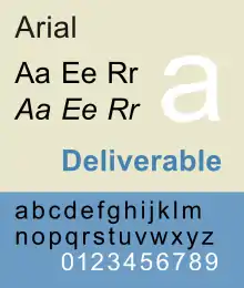
Arial
Arial, sometimes marketed or displayed in software as Arial MT, is a sans-serif typeface and set of computer fonts in the neo-grotesque style. Fonts from the Arial family are packaged with all versions of Microsoft Windows from Windows 3.1 onwards, some other Microsoft software applications,[2] Apple's macOS[3] and many PostScript 3 computer printers.[4] The typeface was designed in 1982, by Robin Nicholas and Patricia Saunders, for Monotype Typography.[5] It was created to be metrically identical to the popular typeface Helvetica, with all character widths identical, so that a document designed in Helvetica could be displayed and printed correctly without having to pay for a Helvetica license.
 | |
| Category | Sans-serif |
|---|---|
| Classification | Neo-grotesque sans-serif |
| Designer(s) | Robin Nicholas Patricia Saunders[1] |
| Foundry | Monotype Corporation |
| Date released | 1982[1] |
| License | Proprietary |
| Design based on | Monotype Grotesque Helvetica Venus |
| Metrically compatible with | |
The Arial typeface comprises many styles: Regular, Italic, Medium, Medium Italic, Bold, Bold Italic, Black, Black Italic, Extra Bold, Extra Bold Italic, Light, Light Italic, Narrow, Narrow Italic, Narrow Bold, Narrow Bold Italic, Condensed, Light Condensed, Bold Condensed, and Extra Bold Condensed. The extended Arial type family includes more styles: Rounded (Light, Regular, Bold, Extra Bold); Monospaced (Regular, Oblique, Bold, Bold Oblique). Many of these have been issued in multiple font configurations with different degrees of language support. The most widely used and bundled Arial fonts are Arial Regular, Italic, Bold, and Bold Italic; the same styles of Arial Narrow; and Arial Black. More recently, Arial Rounded has also been widely bundled.
In Office 2007, Arial was replaced by Calibri as the default typeface in PowerPoint, Excel, Outlook, and Word.
Design characteristics
Embedded in version 3.0 of the OpenType version of Arial is the following description of the typeface:
A contemporary sans serif design, Arial contains more humanist characteristics than many of its predecessors and as such is more in tune with the mood of the last decades of the twentieth century. The overall treatment of curves is softer and fuller than in most industrial style sans serif faces. Terminal strokes are cut on the diagonal which helps to give the face a less mechanical appearance. Arial is an extremely versatile family of typefaces which can be used with equal success for text setting in reports, presentations, magazines etc, and for display use in newspapers, advertising and promotions.
In 2005, Robin Nicholas said, "It was designed as a generic sans serif; almost a bland sans serif."[6][7]
Arial is a neo-grotesque typeface: a design based on nineteenth-century sans-serifs, but regularized to be more suited to continuous body text and to form a cohesive font family.
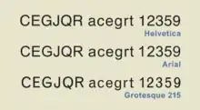
Apart from the need to match the character widths and approximate/general appearance of Helvetica, the letter shapes of Arial are also strongly influenced by Monotype's own Monotype Grotesque designs, released in or by the 1920s, with additional influence from 'New Grotesque', an abortive redesign from 1956.[8][9][10][11] The designs of the R, G and r also resemble Gill Sans. The changes cause the typeface to nearly match Linotype Helvetica in both proportion and weight (see figure), and perfectly match in width.[12] Monotype executive Allan Haley observed, "Arial was drawn more rounded than Helvetica, the curves softer and fuller and the counters more open. The ends of the strokes on letters such as c, e, g and s, rather than being cut off on the horizontal, are terminated at the more natural angle in relation to the stroke direction."[10] Matthew Carter, a consultant for IBM during its design process, described it as "a Helvetica clone, based ostensibly on their Grots 215 and 216".
The styling of Arabic glyphs comes from Times New Roman, which have more varied stroke widths than the Latin, Greek, Cyrillic glyphs found in the font. Arial Unicode MS uses monotone stroke widths on Arabic glyphs, similar to Tahoma.
The Cyrillic, Greek and Coptic Spacing Modifier Letters glyphs initially introduced in Arial Unicode MS, but later debuted in Arial version 5.00, have different appearances.
History
IBM debuted two printers for the in-office publishing market in 1982: the 240-DPI 3800-3 laserxerographic printer, and the 600-DPI 4250 electro-erosion laminate typesetter.[13][14] Monotype was under contract to supply bitmap fonts for both printers.[10][13] The fonts for the 4250, delivered to IBM in 1983,[15] included Helvetica, which Monotype sub-licensed from Linotype.[13] For the 3800-3, Monotype replaced Helvetica with Arial.[13] The hand-drawn Arial artwork was completed in 1982 at Monotype by a 10-person team led by Robin Nicholas and Patricia Saunders[6][16] and was digitized by Monotype at 240 DPI expressly for the 3800-3.[17]
IBM named the font Sonoran Sans Serif due to licensing restrictions and the manufacturing facility's location (Tucson, Arizona, in the Sonoran Desert),[10][18] and announced in early 1984 that the Sonoran Sans Serif family, "a functional equivalent of Monotype Arial", would be available for licensed use in the 3800-3 by the fourth quarter of 1984. There were initially 14 point sizes, ranging from 6 to 36, and four style/weight combinations (Roman medium, Roman bold, italic medium, and italic bold), for a total of 56 fonts in the family. Each contained 238 graphic characters, providing support for eleven national languages: Danish, Dutch, English, Finnish, French, German, Italian, Norwegian, Portuguese, Spanish, and Swedish. Monotype and IBM later expanded the family to include 300-DPI bitmaps and characters for additional languages.
In 1989, Monotype produced PostScript Type 1 outline versions of several Monotype fonts,[15] but an official PostScript version of Arial was not available until 1991. In the meantime, a company called Birmy marketed a version of Arial in a Type 1-compatible format.[12][19]
In 1990, Robin Nicholas, Patricia Saunders[6][16] and Steve Matteson developed a TrueType outline version of Arial which was licensed to Microsoft.[15][20][21]
In 1992, Microsoft chose Arial to be one of the four core TrueType fonts in Windows 3.1, announcing the font as an "alternative to Helvetica".[15][16][22] Matthew Carter has noted that the deal was complex and included a bailout of Monotype, which was in financial difficulties, by Microsoft. Microsoft would later extensively fund the development of Arial as a font that supported many languages and scripts. Monotype employee Rod MacDonald noted:
As to the widespread notion that Microsoft did not want to pay licensing fees [for Helvetica], [Monotype director] Allan Haley has publicly stated, more than once, that the amount of money Microsoft paid over the years for the development of Arial could finance a small country.[23]
Arial ultimately became one of several clones of PostScript standard fonts created by Monotype in collaboration with or sold to Microsoft around this time, including Century Gothic (a clone of ITC Avant Garde), Book Antiqua (Palatino) and Bookman Old Style (ITC Bookman).[24][25][26]
Distribution
TrueType editions of Arial have shipped as part of Microsoft Windows since the introduction of Windows 3.1 in 1992;[22] Arial was the default font.[1]
From 1999 until 2016, Microsoft Office shipped with Arial Unicode MS, a version of Arial that includes many international characters from the Unicode standard. This version of the typeface was for a time the most widely distributed pan-Unicode font. The font was dropped from Microsoft Office 2016 and has been deprecated; continuing growth of the number of characters in Unicode and limitations on the number of characters in a font meant that Arial Unicode could no longer perform the job it was originally created for.[27]
Arial MT, a PostScript version of the Arial font family, was distributed with Acrobat Reader 4 and 5.
PostScript does not require support for a specific set of fonts, but Arial and Helvetica are among the 40 or so typeface families that PostScript Level 3 devices typically support.[28][29]
Mac OS X (now known as macOS) was the first Mac OS version to include Arial; it was not included in classic Mac OS. The operating system ships with Arial, Arial Black, Arial Narrow, and Arial Rounded MT. However, the default macOS font for sans-serif/Swiss generic font family is Helvetica. The bundling of Arial with Windows and macOS has contributed to it being one of the most widely distributed and used typefaces in the world.
In 1996, Microsoft launched the Core fonts for the Web project to make a standard pack of fonts for the Internet. Arial in TrueType format was included in this project. The project allowed anyone to download and install these fonts for their own use (on end user's computers) without any fee. The project was terminated by Microsoft in August 2002, allegedly due to frequent EULA violations.[30][31][32] For MS Windows, the core fonts for the web were provided as self-extracting executables (.exe); each included an embedded cabinet file, which can be extracted with appropriate software. For the Macintosh, the files were provided as BinHexed StuffIt archives (.sit.hqx). The latest font version that was available from Core fonts for the Web was 2.82, published in 2000. Later versions (such as version 3 or version 5 which include many new characters) were not available from this project. A Microsoft spokesman declared in 2002 that members of the open source community "will have to find different sources for updated fonts. ... Although the EULA did not restrict the fonts to just Windows and Mac OS, they were only ever available as Windows .exe's and Mac archive files."[30] The chief technical officer of Opera Software cited the cancellation of the project as an example of Microsoft resisting interoperability.[33]
Arial variants
The known variants of Arial include:
- Arial: Sometimes called Arial Regular to distinguish its width from Arial Narrow, it contains Arial (Roman text weight), Arial Italic, Arial Bold, Arial Bold Italic
- Arial Unicode MS[34]
- Arial Black: Arial Black, Arial Black Italic. This weight is known for being particularly heavy. This is because the face was originally drawn as a bitmap, and to increase the weight, stroke widths for bold went from a single pixel width to two pixels in width, but only supports Latin, Greek and Cyrillic.
- Arial Narrow: Arial Narrow Regular, Arial Narrow Bold, Arial Narrow Italic, Arial Narrow Bold Italic. This family is a condensed version.
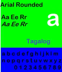
- Arial Rounded: Arial Rounded Light, Arial Rounded Regular, Arial Rounded Medium, Arial Rounded Bold, Arial Rounded Extra Bold. The regular versions of the rounded glyphs can be found in Gulim, Microsoft's Korean font set. Originally only available in bold form as Arial Rounded MT Bold, extra fonts appeared as retail products. In Linotype's retail version, only Arial Rounded Regular supports WGL character set.
- Arial Special: Arial Special G1, Arial Special G2. They are included with Microsoft Encarta Virtual Globe 99, Expedia Streets and Trips 2000, MapPoint 2000.
- Arial Light, Arial Medium, Arial Extra Bold, Arial Light Condensed, Arial Condensed, Arial Medium Condensed, Arial Bold Condensed: These fonts first appeared in the Linotype online stores. The condensed fonts do not have italic counterparts.
- Arial Monospaced: In this monospaced variant, letters such as @, I (uppercase i), i, j, l (lowercase L), M, W are redesigned.
Arial Alternative
Arial Alternative Regular and Arial Alternative Symbol are standard fonts in Windows ME, and can also be found on Windows 95 and Windows XP installation discs, and on Microsoft's site.[35] Both fonts are Symbol-encoded. These fonts emulate the monospaced font used in Minitel/Prestel teletext systems, but vectorized with Arial styling. The fonts are used by HyperTerminal.
Arial Alternative Regular contains only ASCII characters, while Arial Alternative Symbol contains only 2 × 3 semigraphics characters.
Code page variants
Arial Baltic, Arial CE, Arial Cyr, Arial Greek, Arial Tur are aliases created in the FontSubstitutes section of WIN.INI by Windows. These entries all point to the master font. When an alias font is specified, the font's character map contains different character set from the master font and the other alias fonts.
In addition, Monotype also sells Arial in reduced character sets, such as Arial CE, Arial WGL, Arial Cyrillic, Arial Greek, Arial Hebrew, Arial Thai.
Arial Unicode is a version supporting all characters assigned with Unicode 2.1 code points.
Arial Nova
Arial Nova's design is based on the 1982's Sonora Sans bitmapped fonts,[36][37] which were in fact Arial renamed to avoid licensing issues. It was bundled with Windows 10, and is offered free of charge on Microsoft Store.[38] It contains Regular, Bold and Light weights, corresponding italics and corresponding Condensed widths.
Monotype/Linotype retail versions
Arial
The TrueType core Arial fonts (Arial, Arial Bold, Arial Italic, Arial Bold Italic) support the same character sets as the version 2.76 fonts found in Internet Explorer 5/6, Windows 98/ME.
Version sold by Linotype includes Arial Rounded, Arial Monospaced, Arial Condensed, Arial Central European, Arial Central European Narrow, Arial Cyrillic, Arial Cyrillic Narrow, Arial Dual Greek, Arial Dual Greek Narrow, Arial SF, Arial Turkish, Arial Turkish Narrow.
In addition, Monotype also sells Arial in reduced character sets, such as Arial CE, Arial WGL, Arial Cyrillic, Arial Greek, Arial Hebrew, Arial Thai, Arial SF.
Arial WGL
It is a version that covers only the Windows Glyph List 4 (WGL4) characters. They are only sold in TrueType format.
The family includes Arial (regular, bold, italics), Arial Black, Arial Narrow (regular, bold, italics), Arial Rounded (regular, bold).
Ascender Corporation fonts
Ascender Corporation sells the font in Arial WGL family, as well as the Arial Unicode.
Arial in other font families
Arial glyphs are also used in fonts developed for non-Latin environments, including Arabic Transparent, BrowalliaUPC, Cordia New, CordiaUPC, Miriam, Miriam Transparent, Monotype Hei, Simplified Arabic.
Free alternatives
Arial is a proprietary typeface[39] to which Monotype Imaging owns all rights, including software copyright and trademark rights (under U.S. copyright law, Monotype cannot legally copyright the shapes of the actual glyphs themselves).[40] Its licensing terms prohibit derivative works and free redistribution.[41][42][43][44][45][46][47]
There are some free software metric-compatible fonts used as free Arial alternatives or used for Arial font substitution:
- Liberation Sans is a metrically equivalent font to Arial developed by Ascender Corp. and published by Red Hat in 2007, initially under the GPL license with some exceptions.[48] Versions 2.00.0 onwards are published under SIL Open Font License.[49] It is used in some GNU/Linux distributions as default font replacement for Arial.[50] Liberation Sans Narrow is a metrically equivalent font to Arial Narrow contributed to Liberation fonts by Oracle in 2010,[51] but is not included in 2.00.0.[52] Google commissioned a variation named Arimo for Chrome OS.
- URW++ produced a version of Helvetica called Nimbus Sans L in 1987, and it was eventually released under the GPL and AFPL (as Type 1 font for Ghostscript) in 1996.[53][54][55] It is one of the Ghostscript fonts, free alternatives to 35 basic PostScript fonts (which include Helvetica).
- FreeSans, a free font descending from URW++ Nimbus Sans L, which in turn descends from Helvetica.[39][56] It is one of free fonts developed in GNU FreeFont project, first published in 2002. It is used in some free software as Arial replacement or for Arial font substitution.
- TeX Gyre Heros, a free font descending from URW++ Nimbus Sans L, which in turn descends from Helvetica.[57] It is one of free fonts developed by the Polish TeX Users Group (GUST), first published in 2007. It is licensed under the GUST Font License.
- Arimo, an open-source font developed by Steve Matteson with the same metrics as Arial.
Uses
- SM used in City or Center since 2010, later in 2011 upgraded Capitalized after used in SM City San Pablo. It also uses the logo of SMDC in Arial Black.
See also
- Core fonts for the Web
- List of fonts
- Category:Monotype typefaces – typefaces owned by or designed for Monotype Imaging
References
- McNeil, Paul (9 November 2017). The Visual History of Type (print). London: Laurence King. p. 446–447. ISBN 9781780679761. OCLC 1004655550.
- Microsoft Corporation. "Arial – Products that supply this font". Retrieved 31 January 2010.
- Apple Inc. "Mac OS X 10.5: Fonts list". Archived from the original on 20 January 2010. Retrieved 31 January 2010.
- "Adobe PostScript 3 fonts" (PDF). Archived (PDF) from the original on 5 June 2011. Retrieved 4 May 2011.
- Nicholas, Robin. "Two minutes with Robin Nicholas". Metacafe. Retrieved 1 July 2015.
- "Twenty/20" (PDF). MacUser. 8 July 2005. Archived from the original (PDF) on 4 March 2009.
- Clark, Joe. "Upload of Macuser". Flickr. Retrieved 1 July 2015.
- Shaw, Paul. "Arial Addendum no. 3". Blue Pencil. Retrieved 1 July 2015.
- Shaw (& Nicholas). "Arial addendum no. 4". Blue Pencil. Retrieved 1 July 2015.
- Haley, Allan (May–June 2007). "Is Arial Dead Yet?". Step Inside Design. Archived from the original on 19 July 2011. Retrieved 11 May 2011.
- "Type Designer Showcase: Robin Nicholas – Arial". Monotype Imaging. Archived from the original on 14 July 2011. Retrieved 10 May 2011.
- Simonson, Mark. "The Scourge of Arial". Archived from the original on 25 May 2011. Retrieved 11 May 2011.
- Boag, Andrew (14 October 1996). "Have you ever thought about the LaserWriter fonts and how you got them?". Typo-L (Mailing list). Retrieved 9 May 2011. "Monotype's first contract for the IBM 4250 included [...] Helvetica (sub-licensed from Lino) [...] When it came to the 3800 laser printer I think IBM wanted a functional equivalent to Helvetica to save on the licensing wrangles, and this is when the Arial bitmaps were first created. But IBM named all the fonts in the machine after rivers in Colorado (!) so it was initially called Sonoran Sans." Boag is a former Monotype employee.
- The 4250 prototype debuted at Drupa in 1982, but the production model 4250/II wasn't on the market until 1984.
- Wallis, Lawrence W. "About Us: The Monotype Chronicles". Monotype Imaging. Archived from the original on 26 July 2011. Retrieved 11 May 2011.
1983 [...] Monotype supplied IBM with digital fonts for its 600 dpi 4250 Printer operating on the principle of electro-erosion of the coated surface of a laminated substrate. [...] 1989 – Monotype issued first fonts in the PostScript Type 1 format containing 'hinted' refinements under license from Adobe Systems. [...] 1990 – Monotype Typography licensed to Microsoft a set of 13 core fonts in the TrueType format for use in the Windows and OS/2 environments. It was an association that burgeoned further with release of additional TrueType font packages in 1992 and afterwards.
- Robin Nicholas bio at Ascender Corporation by Monotype Imaging website [blacklisted, so direct link not available] "[Robin Nicholas] in 1982 developed a sans serif typeface for bitmap font laser printers which was later developed, with Patricia Saunders, into the Arial typeface family – chosen by Microsoft as a core font for Windows 3.1 (and subsequent versions)"
- "IBM Typographic Fonts for IBM 3800 Printing Subsystem Model 3 [announcement letter 284-040]". 7 February 1984.
The fonts, designed for use with the IBM 3800 Printing Subsystem Model 3, consist of proportionally spaced, digitized, alphabetic character, and other forms in sizes ranging from 4 to 36 points (approximately 1/18-inch to 1/2-inch) in height. Each character pattern is printed at a density of 240 × 240 dots (pels) per square inch. Letter forms were digitized by The Monotype Corporation, Limited, from original artwork. The digitization was done at 240 × 240 dots (pels) per square inch expressly for the IBM 3800 Printing Subsystem Model 3.
- A Guide to Understanding AFP Fonts (PDF), International Business Machines Corporation, 30 December 1999, retrieved 10 May 2011,
The Sonoran font products were created to provide AFP customers with two of the most popular typefaces: Times New Roman and Arial (Monotype's equivalent of Helvetica). Due to licensing requirements in place at the time, the type family names used for the IBM-supplied versions of these fonts were changed from Times New Roman to Sonoran Serif and from Arial to Sonoran Sans Serif. These 240 dpi-only fonts were extensively hand-edited. Since the characters in the fonts were not derived from common databases, there is no linear progression of character size as point size increases, a requirement for migration to outline fonts. [...] Since the linearity issue cannot be resolved (each character in each point size is unique and not linearly related to the same character in any other point size) there will be no outline font support for the Sonoran fonts and the migration path will stop at 300-pel..
- Fenton, Erfert (1989), The Macintosh Font Book (1 ed.), Peachpit Press (Verification needed; Google Books search result only shows that Arial is mentioned.)
- "Steve Matteson". MyFonts.com (Bitstream Inc.). Retrieved 11 May 2011.
- Steve Matteson bio at Ascender Corporation by Monotype Imaging website [blacklisted, so direct link not available] "In 1990 Steve was hired by Monotype Typography as a contractor to aid in the production of Microsoft’s first TrueType fonts."
- "New features in Windows 3.1". Microsoft. 16 November 2006. Retrieved 8 March 2008.
Windows 3.1 includes the new TrueType scalable-font technology…Four TrueType scalable-font families will ship with all copies of Windows 3.1: Arial (alternative to Helvetica), Times New Roman, Courier, and Symbol.
- McDonald, Rob. "Some history about Arial". Paul Shaw Letter Design. Retrieved 22 May 2015.
- Downer, John. "Call It What It Is". Emigre. Retrieved 20 March 2016.
- Simonson, Mark. "Monotype's Other Arials". Mark Simonson Studio. Retrieved 14 July 2015.
- Gavin Ambrose; Paul Harris (1 November 2006). The Fundamentals of Typography. AVA Publishing. p. 145. ISBN 978-2-940373-45-1.
- "What happened to the Arial Unicode MS font?". Retrieved 11 November 2019.
- Adobe Systems Incorporated, PostScript Language Reference Supplement, Adobe PostScript 3, Version 3010 and 3011 Product Supplement Archived 3 June 2006 at the Wayback Machine, Appendix D, 30 August 1999. Retrieved 29 April 2006.
- Adobe Systems Incorporated, The Adobe PostScript 3 Font Set. Retrieved 29 April 2006.
- Mark Hachman (14 August 2002). "Microsoft Withdraws Free Web Fonts". ExtremeTech. Archived from the original on 17 April 2010. Retrieved 13 April 2010.
- Jesse Burgheimer (13 August 2002). "Microsoft Cuts the Line to Web Core Fonts". archive.org. Archived from the original on 11 January 2008. Retrieved 13 April 2010.
- "Microsoft Cuts the Line to Web Core Fonts". 13 August 2002. Archived from the original on 13 March 2008. Retrieved 4 August 2008.
- "Opera to MS: Get real about interoperability, Mr Gates – Opera CTO Hakon Lie responds to Bill's clarion call". 11 February 2005. Archived from the original on 25 May 2010. Retrieved 2 July 2010.
- "Arial Unicode MS". Archived from the original on 8 January 2010. Retrieved 15 January 2010.
- "Knowledge base", Support, Microsoft, archived from the original on 4 June 2012
- "Background Story". Arial Nova. Linotype. Retrieved 2 March 2018.
- "Typeface Story". Arial Nova. Fonts.com.
- "Get Arial Nova". Microsoft Store. Microsoft. Retrieved 2 March 2018.
- "GNU FreeFont – Why do we need free outline UCS fonts?". 4 October 2009. Archived from the original on 16 June 2010. Retrieved 2 July 2010.
- Copyright registrations for the TrueType "computer programs": Arial Roman, Arial Bold, Arial Italic, and Arial Bold Italic.
- "Monotype Imaging, Inc. – End User License Agreement". Archived from the original on 17 July 2010. Retrieved 2 July 2010.
- "Monotype Imaging – Licensing Options". Archived from the original on 4 July 2010. Retrieved 2 July 2010.
- "Microsoft Typography – Arial". Archived from the original on 25 July 2010. Retrieved 2 July 2010.
- Microsoft. "Core fonts for the Web – End-User License Agreement for Microsoft Software". Retrieved 13 April 2010.
- Microsoft (28 December 2001). "TrueType core fonts for the Web EULA". Retrieved 13 April 2010.
- Microsoft (12 October 2001). "TrueType core fonts for the Web FAQ". Archived from the original on 29 March 2010. Retrieved 13 April 2010.
- Microsoft (25 July 2002). "TrueType core fonts for the Web FAQ". Retrieved 13 April 2010.
- LiberationFontLicense – License Agreement and Limited Product Warranty, Liberation Font Software, retrieved 19 December 2012
- LICENSE - liberation-fonts, retrieved 19 December 2012
- Mandriva Linux 2008 Release Tour, archived from the original on 19 June 2010, retrieved 4 April 2010,
integrated into Mandriva Linux 2008
- "OpenOffice.org 3.3 New Features".
- Liberation Fonts, Fedora
- Finally! Good-quality free (GPL) basic-35 PostScript Type 1 fonts., archived from the original on 23 October 2002, retrieved 6 May 2010
- Finally! Good-quality free (GPL) basic-35 PostScript Type 1 fonts. (TXT), retrieved 6 May 2010
- "Fonts and TeX". 19 December 2009. Retrieved 6 May 2010.
- "GNU FreeFont – Design notes". 4 October 2009. Archived from the original on 15 June 2010. Retrieved 2 July 2010.
- "TeX Gyre Heros – GUST Web Presence". Retrieved 19 December 2018.
External links
| Wikimedia Commons has media related to Arial. |
- Microsoft Typography: Arial, Arial Black, Arial Narrow, Arial Rounded MT, Arial Special G1/G2, Arial Narrow Special G1/G2, Arial Unicode MS
- Linotype/Monotype Arial families: Arial, Arial WGL, Arial Arabic, Arial Nova, Arial OS, Arial Unicode
- Fonts in Use
Monospaced programming and typewriter fonts | |||||||||||
|---|---|---|---|---|---|---|---|---|---|---|---|
| Sans serif |
| ||||||||||
| Serif | |||||||||||
Monotype typefaces | |
|---|---|
| 1900s |
|
| 1910s |
|
| 1920s |
|
| 1930s |
|
| 1940s |
|
| 1950s |
|
| 1960s |
|
| 1970s |
|
| 1980s | |
| 1990s |
|
| 2000s |
|
| 2010s |
|
macOS typefaces | |
|---|---|
| Latin, Greek, Cyrillic |
|
| Non-alphabetic | |