Optical margin alignment
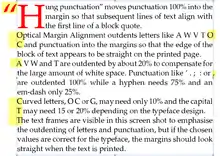
Optical margin alignment outdents letters like A, V, W, Y, and punctuation into the margins to align the text border optically. Some users remark that it makes the text margin look crooked, but this is because text frames or margin guides are visible. If text frames are not visible, e.g. in print preview, or when printed, the edge of a block of text looks more even if optical margin alignment is enabled.

From the earliest days of machine printing, punctuation and Drop Capitals were indented slightly into the margin, as can be seen in the pages of the Gutenberg Bible[1] in the British Library. Word-processing software lacks this attention to detail that could be achieved when manually setting type page by page, but professional page layout software like InDesign, Ventura and Serif PagePlus can now achieve this with a fine level of adjustment over which letters to indent into the margin and by how much.
Use
Optical margin alignment is designed to be used for body text, and not for display type, text in tables, or headlines.
It is often used for block quotes, which benefit from “hung punctuation.” In such cases, the leading quotation mark is outdented 100% into the margin or paragraph indent, so that subsequent lines of text align with the first character in the quotation. If the first character of the quotation is meant to be styled as a drop cap, then both the opening, hung quotation mark and the following letter are styled as such.
The optimal values used for the outdents is font-dependent. A typeface whose capital A, V, W, and Y have vertical sides needs no outdents for these letters, but the capital T and punctuation will still benefit from the use of optical margin alignment.
If text has narrow gutters between columns, table borders, or any straight edge such as an image near to the edge of the text, optical margin alignment should not be used because the proximity of the straight line will break the optical illusion.
This technique is related to and sometimes equated with hanging punctuation, though optical margin alignment is not limited to adjusting only punctuation.
Suggested Values for Optical Justification
These values may be suitable for common seriffed fonts like Times New Roman, Palatino, or Garamond. Other fonts may need different values.
| Characters | Value |
|---|---|
| " “ ” ' ‘ ’, . | 100% |
| hyphen | 75% |
| en-dash | 50% |
| em-dash | 25% |
| A T V W Y | 20% |
| C O | 10% |
See also
References
External links
- Micro-typographic Extensions of pdfTEX in Practice - Hàn Thé Thành, University of Education, Ho Chi Minh City, Vietnam
- Optical Margin Alignment in InDesign - (RussellViers.com)
