Serif
In typography, a serif (/ˈsɛrɪf/) is a small line or stroke regularly attached to the end of a larger stroke in a letter or symbol within a particular font or family of fonts. A typeface or "font family" making use of serifs is called a serif typeface (or serifed typeface), and a typeface that does not include them is a sans-serif one. Some typography sources refer to sans-serif typefaces as "grotesque" (in German, grotesk) or "Gothic",[1] and serif typefaces as "roman".
| Sans-serif font | |
 |
Serif font |
 |
Serif font (red serifs) |
Origins and etymology
Serifs originated in the Latin alphabet with inscriptional lettering—words carved into stone in Roman antiquity. The explanation proposed by Father Edward Catich in his 1968 book The Origin of the Serif is now broadly but not universally accepted: the Roman letter outlines were first painted onto stone, and the stone carvers followed the brush marks, which flared at stroke ends and corners, creating serifs. Another theory is that serifs were devised to neaten the ends of lines as they were chiselled into stone.[2][3][4]
The origin of the word serif is obscure, but apparently is almost as recent as the type style. The book The British Standard of the Capital Letters contained in the Roman Alphabet, forming a complete code of systematic rules for a mathematical construction and accurate formation of the same (1813) by William Hollins, defined surripses, usually pronounced "surriphs", as "projections which appear at the tops and bottoms of some letters, the O and Q excepted, at the beginning or end, and sometimes at each, of all". The standard also proposed that surripsis may be a Greek word derived from σῠν- (sun-, together) and ῥῖψῐς (rhîpsis, projection).
In 1827, a Greek scholar Julian Hibbert printed with his own experimental uncial Greek types, remarking that the types of Giambattista Bodoni's Callimachus were "ornamented (or rather disfigured) by additions of what [he] believe[s] type-founders call syrifs or cerefs". The printer Thomas Curson Hansard referred to them as "ceriphs" in 1825.[5] The oldest citations in the Oxford English Dictionary (OED) are 1830 for serif and 1841 for sans serif. The OED speculates that serif was a back-formation from sanserif.
Webster's Third New International Dictionary traces serif to the Dutch noun schreef, meaning "line, stroke of the pen", related to the verb schrappen, "to delete, strike through" (schreef now also means "serif" in Dutch). Yet, schreef is the past tense of schrijven (to write). The relation between schreef and schrappen is documented by Van Veen and Van der Sijs.[6] In her Chronologisch Woordenboek,[7] Van der Sijs lists words by first known publication in the language area that is The Netherlands today: schrijven, 1100; schreef, 1350; schrappen, 1406 (i.e. schreef is from schrijven [to write], not from schrappen [to scratch, eliminate by strike-through]).
The OED's earliest citation for "grotesque" in this sense is 1875, giving stone-letter as a synonym. It would seem to mean "out of the ordinary" in this usage, as in art grotesque usually means "elaborately decorated". Other synonyms include "Doric" and "Gothic", commonly used for Japanese Gothic typefaces.[8]
Classification
Serif fonts can be broadly classified into one of four subgroups: old style, transitional, Didone and slab serif, in order of first appearance.
Old-style

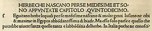
Old-style typefaces date back to 1465, shortly after Johannes Gutenberg's adoption of the movable type printing press. Early printers in Italy created types that broke with Gutenberg's blackletter printing, creating upright and later italic styles inspired by Renaissance calligraphy.[9][10] Old-style serif fonts have remained popular for setting body text because of their organic appearance and excellent readability on rough book paper. The increasing interest in early printing during the late 19th and early 20th centuries saw a return to the designs of Renaissance printers and type-founders, many of whose names and designs are still used today.[11][12][13]
Old-style type is characterized by a lack of large differences between thick and thin lines (low line contrast) and generally, but less often, by a diagonal stress (the thinnest parts of letters are at an angle rather than at the top and bottom). An old-style font normally has a left-inclining curve axis with weight stress at about 8 and 2 o'clock; serifs are almost always bracketed (they have curves connecting the serif to the stroke); head serifs are often angled.[14]
Old-style faces evolved over time, showing increasing abstraction from what would now be considered handwriting and blackletter characteristics, and often increased delicacy or contrast as printing technique improved.[10][15][16] Old-style faces have often sub-divided into Venetian (or humanist) and Garalde (or Aldine), a division made on the Vox-ATypI classification system.[17] Nonetheless, some have argued that the difference is excessively abstract, hard to spot except to specialists and implies a clearer separation between styles than originally appeared.[18][lower-alpha 2] Modern typefaces such as Arno and Trinité may fuse both styles.[21]
Early "humanist" roman types were introduced in Italy. Modelled on the script of the period, they tend to feature an "e" in which the cross stroke is angled, not horizontal; an "M" with two-way serifs; and often a relatively dark colour on the page.[9][10] In modern times, that of Nicolas Jenson has been the most admired, with many revivals.[22][9] Garaldes, which tend to feature a level cross-stroke on the "e", descend from an influential 1495 font cut by engraver Francesco Griffo for printer Aldus Manutius, which became the inspiration for many typefaces cut in France from the 1530s onwards.[23][24] Often lighter on the page and made in larger sizes than had been used for roman type before, French Garalde faces rapidly spread throughout Europe from the 1530s to become an international standard.[19][23][25]
Also during this period, italic type evolved from a quite separate genre of type, intended for informal uses such as poetry, into taking a secondary role for emphasis. Italics moved from being conceived as separate designs and proportions to being able to be fitted into the same line as roman type with a design complementary to it.[26][27][28][lower-alpha 3]
A new genre of serif type developed around the 17th century in the Netherlands and Germany that came to be called the "Dutch taste" ("goût Hollandois" in French).[30] It was a tendency towards denser, more solid typefaces, often with a high x-height (tall lower-case letters) and a sharp contrast between thick and thin strokes, perhaps influenced by blackletter faces.[31][32][30][33][34]
Examples of contemporary Garalde old-style typefaces are Bembo, Garamond, Galliard, Granjon, Goudy Old Style, Minion, Palatino, Renard, Sabon, and Scala. Contemporary typefaces with Venetian old style characteristics include Cloister, Adobe Jenson, the Golden Type, Hightower Text, Centaur, Goudy's Italian Old Style and Berkeley Old Style and ITC Legacy. Several of these blend in Garalde influences to fit modern expectations, especially placing single-sided serifs on the "M"; Cloister is an exception.[35] Artists in the "Dutch taste" style include Hendrik van den Keere, Nicolaas Briot, Christoffel van Dijck, Miklós Tótfalusi Kis and the Janson and Ehrhardt types based on his work and Caslon, especially the larger sizes.[33]
Transitional

Transitional, or baroque, serif typefaces first became common around the mid-18th century until the start of the nineteenth.[36] They are in between "old style" and "modern" fonts, thus the name "transitional". Differences between thick and thin lines are more pronounced than they are in old style, but less dramatic than they are in the Didone fonts that followed. Stress is more likely to be vertical, and often the "R" has a curled tail. The ends of many strokes are marked not by blunt or angled serifs but by ball terminals. Transitional faces often have an italic h that opens outwards at bottom right.[37] Because the genre bridges styles, it is difficult to define where the genre starts and ends. Many of the most popular transitional designs are later creations in the same style.
Fonts from the original period of transitional typefaces include early on the "romain du roi" in France, then the work of Pierre Simon Fournier in France, Fleischman and Rosart in the Low Countries,[38] Pradel in Spain and John Baskerville and Bulmer in England.[39][40] Among more recent designs, Times New Roman (1932), Perpetua, Plantin, Mrs. Eaves, Freight Text, and the earlier "modernised old styles" have been described as transitional in design.[lower-alpha 4]
Later 18th-century transitional typefaces in Britain begin to show influences of Didone typefaces from Europe, described below, and the two genres blur, especially in type intended for body text; Bell is an example of this.[42][43][lower-alpha 5]
Didone

Didone, or modern, serif typefaces, which first emerged in the late 18th century, are characterized by extreme contrast between thick and thin lines.[lower-alpha 6] These typefaces have a vertical stress and thin serifs with a constant width, with minimal bracketing (constant width). Serifs tend to be very thin, and vertical lines very heavy. Didone fonts are often considered to be less readable than transitional or old-style serif typefaces. Period examples include Bodoni, Didot, and Walbaum. Computer Modern is a popular contemporary example. The very popular Century is a softened version of the same basic design, with reduced contrast.[46] Didone typefaces achieved dominance of printing in the early nineteenth-century printing before declining in popularity in the second half of the century and especially in the twentieth as new designs and revivals of old-style faces emerged.[47][48][49]
In print, Didone fonts are often used on high-gloss magazine paper for magazines such as Harper's Bazaar, where the paper retains the detail of their high contrast well, and for whose image a crisp, "European" design of type may be considered appropriate.[50][51] They are used more often for general-purpose body text, such as book printing, in Europe.[51][52] They remain popular in the printing of Greek, as the Didot family were among the first to establish a printing press in newly independent Greece.[53][54] The period of Didone types' greatest popularity coincided with the rapid spread of printed posters and commercial ephemera and the arrival of bold type.[55][56] As a result, many Didone typefaces are among the earliest designed for "display" use, with an ultra-bold "fat face" style becoming a common sub-genre.[57][58][59]
Slab serif


Slab serif typefaces date to about 1817.[lower-alpha 7][60] Originally intended as attention-grabbing designs for posters, they have very thick serifs, which tend to be as thick as the vertical lines themselves. Slab serif fonts vary considerably: some such as Rockwell have a geometric design with minimal variation in stroke width—they are sometimes described as sans-serif fonts with added serifs. Others such as those of the "Clarendon" model have a structure more like most other serif fonts, though with larger and more obvious serifs.[61][62] These designs may have bracketed serifs that increase width along their length.
Because of the clear, bold nature of the large serifs, slab serif designs are often used for posters and in small print. Many monospace fonts, on which all characters occupy the same amount of horizontal space as in a typewriter, are slab-serif designs. While not always purely slab-serif designs, many fonts intended for newspaper use have large slab-like serifs for clearer reading on poor-quality paper. Many early slab-serif types, being intended for posters, only come in bold styles with the key differentiation being width, and often have no lower-case letters at all.
Examples of slab-serif typefaces include Clarendon, Rockwell, Archer, Courier, Excelsior, TheSerif, and Zilla Slab. FF Meta Serif and Guardian Egyptian are examples of newspaper and small print-oriented typefaces with some slab-serif characteristics, often most visible in the bold weights. In the late twentieth century, the term "humanist slab-serif" has been applied to typefaces such as Chaparral, Caecilia and Tisa, with strong serifs but an outline structure with some influence of old-style serif typefaces.[63][64][65]
Other styles
During the nineteenth century, genres of serif type besides conventional body text faces proliferated.[66][67] These included "Tuscan" faces, with ornamental, decorative ends to the strokes rather than serifs, and "Latin" or "wedge-serif" faces, with pointed serifs, which were particularly popular in France and other parts of Europe including for signage applications such as business cards or shop fronts.[68]
Well-known typefaces in the "Latin" style include Wide Latin, Copperplate Gothic, Johnston Delf Smith and the more restrained Méridien.
Readability and legibility
Serifed fonts are widely used for body text because they are considered easier to read than sans-serif fonts in print.[69] However, scientific study on this topic has been inconclusive. Colin Wheildon, who conducted scientific studies from 1982 to 1990, found that sans serif fonts created various difficulties for readers that impaired their comprehension.[70] According to Kathleen Tinkel, studies suggest that "most sans serif typefaces may be slightly less legible than most serif faces, but ... the difference can be offset by careful setting".[71]
Sans-serif are considered to be legible on computer screens. According to Alex Poole,[72] "we should accept that most reasonably designed typefaces in mainstream use will be equally legible". A study suggested that serif fonts are more legible on a screen but are not generally preferred to sans serif fonts.[73] Another study indicated that comprehension times for individual words are slightly faster when written in a sans serif font versus a serif font.[74]
When size of an individual glyph is 9-20 pixels, proportional serifs and some lines of most glyphs of common vector fonts are smaller than individual pixels. Hinting, spatial anti-aliasing, and subpixel rendering allow to render distinguishable serifs even in this case, but their proportions and appearance are off and thickness is close to many lines of the main glyph, strongly altering appearance of the glyph. Consequently, it is sometimes advised to use sans-serif fonts for content meant to be displayed on screens, as they scale better for low resolutions. Indeed, most web pages employ sans-serif type.[75] Recent introduction of desktop displays with 300+ dpi resolution might eventually make this recommendation obsolete.
As serifs originated in inscription, they are generally not used in handwriting. A common exception is the printed capital I, where the addition of serifs distinguishes the character from lowercase L. The printed capital J and the numeral 1 are also often handwritten with serifs.
Gallery
Below are some images of serif letterforms across history:
 The roman type of Nicolas Jenson
 De Aetna, printed by Aldus Manutius
 Title page printed by Robert Estienne
.jpg.webp) 1611 book, with arabesque ornament border
1611 book, with arabesque ornament border.png.webp) The Romain du roi, the first "transitional" typeface
The Romain du roi, the first "transitional" typeface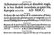 Condensed, high x-height types in the "Dutch taste" style, c. 1720
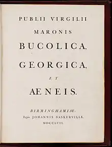 Title page by John Baskerville, 1757
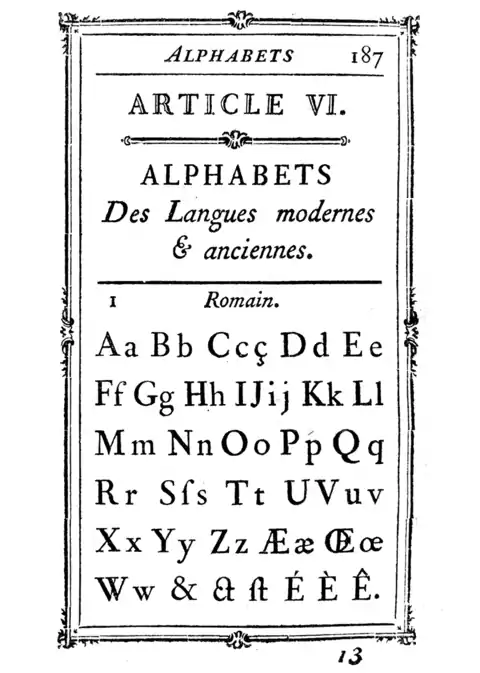 Alphabet by Pierre-Simon Fournier in his Manuel typographique, 1760s
 Transitional type by Joan Michaël Fleischman of Amsterdam, 1768
.jpg.webp) 1779 theatre poster, London
1779 theatre poster, London Modern-face types by the Amoretti Brothers, 1797
.jpg.webp) Didone type in a book printed by the company of Firmin Didot, 1804
Didone type in a book printed by the company of Firmin Didot, 1804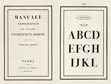 Bodoni's posthumous Manuale Tipografico, 1818
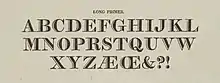 Inline modern face
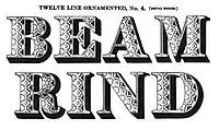 Display type with pattern inside
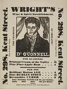 "Fat face" ultra-bold Didone type
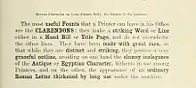 The original Clarendon typeface
 Display-size slab-serifs
.jpg.webp) Miller and Richard's Modernised Old Style, a reimagination of pre-Didone typefaces
Miller and Richard's Modernised Old Style, a reimagination of pre-Didone typefaces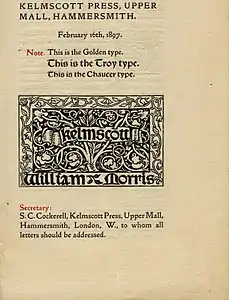 William Morris's Golden Type in the style of Jenson and other typefaces of his Kelmscott Press
 ATF's "Garamond" type, an example of historicist printing
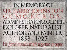 Memorial plaque by Eric Gill, c. 1920s
East Asian analogues

In the Chinese and Japanese writing systems, there are common type styles based on the regular script for Chinese characters akin to serif and sans serif fonts in the West. In Mainland China, the most popular category of serifed-like typefaces for body text is called Song (宋体, Songti); in Japan, the most popular serif style is called Minchō (明朝); and in Taiwan and Hong Kong, it is called Ming (明體, Mingti). The names of these lettering styles come from the Song and Ming dynasties, when block printing flourished in China. Because the wood grain on printing blocks ran horizontally, it was fairly easy to carve horizontal lines with the grain. However, carving vertical or slanted patterns was difficult because those patterns intersect with the grain and break easily. This resulted in a typeface that has thin horizontal strokes and thick vertical strokes. In accordance with Chinese calligraphy (kaiti style in particular), where each horizontal stroke is ended with a dipping motion of the brush, the ending of horizontal strokes are also thickened. These design forces resulted in the current Song typeface characterized by thick vertical strokes contrasted with thin horizontal strokes, triangular ornaments at the end of single horizontal strokes, and overall geometrical regularity.
In Japanese typography, the equivalent of serifs on kanji and kana characters are called uroko—"fish scales". In Chinese, the serifs are called either youjiaoti (有脚体, lit. "forms with legs") or youchenxianti (有衬线体, lit. "forms with ornamental lines").
The other common East Asian style of type is called black (黑体/體, Heiti) in Chinese and Gothic (ゴシック体, Goshikku-tai) in Japanese. This group is characterized by lines of even thickness for each stroke, the equivalent of "sans serif". This style, first introduced on newspaper headlines, is commonly used on headings, websites, signs and billboards.
See also
| Look up serif in Wiktionary, the free dictionary. |
- Homoglyph
- Ming (typeface), a similar style in Asian typefaces
- The analogs of serifs are called 鱗, literally "fish scales".
- San Serriffe, an elaborate typographic joke
- Serif typefaces, a list of Serif typefaces
Lists of serif typefaces
- Old-style
- Transitional
- Didone
Notes and references
Explanatory footnotes
- Note that this image includes 'Th' ligatures, common in Adobe typefaces but not found in the sixteenth century.
- Specifically, Manutius's type, the first type now classified as "Garalde", was not so different from other typefaces around at the time.[9] However, the waves of "Garalde" faces coming out of France from the 1530s onwards did tend to cleanly displace earlier typefaces, and became an international standard.[19][20]
- Early italics were intended to exist on their own on the page, and so often had very long ascenders and descenders, especially the "chancery italics" of printers such as Arrighi.[29] Jan van Krimpen's Cancelleresca Bastarda typeface, intended to complement his serif family Romulus, was nonetheless cast on a larger body to allow it to have an appropriately expansive feel.
- Monotype executive Stanley Morison, who commissioned Times New Roman, noted that he hoped that it "has the merit of not looking as if it had been designed by somebody in particular".[41]
- It should be realised that "Transitional" is a somewhat nebulous classification, almost always including Baskerville and other typefaces around this period but also sometimes including nineteenth and twentieth-century reimaginations of old-style faces, such as Bookman and Plantin, and sometimes some of the later "old-style" faces such as the work of Caslon and his imitators. In addition, of course Baskerville and others of this period would not have seen their work as "transitional" but as an end in itself. Eliason (2015) provides a leading modern critique and assessment of the classification, but even in 1930 A.F. Johnson called the term "vague and unsatisfactory."[42][44]
- Additional subgenres of Didone type include "fat faces" (ultra-bold designs for posters) and "Scotch Modern" designs (used in the English-speaking world for book and newspaper printing).[45]
- Early slab-serif types were given a variety of names for branding purposes, such as Egyptian, Italian, Ionic, Doric, French-Clarendon and Antique, which generally have little or no connection to their actual history. Nonetheless, the names have persisted in use.
Citation footnotes
- Phinney, Thomas. "Sans Serif: Gothic and Grotesque". TA. Showker Graphic Arts & Design. Showker. Retrieved 1 February 2013.
- Samara, Timothy (2004). Typography workbook: a real-world guide to using type in graphic design. Rockport Publishers. p. 240. ISBN 978-1-59253-081-6.
- Goldberg, Rob (2000). Digital Typography: Practical Advice for Getting the Type You Want When You Want It. Windsor Professional Information. p. 264. ISBN 978-1-893190-05-4.
- The Linotype Bulletin. January–February 1921. p. 265. Retrieved 26 October 2011.
- Hansard, Thomas Curson (1825). Typographia, an Historical Sketch of the Origin and Progress of the Art of Printing. p. 370. Retrieved 12 August 2015.
- Etymologisch Woordenboek (Van Dale, 1997).
- (Veen, 2001).
- Berry, John. "A Neo-Grotesque Heritage". Adobe Systems. Retrieved 15 October 2015.
- Boardley, John. "The first roman fonts". ilovetypography. Retrieved 21 September 2017.
- Olocco, Riccardo. "The Venetian origins of roman type". Medium. C-A-S-T. Retrieved 27 January 2018.
- Mosley, James (2006). "Garamond, Griffo and Others: The Price of Celebrity". Bibiologia. Retrieved 3 December 2015.
- Coles, Stephen. "Top Ten Typefaces Used by Book Design Winners". FontFeed (archived). Archived from the original on 2012-02-28. Retrieved 2 July 2015.
- Johnson, A.F. (1931). "Old-Face Types in the Victorian Age" (PDF). Monotype Recorder. 30 (242): 5–15. Retrieved 14 October 2016.
- "Old Style Serif"{{inconsistent citations}}
- Boardley, John. "Unusual fifteenth-century fonts: part 1". i love typography. Retrieved 22 September 2017.
- Boardley, John. "Unusual fifteenth-century fonts: part 2". i love typography. Retrieved 22 September 2017.
- "Type anatomy: Family Classifications of Type". SFCC Graphic Design department. Spokane Falls Community College. Retrieved 14 August 2015.
- Dixon, Catherine (2002), "Twentieth Century Graphic Communication: Technology, Society and Culture", Typeface classification, Friends of St Bride
- Amert, Kay (April 2008). "Stanley Morison's Aldine Hypothesis Revisited". Design Issues. 24 (2): 53–71. doi:10.1162/desi.2008.24.2.53. S2CID 57566512.
- The Aldine Press: catalogue of the Ahmanson-Murphy collection of books by or relating to the press in the Library of the University of California, Los Angeles : incorporating works recorded elsewhere. Berkeley [u.a.]: Univ. of California Press. 2001. pp. 22–25. ISBN 978-0-520-22993-8.
[On the Aldine Press in Venice changing over to types from France]: the press followed precedent; popular in France, [these] types rapidly spread over western Europe.
- Twardoch, Slimbach, Sousa, Slye (2007). Arno Pro (PDF). San Jose: Adobe Systems. Retrieved 14 August 2015.CS1 maint: multiple names: authors list (link)
- Olocco, Riccardo. "Nicolas Jenson and the success of his roman type". Medium. C-A-S-T. Retrieved 21 September 2017.
- Vervliet, Hendrik D.L. (2008). The palaeotypography of the French Renaissance. Selected papers on sixteenth-century typefaces. 2 vols. Leiden: Koninklijke Brill NV. pp. 90–91, etc. ISBN 978-90-04-16982-1.
[On Robert Estienne's typefaces of the 1530s]: Its outstanding design became standard for Roman type in the two centuries to follow...From the 1540s onwards French Romans and Italics had begun to infiltrate, probably by way of Lyons, the typography of the neighbouring countries. In Italy, major printers replaced the older, noble but worn Italian characters and their imitations from Basle.
- Carter, Harry (1969). A View of Early Typography up to about 1600 (Second edition (2002) ed.). London: Hyphen Press. pp. 72–4. ISBN 0-907259-21-9.
De Aetna was decisive in shaping the printers' alphabet. The small letters are very well made to conform with the genuinely antique capitals by emphasis on long straight strokes and fine serifs and to harmonise in curvature with them. The strokes are thinner than those of Jenson and his school...the letters look narrower than Jenson's, but are in fact a little wider because the short ones are bigger, and the effect of narrowness makes the face suitable for octavo pages...this Roman of Aldus is distinguishable from other faces of the time by the level cross-stroke in 'e' and the absence of top serifs from the insides of the vertical strokes of 'M', following the model of Feliciano. We have come to regard his small 'e' as an improvement on previous practice.
- Bergsland, David. "Aldine: the intellectuals begin their assault on font design". The Skilled Workman. Retrieved 14 August 2015.
- Boardley, John. "Brief notes on the first italic". i love typography. Retrieved 21 September 2017.
- Vervliet, Hendrik D. L. (2008). The Palaeotypography of the French Renaissance: Selected Papers on Sixteenth-century Typefaces. BRILL. pp. 287–289. ISBN 978-90-04-16982-1.
- Lane, John (1983). "The Types of Nicholas Kis". Journal of the Printing Historical Society: 47–75.
Kis's Amsterdam specimen of c. 1688 is an important example of the increasing tendency to regard a range of roman and italic types as a coherent family, and this may well have been a conscious innovation. But italics were romanised to a greater degree in many earlier handwritten examples and occasional earlier types, and Jean Jannon displayed a full range of matching roman and italic of his own cutting in his 1621 specimen...[In appendix] [György] Haiman notes that this trend is foreshadowed in the specimens of Guyot in the mid-sixteenth century and Berner in 1592.
- Vervliet, Hendrik D. L. (2008). The Palaeotypography of the French Renaissance: Selected Papers on Sixteenth-century Typefaces. BRILL. pp. 287–319. ISBN 978-90-04-16982-1.
- Johnson, A. F. (1939). "The 'Goût Hollandois'". The Library. s4-XX (2): 180–196. doi:10.1093/library/s4-XX.2.180.
- Updike, Daniel Berkeley (1922). "Chapter 15: Types of the Netherlands, 1500-1800". Printing Types: Their History, Forms and Uses: Volume 2. Harvard University Press. pp. 6–7. Retrieved 18 December 2015.
- "Type History 1". Typofonderie Gazette. Retrieved 23 December 2015.
- Mosley, James. "Type and its Uses, 1455-1830" (PDF). Institute of English Studies. Archived from the original (PDF) on 9 October 2016. Retrieved 7 October 2016.
Although types on the 'Aldine' model were widely used in the 17th and 18th centuries, a new variant that was often slightly more condensed in its proportions, and darker and larger on its body, became sufficiently widespread, at least in Northern Europe, to be worth defining as a distinct style and examining separately. Adopting a term used by Fournier le jeune, the style is sometimes called the 'Dutch taste', and sometimes, especially in Germany, 'baroque'. Some names associated with the style are those of Van den Keere, Granjon, Briot, Van Dijck, Kis (maker of the so-called 'Janson' types), and Caslon.
- de Jong, Feike; Lane, John A. "The Briot project. Part I". PampaType. TYPO, republished by PampaType. Retrieved 10 June 2018.
- Shen, Juliet. "Searching for Morris Fuller Benton". Type Culture. Retrieved 11 April 2017.
- Paul Shaw (18 April 2017). Revival Type: Digital Typefaces Inspired by the Past. Yale University Press. pp. 85–98. ISBN 978-0-300-21929-6.
- Morison, Stanley (1937). "Type Designs of the Past and Present, Part 3". PM: 17–81. Retrieved 4 June 2017.
- Jan Middendorp (2004). Dutch Type. 010 Publishers. pp. 27–29. ISBN 978-90-6450-460-0.
- Corbeto, A. (25 September 2009). "Eighteenth Century Spanish Type Design". The Library. 10 (3): 272–297. doi:10.1093/library/10.3.272. S2CID 161371751.
- Unger, Gerard (1 January 2001). "The types of François-Ambroise Didot and Pierre-Louis Vafflard. A further investigation into the origins of the Didones". Quaerendo. 31 (3): 165–191. doi:10.1163/157006901X00047.
- Alas, Joel. "The history of the Times New Roman typeface". Financial Times. Retrieved 16 January 2016.
- Johnson, Alfred F. (1930). "The Evolution of the Modern-Face Roman". The Library. s4-XI (3): 353–377. doi:10.1093/library/s4-XI.3.353.
- Johnston, Alastair (2014). Transitional Faces: The Lives & Work of Richard Austin, type-cutter, and Richard Turner Austin, wood-engraver. Berkeley: Poltroon Press. ISBN 978-0918395320. Retrieved 8 February 2017.
- Eliason, Craig (October 2015). ""Transitional" Typefaces: The History of a Typefounding Classification". Design Issues. 31 (4): 30–43. doi:10.1162/DESI_a_00349. S2CID 57569313.
- Shinn, Nick. "Modern Suite" (PDF). Shinntype. Retrieved 11 August 2015.
- Shaw, Paul. "Overlooked Typefaces". Print magazine. Retrieved 2 July 2015.
- Ovink, G.W. (1971). "Nineteenth-century reactions against the didone type model - I". Quaerendo. 1 (2): 18–31. doi:10.1163/157006971x00301.
- Ovink, G.W. (1971). "Nineteenth-century reactions against the didone type model - II". Quaerendo. 1 (4): 282–301. doi:10.1163/157006971x00239.
- Ovink, G.W. (1 January 1972). "Nineteenth-century reactions against the didone type model-III". Quaerendo. 2 (2): 122–128. doi:10.1163/157006972X00229.
- Frazier, J.L. (1925). Type Lore. Chicago. p. 14. Retrieved 24 August 2015.
- "HFJ Didot introduction". Hoefler & Frere-Jones. Retrieved 10 August 2015.
- "HFJ Didot". Hoefler & Frere-Jones. Retrieved 10 August 2015.
- Leonidas, Gerry. "A primer on Greek type design". Gerry Leonidas/University of Reading. Retrieved 14 May 2017.
- "GFS Didot". Greek Font Society. Retrieved 10 August 2015.
- Eskilson, Stephen J. (2007). Graphic design : a new history. New Haven: Yale University Press. p. 25. ISBN 9780300120110.
- Pané-Farré, Pierre. "Affichen-Schriften". Forgotten-Shapes. Retrieved 10 June 2018.
- Johnson, Alfred F. (1970). "Fat Faces: Their History, Forms and Use". Selected Essays on Books and Printing. pp. 409–415.
- Phinney, Thomas. "Fat faces". Graphic Design and Publishing Centre. Retrieved 10 August 2015.
- Kennard, Jennifer. "The Story of Our Friend, the Fat Face". Fonts in Use. Retrieved 11 August 2015.
- Miklavčič, Mitja (2006). "Three chapters in the development of clarendon/ionic typefaces" (PDF). MA Thesis (University of Reading). Archived from the original (PDF) on November 25, 2011. Retrieved 14 August 2015.
- "Sentinel: historical background". Hoefler & Frere-Jones. Retrieved 15 July 2015.
- Challand, Skylar. "Know your type: Clarendon". IDSGN. Retrieved 13 August 2015.
- Phinney, Thomas. "Most Overlooked: Chaparral". Typekit Blog. Adobe Systems. Retrieved 7 March 2019.
- Lupton, Ellen (12 August 2014). Type on Screen: A Critical Guide for Designers, Writers, Developers, and Students. Princeton Architectural Press. p. 16. ISBN 978-1-61689-346-0.
- Bringhurst, Robert (2002). The Elements of Typographic Style (2nd ed.). Hartley & Marks. pp. 218, 330. ISBN 9780881791327.
- Gray, Nicolete (1976). Nineteenth-century Ornamented Typefaces.
- Lupton, Ellen (15 April 2014). Thinking with Type. p. 23. ISBN 9781616890452.
- Frutiger, Adrian (8 May 2014). Typefaces – the complete works. pp. 26–35. ISBN 9783038212607.
- Merriam-Webster's Manual for Writers and Editors, (Springfield, 1998) p. 329.
- Wheildon, Colin (1995). Type and Layout: How Typography and Design Can Get your Message Across – Or Get in the Way. Berkeley: Strathmoor Press. pp. 57, 59–60. ISBN 0-9624891-5-8.
- Kathleen Tinkel, "Taking it in: What makes type easy to read", adobe.com Archived 2012-10-19 at the Wayback Machine Accessed 28 December 2010. p. 3.
- Literature Review Which Are More Legible: Serif or Sans Serif Typefaces? alexpoole.info Archived 2010-03-06 at the Wayback Machine.
- Effects of Font Type on the Legibility The Effects of Font Type and Size on the Legibility and Reading Time of Online Text by Older Adults. psychology.wichita.edu.
- Moret-Tatay, C., & Perea, M. (2011). Do serifs provide an advantage in the recognition of written words? Journal of Cognitive Psychology 23, 5, 619-24.. valencia.edu.
- The Principles of Beautiful Web Design, (2007) p. 113.
Sources
- Robert Bringhurst, The Elements of Typographic Style, version 4.0 (Vancouver, BC, Canada: Hartley & Marks Publishers, 2012), ISBN 0-88179-211-X.
- Harry Carter, A View of Early Typography: Up to about 1600 (London: Hyphen Press, 2002).
- Father Edward Catich, The Origin of the Serif: Brush Writing and Roman Letters, 2nd ed., edited by Mary W. Gilroy (Davenport, Iowa: Catich Gallery, St. Ambrose University, 1991), ISBN 9780962974021.
- Nicolete Gray, Nineteenth Century Ornamented Typefaces, 2nd ed. (Faber, 1976), ISBN 9780571102174.
- Alfred F. Johnson, Type Designs: Their History and Development (Grafton, 1959).
- Stan Knight, Historical Types: From Gutenberg to Ashendene (Oak Knoll Press, 2012), ISBN 9781584562986.
- Ellen Lupton, Thinking with Type: A Critical Guide for Designers, Writers, Editors, & Students, 2nd ed. (New York: Princeton Architectural Press, 2010), ISBN 9781568989693, <www.thinkingwithtype.com>.
- Indra Kupferschmid, "Some Type Genres Explained," Type, kupferschrift.de (2016-01-15).
- Stanley Morison, A Tally of Types, edited by Brooke Crutchley et al., 2nd ed. (London: Cambridge University Press, 1973), ISBN 978-0-521-09786-4. One of the major statements of typographical practice of our time (in particular on revivals of historical typefaces created by the British company Monotype), it was first privately printed in 1953 before being revised with additions by several hands for publication in 1973.
- ———, “Type Designs of the Past and Present,” was serialized in 4 parts in 1937 in PM Magazine (the last 2 are available online):
- Paul Shaw, Revival Type: Digital Typefaces Inspired by the Past (Brighton: Quid Publishing, 2017), ISBN 978-0-300-21929-6.
- Walter Tracy, Letters of Credit: A View of Type Design, 2nd ed. (David R. Godine, 2003), ISBN 9781567922400.
- Daniel Berkeley Updike, Printing Types, their History, Forms, and Use: A Study in Survivals, 2 vols. (Cambridge: Harvard University Press, 1922), volume 1 and volume 2—now outdated and known for a strong, not always accurate dislike of Dutch printing, but extremely comprehensive in scope.
- Hendrik Désiré Louis Vervliet, The Palaeotypography of the French Renaissance: Selected Papers on Sixteenth-Century Typefaces, 2 vols., Library of the Written Word series, № 6, The Handpress World subseries, № 4 (Leiden: Koninklijke Brill NV, 2008-11-27), ISBN 978-90-04-16982-1.
- ———, Sixteenth Century Printing Types of the Low Countries, Annotated catalogue (Leiden: Koninklijke Brill NV, 1968-01-01), ISBN 978-90-6194-859-9.
- ———, French Renaissance Printing Types: A Conspectus (Oak Knoll Press, 2010).
- ———, Liber librorum: 5000 ans d'art du livre (Arcade, 1972).
- Translation: Fernand Baudin, The Book Through Five Thousand Years: A Survey, edited by Hendrik D. L. Vervliet (London: Phaidon, 1972).
- See also Professor James Mosley's "Type and its Uses, 1455–1830" Course Outline and Reading List on available books on metal type.
| Page | |||||||||
|---|---|---|---|---|---|---|---|---|---|
| Paragraph | |||||||||
| Character |
| ||||||||
| Classifications |
| ||||||||
| Punctuation | |||||||||
| Typesetting | |||||||||
| Typographic units | |||||||||
| Digital typography | |||||||||
| Related articles | |||||||||
| Related tables |
| ||||||||
| |||||||||