Proportional symbol map
A Proportional symbol map of Proportional point symbol map is a type of Thematic map that uses map symbols that vary in size to represent a quantitative variable.[1]:131 For example, circles may be used to show the location of cities within the map, with the size of each circle sized proportionally to the population of the city. Typically, the size of each symbol is calculated so that its area is mathematically proportional to the variable, but more indirect methods (e.g., categorizing symbols as "small," "medium," and "large") are also used.
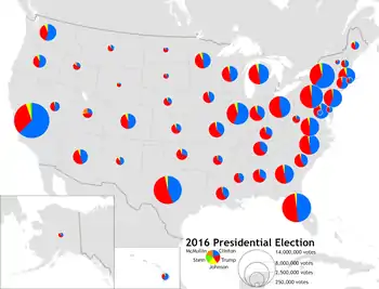
While all dimensions of geometric primitive (i.e., points, lines, and regions) on a map can be resized according to a variable, this term is generally only applied to point symbols, and different design techniques are used for other dimensionalities. A Cartogram is a map that distorts region size proportionally, while a Flow map represents lines, often using the width of the symbol (a form of size) to represent a quantitative variable. That said, there are gray areas between these three types of proportional map: a Dorling cartogram essentially replaces the polygons of area features with a proportional point symbol (usually a circle), while a linear cartogram is a kind of flow map that distorts the length of linear features proportional to a variable (often travel time).
History
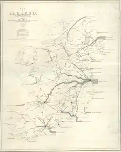
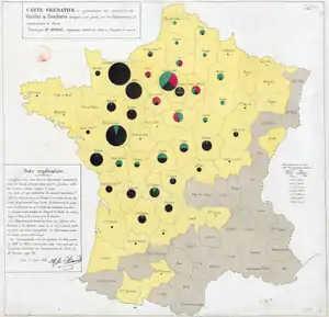
Arthur H. Robinson credited Henry Drury Harness with the first map to clearly attempt to portray point sizes proportionally, on an 1838 map of cargo traffic in Ireland (with proportional widths) that showed city population.[2][3] The technique was soon replicated and enhanced by other cartographers. The official report of the 1851 Census of Great Britain included several maps drawn by a W. Bone, showing significant towns sized proportionally to population (apparently range-graded), including one of the first useful legends.[4] Charles Joseph Minard produced several proportional symbol maps, including the innovations of using them to represent regions rather than points, and incorporating color and statistical charts in the point symbols.[5]
As cartography arose as an academic discipline in the early 20th Century, textbooks included detailed instructions on constructing proportional symbol maps, including calculating circle sizes.[6] Several cartography professors began to experiment with new mapping techniques, notably the use of spheres with a proportional volume rather than area by Sten de Geer (1922) and Guy-Harold Smith (1928),[7][8] and the use of transparency to resolve overlapping circles by Smith (1928) and Floyd Stilgenbauer (1932), the latter of which included a very unique legend.[9][10]
The rise of the map communication paradigm in academic cartography led to a number of psychophysical experiments on the effectiveness of map symbols. One of the earliest and most well-known of these studies was the PhD dissertation of James J. Flannery, who studied the ability of people to judge the relative areas of proportional circles, finding that Stevens's power law applied such that map readers underestimated circle area by a fairly predictable amount, leading to the Flannery Scaling Adjustment still in use today.[11]
Starting in the early 1990s, almost all proportional symbol maps have been created using geographic information system (GIS) and graphics software, with increasing capability for professional design.[12] The rise of the Internet and web mapping, especially modern tiled services with API access starting in 2005, have enabled the creation of interactive proportional symbol maps, including cloud mapping platforms such as Esri ArcGIS Online and CARTO.[13]
Point locations
Proportional symbol maps represent a set of related geographic phenomena (e.g., cities) as point symbols. These point locations can have two different sources and meanings:[14]:303
- A Point dataset includes a point location (i.e., a single coordinate) for each geographic feature. A variety of features may be represented this way, but common point datasets include cities, personal residences, and businesses. This does not mean that these geographic features are zero-dimensional in reality--cities are two-dimensional and buildings are three-dimensional--just that the source data consists of points that are reasonable representations of the location of the geographic features at the chosen map scale.
- An aggregation district dataset consists of predefined regions in which data about individuals has been aggregated to create summary statistical attributes (e.g. total population); that is, it is the same structure as is used in a choropleth map. In this case, the proportional symbol map will have a point representing the district rather than any point location therein.
Variables
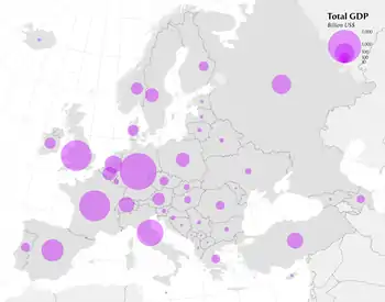
The second part of the proportional symbol map is the choice of variable to represent by symbol size. The best variables to use in this technique are ones in which size will be interpreted intuitively by most map readers. In Semiology of Graphics, Jacques Bertin argued that of all of his visual variables, size was most intimately tied to a single interpretation.[15] That is, a larger symbol looks like more of something and thus more important, and it is very difficult to interpret it any other way (e.g., as qualitatively different nominal categories). A second tendency is for users to interpret relative sizes: a symbol that is twice as large (in area or length) will be interpreted as representing twice the quantity. The absence of a circle would be interpreted as the complete absence of the phenomenon, and negative values cannot be shown.
Based on these principles, only ratio variables (per Stevens' levels of measurement) are appropriate to represent with size, specifically those in which negative values are not possible.[1]:132 Within this set, the most intuitive are those that measure the total amount/count/volume of something, such as total population, volume or weight of agricultural production, or shipping tonnage. These are all spatially extensive variables, which happen to be the most problematic choices for choropleth maps, making these two thematic mapping techniques complimentary.
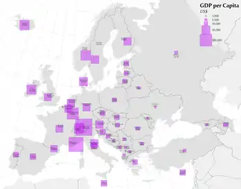
Some ratio variables can be appropriate for both choropleth and proportional symbol maps, especially those that are spatially intensive (i.e., fields) but still represent an amount or count in some way. A common type of variable that meets these criteria is an allotment, calculating how one amount is theoretically distributed among individuals, such as GDP per capita or the crude birth rate (births per 1,000 population). Other non-negative spatially intensive ratio variables can technically be mapped as proportional symbols, such as proportions (e.g., Percent ages 0-17), but can lead to misinterpretations because they do not represent amounts (although proportions can be represented using proportional pie charts).[14]:303 Ordinal qualitative variables can also be appropriate, if the goal is a simple representation of "small," "medium," and "large."
Variables that are inappropriate for proportional symbols include those that may include negative values (e.g., population growth rate) and qualitative categories. Another consideration in selecting a variable is the degree of variance in the statistical distribution. If there is a high degree of variation (i.e., a ratio of high values to low values of more than 1,000:1), the largest symbols will be overcrowded and entirely overlapping while the smallest symbols will be nearly invisible. If there is a low degree of variation (i.e., a ratio of less than 10), most of the symbols will look nearly the same size and the map will be relatively uninformative.[14]:303
Symbol design
The primary goal in selecting a point symbol to use in a proportional symbol map is that users should be able to accurately judge sizes, both in comparison to the legend to estimate data values, and in comparison to each other to judge relative patterns.[1][16]:136 Secondary goals include aesthetic appeal and an intuitive shape that is easy to interpret.
The point symbols that represent each data value can be of any shape. In most proportional symbol maps, the shape does not vary, so it does not represent any information on its own. Differences in shape can be used to represent a nominal variable (say, circles for wheat production and squares for maize production) can make judging relative sizes more difficult. Pictorial or pictographic symbols, which use an iconic shape (usually a silhouette) that evokes the represented phenomenon (e.g., a shaft of wheat to represent wheat production) can give the map an intuitive look, but their complexity can increase the overall feel of clutter, and it can be more difficult to judge their size than simple geometric shapes like circles or squares, especially if they are in a congested area where individual symbols overlap.[1]:135 This difference is lessened if the shape is compact (e.g., more like a geometric shape).
Among geometric symbols, circles have been the predominant shape since this type of thematic map was invented. Several advantages of circles over other geometric shapes have been cited, such as:[17][1]:134
- The simple shape does not attract attention itself, instead diverting attention to judging individual sizes and recognizing broad distribution patterns among circles.
- When circles overlap, they are easy to distinguish.
- Their compact form minimizes the overall amount of underlying map space they obscure.
- They are relatively easy to scale and draw (which was more important before the digital era).
- They are easy to combine with other visual variables to represent additional attributes, such as colors and pie charts.
However, disadvantages of circles have also been raised, especially that circles are aesthetically uninteresting, and that psychophysical studies have suggested that people are worse at judging the relative areas of circles than other shapes, especially squares.[18][11][17] The best way to increase the reader's ability to correctly estimate the size of a circle is through effective legend design, including providing examples of different sized circles which will be shown in the map.
Three dimensional symbols, such as spheres or cubes, are sometimes used. They can add an aesthetic appeal, but they were originally designed for their function, to allow large symbols to be smaller because the value would be proportional to volume rather than area.[8] However, it appears that most map readers will interpret a three dimensional symbol by projected area, not by volume, so they are only useful as decorative two dimensional symbols.[16]:137
Isotype maps
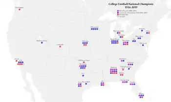
A very different approach to proportional symbols is the isotype symbol, named after an approach to information graphics developed by Austrian Otto Neurath in the 1930s.[19] This uses a composite point symbol composed of a multitude of small point symbols (pictographic or geometric) to represent the value of the variable. The technique is most effective when the variable represents a relatively small number of distinct individuals, rather than a mass amount (which is better visualized as a single mass shape, like a circle).[20] Eduard Imhof argued against this technique (which he called count frame diagrams) for point locations, on the grounds that it tends to be much larger and more complex than a simple point symbol, covering more of the underlying geography; however, he found them effective on region locations, especially if the count consists of different types of individuals.[21]:181–185
Chart maps
A strategy to represent complex information is to create a statistical chart of related attributes for each feature, and use the entire chart as a point symbol, usually using linear (height/width) or areal scaling of the entire chart according to an overall total amount. This approach is thus a form of multivariate map. The most common technique, first appearing in the 1850s, is to start with a proportional circle sized according to some total amount, and turn it into a pie chart to visualize the relative composition of the total, such as the percentage of a total population belonging to various ethnic groups. Other options include bar charts and line charts, which are often used to represent trends over time or relative amounts of related variables for each feature (e.g., agricultural products).[22]:165
Scaling techniques
Theoretically, the proportional symbol map works because the "size" of the symbol appears to be proportional to its value, with size generally interpreted as two-dimensional area. However, making this work in practice can lead to some challenges, so several methods of scaling have been developed.[1]
Absolute scaling
This method calculates the exact area of the symbol and resizes it so that its area is mathematically directly proportional to the represented value. For example, if circles are being used to represent GDP on a global map, then a country with a value of 58 would have a circle with twice the area as a country with a value of 29.
If circles are being used, the sizes of all symbols are calculated based on a chosen size for any one of the symbols (often, but not necessarily, the minimum value). Say the cartographer decides that a value v0 will have a circle of radius r0. Then for any other value v, the radius r is determined by setting the areas in direct proportion to the values:
This can then be solved for r:
Apparent magnitude (Flannery) scaling
In his 1956 PhD Dissertation, James Flannery conducted psychophysical experiments into how well map readers judged the relative size of proportional circles.[11] He found that it conformed to a response power law that was soon after formalized (in general) as Stevens's power law. While people are fairly adept at judging relative length, they are typically much worse at judging relative area. In testing circles, Flannery's subjects underestimated the ratio of area between large circles and smaller circles by a fairly consistent amount. He and Arthur H. Robinson immediately began encouraging cartographers to compensate for this effect by increasing the difference between circle sizes accordingly, using a technique called apparent magnitude scaling.[22] According to Flannery's results, this can be accomplished by increasing the exponent of the scaling factor slightly, replacing the above formula with the following:[1]:139
The acceptance of Flannery's method for circles has been mixed. Various studies have resulted in different magnitudes of the effect, and some have argued that the effect is not large enough to require the effort of compensation, that map readers can make adequate judgments with absolute scaling, as long as a clear legend is provided to help.[23]
Flannery's research focused only on circles, and subequent research has found other symbol types to have different magnitudes of areal underestimation. Squares have been found to be judged fairly accurately,[18] but for spheres and other three-dimensional shapes, volume is estimated extremely poorly; basically, readers judge their two-dimensional area.[24]
Interpolated scaling
One criticism of the absolute scaling method is that it does not work well for very large ranges of values, in which the largest symbols will be overwhelming and the smallest symbols will be nearly invisible. Some software, such as Esri ArcGIS Pro, allow for the option to control the size of both ends of the value range. Rather than calculating a true proportionality, the area of the symbol of each intervening value is calculated using a Linear interpolation:[14]:307
in which A is the symbol area, v is the value of the variable, L is the largest value, S is the smallest value, and i is the value with a symbol size to be determined. The advantage of this method is complete control over the entire range of symbol sizes, but true proportionality is lost, and judgments of relative size can only be made by frequent reference to the legend.
Range grading
In this method, the size of the symbol is not directly mathematically connected to the value. Instead, the range of possible values is classified as it would be in a choropleth map, and a single size of symbol is assigned to each class.[1]:142 This allows the cartographer to have more control over the range of sizes, and is therefore used when absolute scaling produces an undesirable range of sizes. However, it has inherent issues, in that it makes similar values appear identical, and that apparent size differences cannot be interpreted as a ratio; that is, a value of one feature being twice that of another feature is not necessarily represented as a symbol of twice the size.
Managing symbol overlap
Most proportional symbol maps will have occasional overlap between symbols, typically around the largest symbols or in regions with a high density of features. This can lead to errors in size interpretations, and when a mass of symbols obscures too much of the underlying geographical reference map, it can be difficult to recognize feature each symbol is representing.[21]:190 That said, there is general consensus that some overlap is acceptable, because eliminating all overlap would often require reducing symbol size so much that it would be difficult to judge size, or reducing the number of features to the degree that the map would be uninformative. A common rule of thumb is that the scaling should be large enough that some symbols overlap, but the center of most symbols are not covering another symbol.[25] In situations of overlap, smaller symbols are generally drawn on top of larger symbols, because the smaller symbol will obscure a smaller proportion of the larger symbol.[1]:146
When overlap occurs, it is crucial that the individual symbols can be distinctly recognized and the relative sizes of each symbol judged. This is typically accomplished by outlining each symbol (usually either a darker or lighter shade than the main symbol), or making the symbols semi-transparent; research has shown both methods to be effective for discriminating symbols and judging sizes as long as there is not too much overlap; map readers are generally divided in their aesthetic preferences for one or the other.[26][27]
Legend
The primary purpose of the legend for a proportional circle map, as with any thematic map, is for the map reader to clearly understand the meaning of the features and variable being represented, and to assist in the interpretation of the particular values represented by each symbol. In this case, it is not feasible to show every possible symbol size (although some have tried, using wedge-shaped continuous legends[10]), so most proportional symbol legends include a set of sample sizes with their respective values, usually the largest value, one of the smallest value, and one or more in between.[28] Usually, these samples are placed in a linear form, in a vertical or horizontal line, or a nested form, in which the smaller symbols are placed on top of the larger symbols (usually aligned at their bottoms, not centered).[1]:144
References
- Dent, Borden D.; Torguson, Jeffrey S.; Hodler, Thomas W. (2009). Cartography: Thematic Map Design (6th ed.). McGraw-Hill.
- Robinson, Arthur H. (Dec 1955). "The 1837 Maps of Henry Drury Harness". The Geographical Journal. 121 (4): 440–450.
- Griffith, Richard John; Harness, Henry Drury (1838). Atlas to Accompany 2nd Report of the Railway Commissioners. Ireland.
- United Kingdom (1852). Census of Great Britain, 1851. Population tables. London: H.M. Stationery Office. p. xix. Retrieved 9 November 2020.
- Rendgen, Sandra (2018). The Minard System: The Complete Statistical Graphics of Charles-Joseph Minard. New York: Princeton Architectural Press.
- Raisz, Erwin, General Cartography, 2nd Edition, McGraw-Hill, 1948, p.253.
- de Geer, Sten (Jan 1922). "A Map of the Distribution of Population in Sweden: Method of Preparation and General Results". Geographical Review. 12 (1): 72–83. doi:10.2307/208657.
- Smith, Guy-Harold (July 1928). "A Population Map of Ohio for 1920". Geographical Review. 18 (3): 422–427. doi:10.2307/208025.
- Smith, Guy-Harold (July 1928). "The Populating of Wisconsin". Geographical Review. 18 (3): 402–421. doi:10.2307/208024.
- Stilgenbauer, Floyd A. (1932). A New Population Map of the United States. New York: Rand McNally & Company. Retrieved 9 November 2020.
- Flannery, James J., The Graduated Circle: A Description, Analysis and Evaluation of a Quantitative Map Symbol, Ph.D. Dissertation, University of Wisconsin, 1956; summarized in Robinson, Arthur H., Elements of Cartography, 2nd Edition, New York: Wiley, 1960.
- Esri. "Proportional Symbols". ArcGIS Pro Documentation. Esri. Retrieved 9 November 2020.
- Akela, Mamata. "Visualize 2015 Urban Populations with Proportional Symbols". CARTO.
- T. Slocum, R. McMaster, F. Kessler, H. Howard (2009). Thematic Cartography and Geovisualization, Third Edn, page 252. Pearson Prentice Hall: Upper Saddle River, NJ.
- Bertin, Jacque, Sémiologie Graphique. Les diagrammes, les réseaux, les cartes. With Marc Barbut [et al.]. Paris : Gauthier-Villars. Semiology of Graphics, English Edition, Translation by William J. Berg, University of Wisconsin Press, 1983.)
- Kraak, Menno-Jan; Ormeling, Ferjan (2003). Cartography: Visualization of Spatial Data (2nd ed.). Prentice Hall. ISBN 978-0-13-088890-7.
- Flannery, James J. (1971). "The Effectiveness of Some Common Graduated Point Symbols in the Presentation of Quantitative Data". Canadian Cartographer. 8: 96–109.
- Crawford, P. (1973). "The Perception of Graduated Squares as Cartographic Symbols". The Cartographic Journal. 10: 85–88.
- Neurath, Otto (2010). From hieroglyphics to Isotype : a visual autobiography. London: Hyphen Press. ISBN 978-0-907259-44-2.
- Krygier, John. "Mapping with Isotype". Making Maps: DIY Cartography. John Krygier. Retrieved 11 November 2020.
- Imhof, Eduard (1972). Thematische Kartographie. Berlin: De Gruyter.
- Robinson, Arthur, Elements of Cartography, Wiley, 1960
- Chang, K. (1977). "Visual estimation of graduated circles". The Canadian Cartographer. 14 (2): 130–138.
- Ekman, G.; Junge, K. (1961). "Psychophysical relations in visual perception of length, area and volume". The Scandinavian Journal of Psychology. 2 (1): 1–10.
- Cabello S., Haverkort H., van Kreveld M., Speckmann B. (2006) Algorithmic Aspects of Proportional Symbol Maps. In: Azar Y., Erlebach T. (eds) Algorithms – ESA 2006. ESA 2006. Lecture Notes in Computer Science, vol 4168. Springer, Berlin, Heidelberg. https://doi.org/10.1007/11841036_64
- Griffin, Trevor (1990). "The Importance of Visual Contrast for Graduated Circles". Cartography. 19 (1): 21–30. doi:10.1080/00690805.1990.10438484.
- Groop, Richard; Cole, Daniel (1978). "Overlapping Graduated Circles: Magnitude Estimation and Method of Portrayal". Canadian Cartographer. 14: 114–122.
- Dobson, M.W. (1974). "Refining legend values for proportional circle maps". The Canadian Cartographer. 11 (1): 45–53.