Robert Slimbach
Robert Joseph Slimbach is Principal Type Designer at Adobe, Inc., where he has worked since 1987.[1] He has won many awards for his digital typeface designs, including the rarely awarded Prix Charles Peignot from the Association Typographique Internationale, the SoTA Typography Award, and repeated TDC2 awards from the Type Directors Club.[2] His typefaces are among those most commonly used in books.[3]
| Robert Slimbach | |
|---|---|
| Born | 15 December 1956 Evanston, Illinois |
| Occupation | Type designer (1987–) |
| Employer | Adobe, Inc. |
| Awards | Frederic W. Goudy Award, Prix Charles Peignot, SoTA Typography Award, TDC2 Awards |
Biography
Slimbach was born in Evanston, Illinois in 1956. Shortly after, he moved to Southern California where he spent his childhood and his youth. After attending UCLA on an athletics scholarship, he developed an interest in graphic design and typefaces while running a small screen printshop for manufacturing posters and greeting cards. This work brought him into contact with Autologic Incorporated in Newbury Park, California.[4] After training from 1983 to 1985, Slimbach worked as a type designer with Autologic Incorporation. There he received further training, not just as a type designer but also as a calligrapher.[5] Slimbach was then self-employed for two years as a freelance type designer, during which developed the two typefaces ITC Slimbach and ITC Giovanni for the International Typeface Corporation.[6][7] He later commented of this period that "I wasn’t really making enough money to live on."[7]
In 1987 he joined Adobe Systems. Since then, he has concentrated primarily on designing typefaces for digital technology, often drawing inspiration from classical sources. He has developed many new fonts for the Adobe Originals program. Among his early projects at Adobe were the Utopia (1988), Adobe Garamond (1989), Minion (1990) and Poetica (1992) families.
In 1991, he received the Prix Charles Peignot from the Association Typographique Internationale for excellence in type design. More recently, Slimbach's own calligraphy formed the basis for his typeface Brioso. Slimbach has described himself as being particularly interested in humanist and serif projects, calling his work on the neo-grotesque Acumin, in the Swiss modernist style, as being "outside of the design realm I normally prefer."[8][9][10]
Since 2000, the rate of Slimbach's (and Adobe's) new typefaces has slowed, as he has taken advantage of the new linguistic and typographic capabilities offered by the OpenType format. Where in the 1990s a given typeface design might be instantiated in one or two fonts, with 200-500 glyphs, a typical new Slimbach work post-2000 has 1500-3000 glyphs.[11][12] Reviewing Slimbach's 2007 project Arno, font designer Mark Simonson noted that it 'almost becomes a different typeface' when italic alternates are enabled.[13] A hallmark of Slimbach's designs is his use of a 'Th' ligature.
In 2004, Adobe released Garamond Premier Pro, a new take on the Garamond designs, which Slimbach had been working on for 15 years, since he first completed Adobe Garamond in 1989.
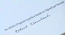
Outside of work for public use, Slimbach has designed Adobe's corporate font, Adobe Clean Sans and Adobe Clean Serif, which are used by Adobe in branding and user interfaces.[14] He also designed Adobe Hand B, based on his handwriting, for use in Acrobat's digital signature feature.
Slimbach has notable skills in several fields other than type design: he went to college on a gymnastics scholarship, and he is an accomplished calligrapher and photographer. His photographic work uses black & white film, and is mainly portraits that examine human foibles and idiosyncrasies.
Typefaces
Before Slimbach came to Adobe, he designed two fonts for the International Typeface Corporation (ITC): ITC Slimbach and ITC Giovanni.
Slimbach typefaces designed before the 2000s were first released in the PostScript Type 1 format, and later re-released in the more capable OpenType format (abbreviated OT in the following table).
| Name | First released | OT re-release (for Type 1 fonts) |
Supported scripts | Weights | Optical sizes for OT release | Widths | Notes |
|---|---|---|---|---|---|---|---|
| Acumin | 2015 (OT Pro) | N/A | Latin | Thin, Extra-light, Light, Regular, Medium, Semi-bold, Bold, Black, Ultra | No | Extra Condensed, Condensed, Semi Condensed, Normal, Wide | |
| Adobe Text | 2010 (OT Pro) | N/A | Latin, Greek, Cyrillic | Regular, Semibold, Bold | No | Normal | |
| Arno | 2007 (OT Pro) | N/A | Latin, Cyrillic, Greek | Light (only at Display size), Regular, Bold, Semibold | Yes | Normal | |
| Brioso | 2003 (OT Pro) | N/A | Latin | Light, Regular, Medium, Semibold, Bold | Yes | Normal | |
| Caflisch Script | 1993 (Type 1) | 2001 (OT Pro) | Latin | Light, Regular, Semibold, Bold | No | Normal | |
| Cronos | 1996 (Type 1) | 2002 (OT Pro) | Latin | Light, Regular, Semibold, Bold | Yes | Normal | |
| Adobe Garamond | 1989 (Type 1) | 2001 (OT Pro) | Latin | Regular, Semibold, Bold | No | Normal | |
| Garamond Premier | 2005 (OT Pro) | N/A | Latin, Cyrillic, Greek | Light (only at Display size), Regular, Medium, Semibold, Bold | Yes | Normal | |
| Adobe Jenson | 1996 (Type 1) | 2000 (OT Pro) | Latin | Light, Regular, Semibold, Bold | Yes | Normal | |
| Kepler | 1996 (Type 1) | 2003 (OT Std) | Latin | Light, Regular, Medium, Semibold, Bold, Black | Yes | Condensed, Semicondensed, Normal, Extended | |
| Minion | 1990 (Latin), 1992 (Cyrillic) (Type 1) | 2000 (OT Pro); 2002 (OT Std) | Latin (1990); Cyrillic (1992) (Type 1); Latin, Cyrillic, Greek (2000 OT Pro); (2002 OT Std) | Regular, Medium, Semibold, Bold (2000); Black (2002, no Italic variant) | Yes (2000 release) | Normal, Condensed (2000 release) | |
| Myriad (with Carol Twombly) | 1992 (Type 1) | 2000 (OT Pro); 2011 (OT) | Latin (Type 1); Latin, Cyrillic, Greek (2000 OT Pro); Arabic, Hebrew (2011 OT) | Light, Regular, Semibold, Bold, Black | No | Condensed, Semicondensed, Normal, Extended (2000 release) | |
| Pelago | 2017 (OT Pro) | N/A | Latin, Cyrillic, Greek | Light, Light Text, Regular, Medium, Semibold, Bold | No | Normal | |
| Poetica | 1992 (Type 1) | 2003 (OT Pro) | Latin | Regular | No | Normal | |
| Sanvito | 1993 (Type 1) | 2002 (OT Pro) | Latin | Light, Regular | Yes | Normal | |
| Adobe Text | 2009 (OT Pro) | N/A | Latin, Cyrillic, Greek | Regular, Semibold, Bold | No | Normal | |
| Trajan 3 (with Carol Twombly) | 2011 (OT Pro) | N/A | Latin, Cyrillic, Greek | Extralight, Light, Regular, Bold, Black | No | Normal | |
| Trajan Sans | 2011 (OT Pro) | N/A | Latin, Cyrillic, Greek | Extralight, Light, Regular, Semibold, Bold, Black | No | Normal | |
| Utopia | 1989 (Type 1) | 2002 (OT Std) | Latin | Regular, Semibold, Bold, Black (only at Headline size; no italic style) | Yes | Normal | |
| Warnock | 2000 (OT Pro) | N/A | Latin, Cyrillic, Greek | Light, Regular, Semibold, Bold | Yes | Normal |
Awards
- Adobe Hand B — 2014 Modern Cyrillic winner
- Adobe Text Pro — 2014 Modern Cyrillic winner
- Arno Pro[16] — TDC2 2007 winning entry
- Brioso Pro[17] — TDC2 2002 winning entry
- Caflisch Script Pro (added many typographic alternates) — bukva:raz! 2001 winner
- Frederick W. Goudy Award — 2018 [18]
- Garamond Premier Pro[19] — TDC2 2006 winning entry
- Minion Pro (added Greek) — bukva:raz! 2001 winner
- Myriad Pro (added Greek and Cyrillic, with Carol Twombly, Fred Brady and Christopher Slye) — TDC2 2000 winning entry and bukva:raz! 2001 winner
- Trajan Sans Pro — 2014 Modern Cyrillic winner
- Warnock Pro — TDC2 2001 winning entry
Notes
- "Robert Slimbach - profile". Retrieved 10 December 2015.
- "SOTA Typography Award Honors Robert Slimbach". SOTA. Retrieved 8 January 2016.
- Coles, Stephen. "Top Ten Typefaces Used by Book Design Winners". FontFeed (archived). Archived from the original on 28 February 2012. Retrieved 2 July 2015.
- David Consuegra (10 October 2011). Classic Typefaces: American Type and Type Designers. Allworth Press. pp. 1984–5. ISBN 978-1-62153-582-9.
- King, Emily. "West Coast (PhD thesis chapter)". Typotheque. Retrieved 8 January 2016.
- Shaw, Paul (2000). "The Typefaces of Robert Slimbach". Print. Archived from the original on 2015-12-11. Retrieved 10 December 2015.
- Riggs, Tamye. "The Adobe Originals Silver Anniversary Story: Stone, Slimbach, and Twombly launch the first Originals". Adobe Typekit. Adobe Systems. Retrieved 8 January 2016.
- Slimbach, Robert. "Using Acumin". Acumin microsite. Adobe Systems. Retrieved 6 January 2016.
- Twardoch, Slimbach, Sousa, Slye (2007). Arno Pro (PDF). San Jose: Adobe Systems. Retrieved 14 August 2015.CS1 maint: multiple names: authors list (link)
- Coles, Stephen. "New Additions: November 2015". Identifont. Retrieved 8 January 2016.
- Riggs, Tamye. "The Adobe Originals Silver Anniversary Story". Typekit blog. Adobe. Retrieved 2 July 2015.
- Slimbach, Robert. "Introducing Pelago from Adobe Originals". Typekit. Adobe. Retrieved 19 October 2017.
- Simonson, Mark. "Arno review". Typographica. Retrieved 14 August 2015.
- "A New Face for Adobe". Typekit Blog. Adobe. Retrieved 8 January 2016.
- Adobe Type
- Main page for Arno Pro at Adobe.com
- Main page for Brioso Pro at Adobe.com
- Auburn, Luke (October 1, 2018). "RIT Cary Graphic Arts Collection to honor Adobe principal type designer Robert Slimbach". RIT University News. Retrieved January 18, 2019.
- Main page for Garamond Premier Pro at Adobe.com
External links
- Adobe's biography of Robert Slimbach
- Adobe Originals
- Robert Slimbach - Luc Devroye's collection of information on Slimbach and his work
| Authority control |
|---|