Westminster (typeface)
Westminster is a printing and display typeface inspired by the machine-readable numbers printed on cheques[1] and designed by Leo Maggs.[2]
| Category | Display |
|---|---|
| Designer(s) | Leo Maggs |
| Foundry | Hazel Sun Group |
| Date released | 1960s |
 | |
| Sample | |

In the 1960s, Leo Maggs was working at the Hazell Sun Group's design studio in Covent Garden, London. At that time, he was commanded to create a futuristic style title for an article of About the House (the magazine of The Friends of Covent Garden Opera House). Maggs based the letters of that title on the MICR (magnetic ink character recognition) system, E-13B, used on bank cheques. He then continued to design the rest of the letters of the alphabet in his spare time, basing their proportions on that of the Gill Sans typeface.[3]
The MICR E-13B font was designed for automated reading by a very simple magnetic reader in the early days of automatic character recognition. The weight of strokes in the characters can be recognised as "light" or "heavy" by a simple circuit and these patterns then map directly to the bit patterns of a computer character set. This made the characters practical to read before 'smart' OCR, but limited the length of the character set. E-13B has only 14 characters: the numeric digits and a few control codes. None of the alphanumeric 'computer' typefaces like Westminster could be read magnetically.
 | |
| Sample |
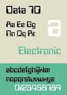
The work was presented to Letraset, who declined to buy it, but soon after released their own rival typeface, Data 70. Other contemporary typefaces based on E-13B include Moore Computer (recognisable by its dots underneath the letters M and N), Gemini, Orbit-B, and Countdown. Later, Typodermic released another derivative, Minicomputer.
Robert Norton, founder of the Photoscript Ltd photo-typesetting company, decided to produce Westminster.[3] The font was named by Norton and, according to Microsoft, received its name from the Westminster Bank Limited (now NatWest) from the United Kingdom) because it helped fund the font's production.[1] The font was included with Microsoft software after Microsoft hired Norton.
Since its design, the typeface has been strongly associated with computers, especially in the late 1960s and early-to-mid 1970s. The font is used frequently to indicate computer involvement in television series, films, books, and comics.
See also
- List of typefaces
- MICR
- OCR-A, another font designed to be machine-readable
References
- Westminster (Microsoft)
- "Westminster". Luc Devroye. Retrieved on 9 May 2016.
- The truth about Westminster (the font!), MERCER DESIGN