Italic type
In typography, italic type is a cursive font based on a stylised form of calligraphic handwriting.[1][2] Owing to the influence from calligraphy, italics normally slant slightly to the right. Italics are a way to emphasise key points in a printed text, to identify many types of creative works, to cite foreign words or phrases, or, when quoting a speaker, a way to show which words they stressed. One manual of English usage described italics as "the print equivalent of underlining"; in other words, underscore in a manuscript directs a typesetter to use italic.[3]
The name comes from the fact that calligraphy-inspired typefaces were first designed in Italy, to replace documents traditionally written in a handwriting style called chancery hand. Aldus Manutius and Ludovico Arrighi (both between the 15th and 16th centuries) were the main type designers involved in this process at the time. Different glyph shapes from Roman type are usually used – another influence from calligraphy – and upper-case letters may have swashes, flourishes inspired by ornate calligraphy. An alternative is oblique type, in which the type is slanted but the letterforms do not change shape: this less elaborate approach is used by many sans-serif typefaces.
History
.jpg.webp)
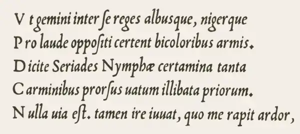
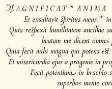
Italic type was first used by Aldus Manutius and his press in Venice in 1500.[7]
Manutius intended his italic type to be used not for emphasis but for the text of small, easily carried editions of popular books (often poetry), replicating the style of handwritten manuscripts of the period. The choice of using italic type, rather than the roman type in general use at the time, was apparently made to suggest informality in editions designed for leisure reading.[lower-alpha 1] Manutius' italic type was cut by his punchcutter Francesco Griffo (who later following a dispute with Manutius claimed to have conceived it). It replicated handwriting of the period following from the style of Niccolò de' Niccoli, possibly even Manutius' own.[8][9]
The first use in a complete volume was a 1501 edition of Virgil dedicated to Italy, although it had been briefly used in the frontispiece of a 1500 edition of Catherine of Siena's letters.[10] In 1501, Aldus wrote to his friend Scipio:
We have printed, and are now publishing, the Satires of Juvenal and Persius in a very small format, so that they may more conveniently be held in the hand and learned by heart (not to speak of being read) by everyone.
Manutius' italic was different in some ways from modern italics, being conceived for the specific use of replicating the layout of contemporary calligraphers like Pomponio Leto and Bartolomeo Sanvito. The capital letters were upright capitals on the model of Roman square capitals, shorter than the ascending lower-case italic letters, and were used at the start of each line followed by a clear space before the first lower-case letter.[11] While modern italics are often more condensed than roman types, historian Harry Carter describes Manutius' italic as about the same width as roman type.[12] To replicate handwriting, Griffo cut at least sixty-five tied letters (ligatures) in the Aldine Dante and Virgil of 1501.[11] Italic typefaces of the following century used varying but reduced numbers of ligatures.[11]
Italic type rapidly became very popular and was widely (and inaccurately) imitated. The Venetian Senate gave Aldus exclusive right to its use, a patent confirmed by three successive Popes, but it was widely counterfeited as early as 1502.[13] Griffo, who had left Venice in a business dispute, cut a version for printer Girolamo Soncino, and other copies appeared in Italy and in Lyons. The Italians called the character Aldino, while others called it Italic. Italics spread rapidly; historian H. D. L. Vervliet dates the first production of italics in Paris to 1512.[7][11] Some printers of Northern Europe used home-made supplements to add characters not used in Italian, or mated it to alternative capitals, including Gothic ones.[7][11]
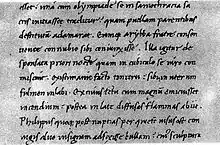
Besides imitations of Griffo's italic and its derivatives, a second wave appeared of "chancery" italics, most popular in Italy, which Vervliet describes as being based on "a more deliberate and formal handwriting [with] longer ascenders and descenders, sometimes with curved or bulbous terminals, and [often] only available in the bigger sizes."[7][14][15] Chancery italics were introduced around 1524 by Arrighi, a calligrapher and author of a calligraphy textbook who began a career as a printer in Rome, and also by Giovanni Antonio Tagliente of Venice, with imitations rapidly appearing in France by 1528.[12] Chancery italics faded as a style over the course of the sixteenth century, although revivals were made beginning in the twentieth century.[lower-alpha 2] Chancery italics may have backward-pointing serifs or round terminals pointing forwards on the ascenders.[14]
Italic capitals with a slope were introduced in the sixteenth century. The first printer known to have used them was Johann or Johannes Singriener in Vienna in 1524, and the practice spread to Germany, France and Belgium.[7][22] Particularly influential in the switch to sloped capitals as a general practice was Robert Granjon, a prolific and extremely precise French punchcutter particularly renowned for his skill in cutting italics.[7] Vervliet comments that among punchcutters in France "the main name associated with the change is Granjon's."[7]
The evolution of use of italic to show emphasis happened in the sixteenth century and was a clear norm by the seventeenth. The trend of presenting types as matching in typefounders' specimens developed also over this period.[23] Italics developed stylistically over the following centuries, tracking changing tastes in calligraphy and type design.[24][25][26] One major development that slowly became popular from the end of the seventeenth century was a switch to an open form h matching the n, a development seen in the Romain du roi type of the 1690s, replacing the folded, closed-form h of sixteenth- and seventeenth-century italics, and sometimes simplification of the entrance stroke.[27][28]
Examples
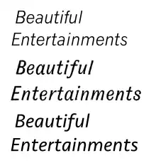
Here is an example of normal (roman) and true italics text:

Here is the same text as oblique text:
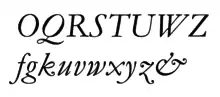
True italic styles are traditionally somewhat narrower than roman fonts. Below are some examples, besides the slant, of other possible differences between roman and italic type that vary according to how the types are designed. (The graphics illustrate transformations from roman to italic.)
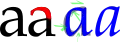 a "round" or one-storey a,
 an e whose bowl is curved rather than pointed,
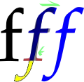 an f with a tail (known as a descender),
 a k with a looped bowl, a k with a ball terminal,
 a p with an intersection at the stem (ascender),
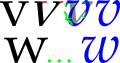 a v and w with swashes and curved bottoms,
 a z with the stress on the horizontal strokes as opposed to the diagonal vertical one.
None of these differences are required in an italic; some, like the "p" variant, do not show up in the majority of italic fonts, while others, like the "a" and "f" variants, are in almost every italic. Other common differences include:
- Double-loop g replaced by single-loop version.
- Different closing height where the forked stroke intersects with the stem (e.g. : a, b, d, g, p, q, r, þ).
- Bracketed serifs (if any) replaced by hooked serifs.
- Tail of Q replaced by tilde (as in, for example, the Garamond typeface).
Less common differences include a descender on the z and a ball on the finishing stroke of an h, which curves back to resemble a b somewhat. Sometimes the w is of a form taken from old German typefaces, in which the left half is of the same form as the n and the right half is of the same form as the v in the same typeface. There also exist specialised ligatures for italics, such as when sp is formed by a curl atop the s that reaches the small ascender at the top of the p.
In addition to these differences in shape of letters, italic lowercases usually lack serifs at the bottoms of strokes, since a pen would bounce up to continue the action of writing. Instead they usually have one-sided serifs that curve up on the outstroke (contrast the flat two-sided serifs of a roman font). One uncommon exception to this is Hermann Zapf's Melior. (Its outstroke serifs are one-sided, but they don't curve up.)
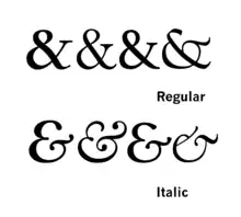
Outside the regular alphabet, there are other italic types for symbols:
- Ampersand resembles an ET ligature more than the Roman version (e.g.: ITC Garamond)
- Asterisk is rotated instead of slanted (e.g.: Bookman Old Style, ITC Garamond).
- Question mark resembles a reversed Latin S.
Usage

- Emphasis: "Smith wasn't the only guilty party, it's true". This is called stress in speech.
- The titles of works that stand by themselves, such as books (including those within a larger series), albums, paintings, plays, television shows, movies, and periodicals: "He wrote his thesis on The Scarlet Letter". Works that appear within larger works, such as short stories, poems, newspaper articles, songs, and television episodes are not italicised, but merely set off in quotation marks. When italics are unavailable, such as on a typewriter or websites that do not support formatting, an underscore or quotes are often used instead.[31]
- The names of ships: "The Queen Mary sailed last night."
- Foreign words, including the Latin binomial nomenclature in the taxonomy of living organisms: "A splendid coq au vin was served"; "Homo sapiens".
- The names of newspaper and magazine companies: "My favorite magazine is Psychology Today, and my favorite newspaper is the Chicago Tribune."
- Mentioning a word as an example of a word rather than for its semantic content (see use–mention distinction): "The word the is an article".
- Using a letter or number mentioned as itself:
- John was annoyed; they had forgotten the h in his name once again.
- When she saw her name beside the 1 on the rankings, she finally had proof that she was the best.
- Using a letter or number mentioned as itself:
- Introducing or defining terms, especially technical terms or those used in an unusual or different way:[32] "Freudian psychology is based on the ego, the super-ego, and the id."; "An even number is one that is a multiple of 2."
- Sometimes in novels to indicate a character's thought process: "This can't be happening, thought Mary."
- Italics are used in the King James Version to de-emphasise words "that have no equivalent in the original text but that are necessary in English".[33]
- Algebraic symbols (constants and variables) are conventionally typeset in italics: "The solution is x = 2."
- Symbols for physical quantities and mathematical constants: "The speed of light, c, is approximately equal to 3.00×10⁸ m/s."[34][35][36]
- In biology, gene names (for example, lacZ) are written in italics whereas protein names are written in roman type (e.g. β-galactosidase, which the lacZ gene codes for).[37][38]
Oblique type compared to italics
Oblique type (or slanted roman, sloped roman) is type that is slanted, but lacking cursive letterforms, with features like a non-descending f and double-storey a, unlike "true italics". Many sans-serif typefaces use oblique designs (sometimes called "sloped roman" styles) instead of italic ones; some have both italic and oblique variants. Type designers have described oblique type as less organic and calligraphic than italics, which in some situations may be preferred.[40] Contemporary type designer Jeremy Tankard stated that he had avoided a true italic 'a' and 'e' in his sans-serif Bliss due to finding them "too soft", while Hoefler and Frere-Jones have described obliques as more "keen and insistent" than true italics.[41][42] Adrian Frutiger has described obliques as more appropriate to the aesthetic of sans-serifs than italics.[43] In contrast, Martin Majoor has argued that obliques do not contrast enough from the regular style.[44]
Almost all modern serif fonts have true italic designs. In the late nineteenth and early twentieth centuries, a number of type foundries such as American Type Founders and Genzsch & Heyse offered serif typefaces with oblique rather than italic designs, especially display typefaces but these designs (such as Genzsch Antiqua) have mostly disappeared.[45][46][47] An exception is American Type Founders' Bookman, offered in some releases with the oblique of its metal type version.[48] An unusual example of an oblique font from the inter-war period is the display face Koch Antiqua. With a partly-oblique lower case, it also makes the italic capitals inline in the style of blackletter capitals in the larger sizes of the metal type. It was developed by Rudolph Koch, a type designer who had previously specialised in blackletter font design (which does not use italics); Walter Tracy described his design as "uninhibited by the traditions of roman and italic".[49]
The printing historian and artistic director Stanley Morison was for a time in the inter-war period interested in the oblique type style, which he felt stood out in text less than a true italic and should supersede it. He argued in his article Towards an Ideal Italic that serif book typefaces should have as the default sloped form an oblique and as a complement a script typeface where a more decorative form was preferred.[50] He made an attempt to promote the idea by commissioning the typeface Perpetua from Eric Gill with a sloped roman rather than an italic, but came to find the style unattractive; Perpetua's italic when finally issued had the conventional italic 'a', 'e' and 'f'.[51][52] Morison wrote to his friend, type designer Jan van Krimpen, that in developing Perpetua's italic "we did not give enough slope to it. When we added more slope, it seemed that the font required a little more cursive to it."[45][lower-alpha 3] A few other type designers replicated his approach for a time: van Krimpen's Romulus and William Addison Dwiggins' Electra were both released with obliques.[lower-alpha 4] Morison's Times New Roman typeface has a very traditional true italic in the style of the late eighteenth century, which he later wryly commented owed "more to Didot than dogma".[55]
Some serif designs primarily intended for headings rather than body text are not provided with an italic, Engravers and some releases of Cooper Black and Baskerville Old Style being common examples of this. In addition, computer programmes may generate an 'italic' style by simply slanting the regular style if they cannot find an italic or oblique style, though this may look awkward with serif fonts for which an italic is expected. Professional designers normally do not simply tilt fonts to generate obliques but make subtle corrections to correct the distorted curves this introduces. Many sans-serif families have oblique fonts labelled as italic, whether or not they include "true italic" characteristics.
More complex usage
Italics within italics
If something within a run of italics needs to be italicised itself, the type is normally switched back to non-italicized (roman) type: "I think The Scarlet Letter had a chapter about that, thought Mary." In this example, the title ("The Scarlet Letter") is within an italicised thought process and therefore this title is non-italicised. It is followed by the main narrative that is outside both. It is also non-italicised and therefore not obviously separated from the former. The reader must find additional criteria to distinguish between these. Here, apart from using the attribute of italic–non-italic styles, the title also employs the attribute of capitalization. Citation styles in which book titles are italicised differ on how to deal with a book title within a book title; for example, MLA style specifies a switch back to roman type, whereas The Chicago Manual of Style (8.184) specifies the use of quotation marks (A Key to Whitehead's "Process and Reality"). An alternative option is to switch to an 'upright italic' style if the typeface used has one; this is discussed below.
Left-leaning italics
Left-leaning italics are now rare in Latin script, where they are mostly used for the occasional attention-grabbing effect.[56][57] They were once more common, however, being used for example in legal documents.[58]
They are more common in Arabic script.
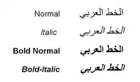
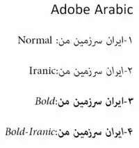
In certain Arabic fonts (e.g.: Adobe Arabic, Boutros Ads), the italic font has the top of the letter leaning to the left, instead of leaning to the right. Some font families, such as Venus, Roemisch, Topografische Zahlentafel, include left leaning fonts and letters designed for German cartographic map production, even though they do not support Arabic characters.[59]
Iranic font style
In the 1950s, Gholamhossein Mosahab invented the Iranic font style, a back-slanted italic form to go with the right-to-left direction of the script.[60]
Upright italics
Since italic styles clearly look different from regular (roman) styles, it is possible to have 'upright italic' designs that have a cursive style but remain upright. In Latin-script countries, upright italics are rare but are sometimes used in mathematics or in complex texts where a section of text already in italics needs a 'double italic' style to add emphasis to it. Donald Knuth's Computer Modern has an alternate upright italic as an alternative to its standard italic, since its intended use is mathematical typesetting.
Font families with an upright or near-upright italic only include Jan van Krimpen's Romanée, Eric Gill's Joanna, Martin Majoor's FF Seria and Frederic Goudy's Deepdene. The popular book typeface Bembo has been sold with two italics: one reasonably straightforward design that is commonly used today, and an alternative upright 'Condensed Italic' design, far more calligraphic, as a more eccentric alternative. This italic face was designed by Alfred Fairbank and named "Bembo Condensed Italic", Monotype series 294. [61][17][18] Some Arts and Crafts movement-influenced printers such as Gill also revived the original italic system of italic lower-case only from the nineteenth century onwards.[62]
Parentheses
The Chicago Manual of Style suggests that to avoid problems such as overlapping and unequally spaced characters, parentheses and brackets surrounding text that begins and ends in italic or oblique type should also be italicised (as in this example). An exception to this rule applies when only one end of the parenthetical is italicised (in which case roman type is preferred, as on the right of this example).
In The Elements of Typographic Style, however, it is argued that since Italic delimiters are not historically correct, the upright versions should always be used, while paying close attention to kerning.
Substitutes
In media where italicization is not possible, alternatives are used as substitutes:
- In typewritten or handwritten text, underlining is typically used.
- In plain-text computer files, including e-mail communication, italicised words are often indicated by surrounding them with slashes or other matched delimiters. For example:
- I was /really/ annoyed.
- They >completely< forgot me!
- I had _nothing_ to do with it. (Commonly interpreted as underlining, which is an alternative to italics.)
- It was *absolutely* horrible. (Commonly interpreted as bold. This and the previous example signify italic in Markdown.)
- Where the italics do not indicate emphasis, but are marking a title or where a word is being mentioned, quotation marks may be substituted:
- The word "the" is an article.
- The term "even number" refers to a number that is a multiple of 2.
- The short story "A Sound of Thunder" was written by Ray Bradbury.
OpenType
OpenType has the ital feature tag to substitute a character to italic form with single font. In addition, the OpenType Font Variation has ital axis for the transition between italic and non-italic forms and slnt axis for the oblique angle of characters.
Web pages
In HTML, the <i> element is used to produce italic (or oblique) text. When the author wants to indicate emphasised text, modern Web standards recommend using the <em> element, because it conveys that the content is to be emphasised, even if it cannot be displayed in italics. Conversely, if the italics are purely ornamental rather than meaningful, then semantic markup practices would dictate that the author use the Cascading Style Sheets declaration font-style: italic; along with an appropriate, semantic class name instead of an <i> or <em> element.
See also
References
- Ewan Clayton (5 September 2013). The Golden Thread: The Story of Writing. Atlantic Books. pp. 104–6. ISBN 978-1-78239-034-3.
- Hoefler, Jonathan. "Italics Examined". Hoefler & Co. Retrieved 10 February 2017.
- Truss, Lynne (2004), Eats, Shoots & Leaves: The Zero Tolerance Approach to Punctuation, New York: Gotham Books, p. 146, ISBN 978-1-59240-087-4
- Bühler, Curt (1970). "False Information in the Colophons of Incunabula". Proceedings of the American Philosophical Society. 114 (5): 405. ISBN 9781422371374. Retrieved 8 June 2020.
Manutius dated his edition...as 15 September, 1500, but included in the volume is a letter...with date of September 19.
- "Columbia University Libraries Online Exhibitions | Type to Print: The Book & The Type Specimen Book". exhibitions.library.columbia.edu. Retrieved 18 December 2018.
- "Aldus Manutius". Pioneers of Print. University of Manchester. Retrieved 6 April 2017.
- Hendrik D. L. Vervliet (2008). The Palaeotypography of the French Renaissance: Selected Papers on Sixteenth-century Typefaces. BRILL. pp. 287–319. ISBN 978-90-04-16982-1.
- Oxford University Press (1 June 2010). Aldo Manuzio (Aldus Manutius): Oxford Bibliographies Online Research Guide. Oxford University Press, USA. pp. 10–11. ISBN 978-0-19-980945-5.
- Berthold Louis Ullman, The origin and development of humanistic script, Rome, 1960, p. 77
- "Roman vs Italic". Type to Print: The Book & The Type Specimen Book. Columbia University Libraries. Retrieved 27 October 2014.
- Kaufmann, Ueli (11 October 2015). "The design and spread of Froben's early Italics". Department of Typography & Graphic Communication. University of Reading. Retrieved 5 April 2017.
- Carter, Harry (1969). A View of Early Typography. pp. 117–126.
If Aldus hoped, as it is commonly said that he did, but he never said, that cursive letterforms would save space, he must have been disappointed by the result: a Roman type on the same body gets in just as much. It is a beautiful and legible typeface.
- Updike, D.B. (1927), Printing Types: Their History, Form and Use, Harvard University
- Morison, Stanley; Johnson, Alfred (2009). "3: The Chancery Types of Italy and France". In McKitterick, David John (ed.). Selected essays on the history of letter-forms in manuscript and print. Cambridge: Cambridge University Press. pp. 30–45. ISBN 978-0-521-18316-1. Retrieved 28 December 2015.
- Morison, Stanley (1973). A Tally of Types. Cambridge: Cambridge University Press. pp. 41–60. ISBN 978-0-521-09786-4.
- Hoefler, Jonathan. "Requiem". Hoefler & Frere-Jones. Retrieved 6 April 2017.
- "Fairbank". Monotype. Retrieved 30 June 2015.
- "Fairbank". MyFonts. Monotype.
- "Fairbanks Italic specimen" (PDF). Monotype. Archived from the original (PDF) on 11 June 2016. Retrieved 14 May 2016.
- "Alfred Fairbank" (PDF). Klingspor Museum. Retrieved 14 May 2016.
- "Poetica". MyFonts. Adobe Systems. Retrieved 6 April 2017.
- Clair, Colin (1969). A Chronology of Printing. p. 43.
- Lane, John (1983). "The Types of Nicholas Kis". Journal of the Printing Historical Society: 47–75.
- Johnson, Alfred F. (1930). "The Evolution of the Modern-Face Roman". The Library. s4-XI (3): 353–377. doi:10.1093/library/s4-XI.3.353.
- Dreyfus, John (1950). "The Baskerville Punches 1750–1950". The Library. s5-V (1): 26–48. doi:10.1093/library/s5-V.1.26.
- Ewan Clayton (11 February 2014). The Golden Thread: A History of Writing. Counterpoint LLC. pp. 205–210. ISBN 978-1-61902-242-3.
- Morison, Stanley (1937). "Type Designs of the Past and Present, Part 3". PM: 17–81. Retrieved 4 June 2017.
- Mosley, James. "Comments on Typophile thread". Retrieved 27 March 2017.
One of the distinctive things about French calligraphy of [the 1680s] is that the lead-in stroke of letters like i, m, n and so on have flat, rather ‘roman’, serifs, making them look a bit like a ‘sloped roman’…Fournier used it fifty years later in his ‘new style’ italics, and later so did Firmin Didot. And that French flat serif also turns up in…the italic to Times New Roman.
- Butterick, Matthew. "Bold or italics?". Practical Typography. Retrieved 29 July 2015.
- Butterick, Matthew. "Small caps". Practical Typography. Retrieved 29 July 2015.
- "Formatting Book Titles in the Digital Age". dailywritingtips.com.
- University of Minnesota Style Manual, University of Minnesota, 18 July 2007, archived from the original on 24 March 2010, retrieved 22 October 2009
- Norton, David (2005). A Textual History of the King James Bible. Cambridge University Press. p. 162. ISBN 9780521771009. Retrieved 18 October 2016.
- Mills, I. M.; Metanomski, W. V. (December 1999), On the use of italic and roman fonts for symbols in scientific text (PDF), IUPAC Interdivisional Committee on Nomenclature and Symbols, retrieved 9 November 2012. This document was slightly revised in 2007* and full text included in the Guidelines For Drafting IUPAC Technical Reports And Recommendations and also in the 3rd edition of the IUPAC Green Book. *Refer to Chemistry International. Volume 36, Issue 5, Pages 23–24, ISSN (Online) 1365-2192, ISSN (Print) 0193-6484, DOI: 10.1515/ci-2014-0529, September 2014
- See also Typefaces for Symbols in Scientific Manuscripts, NIST, January 1998. This cites the family of ISO standards 31-0:1992 to 31-13:1992.
- "More on Printing and Using Symbols and Numbers in Scientific and Technical Documents Archived 29 June 2007 at the Wayback Machine". Chapter 10 of NIST Special Publication 811 (SP 811): Guide for the Use of the International System of Units (SI). 2008 Edition, by Ambler Thompson and Barry N. Taylor. National Institute of Standards and Technology, Gaithersburg, MD, US. March 2008. 76 pages. This cites the ISO standards 31-0:1992 and 31-11:1992, but notes "Currently ISO 31 is being revised [...]. The revised joint standards ISO/IEC 80000-1—ISO/IEC 80000-15 will supersede ISO 31-0:1992—ISO 31-13.".
- "The NCBI Style Guide: Style Points and Conventions". National Center for Biotechnology Information. Retrieved 28 April 2016.
- "Guidelines for Formatting Gene and Protein Names". BioScience Writers. Retrieved 28 April 2016.
- Specimens of type, borders, ornaments, brass rules and cuts, etc. : catalogue of printing machinery and materials, wood goods, etc. American Type Founders Company. 1897. p. 340. Retrieved 17 August 2015.
- Majoor, Martin. "Inclined to be dull". Eye magazine. Retrieved 20 June 2015.
- Tankard, Jeremy. "Bliss". Jeremy Tankard Typography. Retrieved 16 December 2016.
- Frere-Jones, Tobias; Hoefler, Jonathan. "Whitney". Hoefler & Frere-Jones. Retrieved 16 December 2016.
- Frutiger, Adrian (8 May 2014). Typefaces: The Complete Works (2nd ed.). Walter de Gruyter. p. 260. ISBN 978-3038212607.
- Majoor, Martin. "My Type Design Philosophy". Typotheque. Retrieved 12 November 2015.
- Walter Tracy (January 2003). Letters of Credit: A View of Type Design. D.R. Godine. pp. 61–4. ISBN 978-1-56792-240-0.
- "Typophile discussion". Typophile. Retrieved 8 November 2014.
- Devroye, Luc. "Friedrich Bauer". Type Design Information. Retrieved 8 November 2014.
- Simonson, Mark. "Bookmania". Retrieved 23 September 2014.
- Tracy, Walter. Letters of Credit. pp. 162–3.
- Morison, Stanley. Towards an Ideal Italic.
- "Monotype Imaging: Perpetua". Archived from the original on 10 January 2012. Retrieved 8 November 2014.
- Lo Celso, Alejandro. "Serial Type Families" (PDF). Archived from the original (PDF) on 8 November 2014.
- "Recasting Electra as Aluminia". Letterform Archive. Retrieved 10 November 2017.
- Puckett, James. "Draughtsman's Alphabets published by Keuffel & Esser". dailytypespecimen. Retrieved 10 November 2017.
- Morison, Stanley. "Changing the Times". Eye. Retrieved 28 July 2015.
- William E. Ryan; Theodore E. Conover (2004). Graphic Communications Today. Cengage Learning. p. 98. ISBN 978-0-7668-2075-3.
- "Nitro & Turbo - Overview". Hoefler & Frere-Jones. Retrieved 29 February 2016.
- Reverse italics at StudioType
- "Venus". Fonts in Use. Retrieved 13 January 2017.
- Esfahbod, Behdad; Roozbeh Pournader (March 2002). "FarsiTeX and the Iranian TeX Community" (PDF). TUGboat. 23 (1): 41–45. Retrieved 3 January 2013.
- Bixler, M & W. "Bembo Condensed Italic specimen". Retrieved 30 June 2015.
- Harling, Robert (1975). The Letter Forms and Type Designs of Eric Gill (1st U.S. ed.). Westerham, Kent: Published by Eva Svensson, and printed by the Westerham Press. pp. 51–8. ISBN 978-0-903696-04-3.
- Warde, Beatrice (1926). "The 'Garamond' Types". The Fleuron: 131–179.
Notes
- His choice to publish such small, cheap additions, has been suggested to be the result of a recession beginning in 1500, the result of war with the Ottoman Empire.
- Notable revivals include Bembo Narrow Italic, Centaur Italic or Arrighi, Poetica and Requiem.[16][17][18][19][20][21]
- Spelling modernised to avoid confusion–Morison wrote 'fount', the usual spelling in British English at the time.
- Electra was later reissued–although not in Britain–with a true italic, which is the only form most digitisations include. An exception is Jim Parkinson's Aluminia revival, which includes both.[53] Romulus was issued on Morison's plan with an oblique a script typeface companion, Cancelleresca Bastarda, which has longer ascenders and descenders than Romulus does. Digital period type designer James Puckett describes the obliques on both Romulus and Electra as "spectacular failures [which] pretty much killed the idea for serifed types."[54]
External links
| Look up italic or Appendix:Italic in Wiktionary, the free dictionary. |
- Hamilton, Frederick W. (1918). The Uses of Italic: A Primer of Information Regarding the Origin and Uses of Italic Letters at Project Gutenberg
| Page | |||||||||
|---|---|---|---|---|---|---|---|---|---|
| Paragraph | |||||||||
| Character |
| ||||||||
| Classifications |
| ||||||||
| Punctuation | |||||||||
| Typesetting | |||||||||
| Typographic units | |||||||||
| Digital typography | |||||||||
| Related articles | |||||||||
| Related tables |
| ||||||||
| |||||||||