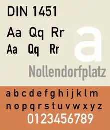
DIN 1451
DIN 1451 is a sans-serif typeface that is widely used for traffic, administrative and technical applications.[1]
 | |
| Category | Sans-serif |
|---|---|
| Foundry | FontFont, Linotype GmbH |
It was defined by the German standards body DIN - Deutsches Institut für Normung (German Institute for Standardization), pronounced as "Din", in the standard sheet DIN 1451-Schriften (typefaces) in 1931.[2] Similar standards existed for stencilled letters.[3]
Originally designed for industrial uses, the first DIN-type fonts were a simplified design that could be applied with limited technical difficulty. Due to the design's legibility and uncomplicated, unadorned design, it has become popular for general purpose use in signage and display adaptations. Many adaptations and expansions of the original design have been released digitally.[4][5]
Overview
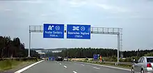
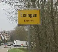
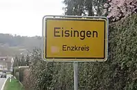
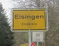
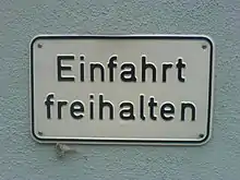
The DIN 1451 typeface family includes both a medium (Mittelschrift) and a condensed (Engschrift) version; an older extended version (Breitschrift) has not been used since the early 1980s, but may still be encountered on older road signs in Germany. DIN 1451 is the typeface used on road signage in Germany and a number of other countries. It was also used on German car number plates from 1956, until replaced there in January 1995 by FE-Schrift, a typeface especially designed to make the plates more tamper-proof and to optimize automatic character recognition. The typeface has gained popularity due to its wide exposure through its release as a PostScript typeface in 1990. Since then, it is also used by non-governmental organisations and businesses. For graphic design and desktop publishing, several type foundries offer redesigned and extended versions of this typeface.
History
In 1931, the DIN institute published DIN 1451. It contained several standard typefaces for mechanically engraved lettering, hand-lettering, lettering stencils and printing types. These were to be used in the areas of signage, traffic signs, wayfinding, lettering on technical drawings and technical documentation.
The origins of DIN 1451 Engschrift ("condensed face") for hand lettering date back to 1905, when the Prussian state railways prescribed a standardized lettering style for use on all of its rolling stock. This specification was published in a document known as Musterzeichnung ("Master Template"; lit. "pattern drawing") IV 44. Ten years later, the company – by then, renamed Prussian-Hessian Railways – additionally required that signage lettering on railway platforms and station premises also be rendered according to the 1905 master template. Then, as a byproduct of the 1920 consolidation of all German railway companies into the Deutsche Reichsbahn, the Prussian railway's typeface quickly became a de facto national standard, even before the DIN Committee of Typefaces took up its work on DIN 1451 a few years later. The DIN Committee of Typefaces was headed by the Siemens engineer, Ludwig Goller (1884–1964), who also led the central standardization office at Siemens & Halske in Berlin, between 1920 and 1945.
The design included not only the DIN Engschrift, but also a DIN Mittelschrift ("medium[-width] face" – now very popular). A DIN Breitschrift ("extended face") design was also included, but it has never been widely used.
In order to enable quick and easy reproduction, all drawings were originally based on a coarse grid and could be executed with compass and rulers. The Normblatt ("standards sheet") DIN 1451, Schriften ("Typefaces") was released preliminarily in 1931; then, with some minor changes in 1936, it was released as an official standard. In 1938, Temporary Order No. 20 required DIN 1451 to be used on the new German Autobahn (motorway) system. Due to this and similar regulations, DIN 1451 still dominates German public lettering today.
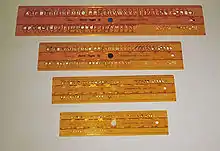
In 1923, Stempel was the first type foundry to produce printing type according to a DIN Standard. The design follows DIN 16, an earlier standard for oblique lettering on technical drawings, which had been released in 1919. In 1929, the Berthold Type Foundry released a similar typeface. DIN 16 had also been made available as lettering templates engraved in celluloid material for drafting use by the Filler and Fiebig company in Berlin.
Within the scope of public and technical lettering, the use of the DIN 1451 typefaces spread rapidly once they were adopted. They were released as celluloid lettering stencils for smaller applications, as larger metal stencils for application to machinery, vehicles and airplanes, and as cast metal lettering for street and building signage; nevertheless, printing type conforming to DIN 1451 have never been produced. During World War II, DIN 1451 was also adopted in the Protectorate of Bohemia and Moravia. The 1943 version of DIN 1451 added a set of Cyrillic characters, although their design did not match the weight and proportions of DIN Mittelschrift.
Sans-serif lettering and typefaces styled around geometric shapes, along with Art Deco in general, was very popular in the 1920s and 1930s. At the Bauhaus, the use of coarse grids for designing typefaces was advocated by Herbert Bayer and Joost Schmidt during the Dessau period. Although of a similar design, the DIN typefaces did not incorporate the elegance of this stylistic trend.
Inspired by the DIN standard, a consortium of Dutch organisations created an equivalent lettering standard, NEN 3225.[6] Created by a group of designers that included Jan van Krimpen, the design has no similarity to the DIN standard: it is a humanist family with serif and sans-serif styles. The sans-serif is similar to Gill Sans and to Johnston; the serif reflects the classical Renaissance humanist model.[7]
Releases
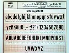
The transferable-lettering-sheet company, Letraset made several variants available in the 1970s. Also, the Berthold type foundry adopted the DIN typefaces for their optomechanical phototype setting systems such as Staromat. In 1980, the DIN typefaces were redrawn by Adolf Gropp (1911–1996), a lettering artist from Frankfurt. The drawings were made on a finer grid. This enabled an exact definition of details such as the amount of overshoot of round characters (e.g. C, G and O) below the baseline and above the cap height. Also, characters such as S for which an accurate construction drawing had never been made were now defined using lines and arcs for the new cutting plotters that were to be used for the lettering on motorway signage. A number of the glyphs were changed, in particular those for "a", "6" and "9" as well as "t" in DIN Engschrift.
By the mid 1980s, Linotype adopted the redrawn DIN typefaces for digital photocomposition. Together with Adobe, they released it as DIN Mittelschrift and DIN Engschrift in 1990. Thus, the typefaces became part of the Adobe/Linotype PostScript typeface library. The use of DIN typefaces started to appear in the work of cutting edge graphic designers and design studios such as Uwe Loesch in Germany, Tel Design in the Netherlands, as well as David Carson and April Greiman in the USA. Soon, other leading designers began using DIN Mittelschrift and Engschrift, making it a popular option to other sans serif faces.
Third-party adaptations
.jpg.webp)
With the popularity of the DIN fonts, with their minimal, modern design, several designers and companies have released their own interpretations and adaptations, often adding new weights such as light or extra-bold, and italics, causing a range of digital interpretations to exist.
One of the most famous and best-selling digitisations of DIN is FF DIN (1995), created by Dutch typeface designer Albert-Jan Pool for FontFont.[10][11][12][13] Typographica editor Stephen Coles has particularly praised it for the quality of its hinting for onscreen display.[14] Users include the New York City Ballet, ETH Zurich, The Verge and the film The Wolf of Wall Street.[15][16][17] Unlike the original design, it uses conventional weight names.
As the original DIN design is out of copyright, other companies have offered digital releases (or obtained rights to resell Linotype's). Parachute (Latin, Arabic, Cyrillic, Greek), Elsner+Flake, Paratype (with Cyrillic characters) and others have issued revivals of some DIN styles, often upgraded with additional weights.[18] Fontsite renamed its release 'Fette 1451'.[19]
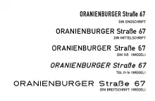
An extensive set of digitisations is that made by Peter Wiegel with donations requested from users under the OFL. This includes the regular style (Mittelschrift) in two grades for printing with less and more ink spread, and the less well-known Breitschrift.[20][21][22] He also digitised the rounded DIN 16 Oblique and DIN 17 Upright Standard Typeface for Drawings using the names TGL 0-16 and 0-17, the names under which they were known in the German Democratic Republic.[23][24]
Microsoft created custom digitizations of both Mittelschrift and Engschrift versions of DIN 1451 in 2013, but this version was never released publicly. In 2016, a version was released as "Bahnschrift", as Microsoft's first ever Open Type variable font.[25] The Bahnschrift source was completely rebuilt from the ground up by Aaron Bell of Saja Typeworks and was expanded in weight, character set and manual hinting.[26] It supports Latin, Cyrillic, Greek, currency symbols, and some Coptic. It was first included in Windows 10 version 1709, and is primarily being used as the user interface font for Xbox software.[27][28]
Usage examples
Font for many license plates throughout Europe, but also Africa and Asia, including:
- Azerbaijan
- Belarus
- Cambodia
- Estonia
- Faroe Islands
- Hungary
- Indonesia
- Israel
- Latvia (with Mittelschrift used also in road signage)
- Lebanon
- Lithuania
- Moldova (until 2015; *) + Transnistria
- Mongolia
- Niger
- Palestine
- Portugal + Cape Verde
- Romania
- San Marino
- Togo
- Tunisia
- Turkmenistan
- Vietnam
- Some variants in Cyprus, including Sovereign Base Areas (GB)
- Vehicle travelling outside Iran
- Some variants of French plates (current and pre-2009 format, as well as diplomatic, military personnel stationed in Germany, temporary)
- Some variants in Turkey
- Some variants of international organisations - United Nations, European Union and Council of Europe missions - and militaries (for example: Netherlands & France forces in Germany)
and older plates of:
- Albania *
- Belgium
- Bosnia and Herzegovina *
- Botswana
- Chile *
- Cuba *
- Georgia *
- Germany *
- Ghana *
- Guinea
- Guinea Bissau
- Kyrgyzstan *
- South Sudan *
- Uganda *
Other countries use slightly modified versions of the font:
- Austria (rounded)
- Czech Republic (narrower)
- Slovakia (notable differences for '0' and '7')
- Spain (narrower)
- Old Italy (notable differences for '3', '4', '5', '6', '7', '9', 'G', 'M', 'Q', 'W')
- Old Poland (notable differences for '4', '6', '7', '9', 'K', 'M', 'W')
In several countries, marked with *, it has been superseded by FE-Schrift, a typeface developed specifically to hinder tampering.
See also
References
- Pool, Albert-Jan (2007). "FF DIN, the history of a contemporary typeface". In Spiekermann, Erik; Middendorp, Jan (eds.). Made with FontFont: type for independent minds (1st ed.). New York: Mark Batty Publisher. pp. 66–73. ISBN 0977985040.
- Pool, Albert-Jan. "FF DIN: Digital Block Letters" (PDF). FontShop. Archived from the original (PDF) on 7 July 2017. Retrieved 14 December 2016.
- Hardwig, Florian; Maier, Thomas. "From Lettering Guides to CNC Plotters — A Brief History of Technical Lettering Tools". Typotheque. Retrieved 19 July 2017.
- Berry, John D. (2006). Dot-font: Talking About Fonts (1st ed.). New York: Mark Batty Publisher. pp. 50–51. ISBN 0-9772827-0-8.
- Berry, John. "dot-font: Industrial-Standard Typefaces". Creative Pro. Retrieved 16 July 2016.
- Jan Middendorp (2004). Dutch Type. 010 Publishers. pp. 298–9. ISBN 978-90-6450-460-0.
- G. Willem Ovink (1964). "NEN 3225: Dutch Standard Alphabets". Alphabet. Kynoch Press. pp. 123–130.
- "Albert-Jan Pool - Können Serifen funktional sein? (German)". YouTube. Typographische Gesellschaft München – tgm. Retrieved 13 February 2017.
- Jan-Pool, Albert. "Funktionale Serifen?". Design Made In Germany (archived). Archived from the original on 6 February 2013. Retrieved 13 February 2017.
- Spiekermann, Erik. "Comments on Typophile thread". Typophile. Archived from the original on April 10, 2009. Retrieved 13 July 2015.
- "Can the typefaces we see around us on highway signs be turned into usable fonts for general use? Sometimes". Creativepro.com. Retrieved 2012-10-10.
- "FF DIN Round". Issuu.com. 2010-07-28. Retrieved 2012-10-10.
- "FF DIN in use :: A FontFont Focus by FontShop". Dinfont.com. Retrieved 2012-10-10.
- Coles, Stephen. "Twitter post". Twitter. Retrieved 1 September 2015.
- "The Verge Logo and Website". Fonts In Use. 2013-11-19.
- "The Wolf of Wall Street movie posters". Fonts In Use. 2014-01-08.
-
"Communication - Font". ETH Zurich. Retrieved 22 January 2016.
Arial and FF DIN Pro are the corporate fonts for ETH Zurich.
- "Parachute DIN". MyFonts. Parachute. Retrieved 1 September 2015.
- "Fette 1451". Fontsite. Retrieved 1 September 2015.
- Wiegel, Peter. "DIN Breitschrift". Retrieved 1 September 2015.
- Wiegel, Peter. "Alte DIN 1451". Peter Wiegel. Retrieved 1 September 2015.
- Wiegel, Peter. "DIN 1451 H". Peter Wiegel. Retrieved 1 September 2015.
- Wiegel, Peter. "TGL 0-16". Retrieved 1 September 2015.
- Wiegel, Peter. "TGL 0-17". Retrieved 1 September 2015.
- "Introducing the Bahnschrift font". Windows Blog. Microsoft. Retrieved 28 August 2017.
- "Bahnschrift font family". Microsoft Typography. Microsoft. Retrieved 14 June 2019.
- "The next Xbox One and Xbox Series X dashboard finally gets it right". Windows Central. 2020-08-25. Retrieved 2021-02-02.
- Protalinski, Emil. "Microsoft releases new Windows 10 preview with shell, Edge, and input improvements". VentureBeat. Retrieved 28 August 2017.
Further reading
- The series of articles "The history of the design of a contemporary typeface" in which Albert-Jan Pool published many of his findings on the history of the typefaces of DIN 1451 is a vault of references on this subject. The series was published in the e-magazine 'Encore', issues 13-15, 17-18. These are direct links to the article which were reprinted in modified form in Made with FontFont
- Albert-Jan Pool. FF Din. 1995
- Blackwell, Lewis. 20th Century Type. Yale University Press: 2004. ISBN 0-300-10073-6.
- Friedl, Friedrich, Nicholas Ott and Bernard Stein. Typography: An Encyclopedic Survey of Type Design and Techniques Through History. Black Dog & Leventhal: 1998. ISBN 1-57912-023-7.
- Jaspert, W. Pincus, W. Turner Berry and A.F. Johnson. The Encyclopædia of Type Faces. Blandford Press Lts.: 1953, 1983. ISBN 0-7137-1347-X.
- Macmillan, Neil. An A–Z of Type Designers. Yale University Press: 2006. ISBN 0-300-11151-7.
- DIN 1451-2: Schriften – Serifenlose Linear-Antiqua – Verkehrsschrift. Deutsches Institut für Normung, 1986-02.
External links
| Wikimedia Commons has media related to DIN 1451. |
- Download of fonts used on roadsigns
- A free implementation of Fette Engschrift, an early version of the DIN 1451 typeface
- A minisite from Fontshop regarding FF DIN, includes history and specs as well as an interview with FF DIN's designer Albert-Jan Pool.
- Weights overview of FF DIN and in-use examples
- Linotype DIN pages: DIN 1451, DIN Next, DIN Next Arabic, DIN Next Devanagari font family - Designed by Akira Kobayashi in 2012, Kimya Gandhi in 2012
- Parachute DIN: PF DIN Text Pro, PF DIN Text Arabic, PF DIN Text Universal, PF DIN Text Condensed Pro, PF DIN Text Compressed Pro, PF DIN Display Pro, PF DIN Mono Pro, PF DIN Stencil Pro, PF DIN Type System - Comparison Table
- Fonts in Use: DIN 1451, DIN Engschrift, DIN Breitschrift
macOS typefaces | |
|---|---|
| Latin, Greek, Cyrillic |
|
| Non-alphabetic | |