Hightower Text
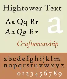
Hightower Text is a serif typeface designed by Tobias Frere-Jones. It is loosely based on the printing of Nicolas Jenson in Venice in the 1470s, in what is now called the "old style" of serif fonts.[1]
 | |
| Category | Serif Old-style |
|---|---|
| Designer(s) | Tobias Frere-Jones |
| Foundry | Font Bureau |
| Date released | 1994 |
| Design based on | Nicolas Jenson |
Begun by Frere-Jones while he was a student, it was originally used in AIGA's magazine and released commercially by Font Bureau.[2][3] It was named for the then-executive director of AIGA, Caroline Warner Hightower.[4][5] It has been included with some Microsoft software such as versions of Microsoft Office.[6] Some releases have been called "High Tower Text".
The family includes an italic style; this is Frere-Jones' design, since this style only emerged after Jenson's death. A commercial release is sold by Font Bureau in the OpenType format, which includes small capitals, ligatures and both lining and text figures.[7] It does not include a bold style, which did not exist in Jenson's time.
References
- "High Tower Text". Microsoft. Retrieved 29 June 2016.
- "Interview, Ellen Lupton with Tobias Frere-Jones". Ellen Lupton. Retrieved 31 October 2019.
- Riechers, Angela. "3 Major Designers Confess Their Biggest Mess-ups and Do-overs—and What They Learned". Eye on Design. AIGA. Retrieved 22 June 2016.
- Helfand, Jessica; Coltz, Jon. "Interview with Jessica Helfand". Daidala. Archived from the original on 8 April 2016. Retrieved 29 June 2016.
- Shaw, Paul. "AIGA Timeline: A Window on American Graphic Design". Blue Pencil. Retrieved 29 June 2016.
- "High Tower Text - Version 1.00". Microsoft. Retrieved 29 June 2016.
- "Hightower". MyFonts. Font Bureau. Archived from the original on 30 April 2016. Retrieved 29 June 2016.