Jonathan Hoefler
Jonathan Hoefler (/ˈhɛflər/; born August 22, 1970[1]) is an American typeface designer. Hoefler founded the Hoefler Type Foundry in 1989, a type foundry in New York.
Jonathan Hoefler | |
|---|---|
 Hoefler presenting in 2014 | |
| Born | August 22, 1970 |
| Nationality | American |
| Occupation | Typeface designer |
| Known for | Typeface design |
Notable work |
|
| Awards | Prix Charles Peignot 2002 |
Early life
Jonathan Hoefler was born on August 22, 1970, in New York City to Doreen Benjamin and Charles Hoefler, a theatrical set designer and producer. Growing up, it was the Gill Sans text on boxes of custard that drew him to typography design.[1] He is largely self-taught, and worked with magazine art director Roger Black prior to forming the Hoefler Type Foundry in 1989.[2]
Career
Hoefler's Champion Gothic was inspired by 19th century wood type.[3] It was commissioned for Sports Illustrated shortly after founding the company in 1989. In 1997, his path crossed with type designer Tobias Frere-Jones when both were trying to purchase German type foundry catalogs.[1] In 1999, Hoefler began working with Frere-Jones, and from 2005–2014 the company operated under the name Hoefler & Frere-Jones as a partnership.[4][2] In 2000, the firm, under Frere-Jones' direction, designed its ubiquitous Gotham typeface for GQ magazine and received wide recognition for their work and in the last 20 years is one of the most successful typefaces.[1][2]
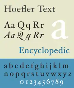
Hoefler's process when designing typefaces begins with research into historical records and then utilize the programming language Python to automate repetitive tasks. Their typefaces are systematic and logical and incorporate specific features based on their research.[2] Hoefler has designed original typefaces for Rolling Stone, Harper’s Bazaar, The New York Times Magazine, Sports Illustrated, and Esquire and several institutional clients, including the Solomon R. Guggenheim Museum and alternative band They Might Be Giants. Perhaps his best-known work is the Hoefler Text family of typefaces, designed for Apple Computer and now appearing as part of the Macintosh operating system.[5] He also designed the current wordmark of The Church of Jesus Christ of Latter-Day Saints.
In January 2014, Frere-Jones sued Hoefler for $20 million in the New York Supreme Court accusing him of scamming Frere-Jones. Frere-Jones claimed that in 1999, Hoefler agreed to a verbal 50-50 partnership that was legally binding. In light of the lawsuit, Hoefler changed the name back to Hoefler & Co claiming Frere-Jones had only been an employee, citing an agreement that they weren't partners but “independent entities" and asked the court to dismiss the case. Fans of the foundry were shocked by the news of the lawsuit. They later settled in September of 2014.[6][7]
Awards and recognition
In 1995, Hoefler was named one of the forty most influential designers in America by I.D. magazine,[8] and in 2002, the Association Typographique Internationale (ATypI) presented him with its most prestigious award, the Prix Charles Peignot for outstanding contributions to type design.[9]
Hoefler's work is part of the Cooper-Hewitt, National Design Museum's permanent collection.[10] In 2011, the Museum of Modern Art acquired two of Hoeflers typefaces: Mercury, and HTF Didot.[7][11]
In 2013, Hoefler was awarded an AIGA Medal along with Frere-Jones for "their contributions to the typographic landscape through impeccable craftsmanship, skilled historical reference and insightful vernacular considerations."[2]
Typefaces
Jonathan Hoefler's types include:
|
|
Notes
- Dunlap, David W (October 19, 2004). "2 Type Designers, Joining Forces and Faces". The New York Times. Retrieved October 17, 2007.
- "2013 AIGA Medalist: Jonathan Hoefler and Tobias Frere-Jones". AIGA | the professional association for design. Retrieved June 6, 2019.
- Heck, Bethany. "Champion Gothic". Font Review Journal. Retrieved September 13, 2019.
- Hoefler & Frere-Jones#Conflict between Hoefler and Frere-Jones
- Heller, Steven. "Jonathan Hoefler on type design". Design Dialogues. Retrieved August 2, 2016.
- Brownlee, John (September 29, 2014). "Type Stars Jonathan Hoefler And Tobias Frere-Jones Settle Their Bitter Lawsuit". Fast Company. Retrieved June 6, 2019.
- "Were H&FJ Partners Jonathan Hoefler and Tobias Frere-Jones Ever Partners at All? -- New York Magazine - Nymag". New York Magazine. Retrieved June 6, 2019.
- “The I.D. Forty,” I.D. magazine, Jan/Feb 1995.
- Barratt, Mark. "Prix Charles Peignot — ATypI". www.atypi.org. Retrieved June 6, 2019.
- "Biographies". Hoefler & Frere-Jones. Archived from the original on January 1, 2011. Retrieved October 17, 2007.
- "Jonathan Hoefler | MoMA". The Museum of Modern Art. Retrieved June 6, 2019.
- Heck, Bethany. "Inkwell review". Font Review Journal. Retrieved September 13, 2019.
References
- HoeflerCo.
- Friedl, Frederich, Nicholas Ott and Bernard Stein. Typography: An Encyclopedic Survey of Type Design and Techniques Through History. Black Dog & Leventhal: 1998. ISBN 1-57912-023-7.
- Macmillan, Neil. An A–Z of Type Designers. Yale University Press: 2006. ISBN 0-300-11151-7.
- “The I.D. Forty,” I.D. magazine, Jan/Feb 1995.
| Authority control |
|---|