Archer (typeface)
Archer is a slab serif typeface designed in 2001 by Tobias Frere-Jones and Jonathan Hoefler for use in Martha Stewart Living magazine. It was later released by Hoefler & Frere-Jones for commercial licensing.
 | |
| Category | Serif |
|---|---|
| Classification | Humanist slab serif |
| Designer(s) | Tobias Frere-Jones Jonathan Hoefler |
| Foundry | Hoefler & Frere-Jones |
Structure
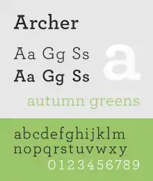
The typeface is a geometric slab serif, one with a geometric design similar to sans-serif fonts. It takes inspiration from mid-twentieth century designs such as Rockwell.
The face is unique for combining the geometric structure of twentieth-century European slab-serifs but imbuing the face with a domestic, less strident tone of voice. Balls were added to the upper terminals on letters such as C and G to increase its charm.[1] Italics are true italic designs, with flourishes influenced by calligraphy, an unusual feature for geometric slab serif designs. As with many Hoefler & Frere-Jones designs, it was released in a wide range of weights from hairline to bold, reflecting its design goal as a typeface for complex magazines.[2]
Uses
The typeface has been used for, among other things, branding for Wells Fargo and is a main font for the San Francisco Chronicle and Wes Anderson's film The Grand Budapest Hotel.[3]
References
- Devroye, Luc. "Jonathan Hoefler". McGill University. Retrieved 29 September 2014.
- Earls, David John. "Archer". Typographica. Retrieved 11 July 2015.
- Adams, Lauren. "Is Archer's Use on Target?". AIGI.