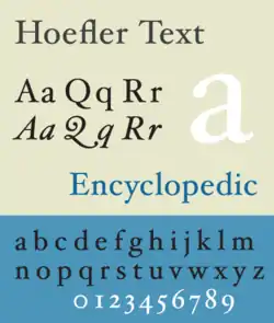
Hoefler Text
Hoefler Text is an old-style serif font by Jonathan Hoefler and released by Apple Computer Inc. (now Apple Inc.) in 1991 to showcase advanced type technologies.[1] Intended as a versatile font that is suitable for body text, it takes cues from a range of classic fonts, such as Garamond and Janson.[2]
 | |
| Category | Serif |
|---|---|
| Classification | Old-style |
| Designer(s) | Jonathan Hoefler |
| Foundry | Hoefler & Co. |
A version of Hoefler Text has been included with every version of the classic Mac OS since System 7.5 and in every version of macOS. Hoefler's company, Hoefler & Frere-Jones, have continued development of the typeface, developing for sale a wide range of additional variants.[3]
Released free with every Mac during the growth of desktop publishing, at a time when producing printed documents was becoming dramatically easier, Hoefler Text raised awareness of type features previously the concern only of professional printers.[4][5][6] New York magazine commented in 2014 that it "helped launch a thousand font obsessives."[7] Hoefler Text was used in the Wikipedia logo until the 2010 redesign, when it was replaced with Linux Libertine.[8]
Features
Hoefler Text incorporates then-advanced features which have since become standard practice for font designers, such as automatic ligature insertion, real small capitals, optional old style figures and optional insertion of characters such as true superscript and subscript characters, the historical round and long s, engraved capitals and swashes. Hoefler Text also has a matching ornament font containing arabesque motifs.[9] It was, until OpenType made alternate characters more common, one of only a few system fonts that contained old style, or ranging, figures, which are designed to harmonize with body text.
Hoefler & Frere-Jones have expanded Hoefler Text to include additional typographic features, and the current commercial release now includes three weights (an additional bold weight beside the regular and black included with Macs) and two sets of engraved capitals, as well as the more slender display variant Hoefler Titling.[10][2] These are released in the cross-platform OpenType format, usable by any modern computer rather than just by Macs.
Gallery
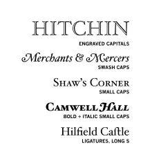 Hoefler Text features in the version bundled with Macs. The commercial release includes an additional bold weight (less bold than that shown) and a second, lighter design of engraved capitals.
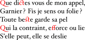 Contextual and selectable ligatures in Hoefler Text, highlighted in red.
See also
References
- Heller, Steven. "Jonathan Hoefler on type design". Design Dialogues. Retrieved 2 August 2016.
- "Hoefler Titling". Hoefler & Frere-Jones. Retrieved 7 July 2015.
- Hoefler Text | Hoefler & Frere-Jones. Retrieved November 18, 2009.
- Berry, John D. "A Rare Font Specimen". Creative Pro. Retrieved 1 April 2017.
- Shaw, Paul. "The Digital Past: When Typefaces Were Experimental". AIGA. Retrieved 1 April 2017.
- Stephen Eskilson (28 February 2012). Graphic Design: New History 2nd Edition. Yale University Press. p. 417. ISBN 978-0-300-17260-7.
- Fagone, Jason. "A Type House Divided". New York magazine. Retrieved 1 December 2014.
- Wikipedia logos
- Hoefler, Jonathan. "Ornaments and Arabesques". Hoefler & Frere-Jones. Retrieved 1 April 2017.
- Strizver, Ilene. "All About Titling Fonts". Creative Pro. Retrieved 4 September 2018.
External links
 Media related to Hoefler at Wikimedia Commons
- Hoefler Text in the Hoefler & Frere-Jones catalog
- Hoefler Text features in the Hoefler & Frere-Jones catalog
- Hoefler Titling in the Hoefler & Frere-Jones catalog
macOS typefaces | |
|---|---|
| Latin, Greek, Cyrillic |
|
| Non-alphabetic | |