Rockwell (typeface)
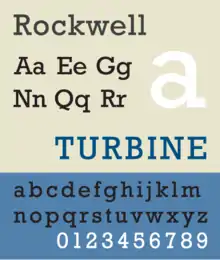
Rockwell is a slab serif typeface designed by the Monotype Corporation and released in 1934.[1][2] The project was supervised by Monotype's engineering manager Frank Hinman Pierpont. This typeface is distinguished by a serif at the apex of the uppercase A, while the lowercase a has two storeys. Because of its monoweighted stroke, Rockwell is used primarily for display or at small sizes rather than as a body text. Rockwell is based on an earlier, more condensed slab serif design cast by the Inland Type Foundry called Litho Antique.
 | |
| Category | Serif |
|---|---|
| Classification | Slab serif |
| Foundry | Monotype |
| Date released | 1934 |
Rockwell is a geometric slab-serif with a monoline construction, with all of its strokes appearing to be roughly the same width and its capital O roughly circular. This gives it a similar impression to common sans-serif designs of the period like Akzidenz Grotesk, Franklin Gothic, or Futura.[3] Rockwell is influenced by a style of geometric slab serif that had become popular around the time, including the earlier Memphis and Beton, and less similarly Stymie and City.[4]
Rockwell has remained popular and been digitised, although a shadowed weight has not been.
And also from Bitstream, a cloned version from Rockwell, under the name Geometric Slabserif 712.[5]
Vernon Adams designed the Rokkitt typeface, which based on the Rockwell typeface.[6]
Usage
The Guinness World Records used Rockwell in some of its early-1990s editions. Informational signage at Expo 86 made extensive use of the Rockwell typeface.[7] Docklands Light Railway used a bold weight of this typeface in the late 1980s and early 1990s. The poetry publisher Tall Lighthouse also uses Rockwell in all of its books, as well as on its website.[8]
References
| Wikimedia Commons has media related to Rockwell (typeface). |
- W. Pincus Jaspert, W. Turner Berry and A.F. Johnson (1970) [1953]. Encyclopaedia of Type Faces (4th ed.). London: Blandford Press. p. 194. ISBN 0-7137-0191-9.CS1 maint: uses authors parameter (link)
- Lucienne Roberts (1 November 2005). Drip-dry Shirts: The Evolution of the Graphic Designer. AVA Publishing. p. 32. ISBN 978-2-940373-08-6.
- "Sentinel: historical background". Hoefler & Frere-Jones. Retrieved 15 July 2015.
- Tam, Keith. "The revival of slab-serif typefaces in the 20th century" (PDF). University of Reading (MA thesis). Retrieved 3 March 2016.
- "Geometric Slabserif 712 - Webfont & Desktop font « MyFonts". www.myfonts.com. Retrieved 3 March 2019.
- "Rokkitt - Google Fonts". fonts.google.com. Retrieved 12 May 2020.
- General Report on the 1986 World Exposition. Expo 86 Corporation, 1986, p. 115.
- http://www.tall-lighthouse.co.uk/
External links
- Fonts in Use
- Rockwell Shadow from a specimen book
Monotype typefaces | |
|---|---|
| 1900s |
|
| 1910s |
|
| 1920s |
|
| 1930s |
|
| 1940s |
|
| 1950s |
|
| 1960s |
|
| 1970s |
|
| 1980s | |
| 1990s |
|
| 2000s |
|
| 2010s |
|
macOS typefaces | |
|---|---|
| Latin, Greek, Cyrillic |
|
| Non-alphabetic | |