BBC News presentation
The presentation and the identities of the BBC News Channel, the international counterpart BBC World News and the BBC Parliament coverage channel use specific identities that demonstrate their remit and purpose.
BBC News Channel
1997 "Flags and Drums"
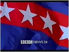
BBC News 24 was launched at 5.30pm on 9 November 1997 as a 24-hour domestic news channel. It acted as a sister channel to BBC World which had launched two years earlier. As a result of this partnership between the two channels, they shared some overnight programming and the same identity consisting of flags designed by Lambie-Nairn. The rippling flags were mostly fictitious, but included the Flag of St. George, the Flag of St. Andrew, the Catalan flag and the Pakistani flag, accompanied by an orchestral soundtrack comprised most noticeably of percussion instruments.[1][2][3][4][5]
The channel logo consisted of the BBC logo followed by uppercase 'News 24' text to the right.[1][2][4] The white logo was located at the bottom of the screen and as a Digital on-screen graphic (DOG) in the top left of the screen.[1] A digital clock was also used with the look and was located in a translucent grey stripe to the bottom left of the screen.[1][6] Other graphics including Astons, information graphics located at the bottom of the screen, were written on a two toned translucent purple and yellow background that merged into the picture.[1][6] If a broadcast was live, an additional orange stripe with 'LIVE' inside was added on top of the clock to denote this fact.[6]
Promotions for the channel followed the style used by the rest of the BBC Television network, consisting of the channel logo located at the bottom of the screen throughout the promotion, with information being added on top of the logo at the end.[6][7] The channel font was Gill Sans, also used by the BBC as a whole.
Due to the rolling news nature of the channel, in the final few minutes to the top of the hour, a filler sequence was used which featured one of the flags waving while the music built up, with flag and music linking seamlessly into the ident at the top of the hour. This filler would often be overlaid with a programme schedule for upcoming programmes or promoting the BBC News Website.[1][4]
The new look BBC News 24 was deliberately meant to look more open and friendly to new audiences and to look less authoritative. As a result, the newsreaders didn't wear jackets and were filmed in the BBC Newsroom at the time, which was the studio for BBC News 24.[3] The walls of this newsroom were decorated with panels featuring the bold colours and shapes such as stars, semicircles and numerous lines seen in the idents.[8] Separating the newsroom from the desk was a simple metal barrier.[1][8] Behind and left of the desk was a special weather station featuring a computer and weather graphic monitor.[8]
Following the move to the new BBC News Centre, located in BBC Television Centre, of all television and radio bulletins, the backdrop to BBC News 24 was changed to include a camera view of the new newsroom with a coloured panel featuring the BBC News logo over a flag.[2][9]
On the channel some overnight bulletins were simulcast on BBC World, and as a result the logo on the ident was changed to the generic BBC News logo, increased in size and placed in the centre of the screen.[1] Another logo variation also existed which became prominent on bulletins around 1998, featuring a two-line logo where the 'News 24' appeared below and of equal length to the BBC logo itself.[1]
1999 Cream look
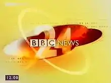
By 1999 a problem had become apparent with BBC News, something noticed by Lambie-Nairn. Despite an attempt in 1993 to unite all the news bulletins under a single brand, the news brand overall had fragmented with different looks for BBC News bulletins, Breakfast News, regional news, BBC News 24 and BBC World. As a result, Lambie-Nairn introduced a new brand that would encompass all of the BBC News output, with the exception of Breakfast News which would relaunch in 2000 as BBC Breakfast with the new style. Regional news would get a slight variation of the look but with several elements retained.[3]
This style involved a new cream and red colour scheme and a numeral to represent the time of day of the bulletin. In the case of News 24, a large '24' was used instead.[10][11] The ident designed featured a cream background with red pulsating rings and scenes; throughout the idents, place names would appear as anagrams and systematically flick through letters to form the place name, while a map of the UK could be seen at the beginning of the sequence and various styles of clock faces could be seen in the red ellipse with the hands passing a '24' mark on the clock face.[10][11] The sequence ended with a large white '24' seen from the front left against a red ellipse on a cream background with the one-line BBC News logo overlaid the numeral in the centre of the screen.[10][11] The music for the ident and for the whole of BBC News was composed by David Lowe and incorporated elements such as the BBC Pips, used on BBC Radio to mark the hour. This score was vastly different from the orchestral scores used by other news producers ITN and Sky News. The music was considered bold and different.
The graphics used by the channel were changed; the DOG remained the same, the background colour of the clock was changed to purple, and the box no longer extended off to the left of the screen.[10][12] When a live broadcast occurred, a graphic was added on top of the clock, however the colour was changed to red.[10][12] Equally, the channel astons were changed so the main body text, stating details about the story, shared the same translucent purple colour as the clock while the headline strip was a solid cream colour with bold red text.[10][12] This strip changed colour in the event of a breaking news story, when it became red with white text,[12] or when the channel reported the death of a notable public figure, such as Princess Margaret, when the heading became black with white text.[12]
Promotional style remained the same as from launch with the BBC News 24 logo being used and the generic BBC style used.[7] However, more adventurous styles were being tested with the one-line logo often being dropped in favour of the large 24 numeral.[7] Gill Sans was retained as the font on the channel.
For the re-launch, the idea of a filler was extended further to a full countdown. This consisted of world continents rotating on the left hand side of the screen which overlapped two large numerals filling the right side of the screen counting down until the top of the hour. The soundtrack used an extended version of David Lowe's soundtrack for the main titles. The beeps in the soundtrack, similar to the BBC Pips, corresponded to the seconds changing and became louder and more noticeable from 10 seconds. This countdown came with and without the BBC News 24 one-line logo at the bottom and also had programming details overlaid on some junctions.[10][11]
On the occasions that BBC News 24 simulcast with BBC World, a generic BBC News graphic featuring a world at the centre was used - this graphic was also used for the generic bulletins on BBC Television.[10]
There was also a change in the BBC News 24 set. Upon re-launch in 1999, the newsroom feel was retained but smartened up with beige and red walls.[9][10][13] To either side of the long desk were two flat screen televisions for linking into sport, weather and to partake in interviews; a large curved half wall went around the rear of the desk separating it from the newsroom.[9][10][13] The newsroom featured numerous televisions embedded into the far back wall and attached to a circular display behind the desk suspended from the ceiling.[9][10][13] Weather was now presented from the main weather studio used by the terrestrial bulletins and Sport was now presented from its own studio featuring a small desk against a background of ten small televisions embedded into the wall.[13]
In April 2002 some small changes were made to the studio and graphics. The astons were changed to a shaded area beneath a red line containing all the information; for breaking news this remained on screen throughout.[14] The studio was also changed: the suspended circular television display was removed in favour of a bank of televisions at the very back of the studio, and television screens were arranged around the two pillars behind the desk.[15]
One final change of the look occurred in January 2003 when the countdown sequence was replaced by four sequences showing peoples busy lives, combining a mix of ordinary footage and time-lapse photography. These scenes were counted down by the David Lowe theme and an italicised second counter in the bottom right corner.[10][11]
2003 Clamshell
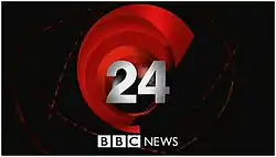
In 2003, BBC News 24 dropped the cream look from 1999 and adopted a new look, designed in house, and featuring a black and red globe.[16] The look had been a result of a government report carried out by Richard Lambert which had investigated whether BBC News 24 had been fulfilling its remit.[3][17][18][19][20] It praised the improvements made by the channel in April 2002 but stated the BBC needed to become more "distinct" and needed a "clearer sense of direction".[3][21][22] This new presentation package aimed to respond to these suggestions.[3][22][23]
Nicknamed the 'clamshell' in reference to the finishing position of the red segments, the ident began with the rapid expansion of a red sphere with a disc intersecting it to reveal a globe before the disc segments reform together as the background to the globe in the familiar clamshell design. Overlaid the globe, and formed at the conclusion by the formation of five lines, is a large numeral '24'. Below the ident at the bottom of the screen is a white BBC News logo. The composed by David Lowe was altered by him for the new look. A key part of the look was the inclusion of the top headline into a ribbon which orbited the globe for a time before retracting back; other ribbons of this nature were present in the background, but featured the BBC News logo. The 24 numeral was originally a creamy yellow in colour before becoming silver in colour in 2004 when the identity was subsequently adopted across the television news output. The '24' numeral was dropped when the titles are used in BBC News bulletins on BBC One.[9][16][24][25]
The graphics of the re-launch were different from those of the last look in many ways. The BBC News 24 channel identification was moved from the upper left corner of the screen to become part of the Aston; the News 24 has been brought down below the BBC logo and is contained along with the clock in a red box with the red and black globe visible in the background.[16][17][24][26] The remainder of the aston featured a red heading with black information box with white text with no specific colour used for breaking news.[16][24][26] For live broadcasts, a red box containing 'LIVE' was added to the top left corner of the screen, usually with the location written to the right in a black box.[24][26] Originally no ticker, a device used to scroll news and information across the bottom of the screen, was used consistently on the channel,[26] however one was adopted c.2004.[16][17] This ticker ran from below the clock across to the right of the screen; the topic of the ticker was shown in a black box below the clock with the news rolling by in black on a white background separated by the BBC logo.[16][17]
Promotions for the channel changed with the new look, with the channel adopting a box logo of a dark red colour with an upper case 'News 24' below the BBC logo in white inside.[7] The box is located throughout the promotion to the lower right corner of the screen.[7] The channel also began to change their font, making greater use of the Arial font alongside the Gill Sans logo.[16][17]
The previous countdown style was retained, with images of everyday life alongside time-lapse photography being used. The numerals were moved to the bottom left corner and straightened up. The bottom of the screen was now shaded black, containing the numerals and a small programme menu placed to the right of the numeral. The menu and shading would often fade out at five and ten seconds to the hour respectively.[16][26]
For bulletins simulcast with BBC World, no numeral was seen over the clamshell, and for some programmes such as The World Today the programme title replaced the numeral, leaving only the BBC News logo at the bottom of the screen.[24]
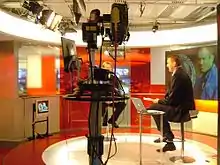
For the re-launch, the studio was completely redesigned. The newsroom in the background was laid out and separated from the studio by glass panels that were slightly frosted. The studio was split into three sections to allow a more flexible presentation style;[18] the middle section contained the main desk and flanked by two screens behind the desk to the left and right;[9] the left hand segment featured a small round standing studio for delivering headlines and news roundups while the right hand segment featured a round standing set with a screen behind, usually used for sports, business and in depth review. The whole set was designed by Simon Jago.[16][17][27][28][29]
In 2005, the countdown was changed following a test on BBC World. The new sequence showed the elements involved in bringing news to the air, including footage of BBC journalists, cameramen and production staff around the UK and the world. The new sequences were the brainchild of Mark Chaudoir of BBC Broadcast and were specially shot on DV to give the shots a gritty look. Overlaid on the footage are red bars representing the news being broadcast between satellite transmitters worldwide. A red translucent bar extended from the left hand side of the screen containing the countdown clock featuring the seconds and marking every frame (PAL timecode).[16][30]
2007 Clamshell
In 2007, the play-out systems for BBC World and BBC News 24 were upgraded and replaced. As a result, the channels presentation was upgraded to keep the look fresh on 22 January 2007.[31][32] This new look was subsequently rolled out to the other BBC News bulletins the same year.[33]
The new idents had the same theme as the previous look, but the whole look had been upgraded with new 3D glossy graphics. The new ident began with a close up of the rotating red and black globe over Europe, South Asia and Australia while the strands of news seen in the countdown circle the world. The ident then pulls out to a full view of the globe as a single 'BBC News' ribbon moves backwards across the globe and the red segments form the clamshell shape. The numeral appears last, appearing from the background outwards. The numeral is now pure white and has a small reflection immediately below the numeral. The BBC News one-line logo is still present at the bottom of the ident. The numeral would be removed prior to programming simulcast on BBC World.[33][34]
The channel graphics changed quite considerably for this new look. The channel name was returned to the one-line variation seen previously and placed at the bottom left of the screen just inside the 4:3 safe zone of the 16:9 widescreen picture; the white logo was contained inside a dark red box that extended to the far left of the screen.[31][33][34] To the right of the logo was a white bar containing a, now fully adopted, news ticker.[31][33][34] News stories appeared in black and were separated by the BBC logo as previous. The clock was originally located to the left of the BBC News 24 logo, however in February 2007, due to complaints from viewers that the clock was cut off a 4:3 screen,[33] it was moved and contained within a black box at the very left of the white news ticker.[31][33][34] Above the logo and ticker was the information about the story and the people involved.[34] The headline itself was contained within an opaque dark red stripe crossing the entire picture, while the further information was added below in a translucent black section.[33][34] The design of the live broadcast tag remained the same with the exception of a darker colour red used.[33][34]
Promotions for the channel remained relatively the same as previously with two main differences: the BBC News 24 box logo was moved to the left hand corner of the screen and any information given at the end of the promotion was added at the bottom above and below a red line that extended from the logo across the screen.[7]
The countdown was retained in its entirety upon its launch in January 2007,[33][35] but was tweaked slightly in 2008 when the BBC News 24 logo was overlaid on the sequence and the time was moved to the bottom right corner of the screen and overlaid directly onto the image.[33] It was about this time that the sequences were updated with new images of the BBC journalists and production staff.
The studio set was retained from the last look with no major modifications made. The furniture was a slightly deeper shade of red to match the new graphics, but apart from this the three section set was retained.[31][33]
2008 White look
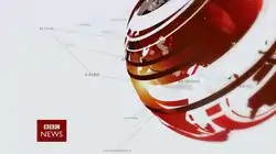
In April 2008, the entire BBC News department was reorganised at a cost of £550,000.[36][37] As part of this, a new look was commissioned by Mark Byford, designed by Lambie-Nairn and the BBC News designers,[38] featured a new remix of the theme by David Lowe and was subsequently applied to the whole BBC News output.[37][38] The result of this was that BBC News 24 was renamed as BBC News and referred to on air as the BBC News Channel.[37][38] This was as a result of a survey which revealed that the majority of the population referred to the channel as News 24 and saw the channel as inferior to the main news bulletins.[37]
The new titles feature an abstract globe made out of the continents and given shape by pulsating rings of a red colour; the ident itself features the globe coming together from many different angles and ending with the globe fully formed on the right of the screen.[5][36][37][39][40] The new BBC News box logo was also added to the bottom left corner of the screen and featured the word 'News' below the BBC logo.[5][37][39][40] The box look fits with the other brands of the BBC and allows cross promotion of the channel. In addition to the main ident a second short animation, called a sting, was used. Stings had been used previously by the channel, however mainly as a break between headlines. In the current look, the red globe is used only at the beginning of bulletins themselves whereas the sting is to identify the channel or to introduce news related programming into the schedule, such as Click.[37][39] This sting involves each of the continents appearing in the centre of the screen as each pulsating ring passes over it, ending up with a full grey and white globe overlaid with the BBC News logo in the centre of the screen.[37][39][40]
The re-launch also saw a modification in the channels DOG and Aston design. The one-line BBC News logo was now used as the channel DOG and remained at the bottom left of the screen, however inside the 4:3 safe zone, inside a deep red box matching the same colour as the box logo design. To the immediate right, the channel clock was encased in a black box with white text and running from there to the far right of the screen is the news ticker, now grey in colour with white text. The ticker subject would rotate up from the far left side of the ticker and dissolved out once the news began to scroll across, separated by large dots. Above all this would be a double thickness white box containing any information, headlines or people identification, in which case the person’s name or headline would appear in bold in the top of the box. If a live broadcast occurred, then this would be denoted by a red 'LIVE' identification in the top left corner of the screen with the location of the broadcast listed in a black box to the right. In the case of breaking news, the Aston would change colour accordingly. If breaking news appears on the ticker, then the ticker box would become red, as would the main aston itself which would switch to a red box with white text. Also in these occasions, another smaller box would be added on top of the main aston and aligned left to indicate the story was breaking; this smaller box was white with bold red text.[37][39][40][41]
Promotions for the channel used a similar style to that used previously, with the BBC News box logo appearing in the bottom left corner of the screen throughout, with end boards frequently over the white globe background. However, promotions for the channel itself have become less frequent as the adoption of the same logo and idents for all news bulletins causes confusion when promoting the service as to which bulletin or service the promotion is referring to. At the same time, BBC News as a whole organisation, systematically adopted Gill Sans as the typeface for all graphics and logos, following the use of other typefaces in previous years.[37]
The countdown style was retained for the new look. The countdown still featured journalists and production crew filming the reports, with the red News beams still seen being broadcast from transmitters and satellite dishes. The timer has remained in the bottom right corner and still records frame (PAL timecode), but changed to use the Gill Sans font in line with the rest of the channel, and also adopted the BBC News box logo in the bottom left corner of the screen instead of the DOG used in the previous look. The countdown concluded by linking directly into the sting animation.[37][40][42]
One of the most dramatic changes was as a result of the set change. Following the feedback stating that BBC News 24 was less authoritative than the main news bulletins, the newsroom was abandoned. The channel moved into Studio N6 in Television Centre; the set there had been in use for approximately a year, and featured a single desk on a raised platform in the middle of the rectangular studio, with video walls running round the centre of all the walls.[37][40][41] As a result, an image or graphic could appear anywhere on the many screens behind the presenters, allowing a great deal of flexibility in the arrangement of the channel and the presentation of news stories and of business and sports news.[37]
.png.webp)
2013 White look
Following BBC News' move to Broadcasting House on 18 March 2013, the on-screen presentation of BBC News was refreshed. The main titles remained the same however the channel logo was made smaller and stayed on screen for a few seconds after the titles. The channel's astons were altered and the font was changed from Gill Sans to Helvetica Neue. Also, a new countdown sequence was used, this time featured more red beams and report filming, and the countdown and opening title music is slightly modified.
Channel production was changed to HD, although this was only visible during BBC TWO HD simulcasts prior to the 10 December 2013 launch of BBC News HD.[43]
2019 Reith redesign
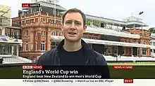
On 15 July 2019, the BBC rolled out its new on-air look replacing the layout seen since 2013, unifying the presentation used online and on other BBC on-air properties across news bulletins, the BBC News Channel, BBC Breakfast and local news bulletins. The new layout makes use of the BBC Reith typeface extensively, much like that used on other BBC channels, for example BBC Two. Text is generally larger, notably with headlines, with containing boxes strongly contrasting with the background, taking up more space on the screen, something that has drawn criticism for often obscuring the content behind. The BBC cites these changes as improving readability, making content easier to read on smartphones and tablets, for example on the BBC's official YouTube channels where content is often ripped straight from TV. As part of this redesign, the BBC replaced the long-used headline 'ticker', replacing it with headlines that scroll from the bottom individually, one at a time.[44]
BBC Parliament
1998 Water look
BBC Parliament took over from the cable-only Parliamentary Channel on 23 September 1998, transmitting sessions of the House of Commons, House of Lords, Scottish Parliament, Welsh National Assembly, and the Northern Ireland Assembly among other programmes of political interest.[45][46] Upon launch, the channel was available on cable, satellite and on digital terrestrial television, however the latter platform had insufficient bandwidth to allow the channel to transmit pictures, and it was restricted to sound-only transmissions with a fixed caption identifying the channel.
The channel's launch identity featured the channel logo in the centre of the screen over a background similar in style to water and accompanied by an orchestral musical score. The channel logo consisted of the BBC logo with the channel name 'Parliament' written to the right in white upper case text, as common with all other BBC channels at the time.[45][46]
The BBC Parliament logo would also appear as a Digital on-screen graphic (DOG), located in the top left hand corner of the screen and present for all programmes.[45][46] Accompanying coverage were Astons, graphics at the bottom of the screen, that provided information on the speakers in the coverage. These astons consisted of a black bar, upon which information such as the speakers name and party affiliation would be shown at opposite ends of the bar, and a box beneath for additional information related to the speech or to state the constituency depending on which house was being broadcast.[46] This large box would be colour-coded according to house - green for the House of Commons,[46] red for the House of Lords and additional colours for other committees and coverage. On the occasion that the broadcast scenes were not live and instead recorded, a 'R' would appear encased in a circle in the top right corner of the screen.[46]
Prior to channel programmes, short idents known as 'stings' were used to introduce the programme. These featured the BBC Parliament logo at the bottom of the screen with the programme title in the centre against the water background of the ident.[46] This same background was used over programme menus and other generic channel information, however in these cases the channel broke with common BBC style by aligning the text right and by not including the channel logo at the bottom of the screen, although the logo was present through the channel DOG.[46] The channel did adhere to common practice with promotions however, with the BBC Parliament logo present throughout the promotion at the bottom of the screen and with programme details appearing centred above the logo at the end of the promotion.[45][46] The typeface used by the channel was Gill Sans, in line with the rest of the corporation.[45][46]
2002 spiral
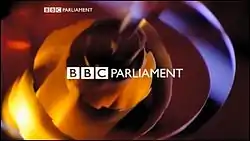
In 2002, BBC Parliament underwent several changes. On the DTT platform, the channel's bandwidth was increased enough to allow a quarter-screen picture to be broadcast, with the remaining screen space taken up by commentary of the channel. The channel's output was also upgraded to 16:9 widescreen, one of the last BBC channels to do so. As a result of these changes, a stronger presentational package was adopted. Created in house by BBC News, the new ident would represent the "inner workings of Parliament", through the depiction of the mechanisms of Big Ben and the design inspirations of the Palace of Westminster.
The new ident featured a rotating coil of metal, with teeth cut into the outside edges of the spiralled coil.[45] Pulsating rings would also be emitted from the coil as it spun, reflecting the BBC News style at the time, and the camera angle would often change position throughout the ident.[45] The ident ended with the one-line BBC Parliament logo appearing in the centre of the screen.[45] The ident itself was a filmed model, built and shot at Pirate by Martin Godward and lit by Tony May with post production by SVC.[47] The soundtrack was by David Lowe and was similar to the BBC News theme of the time and reflected the similarity between the channel and the BBC News service.
The channel DOG survived in the same one-line form and in the same location in the top left of the screen.[45] The channel graphics were advanced upon the re-launch from the original designs. The astons featured a red box crossing the screen with a translucent shaded area below, with both intersected by a vertical box on the left-hand side of the screen and running between both regions.[45] The red box at the top would contain the motion being passed or the event itself, such as Prime Ministers Question Time, while the area below would feature information about the act or the session or the names of the people speaking; in these cases their name would feature in bold with their party and seat below.[45] The cross section box would feature the date of the debate on the top line in an orange box with a pictorial reference below, usually the logo, to represent the house, assembly or parliament being broadcast.[45] In the case of an outside address, such as to a press conference or another country's parliament, then a pictorial camera was used instead.
Channel promotions originally featured the generic BBC style featuring the BBC Parliament one-line logo present during the whole promotion, with further information appearing centred at the end.[45] However, after some time the promotional style changed to a box style, where the 'Parliament' name was shown below a BBC logo and contained inside a box of a deep red colour to match BBC News 24 at the time. This box would remain present throughout the promotion in the bottom left corner of the screen. Programme menus were frequently used and originally consisted with the same styling as previous, with the menu moved towards the centre of the screen.[45] However, this was later changed so that the programme names were located in a shaded box and that the date was made smaller and located in a red bar running across the upper screen. Often, pictures representing the titles of the programmes were used as inserts against the spiral background as 'Next' graphics. The channel font was originally Gill Sans, as used previously, however some elements of the channel began to use different fonts, such as Arial - mainly for aston graphics and menus; the logo and promotion font remained Gill Sans.
2009 Cogs
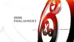
In April 2009, BBC Parliament was rebranded and brought up to date and more into line with BBC News output. The new design was by Lambie-Nairn and the music was by David Lowe.
The new ident featured the idea of cogs, with numerous cogs inside each other turning and twisting as viewed on screen from different angles; the centre cog is solid and features an 'X' cut out of the centre.[45] The whole sequence represented the inner workings of Parliament itself, with the centre cog used to mark an individual vote at the centre of government. The cogs were shown on a white background, with red elements integrated into the sequence with the cogs being lit red at the end of the sequence.[45] The cogs would form together to the right of the screen at the end of the sequence, mirroring the location of the globe in the 2008 BBC News sequences.[45] The channel name would appear in the final seconds of the ident with the name 'Parliament' written below a BBC logo in grey and bold; the logo was aligned left, rather than centred, and was placed in the middle left of the screen.[45] Also present throughout the idents were geographical place names linked together by thin grey lines; this reflects back to the BBC News look who use place names in their opening titles but also to BBC Parliament's field of operation as all place names are locations of government the channel covers: Westminster, Holyrood, Cardiff Bay, Stormont, Strasbourg and Brussels.[45]
The channel aston and DOG changed significantly with the latest re-launch, with a new style similar to the BBC News Channel in use. The BBC Parliament DOG retained its one-line format, however the 'Parliament' name was made bold, and was moved to the bottom of the screen; located to the left of the screen in a red box, it formed an integral part of the aston graphics.[45] To the right of this box another black box of the same height contained the date of the debate. A grey box then extended to the right of the screen in which the debating location was placed, such as House of Commons, in upper case. Above this lower bar, a translucent white box would contain information about the debate and the members speaking, with the members name in bold and their party affiliation and seat listed below. On top of this, a red translucent box, aligned to the left of the white box, would name the debate or event in progress. In the event of a live broadcast, a red box will be displayed in the top left corner of the screen containing 'Live'. In some instances, a grey box containing 'Recorded' is displayed in cases of old debated being broadcast.
Channel menus would take place over the cog graphic, with the cog rotating in the centre of the screen, while the menu is displayed on the right side of the screen against a shaded white area with the BBC Parliament DOG in the red box present at the bottom.[45] This centralised cog graphic would also link into live coverage of a debate, with the name appearing in the centre of the cog and the BBC Parliament logo present at the centre bottom of the screen without the red box surround.[45] The look also reasserted Gill Sans as the only typeface used on the channel, in line with the internal BBC corporate style and that of BBC News.[45] This package last appeared on 10 October 2016 prior to the launch of the current look.
2016 "Cogs and colours"
On 10 October 2016, the BBC News red and gears look gave way to a new on-screen imaging package with colourful idents and softer, orchestral music led by an oboe soloist with plucked strings, percussion and elements of a chorus. Here, the cogs from the previous look are re-imagined as free-wheeling, less-clock-like, spinning on an invisible axis in a layered formation, overlaid on blocks of translucent colours, flipping over with a mix of 3-D cog wheels and line-drawn cogs. The main ident between shows is now silent, with the cogs flipping over and spinning not unlike the former ITV Rediffusion logo. The effect is less mechanical and less bombastic than the previous ident, more pastel-shaded and includes images of the parliaments of the UK home nations and the EU parliament. The transition to the new look was marked by a presenter sitting in the editing suite throwing a fader, to reveal the new look which was played out in full. The BBC Parliament identity is different from the previous one, with upper and lower case lettering and a softer, grey look similar to the main BBC News.[48] The transition to the new package did not coincide with the beginning of the British conference season, which meant that coverage of the SDP Conference of October 2016 had the visuals of the 2009 look overlaid with the new 2016 music.
The on-screen graphics for live and recorded sittings remained unchanged, similar to the BBC News channel look.
BBC World News
1995 Flags
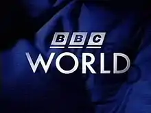
The channel originally launched as BBC World on 16 January 1995 at 19:00 GMT. The new channel was formed following the split of BBC World Service Television into the international news and current affairs channel BBC World and the entertainment channel BBC Prime.[49]
The channel's launch identity was designed by Lambie-Nairn and consisted of various elements of flags and of fictitious flags themselves.[49] The ident consisted of various elements of flag designs, such as coloured stars, crosses, parallel lines and rectangular coloured flag segments moving off the screen in all directions to reveal the BBC World logo against a blue flag background.[49] The BBC World logo at the time featured the BBC logo over the channel name 'World' written in the typeface Twentieth Century, the typeface used by the entire channel at the time.[49] To give the impression of the logo floating atop the flag, a shadow of the logo was added below.[49] The music featured an orchestral score heavy on Brass instruments. The introduction of the news programmes themselves also consisted of similar elements, with the flag segments seen moving across the globe before forming behind the channel name in a translucent rectangle with the BBC logo on top. This was deliberately intended to give the titles and the ident a similar look and to link between them.[49]
The channel logo featured as the channel Digital on-screen graphic (DOG) also, which was located in the top left corner of the screen and identified the channel.[49] The channel didn't use any astons, or graphics present at the bottom of the screen to provide information, that were permanently placed there. Graphics consisted solely of a bar running across the bottom of the page which was multi-coloured to match the flag designs, but muted by a translucent finish to appear more appropriate for the bulletins.[49]
The channel promotional style was consistent with the remainder of BBC Television output, consisting of a sidebar that appeared at the end of the ident containing an image from the BBC World flags ident. The programme name would appear at the bottom of the screen, aligned left, while the programme times were placed in the sidebar to reflect different world areas. Various other channel continuity elements also used the flags, such as 'Coming up' and 'Next' graphics, as well as break bumpers and break fillers. In addition, some promotion stings were also used which revolved around people in a colour filtered environment before the promotion ran.[49][50]
The studio set at the time featured an extended computer generated set used by the BBC domestic news at the time. This featured a desk which was extended by computer graphics in wide shots of the studio, and featured an artificial studio environment.[49]
1997 Flags
To coincide with the launch of BBC News 24 and the BBC's corporate rebrand as a whole, BBC World refreshed its identity. Designed by Lambie-Nairn, the new look kept the flags theme but updated it and brought it into line with BBC News 24. The ident transitioned between different fictitious flag designs against an orchestral soundtrack, composed and produced by Joe Glasman of HUM music production, as part of a suite of music for BBC World, which was different from BBC News 24 and slightly more subdued than the previous look.[51]
BBC World's logo now followed the corporation logo guidelines, which consisted of the new BBC logo followed by the channel name 'World' in upper case to the right of the logo.[51] This same logo was also used as the channel DOG, located in the top left corner of the screen throughout all programming.[51] The channel uses few on screen graphics and astons for news coverage; this is partly a result of the differing time zones across the broadcast area so the use of a clock is inaccurate and impractical. When introducing people, or for a summary of the headlines, a single box was used which features one of the flag designs in the far right of the box and a background of a combined blue design.
The channel promotions for upcoming programmes followed the same guidelines as the rest of the television network and consisted of the BBC World logo located at the bottom of the screen throughout the promotion, with information being added on top of the logo at the end.[50] The channel font was changed to Gill Sans, also used by the BBC as a whole. Also used between breaks in programmes, when adverts were not inserted by some operators, were break fillers consisting a white flag background and a stripe across the top in a bright colour containing the information topic.[51]
Some bulletins on the channel were also simulcast on BBC News 24, often during the overnight GMT slot, and in these cases the bulletin used a generic 'BBC News' one-line logo placed in the centre of the screen. In these cases, the idents played with the BBC News 24 music version and were presented from the BBC News 24 studio.[51]
2000 Cream and Red look
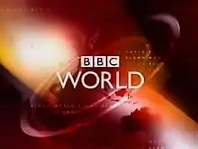
On 3 April 2000, BBC World was given a look that was based upon those being used by the rest of the BBC domestic news bulletins. Lambie-Nairn designed the new look which differentiated between the ident used on the channel and the titles for the bulletins.[52]
The ident used prior to programmes on the channel featured a rotating ellipse shape against a rotating globe background upon which the BBC World logo appears on top in white.[52] In contrast, the news bulletins used the same cream and red colour scheme used by the rest of the BBC News network, with the exception of Breakfast News. These titles features pulsating rings moving over a small cream-and-red spinning globe in the centre of the screen from various angles while place names of various cities appear around.[11][52] The globe finished inside two intersecting red ellipses, before the BBC News one-line logo appears in the centre of the screen and the BBC World one-line logo appears at the bottom of the screen.[11] The music was composed by David Lowe and was used on the rest of the BBC News network.[52]
The channel used a DOG in the form of the channel logo in the top left of the screen.[52] Beneath this, a red box with 'Live' inside would be added in the event of a live broadcast on the station.[52] The aston graphics would only appear with certain information and featured a translucent purple colour box, extending from the right to the centre left of the screen, while the headline strip was a solid cream colour with bold red text.[52]
Promotions for the channel still used the BBC World one-line logo at the centre bottom of the screen throughout.[50][52] The break filler used the same background as the ident as well as a similar music remix to the ident itself. Each item was separated by a line of scrolling letters moving right across the screen, leaving behind the name of the upcoming strand such as Business, Coming up, Sport, before the scrolling letters move across the screen again removing the small word.[52] The strand name would be placed in the top right corner of the screen with the information centred in the screen. Gill Sans was retained as the font on the channel.[52]
In addition to the filler, a countdown was used by the channel for the first time. The countdown included a rotating globe in the left side of the screen, while a large italic numeral counted down the seconds until the hour. The soundtrack accompanied the seconds and was a remixed variation of the news theme. As the countdown reached five seconds, a beep accompanied each second in a similar fashion to the BBC Pips; this was used as an inspiration to the news theme.[52]
On the occasions that BBC World simulcast with BBC News 24, a generic BBC News graphic, used for the generic bulletins on BBC Television, was used instead of the normal news graphic.[52]
To accompany the new look, BBC World swapped sets with BBC News 24, so that BBC World now used thusemall newsroom that had been used previously by News 24. The set featured the front desk with two flat screen televisions to either side of the desk, mounted on pillars. Immediately behind the presenters and only separated by a railing was the live newsroom set, complete with televisions embedded in the back wall and given a red makeover.[52]
2003 Orange clamshell
Introduced on 8 December 2003, a new in house designed look was launched on BBC World.[53] This new look brought back a similarity between the idents of the channel and the news graphics. The news ident was exactly the same as on BBC News 24 and consisted of a globe surrounded by orange segments and the movement of a stream containing the main headline around the globe, before the globe gets smaller and moves into the familiar 'clamshell' design.[53] At the end, the BBC World one-line logo is added at the bottom of the screen, while a larger BBC News one-line logo is overlaid onto the globe in the centre of the screen. The ident consists of the globe up close surrounded on all sides by the orange segments and "BBC News" ribbons; the globe then shrinks back into the animated clamshell design before a large BBC World logo is added at the bottom of the screen along with the station tag line 'Putting News First'.[53]
The channel DOG for the look was relocated during news bulletins to a two-line logo, set within a red box with a spinning globe in the background.[53] At the bottom of this box, the BBC World news URL was added. Astons consisted of a black box extending from the bottom of the channel logo box to the right of the screen with a red ending to the box.[53] In the event of breaking news, a thick red box would be added above this other aston, containing the headline story.[53] Later on, a ticker was added below the box in white with the news theme box in black and with the headlines separated by the BBC logo.[53]
The break filler was again changed with the look; an area to the left of the screen was devoted to news headlines or promotions for upcoming programmes while to the right small boxes contained promotions for online information and the latest stock market figures. The bottom of the screen showcased the next two programmes and their air times, while the background featured panning shots over orange global continents. As seen on the domestic channel, BBC World began to change their font, making greater use of the Arial font with the Gill Sans logo.[53]
A new countdown was also introduced with the look, featuring an orange globe rotating while the orange logo segments rise and fall around the globe, with the countdown seconds viewed on the globe itself as shaded numerals. After five seconds, the numerals disappear from the globe as the globe shrinks back into the BBC World ident, providing a seamless link. The music used is another variation of David Lowe's theme, however with more exotic themes inserted into the music and a greater emphasis on the second markers also. The set for the look was retained unchanged until 2006.[53]
In 2005, the countdown was changed to a new sequence that showed the elements involved in bringing news to the air.[53] These mainly involves footage, specially shot on DV for a gritty texture,[53] of BBC journalists, cameramen and production staff around the UK and the world collecting news, while red beams are seen around the sky as that news is being broadcast.[53] The new sequences were envisioned by Mark Chaudoir of BBC Broadcast.[53] A red translucent box extended from the right hand side of the screen containing the countdown clock featuring the seconds and marking frame (PAL timecode).
In 2006, the graphics were updated to a glossier news ident package, and the colours were updated so the orange was replaced with red. In addition, the ending of the news ident was amended so that a large BBC World one-line logo was placed in the middle of the screen, while a small BBC News logo was placed at the bottom of the screen. The astons remained the same for the look however. The biggest changes were to the set, which now featured a large oval desk with one screen behind and to the left and separated from the newsroom by a frosted glass railing.[53]
2007 Clamshell
In 2007, a new play out system for BBC World and BBC News 24 was installed and as a result the graphics were again altered. 3D glossy graphics were now used to depict the whole globe package.[32][54]
The news ident consisted of the clamshell look as before, but began with close up globe shots over Europe, South Asia and Australia as news light beams traverse round the globe, before pulling out to see the globe spinning rapidly into place within the clamshell graphic and the BBC World one-line logo appearing at the bottom of the screen.[54][55] Meanwhile, the generic channel ident consisted of a close-up of the globe, before panning left until the globe is located on the right side of the screen. A large BBC World one-line logo and tagline follow on the left side of the screen.[56]
The astons were changed as part of the new look, with the BBC World logo returned to one-line form and placed in a red box at the very bottom of the screen within the 4:3 safe zone, with the box extending to the left of the screen. The remainder of the bottom of the screen is taken up by a white news ticker, separated by BBC logos. Above this, shaded black areas are used for information with glossy dark red boxes added on top in the case of some programmes and breaking news.[54][55]
Channel promotions now featured a BBC World box logo in dark red that was slightly elongated to either side so that the box was wider than on other BBC channels.[56] This box, alongside the station tagline below, could be seen in the bottom right corner of the screen throughout.[56] The promotion ended with no particular style and instead used the programme title sequence in place of the programme name.[56] The break filler originally retained the style as used previously with updated channel logos,[54][56] however it was changed around 2008 to a new style.[54] This new layout featured two boxes adjacent to each other extending of each side of the screen. Where they meet in the centre left of the screen, the corners of the boxes curve with a slight gap between the two. The left hand box contains the topic of the information, e.g. News or Markets, placed sideways towards the right, while the right contains the information itself. Promotions included in the break filler took up the whole of the screen and shrank back as a smaller screen into a widened left hand box. The BBC World one-line logo in these occasions was located in the left hand corner of the screen. The background to each item varied and featured an image faded into a red toned background in the top and right sides.[54]
The countdown remained the same following the new look with no logo present on screen and only appeared when the final red bar engulfed the screen at the end of the countdown.[54][57] The studio set also remained the same, albeit with slight colour modifications to make the reds deeper.[54]
2008 White look
As part of the April 2008 changes that rebranded BBC News 24 as the BBC News channel, BBC World was renamed BBC World News. This gave the channel a closer link with the main news bulletins of the same name and firmly focused the channel on that aspect of broadcasting. The new look matched the domestic BBC News output while also mirroring the looks soon to be applied to the BBC Persian and BBC Arabic television stations.
The titles featured exactly the same on screen look as BBC News channel and featured an abstract globe of red pulsating rings against a white background with interconnected place names. The change of name also resulted in a new box logo for BBC World News; this featured the 'World News' name on a separate line for each word below the BBC logo in a red box, matching the colour of the BBC News department logo as a whole, and of the same size as the other BBC box logos used domestically. The new logo was placed in the bottom corner on the ident. For junctions into non news programming, an ident featuring the globe and box logo appearing in the centre of the screen as each pulsating ring pass over it, was used. The David Lowe music was retained, sharing a similarity with the domestic channel while appealing to more multicultural audiences.[58]
The channel DOG and aston was also changed in line with the BBC News channel, consisting of a one-line BBC World News logo inside a red box in the bottom left of the screen, within the 4:3 safe zone, with a grey news ticker from right of the logo through to the right of the screen. On top of both, a large white box would appear with headlines and additional information, including the name of the reporter or interview subject.[58] In the case of breaking news, this large box would become red, and a smaller white box with bold red text would be added to the top left of this box declaring the news as such. The ticker would also become red if it was scrolling through breaking news stories. In the case of a live broadcast, the red 'Live' box would be added to the top left of the screen, occasionally accompanied by the local time in an adjacent black box.[58]
In addition to the generic news bulletins, other programmes with specific audiences were launched such as GMT, The Hub and World News Today which broadcast news live but to a different audience. The programmes all had distinct opening titles featuring the BBC World News box logo in the bottom left of the screen, mirroring the main titles for the bulletins. While these live programmes were on air, a box containing the programme name in bold white and a background based from the programmes' opening titles, was placed above the BBC World News logo in the aston design. Also, the usual astons for headlines and information were suspended with breaking news appearing in the ticker only.[58]
Promotions for the channel usually consisted of the BBC World News logo located in the bottom right of the screen throughout.[58] Break fillers retained the existing design with a few modifications; the unique background image was moved from the very background to inside the boxes with the information and was replaced in the screen background by a white and light grey version of the pulsating rings globe. The BBC World News box logo is also present in the bottom right of the screen throughout.[58] Along with the rest of the BBC News organisation, the channel adopted the font Gill Sans for all on and off screen use.[58]
The channel still used the countdown as before, but the red box containing the numerals was removed and the numerals were changed to type Gill Sans. In contrast with the BBC News channel, BBC World News doesn't feature the channel logo until the end of the promotion, when the channel ident and sting is linked into instead.[58]
Following the repositioning of the domestic BBC News channel, the channel moved from its newsroom set to N6 at BBC Television Centre, freeing the way for BBC World News to move into the old newsroom in N8. The change occurred shortly after the rebrand, allowing time for N8 to be altered. The new set was rectangular and featured a desk with a frosted glass screen behind, imprinted with the BBC News abstract globe design and separating the newsroom, and had a large screen taking up the entire left side of the studio.[58] This studio was primarily used, however another set was used, featuring a circular set with a small desk and a frosted glass screen behind. This screen displayed coverage of other channels in the newsroom, but due to the frosted glass was indistinguishable.[58]
2013 White look
Following BBC News' move to Broadcasting House, the on-screen presentation of BBC World News was refreshed in January 2013. The main titles remained similar after production moved to HD whilst the channel's astons were altered and the typeface was changed from Gill Sans to Helvetica. The BBC World News box logo is shown throughout the countdown, similar to BBC News. In 2014, the countdown has been redesigned again, with the BBC World News box logo showing its slogan, "Live the Story," at the bottom left of the screen.
In 2019, alongside the BBC News channel, World News received a Reith Refresh. The changes were almost identical, apart from the missing clock on this channel. The "Live the Story" slogan was removed from the countdown.
References
- Walker, Hayden. "BBC News 24 1997". TVARK: The Online Television Museum. Archived from the original on 5 May 2012. Retrieved 22 December 2011. Contains video evidence of channel presentation.
- "BBC News Channel November 1997 - October 1999". The TV Room. Archived from the original on 4 February 2013. Retrieved 23 December 2011. Contains pictorial evidence of channel presentation.
- "About BBC News 24". TV Home. Archived from the original on 1 December 2011. Retrieved 28 December 2011.
- "1997 - 1999 Images". TV Home. Archived from the original on 8 February 2012. Retrieved 28 December 2011. Contains pictorial evidence of channel presentation.
- "BBC News through the ages". BBC News. 21 April 2008. Retrieved 28 December 2011.
- "1997 - 1999 Graphics and Astons". TV Home. Archived from the original on 7 February 2012. Retrieved 28 December 2011. Contains pictorial evidence of channel presentation.
- Walker, Hayden. "BBC News 24 Promotions". TVARK: The Online Television Museum. Archived from the original on 5 May 2012. Retrieved 22 December 2011. Contains video evidence of channel promotions.
- "1997 - 1999 Studio". TV Home. Archived from the original on 8 February 2012. Retrieved 28 December 2011. Contains pictorial evidence of channels studio.
- "BBC news in focus". Guardian. 18 April 2008. Retrieved 5 July 2012.
- Walker, Hayden. "BBC News 24 1999". TVARK: The Online Television Museum. Archived from the original on 18 March 2012. Retrieved 22 December 2011.
- "1999 - 2003 Titles, Countdowns and Stings". TV Home. Archived from the original on 8 February 2012. Retrieved 28 December 2011. Contains pictorial evidence of channel presentation.
- "1999 - 2003 Original Graphics". TV Home. Archived from the original on 8 February 2012. Retrieved 28 December 2011. Contains pictorial evidence of channel presentation.
- "1999 - 2003 Studio 99-02". TV Home. Archived from the original on 8 February 2012. Retrieved 28 December 2011. Contains pictorial evidence of channels studio set.
- "1999 - 2003 Later Graphics". TV Home. Archived from the original on 8 February 2012. Retrieved 28 December 2011. Contains pictorial evidence of channel presentation.
- "1999 - 2003 Studio 02-03". TV Home. Archived from the original on 8 February 2012. Retrieved 28 December 2011. Contains pictorial evidence of channel studio design.
- Walker, Hayden. "BBC News 24 2003". TVARK: The Television Museum. Archived from the original on 5 May 2012. Retrieved 22 December 2011. Contains video evidence of channel presentation.
- "BBC News Channel December 2003 - January 2007". The TV Room. Archived from the original on 4 February 2013. Retrieved 23 December 2011. Contains pictorial evidence of channel news presentation.
- "BBC News 24's revamp is launched". BBC News. 27 November 2003. Retrieved 28 December 2011.
- Wells, Matt (5 September 2003). "BBC takes on Sky with fresh look at News 24". The Guardian. Retrieved 28 December 2011.
- Hodgson, Jessica (12 March 2002). "Lambert to head BBC News 24 review". The Guardian. Retrieved 28 December 2011.
- "BBC news channel told to change". BBC News. 5 December 2002. Retrieved 28 December 2011.
- "Rolling revamp for BBC News 24". BBC News. 16 June 2003. Retrieved 28 December 2011.
- Wells, Matt (9 December 2003). "Sparks fly as BBC relaunches News 24". The Guardian. Retrieved 28 December 2011.
- "BBC News Channel December 2003 - January 2007 Graphics". The TV Room. Archived from the original on 4 February 2013. Retrieved 23 December 2011. Contains pictorial evidence of channel graphics and astons.
- "2003 Title Sequences". TV Home. Archived from the original on 8 February 2012. Retrieved 28 December 2011. Contains pictorial evidence of channel presentation.
- "2003 Graphics and Countdowns". TV Home. Archived from the original on 8 February 2012. Retrieved 28 December 2011. Contains pictorial evidence of channel presentation.
- "BBC News Channel December 2003 - January 2007 Sport". The TV Room. Archived from the original on 4 February 2013. Retrieved 23 December 2011. Contains pictorial evidence of studio layout.
- "2003 Studio Page 1". TV Home. Archived from the original on 8 February 2012. Retrieved 28 December 2011. Contains pictorial evidence of studio layout.
- "2003 Studio Page 2". TV Home. Archived from the original on 8 February 2012. Retrieved 28 December 2011. Contains pictorial evidence of studio layout.
- "BBC News Channel December 2003 - January 2007 Countdown". The TV Room. Archived from the original on 4 February 2013. Retrieved 23 December 2011. Contains pictorial evidence of channel countdowns.
- "BBC News Channel January 2007 - April 2008 News". The TV Room. Archived from the original on 4 February 2013. Retrieved 23 December 2011. Contains pictorial evidence of channel news presentation.
- Taylor, Sam. "Fine tuning". The Editors Blog. BBC News. Retrieved 28 December 2011.
- Walker, Hayden. "BBC News 24 2007". TVARK: The Online Television Museum. Archived from the original on 5 May 2012. Retrieved 23 December 2011. Contains video evidence of channel presentation.
- "BBC News Channel January 2007 - April 2008 Graphics". The TV Room. Archived from the original on 4 February 2013. Retrieved 23 December 2011. Contains pictorial evidence of channel graphics.
- "BBC News Channel January 2007 - April 2008 Countdown". The TV Room. Archived from the original on 4 February 2013. Retrieved 23 December 2011. Contains pictorial evidence of channel countdowns.
- Martin, Nicole (15 April 2008). "BBC news is given £500,000 makeover". The Telegraph. Retrieved 28 December 2011.
- Walker, Hayden. "BBC News Channel 2008". TVARK: The Online Television Museum. Archived from the original on 10 May 2011. Retrieved 23 December 2011. Contains video evidence of channel presentation.
- Horrocks, Peter. "New News". The Editors Blog. BBC News. Retrieved 28 December 2011.
- "BBC News Channel April 2008 - Present Graphics". The TV Room. Archived from the original on 4 February 2013. Retrieved 23 December 2011. Contains pictorial evidence of channel presentation.
- "New look for BBC News". BBC News. 21 April 2008. Retrieved 28 December 2011.
- "BBC News Channel April 2008 - Present News". The TV Room. Archived from the original on 4 February 2013. Retrieved 23 December 2011. Contains pictorial evidence of channel presentation.
- "BBC News Channel April 2008 - Present Countdown". The TV Room. Archived from the original on 4 February 2013. Retrieved 23 December 2011. Contains pictorial evidence of channel countdowns.
- BBC (9 December 2013). "BBC News - BBC launches five new HD channels". BBC News. BBC. Retrieved 8 May 2014.
The BBC has brought forward its launch of five new subscription-free HD channels in time for Christmas.
- "TV news graphics: a new look". BBC. 15 July 2019. Retrieved 15 July 2019.
- Walker, Hayden. "BBC Parliament". TVARK: The Online Television Museum. Archived from the original on 6 May 2012. Retrieved 22 December 2011. Contains video evidence of channel presentation.
- "BBC Parliament September 1998 - October 2002". The TV Room. Archived from the original on 4 February 2013. Retrieved 23 December 2011. Contains pictorial evidence of channel presentation.
- "BBC Parliament October 2002 - Present". The TV Room. Archived from the original on 4 February 2013. Retrieved 23 December 2011.
- "BBC Parliament - Launch of BBC Parliament's New Look". BBC.
- Walker, Hayden. "BBC World 1995". TVARK: The Online Television Museum. Archived from the original on 18 March 2012. Retrieved 22 December 2011. Contains video evidence of channel presentation.
- Walker, Hayden. "BBC World Promotions". TVARK: The Online Television Museum. Archived from the original on 5 May 2012. Retrieved 22 December 2011. Contains video evidence of promotions.
- Walker, Hayden. "BBC World 1997". TVARK: The Online Television Museum. Archived from the original on 5 May 2012. Retrieved 22 December 2011.
- Walker, Hayden. "BBC World 1999". TVARK: The Online Television Museum. Archived from the original on 18 March 2012. Retrieved 22 December 2011. Contains video evidence of channel presentation.
- Walker, Hayden. "BBC World 2003". TVARK: The Online Television Museum. Archived from the original on 5 May 2012. Retrieved 22 December 2011. Contains video evidence of channel presentation.
- Walker, Hayden. "BBC World 2007". TVARK: The Online Television Museum. Archived from the original on 5 May 2012. Retrieved 22 December 2011. Contains evidence of channel presentation.
- "BBC World January 2007 - Present Graphics". The TV Room. Archived from the original on 4 February 2013. Retrieved 23 December 2011. Contains pictorial evidence of channel presentation.
- "BBC World January 2007 - Present Miscellaneous". The TV Room. Archived from the original on 4 February 2013. Retrieved 23 December 2011. Contains pictorial evidence of channel presentation.
- "BBC World January 2007 - Present Countdown". The TV Room. Archived from the original on 4 February 2013. Retrieved 23 December 2011. Contains pictorial evidence of channel countdowns.
- Walker, Hayden. "BBC World 2008". TVARK: The Online Television Museum. Archived from the original on 18 May 2012. Retrieved 22 December 2011. Contains video evidence of channel presentation.
