Bulmer (typeface)
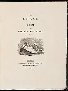
Bulmer is the name given to a serif typeface originally designed by punchcutter William Martin around 1790 for the Shakespeare Press, run by William Bulmer (1757–1830).[1] The types were used for printing the Boydell Shakespeare folio edition.[2]
 | |
| Category | Serif |
|---|---|
| Classification | Transitional |
| Designer(s) | William Martin William Bulmer Morris Fuller Benton (revival) |
| Foundry | American Type Founders Monotype many others |
Design and history

Bulmer is considered to be a late "transitional" face. Faces in this style, which became most common in the mid to late eighteenth century, were more crisply engraved than earlier faces. William Martin's typefaces show strong influence of the Baskerville typeface of John Baskerville which popularised this style in England, but with more contrast, bolder, narrower and with sharper serifs.[3] His brother Robert Martin had worked as Baskerville's foreman and William Martin probably worked for him too.[4][5][6] They also show influence of the crisp new "modern" faces, now called Didones, increasingly popular on the continent.[7][8] The typeface used "modern" figures, a recent innovation, at nearly capital-height.[9] Although Bulmer wrote in his preface to his edition of Poems by Goldsmith and Parnell that Martin would in future be able to offer a specimen of his typefaces, he is not known to have ever issued one.[10][1] However, they were also used by the Liverpool printer John McCreery and his successor G.F. Harris, who did issue a specimen book in 1807.[11]
The Bulmer typeface fell out of interest due to changing tastes in the early nineteenth century following the death of William Martin in 1815, but returned to interest in the twentieth century, when several revival versions were released. In this period, D. B. Updike described Martin's types as "delicate and spirited"[1] and Stanley Morison described it as "a variation on the Baskerville theme".[12]
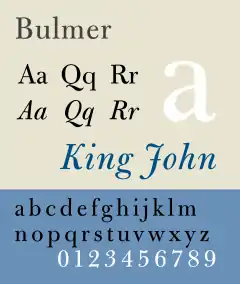
Bulmer's distinguishing characters are an uppercase R with a curved tail. Lowercase g has a small bowl and a curved ear; a heavier stroke weight on the lower right side of the bowl contributes to a sense of that character leaning backwards. Lowercase b's lower left corner is essentially symmetric to d. Uppercase italic characters J, K, N, T and Y have flourishes reminiscent of Baskerville's. The resulting face could show off the high quality of printing technology of the time: James Mosley has described Bulmer's editions: "The type was, however, only one ingredient in the ensemble which Bulmer managed to striking success...the good ink, the consistently good presswork and the superb Whatman paper are combined in one of the few really successful English attempts at printing in the grand manner."[3]
Versions
Metal type
Foundry type versions of Bulmer were made by the following manufacturers:[13]
- American Type Founders (1923-8, Morris Fuller Benton)[1][14]
- Intertype
- Lanston Monotype
- British Monotype (1937, for an edition of Dickens for the Nonesuch Press printed by R. and R. Clark).[15][16][17]
Digital versions
A contemporary digital revival (shown above right), supervised by Robin Nicholas at Monotype Imaging is based on the 1928 revival by Morris Fuller Benton. It features text and display optical sizes and oldstyle and lining figures.[18]
References
- Fiedl, Frederich, Nicholas Ott and Bernard Stein. Typography: An Encyclopedic Survey of Type Design and Techniques Through History. Black Dog & Leventhal: 1998. ISBN 1-57912-023-7.
- Jaspert, W. Pincus, W. Turner Berry and A.F. Johnson. The Encyclopædia of Type Faces. Blandford Press Lts.: 1953, 1983. ISBN 0-7137-1347-X.
- Lawson, Alexander S., Anatomy of a Typeface. Godine: 1990. ISBN 978-0-87923-333-4.
- Macmillan, Neil. An A–Z of Type Designers. Yale University Press: 2006. ISBN 0-300-11151-7.
- Updike, Daniel Berkley. Printing Types Their History, Forms and Use, Vol. II. Dover Publications, Inc.: 1937, 1980. ISBN 0-486-23929-2
- Neil Macmillan (2006). An A-Z of Type Designers. Yale University Press. pp. 24, 46, 132, 140. ISBN 0-300-11151-7.
- Unsigned (1830). "Memoir of William Bulmer Esq. (with a portrait)". Gentlemen's Magazine. Retrieved 23 October 2017.
- Mosley, James (1963). "English Vernacular". Motif. 11: 3–56.
For Martin to emulate [Baskerville's] style as closely as he did was a conservative move. His type is both bolder and narrower than Baskerville's, and the italic is looser and bulges curiously, but it bears a closer resemblance to its original than [earlier imitations by] either Fry's or Wilson's.
- Alexander S. Lawson (January 1990). Anatomy of a Typeface. David R. Godine Publisher. pp. 209–217. ISBN 978-0-87923-333-4.
- Bowman, J.H. (1998). Greek Printing Types in Britain: from the late eighteenth to the early twentieth / J.H. Bowman. Thessaloniki: Typophilia. pp. 99 etc. ISBN 9789607285201.
- Pardoe, F.E. (1975). John Baskerville of Birmingham : letter-founder and printer. London: F. Muller. p. 166. ISBN 0584103549.
- Daniel Berkeley Updike (1922). Printing Types, Their History, Forms, and Use: A Study in Survivals. Harvard University Press. pp. 124–5.
- Reed, Talbot Baines (1887). A History of the Old English Letter Foundries: With Notes, Historical and Bibliographical, on the Rise and Progress of English Typography. E. Stock. pp. 330–334.
- "The New Types". Printing. Walden, Sons & Mott. 1941.
As it first appeared in 1923, Morris Benton’s version of the William Martin original faithfully reproduced the fonts used by Bulmer in setting the foreword to his Poems by Goldsmith and Parnell published in 1795. The figures in these fonts were in modern form but scarcely higher than the middles of the lowercase in height, a circumstance which proved a definite limitation in modern display for all of its attractiveness in a page by Bulmer.
- Bulmer, William (1804). "Advertisement". Poems By Goldsmith And Parnell. London: W. Bulmer and Company, Shakspeare Printing Office, Cleveland-Row. Retrieved 23 April 2018.
The whole of the Types, with which this work has been printed, are executed by Mr. William Martin...who is at this time forming a Foundry, by which he will shortly be enabled to offer to the world a Specimen of Types, that will in a very eminent degree unite utility, elegance, and beauty.
- A specimen of the improved types of G.F. Harris, printer : (Successor to Mr. John M'Creery,) Houghton-Street, Liverpool. Liverpool: G. F. Harris. 1807. Retrieved 23 April 2018.
- Stanley Morison (1 October 2009). The English Newspaper, 1622-1932: An Account of the Physical Development of Journals Printed in London. Cambridge University Press. p. 201. ISBN 978-0-521-12269-6.
- Jaspert, W. Pincus, W. Turner Berry and A.F. Johnson. The Encyclopedia of Type Faces. Blandford Press Lts.: 1953, 1983, ISBN 0-7137-1347-X, p. 32
- Book of American Types: ATF Standard Faces. Jersey City, NJ: American Type Founders. 1934. pp. 60-61, 192–196. Retrieved 24 October 2017.
- McKitterick, David, ed. (1979). Stanley Morison & D.B. Updike: Selected Correspondence. Scolar Press. p. xxvii.
- Williamson, Hugh (1956). Methods of Book Design. Oxford University Press. p. 90.
The design was introduced in 1937 for the Nonesuch Press edition of the works of Dickens, and is available only in 11 and 12-point. Lining figures only are available.
- Gorman, Michael (2012). "The Nonesuch Dickens: A set of books at the intersection of art and commerce" (PDF). Caxtonian. 20 (10): 1–5. Retrieved 24 October 2017.
- Luna, Paul (1995). "Typeface review: Monotype Bulmer and Bulmer Expert Set". Bulletin of the Printing Historical Society: 30–31.
External links
| Wikimedia Commons has media related to Bulmer. |