Vincent Figgins
Vincent Figgins (1766 – 29 February 1844) was a British typefounder based in London.[1] After an apprenticeship with Joseph Jackson, he established his own type foundry in 1792. His company was extremely successful and, with its range of modern serif faces and display typefaces, had a strong influence on the styles of British printing in the nineteenth century.
Career
The main historical sources for Figgins' career, besides his own specimen books, are Literary Anecdotes of the Eighteenth Century by his friend and patron the antiquarian and printer John Nichols (1812),[2] Thomas Curson Hansard's textbook on printing Typographia of 1825, published towards the end of Figgins' career,[3] and A History of The Old English Letter Foundries by Talbot Baines Reed (1887), who knew Figgins' grandson.[4]
Figgins started his career as an apprentice to the typefounder Joseph Jackson from 1782 until Jackson's death in 1792, before setting up his own business.[1] According to Reed, who knew his grandson, Figgins was largely the manager of the foundry from about 1790 onwards due to Jackson's poor health.[4] He married Elizabeth and had the sons Vincent (d. 1860) and James, later an alderman and MP, Henry and four daughters.[5]
On Jackson's death, Figgins apparently could not afford to take the foundry over; it was instead purchased by William Caslon III, seeking to set up a foundry independent of his family's. Jackson's friend John Nichols encouraged Figgins to open his own foundry.[6] Figgins would many years later write to Nichols to thank him for his generosity during the beginning of his career:
I am greatly obliged to you for the very flattering mention of my name, but you have not done yourself the justice to record your own kindness to me: that, on Mr. Jackson's death, finding I had not the means to purchase the foundry, you encouraged me to make a beginning. You gave me large orders and assisted me with the means of executing them; and during a long and difficult struggle in pecuniary matters for fifteen years, you, my dear Sir, never refused me your assistance, without which I must have given it up. Do mention this—that, as the first Mr. Bowyer was the means of establishing Mr. Caslon—his son, Mr. Jackson—it may be known that Vincent Figgins owes his prosperity to Mr. Bowyer's successor.[2][4]
Figgins' foundry was established at White Swan Yard, Holborn, moving in 1801 to West Street, Smithfield.[7][5] His first important commission was to make a facsimile type for Macklin's Bible. Bensley, the printer of the Macklin’s Bible (the type for which was originally cut by Jackson) had decided to renew the type and have it correspond with the original. Instead of going to Caslon, who had Jackson's matrices, he asked Figgins.[6][1][3] Figgins was able to make a perfect recreation of the type. He then worked on a similar job to finish the Double Pica type in Robert Bowyer’s edition of David Hume's The History of England. This was being worked on by Jackson at the time of his death.
Figgins' company issued several specimens starting from a brief sheet in 1792[4] (although they were apparently not always accurately dated: watermarks indicated that Figgins continued to use a dated title page for some years),[1] with his sons issuing a specimen soon after his death in 1845.[8] Berthold Wolpe published a reprint of his 1801 and 1815 specimens.[9][10]
Perhaps the most bizarre aspect of Figgins' career was its beginning, in which one of his tasks was to finish a Greek font begun by Jackson for Oxford University Press that was to be cut into metal by a punchcutter, an engraver practitioner of a highly specialised trade. His son in 1855 claimed that his father’s career began in this way:
The mystery thrown over the operations of a Type-foundry, within my own recollection (thirty-four years), and the still greater secrecy which had existed in my father's experience, testifies that the art had been perpetuated by a kind of Druidic or Masonic induction from the first. An anecdote of my father's early struggles may illustrate this. At the death of Mr. Joseph Jackson, whom my father had served ten years as apprentice and foreman, there was in progress for the University Press of Oxford a new fount of Double Pica [24-point size] Greek, which had progressed under my father's entire management. The then delegates of that Press – the Rev. Dr. Randolph and the Rev. W. Jackson – suggested that Mr Figgins should finish the fount himself. This, with other offers of support from those who had previously known him, was the germ of his prosperity (which was always gratefully acknowledged). But when he had undertaken this work, the difficulty presented itself that he did not know where to find the punch-cutter. No one knew his address; but he was supposed to be a tall man, who came in a mysterious way occasionally, whose name no one knew, but he went by the sobriquet of 'The Black Man'. This old gentleman, a very clever mechanic, lived to be a pensioner on my father's bounty—gratitude is perhaps the better word. I knew him and could never understand the origin of his sobriquet, unless Black was meant for dark, mysterious, from the manner of his coming and going from Mr. Jackson's foundry.[11]
Wolpe investigated the topic of Figgins' engravers in the 1960s, and found in his records and an annotated specimen that Figgins often commissioned work from two engravers about whom little is known. They were named Perry and Edmiston (or Edmonston), who lived at Alfred Place, Cambridge Heath.[5] Wolpe concluded, however, that "who the mysterious 'Black Man'…was, we may never be able to find out."[9] John H. Bowman in his research on the history of printing Greek in Britain concluded that the story did not match Figgins or OUP's known output: "I have not found anything answering its description. It may be that it is a mistake [for another, Great Primer or 18pt, font] or indeed perhaps the difficulties of finding "the Black Man" were such that the type was never completed. I do not believe it can be the Double Pica that appears in Figgins' later specimens, for the style of that type would have been impossible at this early date."[12][13]
Besides his business career, Figgins was a councilman for the ward of Farringdon Without.[14]
Typefaces
Although Hansard perhaps over-optimistically felt in 1825 that Figgins had "strayed less into the folly of fat-faced, preposterous disproportions, than either Thorne, Fry or Caslon,"[3] the other leading London typefounders of the time, Figgins came to sell many innovative, aggressive display typefaces. Mosley suggests that the "unusually large range of lighter types" in his specimens suggest some reservations on his part towards the ultra-bold styles of the period, as does the line in his 1823 specimen book that asks the question "The increased fatness in JOB-LETTER is an improvement, but is it not in many cases carried to an extreme?"[1] He sold many ornamented and inline faces, including "fat face" designs and blackletter faces.[15] Figgins' career coincided with the rise of the mass-market printed poster and an increasing need for dramatic display typefaces, ones that were not simply magnified book typefaces but ones which conveyed a message by the impact of their bold design.[9]
Figgins released the first slab-serif typeface known, which he released under the name Antique in about 1817.[16][1] It was probably based on earlier lettering models: historian Justin Howes found a use of very similar lettering on a woodblock, advertising a lottery, dated 1810.[16] Critics' comments would range from Nicolete Gray's view of the slab-serif as "the most brilliant typographical innovation of the nineteenth century",[15] to being referred to as a "typographical monstrosity" by Hansard. In recent times, Jonathan Hoefler has described his designs as lumpy: "[it] gives the impression that its designer simply began with one letter and worked his way through the alphabet until the project was complete, never stopping to articulate the design’s policies or anticipate any problems. In many ways, this design is two typefaces, its uppercase and lowercase being almost wholly unrelated."[17] Slab serifs proliferated during the nineteenth century, using alternative names including "Ionics", "Clarendons" and "Egyptians".
Figgins was one of the first typefounders to sell sans-serif faces, and quickly developed a large range of sizes. In Walter Tracy's words, while he did not invent the sans-serif (it had first been cut as a font by 1816 and in custom lettering long before that),[16] "he made the style a reality", and was the first to use the term in print.[18] He first showed a sans-serif, a relatively classical design of medium width, in 1828,[19][20] before quickly selling a large range of sizes from 1832 onwards.[18] Many of his later sans-serifs were extremely condensed on the model of a Thorowgood face first known from 1830.[19]
Figgins' "fat face" ultra-bold typefaces were serif faces based on the model of Didone letterforms, but with much bolder verticals. Matthew Carter's Elephant (also known as "Big Figgins"), bundled with some Microsoft software, is inspired by the Figgins' fat faces.[21][22][23] He also sold patterned faces, and blackletter faces in inline and double-inline versions.[1][15]
Figgins sold many non-roman types, according to Hansard Greek, Hebrew, Irish, Persian, Saxon, Syriac and Telugu by 1825.[4] Hansard commented in 1825 that "no foundry existing is better stocked with these extraneous sorts...astronomical, geometrical, algebraical, physical, genealogical and arithmetical sorts".[3] He also offered a Pica-size face of Bengali, according to Fiona Ross "perhaps the first to be cut on a commercial basis".[24][25]
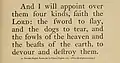
Under the pyrotechnics of Figgins' display faces, his body text faces (which were what he first sold) have received less attention. His earliest faces, being copies of earlier models, are in the late "transitional" style, with affinities to faces such as Caslon, Baskerville and its copy by the Fry Foundry, Bulmer and Bell.[1][4] Nicolas Barker felt that Figgins' early types "constitute the largest and best of the 'transitional' group, in which the genius of Bodoni was most effectively translated into English."[26] His later text faces are very clearly in the modern or Didone style.[1] Reed speculates that "within a few years of the establishment of his foundry, the public taste...experienced a complete revolution...the circumstance may possibly account for the somewhat remarkable absence of any specimen bearing his name for a lengthened period [up to 1815]."[4] Matthew Carter designed a digital revival of his type for Bensley under the name of "Vincent Text" for Newsweek in 1999.[27][28]
Gallery
 Figgins' 1792 type in the transitional style.[4]
.jpg.webp) French canon-size face in the modern style.
French canon-size face in the modern style.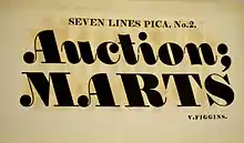 Backslanted "fat face" italic.
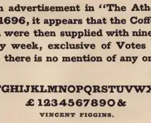 Figgins' "Antique" slab-serif
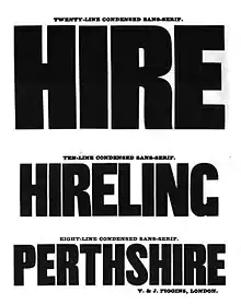 Condensed sans-serifs from the 1845 specimen of his sons.
 "Elephant", Matthew Carter's digital revival of Figgins' "fat face" typefaces.
Retirement and legacy
Figgins ran his foundry until 1836 when he retired to live at 1 Prospect Place, Peckham Rye.[5] He transferred his foundry to his two eldest sons, Vincent Figgins II of Southgate and James Figgins, who issued a first specimen book under their own name in 1838.[24] James Figgins (1811-1884) was elected to Parliament in 1868 as an MP for Shrewsbury.[29]

Figgins died on 29 February 1844 at Peckham Rye, and is buried in Nunhead Cemetery.[14] His memorial, shared with his wife Elizabeth, son Vincent (also commemorated at his local church, Christ Church, Southgate),[30] and his wife Rosanna, is Grade II listed.[31]
The foundry moved to 3-7 Ray Street, Clerkenwell in 1865, and adjacent buildings on Farringdon Road.[5][32] The building survives, and is also grade II listed as one of the few surviving type foundry buildings in London.[5][33] It still retains the original cast iron railings bearing a VJF monogram.[5][34] For some years the headquarters of Guardian Unlimited,[35] as of 2017 it is the headquarters of Company Pictures.[36]
By the late nineteenth century it was becoming clear that for large-run printing of body text the future was hot metal typesetting, which cast fresh new type for each printing job, and in the case of the Linotype machine cast each line in rigid blocks. In 1897 Vincent Figgins commented "the Lino is ruining us entirely".[37] The styles of Figgins' work also became less popular towards the beginning of the twentieth century, with greater interest in the styles of earlier centuries, but attracted attention from the Victoriana[lower-alpha 1] revival from the 1930s onwards, with coverage of his work from authors such as Nicolete Gray.[38][15][39][40][41]
In 1907 Figgins' company passed to R. H. Stevens. In 1933 it merged with another typefounding company, P. M. Shanks and Co., to form the new company Stevens, Shanks & Son, which carried on as a going but declining business casting metal type into the 1970s.[42][5][43][44]
The materials of Figgins' foundry along with others from Stevens Shanks were acquired by St Bride Library, London, in 1968–73,[45] through the work of its then librarian, James Mosley, who briefly worked at Stevens Shanks in the 1950s and has written several articles and talks covering Figgins' work.[1][8][22][46][43] According to Mosley some of the largest matrices were sold for scrap by the 1950s and some damaged by unwise attempts to cast type from them in the twentieth century using high-pressure modern casting equipment, but many of Figgins' materials are extant and have been used for research, for example by the digital font company Commercial Type.[43][47][48]
Notes
- Name used for convenience. Figgins' retirement was the year before Victoria came to the throne, 1837.
References
- Mosley, James. "The Typefoundry of Vincent Figgins, 1792–1836". Motif (1): 29–36.
- John Nichols (1812). Literary Anecdotes of the Eighteenth Century: Comprizing Biographical Memoirs of William Bowyer, Printer, F.S.A., and Many of His Learned Friends; an Incidental View of the Progress and Advancement of Literature in this Kingdom During the Last Century; and Biographical Anecdotes of a Considerable Number of Eminent Writers and Ingenious Artists; with a Very Copious Index. author. pp. 360–2.
- Thomas Curson Hansard (1825). Typographia: An Historical Sketch of the Origin and Progress of the Art of Printing. Baldwin, Cradock and Joy. pp. 317, 359–60, 376.
- Reed, Talbot Baines (1887). A History of the Old English Letter Foundries. Elliot Stock. pp. 323-5, 335–344. Retrieved 27 October 2017.
- Howes, Justin; Mosley, James; Chartres, Richard. "A to Z of Founder's London: A showing and synopsis of ITC Founder's Caslon" (PDF). Friends of the St. Bride's Printing Library. St Bride Library. Archived from the original (PDF) on 1 November 2005. Retrieved 28 September 2017.
- Macmillan, Neil (2006). An A-Z of type designers. Yale University Press New Haven. p. 82. ISBN 0300111517.
- James Raven (2014). Publishing Business in Eighteenth-century England. Boydell & Brewer Ltd. pp. 56–7. ISBN 978-1-84383-910-1.
- Mosley, James (1984). British type specimens before 1831: a hand-list. Oxford Bibliographical Society/University of Reading.
- Wolpe, Berthold (1967). Vincent Figgins: Type specimens, 1801 and 1815. London: Printing Historical Society.
- Knopp, Justin. "Type Specimens from the Vincent Figgins Type Foundry – 1815". Typoretum. Retrieved 10 October 2017.
- Figgins II, Vincent, ed. (1855). The Game of the Chesse. Retrieved 28 October 2017.
- Bowman, J.H. (1998). Greek Printing Types in Britain: from the late eighteenth century to the early twentieth century. Thessaloniki: Typophilia. pp. 92–5. ISBN 9789607285201.
- Bowman, J. H. (1992). Greek Printing Types in Britain in the Nineteenth Century: A Catalogue. Oxford: Oxford Bibliographical Society. p. 40. ISBN 9780901420503.
- Illustrations of the Literary History of the Eighteenth Century by John Nichols, Volume 8. J. B. Nichols. 1858. pp. 515–6.
- Gray, Nicolete (1977). Nineteenth Century Ornamented Typefaces.
- Mosley, James. "The Nymph and the Grot: an update". Typefoundry blog. Retrieved 12 December 2015.
- Hoefler, Jonathan. "Sentinel: historical background". Hoefler & Frere-Jones. Retrieved 15 July 2015.
- Tracy, Walter. Letters of Credit. pp. 79–85.
- Mosley, James; Shinn, Nick. "Two Lines English Egyptian (comments on forum)". Typophile. Retrieved 30 October 2017.
[T]he Figgins 'Sans-serif' types (so called) are well worth looking at. In fact it might be said to be that with these types the Figgins typefoundry brought the design into typography, since the original Caslon Egyptian appeared only briefly in a specimen and has never been seen in commercial use. One size of the Figgins Sans-serif appears in a specimen dated 1828 (the unique known copy is in the University Library, Amsterdam).…It is a self-confident design, which in the larger sizes abandons the monoline structure of the Caslon letter for a thick-thin modulation which would remain a standard model through the 19th century, and can still be seen in the ATF Franklin Gothic. Note that there is no lower-case. That would come, after 1830, with the innovative condensed 'Grotesque' of the Thorowgood foundry, which provided a model for type that would get large sizes into the lines of posters. It gave an alternative name to the design, and both the new features – the condensed proportions and the addition of lower-case – broke the link with Roman inscriptional capitals…But the antiquarian associations of the design were still there, at least in the smaller sizes, as the specimen of the Pearl size (four and three quarters points) of Figgins's type shows. It uses the text of the Latin inscription prepared for the rebuilt London Bridge, which was opened on 1 August 1831.
- Lane, John A.; Lommen, Mathieu; de Zoete, Johan (1998). Dutch Typefounders' Specimens from the Library of the KVB and other collections in the Amsterdam University Library with histories of the firms represented. De Graaf. p. 15. Retrieved 4 August 2017.
Figgins 1828 [is] one of two known copies, but with the first known appearance of the world's second sans-serif type, not in the other copy
- Paul Shaw (April 2017). Revival Type: Digital Typefaces Inspired by the Past. Yale University Press. pp. 121–2. ISBN 978-0-300-21929-6.
- Mosley, James (2003). "Reviving the Classics: Matthew Carter and the Interpretation of Historical Models". In Mosley, James; Re, Margaret; Drucker, Johanna; Carter, Matthew (eds.). Typographically Speaking: The Art of Matthew Carter. Princeton Architectural Press. pp. 35–6, 61, 84, 90. ISBN 9781568984278. Retrieved 30 January 2016.
- Mosley, James. "English Vernacular". Type Foundry. Retrieved 4 March 2016.
- Ross, Fiona. "The Bengali Types of Vincent Figgins". Matrix. 14: 205–212.
- Ross, Fiona (1988). The evolution of the printed Bengali character from 1778 to 1978 (PhD thesis). SOAS Research Online (phd). SOAS. Retrieved 2 July 2019.
- Barker, Nicolas (1967). "Vincent Figgins Type Specimens 1801 and 1815 (review)". The Book Collector: 105–6.
- "New Type for a New Era". Newsweek. 14 June 1999. Retrieved 30 October 2017.
- Bruce Willen; Nolen Strals (23 September 2009). Lettering & Type: Creating Letters and Designing Typefaces. Princeton Architectural Press. p. 57. ISBN 978-1-56898-765-1.
- Debrett's House of Commons. 1870. p. 100. Retrieved 27 October 2017.
- "The printer who gave the world Sans Serif and helped build a church for Southgate". Palmers Green Community. Retrieved 7 May 2020.
- "Monument to Vincent Figgins, Nunhead Cemetery". Historic England. Retrieved 27 October 2017.
- "Farringdon Road". Survey of London. British History Online. Retrieved 27 October 2017.
- "Listed Building Application" (PDF). Islington Council. Retrieved 27 October 2017.
- "NUMBERS 113-117 (ODD) AND ATTACHED RAILINGS". Historic England. Retrieved 27 October 2017.
- Andy Bull (10 August 2007). The NCTJ Essential Guide to Careers in Journalism. SAGE Publications. p. 261. ISBN 978-1-84860-751-4.
- "Contact Us". Company Pictures. Retrieved 27 October 2017.
- Lommen, Mathieu (1996). "A history of Lettergieterij 'Amsterdam' voorheen N. Tetterode (Typefoundry Amsterdam) 1851-19881". Quaerendo. 26 (2): 120. doi:10.1163/157006996X00089.
- Gray, Nicolete (1938). Nineteenth-Century Ornamented Types and Title Pages.
- Gray, Nicolete. "Slab-serif type design in England 1815–1845". Journal of the Printing Historical Society. 15: 1–28.
- Johnson, Alfred F. (1970). "Fat Faces: Their History, Forms and Use". Selected Essays on Books and Printing. pp. 409–415.
- Twyman, Michael. "The Bold Idea: The Use of Bold-looking Types in the Nineteenth Century". Journal of the Printing Historical Society. 22 (107–143).
- A.E. Musson (5 November 2013). Trade Union and Social History. Routledge. p. 153. ISBN 978-1-136-61471-2.
- Mosley, James (2001). "Memories of an Apprentice Typefounder". Matrix. 21: 1–13.
- Specimens of Type Faces cast at the historic London Letter Foundry. Stevens Shanks & Sons Ltd (digitisation: Type Library). c. 1933. Retrieved 7 May 2020.
- Mosley, James. "The Materials of Typefounding". Typefoundry (blog). Retrieved 27 October 2017.
- Dawson, Phillip. "Wednesday 7th October – "Type Talk" – Southgate's Typefounder Vincent Figgins". Christ Church Southgate. Retrieved 27 October 2017.
- "Original Sans Collection". Commercial Classics. Commercial Type. Retrieved 7 May 2020.
- Barnes, Paul. "The treasure of St. Bride: Part II". Type magazine. Retrieved 7 May 2020.
External links
- Specimen of Printing Types by Vincent Figgins, Letter Founder, 1834
- Vincent & James Figgins: Specimen book, 1845. Published by Figgins' sons who took over his foundry on his retirement in 1836; dated to the year after Vincent Figgins' death. It showcases many different decorative typefaces of the period, including some notable ornamented designs.
- James Mosley's Gallery of Figgins designs and memorabilia.
- Type Founding and Printing During the 19th Century (1900), a book by Vincent Figgins' grandson James.
- V&J Figgins specimen, 1858?
| Authority control |
|---|