Clearview (typeface)
Clearview, also known as Clearview Hwy, is the name of a humanist sans-serif typeface family for guide signs on roads in the United States. It has also been used in Canada, Indonesia, the Philippines, Israel, and Sri Lanka. It was developed by independent researchers with the help of the Texas Transportation Institute and the Pennsylvania Transportation Institute, under the supervision of the Federal Highway Administration (FHWA). It was once expected to replace the FHWA typefaces in many applications, although newer studies of its effectiveness have called its benefits into question.[1][2]
| Category | Sans-serif |
|---|---|
| Designer(s) | Donald Meeker[1] James Montalbano[1] Christopher O'Hara[1] Harriet Spear[1] |
| Foundry | Terminal Design Inc. |
| Sample | |
Initial testing indicated that Clearview was 2 to 8 percent more legible in both day- and night-time viewing than the then-dominant Series E (Modified) on overhead signs, particularly benefiting older drivers, with a 6 percent increase in legibility distance.[3] A design goal of Clearview was the reduction of irradiation effects of retroreflective sign materials.[3] Reduced nighttime overglow or haloing was expected also to improve recognition rates for computer road sign detection.[4] However, these tests also compared new signs in Clearview to existing, weathered signs in the existing Highway Gothic font.[5] The new font's apparent legibility "was more due to the fact that older, worn signs were being replaced with nice, fresh, clean signs which were, naturally, more legible." Better testing also revealed that legibility was worse for negative contrast signs (dark lettering on light backgrounds) such as on speed limit and yellow warning signs.[5]
History
The standard FHWA typefaces, developed in the 1940s, were designed to work with a system of highway signs in which almost all words are capitalized; its standard mixed-case form (Series E Modified) was designed to be most visible under the now-obsolete reflector system of button copy, which has since been superseded by retroreflective sheeting.[6] The designers of Clearview sought to create a typeface adapted for mixed-case signage, initially expecting it would be based on an existing European sans-serif typeface.[7] Instead, using a similar weight to the FHWA fonts, a new font was created from scratch. Two key differences are much larger counter spaces, the enclosed spaces in letters like the lower case "e" or "a", and a higher x-height, the relative height of the lower case "x" to the upper case "X". Smaller counter spaces in the FHWA fonts reduced legibility, particularly when the letters glowed from headlight illumination at night. The typeface's general appearance resembles the design of the Transport typeface family, designed by Jock Kinneir and Margaret Calvert in 1957–63 for the British highway sign system.
Official acceptance
Clearview was granted interim approval by the FHWA for use on positive-contrast road signs (light legend on dark background, such as white on black, green, blue, brown, purple or red) on September 2, 2004,[8] though not on negative-contrast road signs (dark legend on light background, such as black on white, yellow or orange), given its inferior legibility to the existing FHWA typefaces in these applications.[9] The FHWA also refused to add Clearview to the 2009 MUTCD, citing lack of testing on Clearview's numerals, symbols, and narrower typefaces.[10] In April 2014, FHWA indicated it expected to rescind Interim Approval to use Clearview in the future,[2] eventually doing so in January 2016.[11] Congress ordered the FHWA to reinstate the interim approval on March 28, 2018.[12]
Outside the US, Clearview has been adopted in Canada where it has been the standard typeface for signs in British Columbia since 2006[13] and used for street signs in Toronto.[14] Clearview has been adopted as the standard typeface for road signs in Indonesia since 2014.[15] Since 2016, Ontario's Ministry of Transportation has started using Clearview on some signs on the Queen Elizabeth Way.
Variants
In addition to its appearance on road signage, a customized version of the ClearviewText typeface was adopted by AT&T for corporate use, including advertising, used from 2006 to 2016.[1] ClearviewText and ClearviewADA are versions of the typeface intended for use in general graphic design and ADA-compliant signage. An example of ClearviewADA in use is signage at Dallas-Fort Worth International Airport.[16] Beginning in 2018, Toyota has also used a variant of the Clearview font in its advertising, with the "Let's Go Places" slogan in italicized form.
Jörg Hemker designed two typefaces which are based on the Clearview typeface: FF Nort and FF Nort Headline. Both typefaces support Greek and Cyrillic.[17][18]
Adoption
United States
Between 20 and 30 states have adopted the use of the typeface as of 2013.[19][20][21] It was not the official font recommended for use by the FHWA and states were required to request interim approval from the Federal Highway Administration to use the font.[19]
On January 25, 2016, the Federal Highway Administration issued a notice in the Federal Register of the agency's intent to rescind interim approval for use of the Clearview font in 30 days.[11] FHWA discussed the current state of road signage research and concluded that "the consistent finding among all the research evaluations is that the brightness of the retroreflective sheeting is the primary factor in nighttime legibility."[11] Even worse, significant misunderstandings and misapplications of the interim approval for Clearview were resulting in badly designed non-uniform signs that violated the uniformity central to the Manual on Uniform Traffic Control Devices.[11] Accordingly, the notice concluded, "FHWA does not intend to pursue further consideration, development, or support of an alternative letter style."[11] The rescission of the interim approval drew negative response from government officials as well as one of the typeface's designers.[22][23][24]
The FHWA reinstated the interim approval on March 28, 2018,[12] per Division L, Title I, Section 125 of the Consolidated Appropriations Act, 2018.[25]
Canada
The Transportation Association of Canada's MUTCD for Canada allows the use of Clearview, and the Ministry of Transportation of Ontario uses it for positive contrast guide signs.[26] Toronto has been replacing its black-on-white street signs with newer white-on-blue signs that use Clearview since 2004, with exceptions for certain older neighborhoods.[27][28][29]
Indonesia
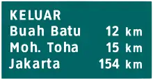
The Ministry of Transportation promulgated a regulation in 2014 to introduce new road signs that would use the Clearview typeface.[30] This new regulation was intended to meet ASEAN Economic Community standards starting in 2015.[31] Previously, road signs in Indonesia had traditionally used FHWA Series fonts since 1993.[32]
Philippines
Signages in the Philippines uses Clearview on newer signs. The numbered shields from the Philippine highway network uses Clearview.
See also
References
- Yaffa, Joshua (August 12, 2007). "The Road to Clarity". The New York Times Magazine. Retrieved June 5, 2009.
- Kehrli, Mark R. "IA-5.31 - Clearview - Grays Harbor County, WA (DENIED)" (PDF). Federal Highway Administration. Retrieved April 25, 2014.
- Castro, Candida; Horberry, Tim (14 April 2004). The Human Factors of Transport Signs. CRC Press. p. 126. ISBN 978-0-203-45741-2. Retrieved 18 December 2013.
- Li, Li; Wang, Fei-Yue (24 November 2007). Advanced Motion Control and Sensing for Intelligent Vehicles. Springer. p. 375. ISBN 978-0-387-44409-3. Retrieved 18 December 2013.
- "The feds are killing off Clearview, the new highway sign font". The Verge. Retrieved 2016-02-05.
- Forbes, Theodore W.; Moskowitz, Karl & Morgan, Glen (1950). "A Comparison of Lower Case and Capital Letters for Highway Signs". Proceedings of the Highway Research Board. pp. 355–373.
- Meeker and Associates / Terminal Design, Inc. ClearviewHWY Research & Design Development. Retrieved on 15 April 2007.
- "Interim Approval for Use of Clearview Font for Positive Contrast Legends on Guide Signs". Federal Highway Administration. 2 September 2004. Retrieved 17 December 2013.
- Evaluation of the Clearview Font for Negative Contrast Traffic Signs (PDF), January 2006
- 74 FR 66740
- Nadeau, Gregory G. (25 January 2016). "Notice of Termination of Interim Approval IA-5". Federal Register. Office of the Federal Register. 81 (15): 4083–4084. Retrieved 31 January 2016.
- Knopp, Martin C. (March 28, 2018). "Information: MUTCD – Interim Approval for Use of Clearview Font for Positive Contrast Legends on Guide Signs (IA-5)—Reinstatement [HOTO-1]" (PDF). Federal Highway Administration. Retrieved April 15, 2018.
- "Archived copy" (PDF). Archived from the original (PDF) on 2016-02-05. Retrieved 2013-09-01.CS1 maint: archived copy as title (link)
- "Toronto's Gorgeous Old Street Signs Might Soon Be for Sale". CityLab. Retrieved 20 May 2015.
- http://kemhubri.dephub.go.id/perundangan/images/stories/doc/permen/2014/pm_13_tahun_2014.pdf%5B%5D
- "Dallas/Fort Worth International Airport wayfinding". Fonts In Use. January 7, 2016. Retrieved September 26, 2016.
- "FF Nort". MyFonts. Retrieved 9 August 2020.
- "FF Nort Headline". MyFonts. Retrieved 9 August 2020.
- Murphy, Matt (26 December 2013). "New font making signs more visible". Charleston Daily Mail. Retrieved 16 January 2014.
- Strizver, Ilene (7 October 2013). Type Rules: The Designer's Guide to Professional Typography. Wiley. p. 20. ISBN 978-1-118-74869-5. Retrieved 18 December 2013.
- "List of approved requests for interim approval – FHWA MUTCD". Manual on Uniform Traffic Control Devices (MUTCD). Federal Highway Administration, U.S. Department of Transportation. Retrieved 16 January 2014.
- "House Report 114-606" (PDF). United States House of Representatives. 7 June 2016. Retrieved 26 September 2016.
FHWA is directed to suspend enforcement of actions terminating the interim approval of this alternate font for highway guide signs until the agency provides an opportunity for public comment on this matter, and documents the safety and cost implications of this decision for affected states. [...]
- "H.R.2029 - To require the Administrator of the Federal Highway Administration to issue a final rule that approves the use of Clearview font for positive contrast legends on guide signs, and for other purposes". Congress.gov. April 6, 2017. Retrieved April 10, 2017.
- Rhodes, Margaret (March 8, 2016). "America's Highway Fonts Got More Drama Than The Bachelor". Wired. Retrieved April 15, 2018.
- "Text - H.R. 1625 - 115th Congress (2017-2018): Consolidated Appropriations Act, 2018 | Congress.gov | Library of Congress". Congress.gov.
For this fiscal year, the Federal Highway Administration shall reinstate Interim Approval IA–5, relating to the provisional use of an alternative lettering style on certain highway guide signs, as it existed before its termination, as announced in the Federal Register on January 25, 2016 (81 Fed. Reg. 4083).
- "Now you see it! MTO's evolution in traffic signs". Road Talk. Ministry of Transportation of Ontario. Archived from the original on 18 January 2014. Retrieved 16 January 2014.
- Holden, Alfred (11 July 2004). "The signs are a-changin; Those familiar street markers are getting a new font and a new look; Words are designed with seniors and drivers in mind". The Toronto Star (ONT Edition). p. B.03. Retrieved 16 January 2014.
- Spears, John (7 March 2007). "The signs they are a changin'; But not right away, as host of exceptions for older neighbourhoods means many existing street signs are sticking around". The Toronto Star (MET Edition). p. C.1. Retrieved 16 January 2014.
- Byrnes, Mark (10 May 2013). "Toronto's gorgeous old street signs might soon be for sale". The Atlantic Cities. The Atlantic Monthly Group.
- Ministerial Regulation No. 13/2014 about Traffic Signs. Ministry of Transportation of the Republic of Indonesia. Retrieved 7 February 2015.
- All road signs will be changed to meet ASEAN Standard. SuaraSurabaya. Retrieved 7 February 2015.
- Ministerial Regulation No. 61/1993 about Traffic Signs. Ministry of Transportation of the Republic of Indonesia. Retrieved 7 February 2015.