Reverse-contrast typefaces
A reverse-contrast letterform is a typeface or custom lettering in which the stress is reversed from the norm: instead of the vertical lines being the same width or thicker than horizontals, which is normal in Latin-alphabet writing and especially printing, the horizontal lines are the thickest.[5][6][7] The result is a dramatic effect, in which the letters seem to have been printed the wrong way round. Originally invented in the early nineteenth century as attention-grabbing novelty display designs, modern font designer Peter Biľak, who has created a design in the genre, has described them as "a dirty trick to create freakish letterforms that stood out."[8]
Reverse-contrast letters are rarely used for body text, being more used in display applications such as headings and posters, in which the unusual structure may be particularly eye-catching.[9][10] They were particularly common in the nineteenth century, and have been revived occasionally since then. They could be considered as slab serif designs because of the thickened serifs, and are often characterised as part of that genre.
The reverse-contrast effect has been extended to other kinds of typeface, such as sans-serif designs and designs more suitable for extended text passages.[7][11] The design style, also known as "reverse-stroke" or "horizontal-stress", has no connection to reverse-contrast printing, where light text is printed on a black background.[12]
Historical background

Throughout the development of the modern Latin alphabet with an upper-case based on Roman square capitals and lower-case based on handwriting, it has been the norm for the vertical lines to generally be slightly thicker than the horizontals. Early 'roman' or 'antiqua' type followed this model, often placing the thinnest point of letters at an angle and downstrokes heavier than upstrokes, mimicking the writing of a right-handed writer holding a quill pen. (The Hebrew alphabet, in contrast, is normally "reverse-contrast" from a Latin-alphabet perspective, as the verticals are lighter.[13])
From the arrival of roman type around 1475 to the late eighteenth century, relatively little development in letter design took place, as most fonts of the period were intended for body text, and they stayed relatively similar in design and rooted in traditions of Italian humanistic handwriting.[lower-alpha 2]


Starting in the eighteenth century, typefounders developed what are now called transitional and then Didone types.[lower-alpha 4] These typefaces had a far greater amount of stroke contrast than before, with the difference in stroke width much greater than in earlier types.[lower-alpha 5][15][16][17] These had more constructed letterforms, matching the steely calligraphy of the period, and daringly slender horizontals and serif details that could show off the increasingly high quality of paper and printing technology of the period.[18][19] In addition, these typefaces had a strictly vertical stress: without exception, the vertical lines were thicker than the horizontals, creating a much more geometric and modular design.
A second major development of the period was the arrival of the printed poster and increasing use of signpainting and printing for publicity and advertising material, for example in newspaper adverts. This caused a desire to develop eye-catching new types of letters.[20] As a result, new styles of lettering and "display type" began to appear, such as "fat face" bold faces, sans serif letters, apparently inspired by classical antiquity, and then slab-serifs.[21][3][22][23][24] These letterforms were a new departure and not simply larger versions of traditional serif letters.[25][26] Presumably to be more eye-catching, these new styles of letter were often extremely bold.[2]
The first reverse-contrast types
The earliest known reverse contrast typeface dates to about 1821. It was created by the H.W. Caslon company in London, presumably as a parody of the crisp, high-contrast "Didone" typefaces and lettering of the period.[5][8][27][28][29][30] A caps-only design, the foundry's steel master punches survive in the collection of the St Bride Library, London.[5][lower-alpha 6]
The Caslon company called the type 'Italian'. Several display types at the time received exotic names: around the same time, 'Egyptian' was applied to sans- (and then slab-) serif types and 'Antique' to slab-serifs; this became increasingly common later in the century as more fanciful display faces were made.[25][31] Nicolete Gray was prepared to believe that it was "probably" Italian in origin, however she was influenced by the French writer on printing Francis Thibaudeau, who claimed in his 1921 book La Lettre d'Imprimerie that the style appeared in France during the First French Empire (1804–1814/15), before its first appearance in Britain.[31][32] Shields (2008) rejects Thibaudeau's claim: "Thibaudeau seems alone...and does not credit any French foundry with this type's origination. In my investigation so far I have found no evidence of examples earlier than Caslon & Catherwood's...the first French specimen with a confirmed date is Laurent & Deberny's 1835 broadside".[7] Reverse-contrast designs do slightly resemble capitalis rustica writing from Ancient Rome, which also has emphatic horizontal serifs at top and bottom, although this may be a coincidence.[33] Other names such as Egyptian were also used.[8][34]
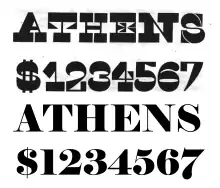
Regarding design, the Caslon Italian typeface is very clearly "conceptual" in design, deliberately taking aspects of the fat face and one by one inverting them; Nick Sherman comments that it "shows a very literal approach to reversing stroke weight, so thicks become thin and thins become thick."[10][35] It has very thick serifs, so the gap between the serifs and the main strokes making up the letters is very small, as can be seen on letters such as 'E' and 'S'. To make the effect even more shocking, the triangular serifs were inverted (becoming thinner as they met the letter, not thicker), and the thicker line on the 'A' was moved from its normal position on the right (the natural position matching the handwriting of a right-handed writer) to the left, making a letter that seems to have been drawn the wrong way round. Writing for Print magazine, Paul Shaw described it as "one of the most bizarre slab serif types of the 19th century."[36][lower-alpha 7] Barnes and Schwartz describe it as "perverse [but] done with sureness and confidence."[5]
Within a few years of their introduction the printer and social reformer Thomas Curson Hansard had described them as "typographic monstrosities":
Fashion and Fancy commonly frolic from one extreme to another. To the razor-edged fine lines and serifs of [Didone] type...a reverse [of sans and slab serifs] has succeeded...the property of which is, that the strokes which form the letters are all of one uniform thickness! After this, who would have thought that further extravagance could have been conceived? It remains, however, to be stated, that the ingenuity of one founder has contrived a type in which the natural shape is reversed, by turning all the serifs and fine strokes into fats, and the fats into leans. Oh! sacred shades of [eminent typefounders of the past] Moxon and van Dijck, of Baskerville and Bodoni! What would ye have said of the typographic monstrosities here exhibited , which Fashion in our age has produced?[38]
In contrast, Walter Tracy described the design in 1986 as "a jeu d’esprit, not meant to be judged in conventional aesthetic terms."[39][40]
The design was apparently successful, since it rapidly spread to the United States and elsewhere.[7] For example, the George Bruce company of New York displays Caslon's Italian (or a close copy) in its 1828 specimen book.[1] Many versions of similar design were released, both as metal and as wood type.[41][lower-alpha 8] Expansions of the concept included italic faces, confusingly called "Italian Italic", backslanted and sans-serif versions.[7]
Peter Biľak's Karloff is a sophisticated revival of the original reverse-contrast faces designed partly through mathematical interpolation. Biľak's group digitally inverted the contrast of a conventional Didone font: this allowed Biľak to create a family of normal and matching reverse-contrast fonts with upper- and lower-case, together with a low-contrast slab serif design, all with the same basic structure. These have been released as Karloff Positive, Negative and Neutral, the name referring to Boris Karloff.[8][30][45][46] Village Type's Arbor like Karloff adds a lower-case, while Match & Kerosene's Slab Sheriff is caps-only, with a 'A' featuring the conventional stress on the right.[47][48] A revival with extremely high contrast is Kris Sowersby's Maelstrom.[49][50][35] Other unreleased revivals have reportedly been made for private use by Paul Barnes and Justin Howes.[40][51]
 Hansard's 1825 gallery of ultra-bold 'monstrosities!!!' The typefaces are blackletter, slab serif and the 'Italian' type at the bottom.[38] ("English" in the bottom two samples refers to the font size.)
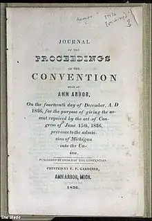 A document printed in 1836, showing Didone (body text), 'Italian' (the word 'proceedings') and early sans-serif fonts. The 'Italian' type is Caslon's Italian or a close copy. The document was printed in Michigan, showing how far the Italian style had penetrated around 15 years after its appearance in London.
French Clarendon

The reverse-contrast idea fused with a separate genre of slab-serif face, known as Clarendons. In the mid to late nineteenth century, it became popular for type foundries to offer reverse-contrast variants of Clarendon, a popular slab serif type genre, especially in the United States, creating large block serifs at the top and bottom of the letter. This was known as "French Clarendon" type.[52][53] The advantage of French Clarendon type was that it allowed very large, eye-catching serifs while the letters remained narrow, suiting the desire of poster-makers for condensed but very bold type.[54] French Clarendon designs were often created in wood type, used for large-print letters on posters. They are often associated with "wild-west" printing and seen on circus posters and wanted notices in western movies, although the style was really used in many parts of the world during this period. The style is sometimes called 'circus letter'.[9][52] The practice was less popular with more artisanal printers: DeVinne commented in 1902 that "To be hated, it needs but to be seen."[34] In Europe the style was sometimes called Italienne, matching the Caslon name. In contrast to the original Caslon type, which features horizontals in the middle of the letter (like the cross-bar in the H) that are often but not always thick, French Clarendon types have the only thick lines at the top and botton, and all inner horizontals thin, and are generally less "conceptually" reverse-contrast, with serifs in a more conventional alignment apart from the thick strokes at top and bottom.[33]
David Shields reports that the first type of the genre is the "French Antique" face of Robert Besley & Co. (which had released and copyrighted the first Clarendon face) in an 1854 specimen.[7] The University of Texas at Austin, which maintains a large archive of American wood type, reports that the first known wood French Clarendon type was issued by William Hamilton Page in 1865.[56][57] Their collection shows the many other names used for wood type which display reverse-contrast characteristics, including 'Celtic', 'Belgian', 'Aldine' and 'Teutonic', as well as Italian again and sometimes 'Tuscan' or 'Etruscan' also.[58][59][lower-alpha 9] (At the time a separation did not fully exist between genre names and typeface names, so these may be the names of individual types, or if they proved popular the name of the subgenre they created.[25][60]) At least one sans-serif typeface with reverse contrast was developed in this period.[61]
A variety of more modern adaptations have been made of the style, including Robert Harling's Playbill (1938) and more recently Adrian Frutiger's Westside, URW++'s Zirkus and Bitstream's P. T. Barnum.[33][53][62][63]
Writing on why he created a design in the genre, Frutiger, a designer better-known for his work in the sans-serif genre, commented:
As a type designer I wanted to draw something in every style. It's a matter of professional pride...I found the existing Italiennes with their big feet too harsh and strict...the fine curves in the serifs give Westside its own expression. A text set in this typeface looks like a weaving pattern...I really enjoyed drawing it. For one thing it was great fun.[33]
Frutiger decided to return to the Caslon type's pattern of all horizontals being thick apart from those on 'a' and 'e', which he felt could not be fitted into this system.
Modern reverse-contrast types
Because of their quirky, hand-made design, lighter versions of the French Clarendon style were popular for uses such as film posters in the 1950s and '60s.[64]
A well-reviewed modernisation of the style has been Trilby by David Jonathan Ross, who has written and lectured on the history of the genre.[65][66] Released by Font Bureau, it is reminiscent of Clarendon revivals from the 1950s. It attempts to adapt the style to use in a much wider range of settings, going so far as to be usable for text.[67][68][69][70] Bigfish is another modernisation inspired by lettering, in which the thickest stress is at the top.[71] Some other adaptations have preserved the concept but changed genre, presenting sans-serif or script typefaces in the same style.[11][64][65][72] Antique Olive of 1966 by Roger Excoffon is a well-known sans-serif design with subtle reverse-contrast aspects, particularly visible in its ultra-bold 'Nord' style, while Signo is an award-winning sans-serif reverse-contrast design from 2015.[73][74]
 Reverse contrast lettering on tiles at a chocolaterie at The Hague, Netherlands. Date unknown.
 David Jonathan Ross speaking on the history of reverse-contrast letters
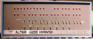 Various unusual stresses on the logo of the Altair 8800 computer, 1975.
Notes
- The fat face design is Elephant by Matthew Carter, a modern revival of the genre.[4]
- This was not the only way in which fonts could appear different, however: differences in x-height, spacing, condensation and colour on the page can make body text fonts look different in design even if individual letters are not that different.
- Rockwell is actually from the 1930s, but early slab-serif typefaces were very similar.[14]
- Some elements of what became transitional typefaces appeared from the very late seventeenth century, as lettering and from the groundbreaking Romain du Roi alphabet of the French crown, but generally typefounders stayed using typefaces of conservative design into the eighteenth century.
- Didone types were at the time called 'modern' for their sophisticated image; the name has fallen from use as they have become less common in body text from around the end of the nineteenth century.
- Barnes and Schwartz show images of surviving punches for the Five Lines Pica size from the 1830s, which was not the first size to be released.[5]
- Slab-serif letterforms were new at the time. The earliest dated example is woodblock lettering on an 1810 advertisement from London, then a series of fonts from Vincent Figgins of c. 1817.[37]
- Other digitised specimen books of the period showing Italians are Caslon 1841,[42] Bruce 1869,[43] Boston, 1880.[44]
- The defining feature of 'Tuscan' fonts is that they have diamond points protruding from the letter and/or ornate serifs, but some were reverse-contrast also.[55]
References
- A Specimen Book of Printing Types. New York: George Bruce. 1828. Retrieved 24 October 2015.
- Kennard, Jennifer. "The Story of Our Friend, the Fat Face". Fonts in Use. Retrieved 11 August 2015.
- Phinney, Thomas. "Fat Faces". Graphic Design and Publishing Centre. Retrieved 10 August 2015.
- "New Faces in Washington". Font Bureau. Retrieved 24 November 2015.
- Barnes & Schwarz. "Type Tuesday". Eye magazine. Retrieved 10 August 2015.
- Abel, Naomi. "The Chosen Contrast". Alphabettes. Retrieved 3 October 2016.
- Shields, David (2008). "A Short History of the Italian". Ultrabold: The Journal of St Bride Library (4): 22–27.
- Biľak, Peter. "Beauty and Ugliness in Type design". I love typography. Retrieved 10 August 2015.
- Lawson, Alexander (1990). Anatomy of a Typeface (1st ed.). Boston: Godine. pp. 321–323. ISBN 9780879233334.
- Heller, Steven. "The Birth of a Wood Type". Print. Retrieved 9 February 2019.
- Peters, Yves. "Fontlists: Reverse Contrast". Fontshop. Retrieved 15 August 2015.
- Helen Osborne (18 November 2012). Health Literacy From A to Z. Jones & Bartlett Publishers. p. 211. ISBN 978-1-4496-7734-3.
- Abel, Naomi. "Chosen Contrast". Alphabettes. Retrieved 15 September 2017.
- "Sentinel's Ancestors". Hoefler & Frere-Jones. Retrieved 14 August 2015.
- Phinney, Thomas. "Transitional & Modern Type Families". Graphic Design & Publishing Center. Retrieved 30 October 2015.
- De Jong, Cees W.; Purvis, Alston W. & Friedl, Friedrich (2005). Creative Type: A Sourcebook of Classical and Contemporary Letterforms. Thames & Hudson. p. 223.
- Hoefler, Jonathan. "Didot History". Hoefler & Frere-Jones. Retrieved 11 August 2015.
- Meggs, Philip B. & Purvis, Alston W. (2006). "Graphic Design and the Industrial Revolution". History of Graphic Design. Hoboken, NJ: Wiley. p. 122.
- Sutton, James & Sutton, Alan (1988). An Atlas of Typeforms. Wordsworth Editions. p. 59. ISBN 1-85326-911-5.
- Eskilson, Stephen J. (2007). Graphic Design: A New History. New Haven: Yale University Press. p. 25. ISBN 9780300120110.
- Mosley, James (1999). The Nymph and the Grot: the Revival of the Sanserif Letter. London: Friends of the St Bride Printing Library. pp. 1–19. ISBN 9780953520107.
- Mosley, James (6 January 2007). "The Nymph and the Grot, an Update".
It became clear that in 1805 Egyptian [sans-serif] letters were happening in the streets of London, being plastered over shops and on walls by signwriters, and they were astonishing the public, who had never seen letters like them and were not sure they wanted to.
- Mosley, James (1963). "English Vernacular". Motif. 11: 3–56.
- Mosley, James. "English vernacular (2006)". Type Foundry (blog). Retrieved 21 October 2017.
- Frere-Jones, Tobias. "Scrambled Eggs & Serifs". Frere-Jones Type. Retrieved 23 October 2015.
- Nesbitt, Alexander (1998). The History and Technique of Lettering. Mineola, NY: Dover Publications. pp. 158–161. ISBN 9780486402819.
- Barnes, Paul. "Twitter post". Twitter. Retrieved 1 August 2016.
[Nicolete] Gray says it was Italian in origin (via France), though I've never seen French or Italian sources...I am unsure of the full story
- Devroye, Luc. "Henry Caslon". Retrieved 10 August 2015.
- Heller, Steven & Meggs, Philip B., eds. (2001). Texts on Type: Critical Writings on Typography. New York: Allworth Press. p. 71. ISBN 9781581150827.
- Biľak, Peter. "Conceptual Type". Typotheque. Retrieved 25 October 2015.
- Gray, Nicolete (1976). Nineteenth-century Ornamented Typefaces. pp. 32–33.
- Thibaudeau, Francis (1921). La Lettre d'Imprimerie: origine, développement, classification & 12 notices illustrées sur les arts du livre. Paris. pp. 432–434. Retrieved 9 February 2019.
[D]ans notre classification, les dérivés le plus marquants de ces quatre families classiques forment des sous-familles se subdivisant á leur tour en un certain nombre de variétés. La premiére sous-famille de l'égyptienne est l'italienne, dont l'usage des types noirs s'est perpétué jus'qu'á nous, avec un success presque comparable-dans l'affiche notamment-á celui du caractére dont elle est la doublure. Le type allongé de notre frontispiece met due reste en valeur les parties qui l'en differencient, c'est á-dire le renforcement trés accentué en hauteur de empattements et des arrondis de tête et de pied, avec amaigrissement des traits de jambages intérieurs. A l'origine, sous le Premier Empire, on eut de ce type des formes archaïques avec appendices en crochets; d'autres avec pleins interverlis. Bien entundu, les blanches ombrées ne furent pas omises, de même que les perspectives.
- Frutiger, Osterer & Stamm (2014). Adrian Frutiger – Typefaces: The Complete Works. Walter de Gruyter. pp. 346–351. ISBN 9783038212607.
- De Vinne, Theodore (1902). The Practice of Typography, Plain Printing Types (2nd ed.). New York: The Century Co. pp. 333–334. Retrieved 24 November 2015.
- Sowersby, Kris. "Maelstrom Design Information". Klim Type Foundry. Retrieved 5 October 2018.
- Shaw, Paul. "Arbor, a Fresh Interpretation of Caslon Italian". Print. Retrieved 30 October 2015.
- Mosley, James. "The Nymph and the Grot: an Update". Typefoundry blog. Retrieved 12 December 2015.
- Hansard, Thomas Curson (1825). Typographia: An Historical Sketch of the Origin and Progress of the Art of Printing. London: Baldwin, Cradock & Joy. Retrieved 23 October 2015.
- Tracy, Walter (2003). Letters of Credit: A View of Type Design. Boston: David R. Godine. ISBN 9781567922400.
- "Caslon's Italian by James Clough". Blue Pencil. Retrieved 23 October 2015.
- Paul Shaw (April 2017). Revival Type: Digital Typefaces Inspired by the Past. Yale University Press. pp. 123–4. ISBN 978-0-300-21929-6.
- Caslon, Henry (1841). Specimen of Printing Types by Henry Caslon. Retrieved 3 November 2017.
- An Abridged Specimen of Printing Types: Made at Bruce's New York Type-foundry. New York: G. Bruce's Son & Company. 1869. pp. 73, 190. Retrieved 3 November 2017.
- Original Faces Cast. Boston Type Foundry. 1880. p. 106.
- Shinn, Nick. "Karloff Review". Typographica. Retrieved 25 October 2015.
- "Karloff Positive". Typotheque. Retrieved 25 October 2015.
- Sheldon, Alex. "Slab Sheriff". MyFonts. Match and Kerosene. Retrieved 23 October 2015.
- "Arbor". Village Type. Retrieved 23 October 2015.
- Bantjes, Marian. "Maelstrom". Typographica. Retrieved 3 November 2017.
- Heck, Bethany. "Review: Maelstrom". Font Review Journal. Retrieved 29 July 2018.
- Barnes, Paul. "Caslon Italian". Retrieved 23 October 2015.
- Provan, Archie & Lawson, Alexander S. (1983). 100 Type Histories. volume 1. Arlington, VA: National Composition Association. pp. 20–21.
- "P.T. Barnum". MyFonts.
- Challand, Skylar. "Know Your Type: Clarendon". IDSGN. Retrieved 13 August 2015.
- Lupton, Ellen (2014-04-15). Thinking with Type. p. 23. ISBN 9781616890452.
- Gomez-Palacio, Bryony & Vit, Armin (2012). Graphic Design Referenced: A Visual Guide to the Language, Applications, and History of Graphic Design. Gloucester, MA: Rockport. p. 124. ISBN 9781592537426.
- "Antique Clarendon Type". Rob Roy Kelly American Wood Type Collection. University of Texas at Austin. Retrieved 23 October 2015.
- "Tuscan no. 132". Rob Roy Kelly American Wood Type Collection. University of Texas at Austin. Retrieved 23 October 2015.
- "Teutonic". Rob Roy Kelly American Wood Type Collection. University of Texas at Austin. Retrieved 23 October 2015.
- Kupferschmid, Indra. "Type Classifications". kupferschrift * (blog). Retrieved 24 November 2015.
- "Gothic Bold". Rob Roy Kelly American Wood Type Collection. University of Texas at Austin. Retrieved 23 October 2015.
- "Playbill". MyFonts. Linotype. Retrieved 11 October 2015.
- "Westside". Linotype. Retrieved 12 September 2015.
- Ross, David Jonathan. "Backasswards! (presentation)" (PDF). Retrieved 15 August 2015.
- Ross, David Jonathan. "Backasswards!". Retrieved 15 August 2015.
- Elnar, Rachel. "David Jonathan Ross Loves Contrast". Type Ed. Retrieved 23 October 2015.
- "Trilby". Font Bureau. Retrieved 13 August 2015.
- Shaw, Paul. "Slab Happy: Trilby Reviewed". Print. Retrieved 15 August 2015.
- "My favourite fonts of 2009". i love typography. Retrieved 15 August 2015.
- Papazian, Hrant. "Mønster". Typographica. Retrieved 19 October 2015.
- Braden, Felix. "Floodfonts – Bigfish". Floodfonts. Retrieved 25 August 2015.
- Larabie, Ray. "Sunday Evening". Typodermic. Retrieved 24 November 2015.
- Peters, Yves. "Award: Signo". Fontshop. Retrieved 23 October 2015.
- Jenkins & Mickel. "Aero". Village Type. Retrieved 23 October 2015.
External links
- Rob Roy Kelly American Wood Type Collection – extremely large archive of eccentric American wood types (often used in posters) at the University of Texas at Austin. Many photographs.
- Hamilton Wood Type Collection, Two Rivers, WI
- Woodtyper, Gallery and resource on wood type
- Bruce's New-York Type-Foundry specimen books – 1820s and later specimen books showing the designs issued by this New York company.
- Gallery of nineteenth-century wood type illustrating the range of exaggerated font designs of the period.
| Page | |||||||||
|---|---|---|---|---|---|---|---|---|---|
| Paragraph | |||||||||
| Character |
| ||||||||
| Classifications |
| ||||||||
| Punctuation | |||||||||
| Typesetting | |||||||||
| Typographic units | |||||||||
| Digital typography | |||||||||
| Related articles | |||||||||
| Related tables |
| ||||||||
| |||||||||