List of typefaces designed by Tobias Frere-Jones
The following is a list of typefaces designed by Tobias Frere-Jones.
This list is not exhaustive, and is likely to exclude many fonts created on private commission not publicly released.[1][2]
For FontFont

A FontShop specimen for FF Dolores
- Dolores (1991) - casual slab serif.[3] Originated as a logo for his brother's band.[4]
For Fuse
- Reactor (1993)
- Fibonacci (1994)
- Microphone (1995)
For Font Bureau
- Armada (1987–94) - geometric sans-serif, similar to gaspipe lettering. Project begun in high school.[4]
- Hightower Text (1990–94) - a "Venetian" old-style serif inspired by the work of Nicolas Jenson. Initially used by the journal of AIGA.[5]
- Nobel (1991–93) revival of the Lettergieterij Amsterdam geometric sans-serif. This was developed by Sjoerd Hendrik de Roos and Dick Dooijes by taking the Berthold foundry's Berthold-Grotesk and altering some characters.[6][7][8] One of several revivals of this design; another exists by the Dutch Type Library. Used by Ineos.
- Garage Gothic (1992) - somewhat distressed, blocky sans-serif with rounded corners, inspired by parking ticket receipts.[4][9]
- Archipelago (1992)[7]
- Cafeteria (1993) - casual sans-serif similar to hand lettering.[10]
- Epitaph (1993) - decorative sans-serif inspired by an Art Nouveau typeface issued by American Type Founders.[10][11]
- Reiner Script (1993) - script font.[10]
- Stereo (1993) - relief sans serif.[10]
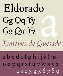
A digitisation of Eldorado by Font Bureau, on which Frere-Jones collaborated (shown is the Text optical size).
- Eldorado (1993–94) - revival of Dwiggins' Eldorado (1953), itself based on a 16th-century font by Jacques de Sanlecque the Elder. Designed with David Berlow, Tom Rickner and Jane Patterson.[12]
- Reactor (1993–96) - distressed sans-serif, an example of the “grunge typography” style of the 1990s.[13][14] Created for Neville Brody's Fuse magazine, one of several drawn by Frere-Jones that appeared in Fuse in this period.[4]
- Interstate (1993–2004) - inspired by the Highway Gothic series of alphabets for the FHWA.[15] Several italic styles were designed by Cyrus Highsmith, and the monospaced versions were designed by Christian Schwartz.
- Niagara (1994) - Art Deco-influenced display typeface with minimal serifs, similar to Onyx or a lighter version of City. With an inline style.[10]
- Asphalt (1995) - bulging casual sans-serif, somewhat similar to Antique Olive Nord and Ad Lib.[10]
- Benton Gothic (1995–97) - grotesque sans-serif loosely inspired by sans-serif typefaces designed by Morris Fuller Benton of American Type Founders, especially News Gothic. First commissioned by Martha Stewart Living magazine, with additional styles commissioned by Worth magazine. Later replaced by Benton Sans by Cyrus Highsmith.
- Citadel (1995) - Art Deco-influenced slab serif, similar to City but with an inline style.[10]
- Pilsner (1995) - blocky sans-serif, inspired by a beer label.[10]
- Benton Modern (1997–2001) - revival of the Century type family, a large Didone body text family by Morris Fuller Benton of American Type Founders. Originally for the Boston Globe. Some styles drawn by Christian Schwartz and others by Richard Lipton.[10]
- Poynter Old Style (1997–2000) - inspired by the high-contrast, slightly condensed old-style serifs of the Low Countries, in particular those designed by Hendrik van den Keere.[10] Text and display optical sizes. Some display styles drawn by Cyrus Highsmith.[16]
- Poynter Gothic (1997–99) - grotesque sans-serif loosely inspired by sans-serif typefaces designed by Morris Fuller Benton of American Type Founders, including News Gothic and Franklin Gothic. Intended to harmonise with Poynter Oldstyle.
- Griffith Gothic (1997–2000) - revival of Bell Gothic by Chauncey H. Griffith, intended for display sizes.[10]
- Phemister (1997)[7]
- Grand Central (1998–2000) - wedge-serif “Latin” capital alphabet, inspired by a Beaux Arts alphabet used for signs at Grand Central Terminal, New York.[10]
Hoefler & Frere-Jones
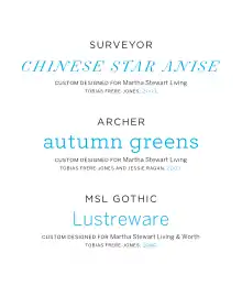
Three of Frere-Jones' best-known typefaces were designed for Martha Stewart Living magazine, Surveyor, Archer and MSL Gothic, later released as Benton Sans.
- Whitney (1996–2004) humanist sans-serif.[17] Originally created for the Whitney Museum of American Art in New York.[18][19]
- Nitro (2001–14)
- Gotham (2000–09) wide geometric-influenced sans-serif, inspired by architectural lettering on inter- and post-war buildings in New York.[20] Similarities to Proxima, Avenir and Nobel. Designed with Jesse Ragan and commissioned by GQ; famously used by the Obama presidential campaigns.[21][22][23] Very large range of styles released, including a rounded version.[24]
- Surveyor (2001–14) Didone serif design inspired by engraved maps with optical sizes.[25][26] Commissioned by Martha Stewart Living magazine along with Archer.[27]
- Idlewild (2002–12) - wide, all-caps alphabet[28]
- Tungsten (2004–12)
- Gotham Rounded (2005)
Collaborations with Jonathan Hoefler:
- Numbers (1997–2006)
- Mercury Text (1999)
- Vitesse (2000)
- Landmark (2000–12)
- Evolution (2000)
- Archer (2001–08) - slab serif with ball terminals.[29] Originally commissioned by Martha Stewart Living magazine along with Surveyor.[30][31]
Frere-Jones Type
- Mallory (2015) - Sans-serif with 1920s and 30s influences.[32] Released with a “micro-plus” optical size intended for small-print use, with wider spacing.[33][34] Similarities to Dwiggins’ Metro and Gill Sans.[35][36][37]
- Retina (2000–16) - a small-size sans-serif for the Wall Street Journal.[38]
- Exchange (2007–17) - text-size serif created for the Wall Street Journal.[39]
- Conductor (2016-18) - a display family inspired by Bulgarian lottery tickets, designed with Nina Stössinger. [40]
- Empirica - display serif inspired by Roman square capitals and French "old-style" or "Elzevir" typefaces of the nineteenth century, designed with Nina Stössinger.[41][42]
References
- Whitman, Sarah. "Do You See What I See? The Illusion of Typeface Mechanics". Print. Retrieved 22 June 2016.
- Fagone, Jason. "A Type House Divided". New York. Retrieved 22 June 2016.
- "FF Dolores". FontFont. Retrieved 22 June 2016.
- Lupton, Ellen. "Interview, Ellen Lupton with Tobias Frere-Jones, November 1, 1995". Ellen Lupton. Retrieved 22 June 2016.
- Riechers, Angela. "3 Major Designers Confess Their Biggest Mess-ups and Do-overs—and What They Learned". Eye on Design. AIGA. Retrieved 22 June 2016.
- Lane, John A.; Lommen, Mathieu; de Zoete, Johan (1998). Dutch Typefounders' Specimens. De Graaf. pp. 29–31. Retrieved 4 August 2017.
- Jason Tselentis; Allan Haley; Richard Poulin; Tony Seddon; Gerry Leonidas; Ina Saltz; Kathryn Henderson; Tyler Alterman (1 February 2012). Typography, Referenced: A Comprehensive Visual Guide to the Language, History, and Practice of Typography. Rockport Publishers. p. 87. ISBN 978-1-61058-205-6.
- "Nobel FB". MyFonts. Font Bureau. Retrieved 22 June 2016.
- Lupton, Ellen (1 September 1996). Mixing Messages. Princeton Architectural Press. pp. 35, 61. ISBN 978-1-56898-099-7.
- Berlow, David. "Tobias Frere-Jones at the Font Bureau". Font Bureau. Retrieved 22 June 2016.
- 1897 Specimen Book (PDF). American Type Founders. 1897. pp. 207–8.
- "Eldorado FB". MyFonts. Retrieved 22 June 2016.
- Lupton, Ellen. "Typography in the 1990s". Print. Retrieved 22 June 2016.
- Hamato, Chris. "Fuse 1-20 (book review)". Typographica. Retrieved 22 June 2016.
- Yaffa, Joshua. "The Road to Clarity". New York Times. Retrieved 22 June 2016.
- Middendorp, Jan. "Space and Rhythm". Eye. Retrieved 22 June 2016.
- Siegel, Dmitri. "Tobias Frere-Jones, type designer". Typotheque. Retrieved 22 June 2016.
- The Best of Newspaper Design 28. Society for News Design. 1997. p. 384. ISBN 978-1-61059-544-5.
- "Sale & Assignment of Type Fonts". New York State Unified Court System. Retrieved 31 October 2019.
HTF hereby agrees to use its commercially best efforts to ensure that TFJ [Tobias Frere-Jones] shall receive a Design credit wherever the Fonts are displayed...nothing herein shall be interpreted as obligating HTF to require or enforce the display of a TFJ design credit
- Dunlap, David. "A 9/11 Cornerstone, Chiseled With a New York Accent". New York Times. Retrieved 22 June 2016.
- "Gotham: Overview". Hoefler Type Foundry (archived). Archived from the original on 7 February 2003. Retrieved 14 September 2019.
- Bryony Gomez Palacio; Armin Vit (1 December 2011). Graphic Design, Referenced: A Visual Guide to the Language, Applications, and History of Graphic Design. Rockport Publishers. p. 378. ISBN 978-1-59253-742-6.
- Brady, Will. "Obama's media campaign - branding our consciousness". The Guardian. Retrieved 22 June 2016.
- "Gotham Rounded: Corners Cut by Popular Demand". Typographica. Retrieved 22 June 2016.
- Twemlow, Alice. "Forensic Types". Eye Magazine. Retrieved 6 October 2014.
- Fagone, Jason. "A Type House Divided". New York. Retrieved 6 October 2014.
- McNaughton, Melanie. "Martha Stewart's Graphic Design for Living". Academia.edu. Retrieved 7 October 2014.
- Moll, Cameron. "Idlewild (review)". Typographica. Retrieved 22 June 2016.
- Adams, Lauren. "Is Archer's Use on Target?". AIGI.
- Earls, David John. "Archer (review)". Typographica. Retrieved 22 June 2016.
- "Archer, the elegant slab serif". i love typography. Retrieved 22 June 2016.
- Steven, Rachael. "Mallory: a new typeface from Tobias Frere-Jones". Creative Review. Retrieved 22 June 2016.
- Walker, Alissa. "Do digital typefaces really need to be different than print?". Gizmodo. Retrieved 22 June 2016.
- Stinson, Liz. "Tobias Frere-Jones' New Typeface 'Mallory' Has British Looks, American Irreverence". Wired. Retrieved 22 June 2016.
- Coles, Stephen. "New Arrivals: December 2015". Identifont. Retrieved 22 June 2016.
- Carey Smith, Elizabeth. "Mallory review". Typographica. Retrieved 22 June 2016.
- Dohmann, Antje. "Mehr Mallory". PAGE. Retrieved 23 August 2019.
- Shaw, Paul. "Ten Typefaces of the Decade". Print. Retrieved 22 June 2016.
- Schwartz, Christian. "Exchange (review)". Typographica. Retrieved 22 June 2016.
- Rosner, Helen. "Marching and Waltzing: Conductors Dual Structures". Frere-Jones Type. Retrieved 25 February 2018.
- Green, Jaime. "Archeology and Invention: Designing Empirica". Frere-Jones Type. Retrieved 5 October 2019.
- Ovink, G.W. (1971). "Nineteenth-century reactions against the didone type model - II". Quaerendo. 1 (4): 282–301. doi:10.1163/157006971x00239. Retrieved 20 February 2016.
This article is issued from Wikipedia. The text is licensed under Creative Commons - Attribution - Sharealike. Additional terms may apply for the media files.