Martin Majoor
Martin Majoor (born 14 October 1960)[1] is a Dutch type designer and graphic designer.[2] As of 2006, he had worked since 1997 in both Arnhem, Netherlands and Warsaw, Poland.[3]
Martin Majoor | |
|---|---|
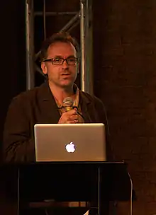 Majoor at Typo Berlin, photographed by Jens Tenhaeff on 21 May 2010 | |
| Born | October 14, 1960 |
| Education | Academy of Fine Arts, Arnhem, Netherlands (1980 to 1986) |
| Known for |
|
Notable work |
|
| Website | martinmajoor.com |
Biography
Early life
Majoor was born in 1960 in the town of Baarn, in the Dutch province of Utrecht.[1]
Education
Majoor enrolled at the then Academie voor Beeldende Kunst Arnhem (Academy of Fine Arts, Arnhem), now part of ArtEZ University of the Arts, in 1980. He graduated in 1986.
For a student placement, Majoor went to URW Type Foundry in 1984. He used their Ikarus system to design a typeface named Serré, which was never released.
Early work
In 1986, Majoor joined the research department of Océ and investigated fonts for use on computer monitors. He also researched fonts for laser printing for Bitstream.
In 1988, Majoor became a graphic designer for the Muziekcentrum Vredenburg, where he designed concert programmes. Frustration with limited availability of professional fonts on the institution's Macintosh computers led him to develop his own font, Scala.
FF Scala and FF Scala Sans
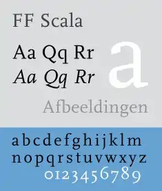 | |
| Category | Serif |
|---|---|
| Classification | Old-style |
| Designer(s) | Martin Majoor |
| Foundry | FontFont |
In 1991, FontShop International released Scala as FF Scala, the first ‘serious’ text face in its FontFont library. Scala expanded to a superfamily providing both serif and sans-serif faces with FF Scala Sans, released in 1993. Both have sold well since their introduction.
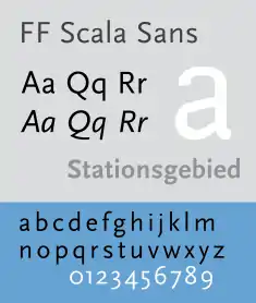 | |
| Category | Sans-serif |
|---|---|
| Classification | Humanist |
| Designer(s) | Martin Majoor |
| Foundry | FontFont |
FF Scala Sans was expanded with new weights and condensed versions in 1998. The family was supplemented with decorative capitals (FF Scala Jewels) in 1996. Several index symbols were also added as FF Scala Hands, from a 1933 design by Bruce Rogers.
Telefont
In 1994, Majoor redesigned the Dutch telephone directory for PTT Telecom (now KPN) alongside Jan Kees Schelvis. For this he created a new typeface named Telefont, with digitization assistance by Fred Smeijers. Telefont List was designed for computer-generated listings, while Telefont Text provides small caps and text figures for use in the directory's introductory material.
FF Seria
FF Seria is Majoor's second superfamily, released in 2000.[4] Seria is a book face with irregular details.[5]
In 2001 the FF Seria family was awarded a Certificate of Excellence from the ISTD International TypoGraphic Awards 2001 in London and a Certificate of Excellence in Type Design from the ATypI Type Design Competition ‘Bukva:raz!’ in Moscow.
FF Seria Arabic (2009), a complimentary Naskh-style Arabic font in four weights for display and text use, was designed by Pascal Zoghbi. It was based on Sada (2007), designed by Zoghbi with Majoor as part of the Typographic Matchmaking project.[6]
FF Nexus
Majoor started on an alternative version of Seria, but this became a larger project. The result was released in 2004 as FF Nexus, Majoor's third superfamily and FontFont's first OpenType product. It has serif, sans-serif, slab serif (‘Mix’), and monospaced variants. OpenType feature support includes small caps in all weights, text figures, tabular figures, ligatures, and two sets of swash characters.[7]
In 2006 the FF Nexus family won the first prize at the Creative Review Type Design Awards, in the category Text Families.
Questa
In 2014, Majoor released Questa, a Didone font and sans-serif derivative in collaboration with Jos Buivenga.[8]
Book design
Besides working as a type designer Martin Majoor has always worked as a book typographer and graphic designer. ‘It is my conviction that you cannot be a good type designer if you are not a book typographer.’[9]
He designed several books for Dutch publishers such as Bunge, Nijgh & Van Ditmar, L.J. Veen, Vrij Geestesleven and Elsevier. Three times his book designs were chosen among the Best Dutch Book Designs, especially for its inside book typography, rather than for its covers.
Among these best books was ‘Adieu Aesthetics & Beautiful Pages!’ (Adieu æsthetica & mooie pagina’s!’), published in 1995 as the catalogue for the exhibition ‘The Aesthetic World of Jan van Krimpen, Book Designer and Typographer’ in the Museum of the Book/Museum Meermanno-Westreenianum in The Hague and in the American Institute of Graphic Arts (AIGA) in New York (1995). For this book Majoor was the first to use the digital version of Jan van Krimpen’s typeface Romanée (originally cut in 1928 for the Joh. Enschedé typefoundry), which in 1991 had been digitized by Peter Mattias Noordzij and Fred Smeijers for incorporation into the Enschedé Font Foundry (TEFF).[10]
In 2010, together with the French teacher Sebastien Morlighem, he wrote a book on the works of the French type designer José Mendoza y Almeida.[11]
From 1999 until 2010 Majoor was the graphic designer for the Warsaw Autumn Festival, the largest international Polish festival of contemporary music. The programme books were set in Majoor’s own typeface Seria.
Teaching and speaking
From 1990 to 1995, Majoor taught typography at the Schools of Fine Arts in Arnhem and Breda.
He wrote articles for magazines like Items, Eye magazine, 2+3D and tpG tipoGráfica.
He lectured at ATypI/Typelab conferences in Budapest, Antwerp, Paris, San Francisco, Barcelona, The Hague and Prague; at TypoBerlin (2002 and 2005); and during other type events in Lure-en-Provence (Rencontres internationales de Lure 1996), Leipzig (TypoTage 2004), Warsaw, Katowice, Stockholm, Hamburg, Caen, Vienna and Dortmund.
He gave workshops in Amsterdam (Gerrit Rietveld Academie), Stuttgart (Merz Akademie) and Warsaw.
His type designs were exhibited in Amsterdam, Rotterdam, New York (Cooper Union), Paris, London, Manchester, Berlin, Helsinki and Barcelona.
Awards
- 1993 - Encouragement Prize Graphic Design 1994. Amsterdam Arts Foundation, for the Scala family.
- 1995 - Award Best Dutch Book Designs 1995 for ‘Adieu Æsthetica & Mooie Pagina’s!’ about the life and work of Jan van Krimpen.
- 2001 - Award International Typographic Awards in London for the Seria familie.
- 2001 - Award ATypI Type Design Competition Bukva:raz! in Moscow for the Seria familie.
- 2006 - Award Creative Review Type Design Award for the Nexus family in the category Text Families.
Bibliography
- Lupton, Ellen. Graphic Design and Typography in the Netherlands: A View of Recent Work. Princeton Architectural Press: 1992. ISBN 1-878271-62-8.
- Friedl, Frederich, Nicholas Ott and Bernard Stein. Typography: An Encyclopedic Survey of Type Design and Techniques Through History. Black Dog & Leventhal: 1998. ISBN 1-57912-023-7.
- Bringhurst, Robert. The Elements of Typographic Style. Hartley & Marks: 1992. ISBN 0-88179-033-8.
- Middendorp, Jan: Dutch Type, 010 Publishers: 2004, ISBN 978-90-6450-460-0
- Lupton, Ellen. Thinking with Type: A critical guide for designers, writers, editors, & students. Princeton Architectural Press: 2004. ISBN 1-56898-448-0.
- Spiekermann, Erik; Middendorp, Jan: Made with FontFont, Book Industry Services (BIS): 2006, ISBN 978-90-6369-129-5
- Thi Truong, Mai-Linh; Siebert, Jürgen; Spiekermann, Erik: FontBook – Digital Typeface Compendium, FSI FontShop International: 2006, ISBN 978-3-930023-04-2
- Martin Majoor & Sébastien Morlighem, José Mendoza y Almeida, bilingual edition French-English, Introduction by Jan Middendorp, 176 pages, 03/2010, ISBN 978-2-35654-008-9.
References
- "Martin Majoor". MyFonts. Woburn, Massachusetts: Monotype Imaging. Archived from the original on 20 October 2019. Retrieved 30 April 2020.
- Majoor, Martin (18 November 2017). Reynolds, Dan (ed.). "Martin Majoor". Creative Characters (Interview). Woburn, Massachusetts: Monotype Imaging. Archived from the original on 26 July 2019. Retrieved 30 April 2020.
- Macmillan, Neil (2006). An A–Z of type designers. New Haven, Connecticut: Yale University Press. ISBN 0-300-11150-9.
- Coltz, Jon. "comparing typefaces 2: seria and scala". daidala (archived). Archived from the original on 2007-04-10. Retrieved 24 June 2018.
- Crewdson, Andy (2002) Seria’s Motives: How Martin Majoor developed his literary typeface. Druk #13-14, FontShop Benelux.
- Smitshuijzen AbiFarès, Huda (2007). Typographic matchmaking: building cultural bridges with typeface design (in English and Arabic). Amsterdam: BIS Publishers / Khatt Foundation. ISBN 978-90-6369-124-0. OCLC 84611726.
- Majoor, Martin (2007) FontFont Focus Nexus. Berlin: FontShop International.
- "The Questa Project". Retrieved 29 September 2014.
- Majoor, Martin (2002) My Type Design Philosophy. Published in tipoGrafica (tpG) #53, Buenos Aires, Argentina
- Sierman, K. et al.,(1995) Adieu æsthetica & mooie pagina's!: J. van Krimpen en het Schoone Boek. Letterontwerper & Boekverzorger 1852-1958. Amsterdam etc.: De Buitenkant. ISBN 90-70386-73-9
- Martin Majoor, Sébastien Morlighem, Jan Middendorp (intr.) (2010) José Mendoza y Almeida. Paris: Ypsilon.éditeur, Bibliothèque Typographique. ISBN 978-2-35654-008-9.
External links
- www.martinmajoor.com Martin Majoor’s official website
- FF Scala microsite A website fully dedicated to FF Scala
- Martin Majoor, type designer Interview by Peter Biľak (2003)
- Seria’s motives: How Martin Majoor developed his ‘literary typeface’ by Andy Crewdson (2002)
- FF Seria Arabic by Pascal Zohgbi (2009)
- Types and Characters: Martin Majoor Brochure by Nina Völlink (2007)
- Writing With Scala Typespecimen by Ellen Lupton (2005)
- Martin Majoor on fontshop.com
- Martin Majoor on fontfont.com
- Martin Majoor on identifont.com
| Authority control |
|---|