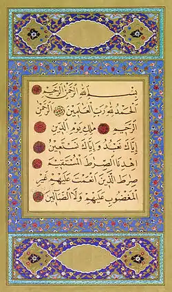
Naskh (script)
Naskh (Arabic: قلم النسخ, romanized: qalam an-naskh, from the verb نَسَخَ, nasakha, 'to copy', from n-s-kh root (ن-س-خ)) is a smaller, round script of Islamic calligraphy. Naskh is one of the first scripts of Islamic calligraphy to develop, commonly used in writing administrative documents and for transcribing books, including the Qur’an, because of its easy legibility. Naskh was standardized by Ibn Muqla as one of the six primary scripts of Islamic calligraphy in the 10th century CE.[1]
 |
| Part of a series on |
| Islamic culture |
|---|
| Architecture |
| Art |
| Clothing |
| Holidays |
| Literature |
| Music |
| Theatre |
|
In his 1617 Grammatica Arabica, Thomas van Erpe defined naskhī characters as the "noblest and true writing style".[2]
Origin
Round scripts became the most popular in the eleventh, twelfth and thirteenth centuries, due to their use by scribes.[1]
Ibn Muqla is credited with standardizing the “Six Pens” of Islamic calligraphy, also including thuluth, tawqi’, ruq'ah, muhaqqaq and reyhan.[1] These are known as “the proportioned scripts” (al-khatt al-mansub) or “the six scripts” (al-aqlam al-sitta).[3]
Kufic is commonly believed to predate Naskh, but historians have traced the two scripts as coexisting long before their codification by Ibn Muqla, as the two served different purposes.[4] Kufic was used primarily in decoration, while Naskh served for everyday scribal use.[5]
Description
Naskh is a sans-serif script, meaning characters lack “hooks” on the ends of ascending and descending strokes. For example, the alif is written as a straight stroke, bending to the lower left.[1] Naskh differentiates various sounds through the use of diacritical points, in the form of 1-3 dots above or below the letter, which makes the script more easily legible.[4] Naskh uses a horizontal base line; in situations where one character starts within the tail of the preceding letter, the base line is broken and raised.[6] In sixteenth-century Constantinople, Şeyh Hamdullah (1429–1520) redesigned the structure of naskh, along with the other "Six Pens," in order to make the script appear more precise and less heavy.[7]
Use
Naskh was historically used heavily in the transcription of books and in administrative courtly documents.[5]
Naskh allowed for the development of decorative elements into more supple, rounded designs, away from the common use of squared kufic in decoration. Naskh's use in architecture first began in the tenth century and had been adopted in many Muslim countries by the eleventh century.[5]
Mixed use with Riqʿah style
More recently, fonts, such as the Bulaq Press-inspired Amiri typeface or Monotype Imaging's Bustani font, have created user-friendly digital manifestations of naskh for use in graphic design and digital typography.[8][9]
See also
- Ruqʿah (the cursive Arabic handwriting)
- Nastaliq
- Arabic, Urdu, other Arabic keyboard layouts
- National Language Authority
- Taʿlīq script
References
- Blair, Sheila (2006). Islamic calligraphy. Edinburgh: Edinburgh University Press. ISBN 9780748612123. OCLC 56651142.
- Thomas Milo Arabic Typography, in Encyclopedia of Arabic Language and Linguistics, Brill 2013
- J., Roxburgh, David (2007). Writing the word of God : calligraphy and the Qur'an. Houston: Museum of Fine Arts, Houston. ISBN 9780300142006. OCLC 180190749.
- Ali, A. K. M. Yaqub (1984). "Muslim Calligraphy: ITS Beginning and Major Styles". Islamic Studies. 23 (4): 373–379. JSTOR 20847281.
- Khatibi, Abdelkebir (1996). The splendor of Islamic calligraphy. Sijelmassi, Mohamed. New York: Thames and Hudson. ISBN 0500016755. OCLC 34275017.
- Ory, Solange (2000-11-30). "Calligraphy". Encyclopaedia of the Qur'an. 1.
- Zakariya, Muhammad (2003-11-30). "Calligraphy". Encyclopedia of the Modern Middle East and North Africa. 1.
- "مشروع الخط الأميري :: Amiri Font Project". www.amirifont.org. Retrieved 2020-01-29.
- By the pen and what they write : writing in Islamic art and culture. Blair, Sheila, Bloom, Jonathan (Jonathan M.). New Haven. 2017. ISBN 9780300228243. OCLC 971615736.CS1 maint: others (link)
External links
| Wikimedia Commons has media related to Naskh (script). |
| Overviews | |||||||||
|---|---|---|---|---|---|---|---|---|---|
| Alphabet | |||||||||
| Letters | |||||||||
| Notable varieties |
| ||||||||
| Pidgins/Creoles | |||||||||
| Academic | |||||||||
| Linguistics | |||||||||
| Technical |
| ||||||||
aSociolinguistically not Arabic
| |||||||||