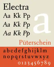
Electra (typeface)
Electra is a serif typeface designed by William Addison Dwiggins and published by the Mergenthaler Linotype Company from 1935 onwards. A book face intended for body text, Dwiggins described the design as intended to be a 'modern roman type letter' with 'personality', avoiding direct revival of any historical model. He therefore chose the name Electra to suggest electricity and crisp modernity, "like metal shavings coming off a lathe".[1][2][3]
 | |
| Category | Serif |
|---|---|
| Classification | Transitional |
| Designer(s) | W.A. Dwiggins |
| Foundry | Linotype |
| Date released | 1935 (roman/oblique) 1940 (cursive) |
| Variations | Electric Azuza Parkinson Electra Poets Electra LfA Aluminia (shown) |
| Also known as | Elante Transitional 521 |
After a slow development process, Electra became a popular book typeface in American printing during the late metal type period.[4] After an eclipse in popularity, partly due to poor translation of the design to modern printing technologies, several revivals have been released.
Background
.jpg.webp)
After establishing a career as a lettering artist and book designer, Dwiggins was hired as a consultant by the Mergenthaler Linotype Company in 1929 and established a partnership with its head of type design Chauncey H. Griffith, who would manage the production of all his typefaces for the rest of his career.[5] Dwiggins's first typeface was Metro, a sans-serif intended as an answer to new European faces such as Futura and Gill Sans, which were experiencing a vogue.
After Metro, Dwiggins set out to design a serif book typeface for long-form reading. His stated intention was to avoid the historical revival approach of most contemporary book faces, which imitated type designs from the Renaissance. Dwiggins marketed the design with a whimsical brochure, Emblems and Electra, in which he claimed the design to be the result of communing with the spirit of Kōbō-Daishi, the Japanese monk famous as a calligrapher and educator.[1][6] Vincent Connare suggests that Electra's narrow, monoline serifs make it look somewhat similar to the typefaces of Pierre-Simon Fournier in the eighteenth century, and it is for this reason that it is generally classified as "transitional".[7] The swash tail of “Q” is also reminiscent of the types of John Baskerville.
In metal, Electra was offered with text figures and two different lengths of descenders; the longer of the two (favored by Dwiggins) required leading, while the shorter could be set solid.[3]
The original release of Electra did not include an italic, with Dwiggins instead choosing to offer an oblique in which the letterforms are slanted without taking on any handwriting characteristics; this was apparently influenced by the arguments of Stanley Morison, who promoted the idea as a more appropriate secondary type than a cursive italic. This did not prove popular, however, and Dwiggins designed a true italic, named "Electra Cursive", which was released in 1940.[4] From this point Electra became a popular book type in American printing: Walter Tracy described it as a "modern classic" in American bookwork, although he felt Dwiggins' italic, his first to be published as a type design, was awkwardly balanced in some characters.[4] In Britain, the war prevented Electra Cursive's release, and the typeface never attained the same popularity.[3]
Digital revivals and interpretations
Electra was digitized in 1994 by Alex Kaczun for Linotype and Adobe. Both a standard and display cut were produced in regular and boldface, although even the standard cut appears thin at typical text sizes (a common issue with early digitizations of metal type). This version uses the longer descenders from the metal version; the italic is Electra Cursive. Although for the most part an exact copy of the outlines of the metal type, the lowercase "f" is given a longer overhang, without the restrictions of the Linotype machine. The Linotype release features separate fonts for small caps and text figures, while the Adobe release incorporates these as OpenType features.[8][9]
Bitstream digitized Electra as Transitional 521; it is the most basic of the digital offerings, with only a basic Latin character set and few typographic features.[10] The italic, which uses Electra Cursive, is available only in the regular weight. A version of this design released by Tilde has a wider range of accented and special characters, but no additional weights or features.
Compugraphic’s cold type Electra copy, Elante, is available digitally from Monotype. It uses the shorter descenders from the metal version of Electra.
Jim Parkinson has created several fonts based on the original Electra:
- An in-house typeface for the San Francisco Chronicle in the early 1990s, which came to be known as Electric; it was heavier than Electra and had shorter extenders.[11] Parkinson complemented it for headings with a digitisation of Dwiggins' sans-serif Metro.[12]
- Azuza (2001),[13] which preserved the general proportions of Electric but added more refined details. Produced in three weights: light, medium, and bold, with italics based on Electra Cursive.
- Parkinson Electra (2010), created for Linotype as an improvement over their original digital version. It is a freer interpretation than the 1992 version, featuring a heavier regular weight and more delicate serifs to improve its presence on the page. Produced in three weights: regular, bold, and heavy, all with italics based on Electra Cursive.[14]
- Aluminia (2017), digitized from Dwiggins's original design drawings, with italics in both the original oblique roman and the later cursive. There is no boldface, mirroring the initial metal version. It was created expressly for the Letterform Archive for use in the retrospective W. A. Dwiggins: A Life in Design, and an in-progress version containing just the basic character set necessary for setting the book has been distributed to crowdfunding backers. However, there are plans for a limited commercial release once it is complete.[15]
Poets Electra is a custom digitization drawn by Christian Schwartz and Miguel Reyes of Commercial Type for the Academy of American Poets.[16] They chose to work from the 8-point metal type of Electra in response to the project's requirement of a font to be used on the world wide web, the accommodations in physical type for very small print sizes being similar to those in digital fonts for text sizes on screen.[17] A slightly heavier version, Poets Electra No. 2, was also produced for use in the academy's official printed matter.
Cyrus Highsmith has designed several newsfaces inspired by Dwiggins's work. Of these, Prensa (1999, for La Prensa Gráfica of El Salvador) is the most directly influenced by Electra. It features a particularly restrained italic reminiscent of Electra's original oblique, using cursive letterforms that nevertheless hew more closely to the roman than to handwriting.
See also
- Joanna by Eric Gill, a design contemporaneous to Electra, born of the same impulse to create a book typeface balancing “humanity” and “modernity”, and with a similarly restrained italic
- Romulus by Jan van Krimpen, another 1930s book serif typeface with a sloped roman “italic”. (A separate chancery italic, Cancelleresca Bastarda, is a part of the same series, but its much longer ascenders and descenders prevented it from being used as a companion italic.)
References
- Leslie Cabarga (15 February 2004). Logo, Font & Lettering Bible. Adams Media. p. 205. ISBN 1-58180-436-9.
- Shaw, Paul. "William Addison Dwiggins: Jack of All Trades, Master of More than One". Linotype. Retrieved 26 December 2015.
- Williamson, Hugh (1956). Methods of Book Design. Oxford University Press. p. 103.
[Quoting a letter from Dwiggins]: an effort to produce a fast-moving face a little out of the line of "old face" or "modern". I think the name Electra suggested itself as a possible expression of electric energy and fast pace.'
- Tracy, Walter (January 2003). Letters of Credit: A View of Type Design. D.R. Godine. pp. 174–194. ISBN 978-1-56792-240-0.
- Shaw, Paul. "The Evolution of Metro and its Reimagination as Metro Nova". Typographica. Retrieved 21 December 2016.
- Coles, Stephen. "Warm Animal Blood: Dwiggins' Mark on Contemporary Type Design". Typographica. Retrieved 4 July 2017.
- "The Type Designs of William Addison Dwiggins". Vincent Connare. Retrieved 4 July 2017.
- "Adobe Electra". MyFonts. Adobe. Retrieved 2 September 2015.
- "Electra Linotype". MyFonts. Linotype. Retrieved 2 September 2015.
- "Transitional 521". MyFonts. Retrieved 10 November 2017.
- "Electric". Jim Parkinson Type Design. Retrieved 10 November 2017.
- "Richmond". MyFonts. Retrieved 2 October 2016.
- "Azuza". Fonts in Use. Retrieved 10 November 2017.
- Parkinson, Jim. "Parkinson Electra". MyFonts. Linotype. Retrieved 2 September 2015.
- "Recasting Electra as Aluminia". Letterform Archive. Retrieved 10 November 2017.
- "Poets Electra for poets.org". Commercial Type. Retrieved 10 November 2017.
- "Our New Typeface: Poets Electra". Academy of American Poets. Retrieved 10 November 2017.
External links
- Fonts in Use
- Illustrations from Emblems and Electra, a brochure to publicise Electra. The drawings were originally created for The Saturday Review of Literature but republished in the specimen to give a sense of Dwiggins' work.
- The Evolution of Electra - presentation by Paul Shaw at ATypI 2017
