Descender
In typography and handwriting, a descender is the portion of a letter that extends below the baseline of a font.
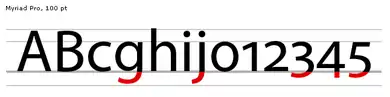
For example, in the letter y, the descender is the "tail", or that portion of the diagonal line which lies below the v created by the two lines converging. In the letter p, it is the stem reaching down past the o.
In most fonts, descenders are reserved for lowercase characters such as g, j, q, p, y, and sometimes f. Some fonts, however, also use descenders for some numerals (typically 3, 4, 5, 7, and 9). Such numerals are called old-style numerals. (Some italic fonts, such as Computer Modern italic, put a descender on the numeral 4 but not on any other numerals. Such fonts are not considered old-style.) Some fonts also use descenders for the tails on a few uppercase letters such as J and Q.[1]
The parts of characters that extend above the x-height of a font are called ascenders.[2]
References
- Mcclam, Erin (2007-09-16). "Typeface designers mix art, engineering". USA Today. Retrieved 2013-04-25.
- Snider, Lesa (2013-04-23). "Typography for all: Demystifying text for high-impact messages". Macworld. Retrieved 2013-04-25.
External links
 The dictionary definition of descender at Wiktionary
| Page | |||||||||
|---|---|---|---|---|---|---|---|---|---|
| Paragraph | |||||||||
| Character |
| ||||||||
| Classifications |
| ||||||||
| Punctuation | |||||||||
| Typesetting | |||||||||
| Typographic units | |||||||||
| Digital typography | |||||||||
| Related articles | |||||||||
| Related tables |
| ||||||||
| |||||||||