Visual communication
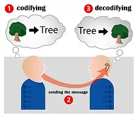
Visual communication is the conveyance of ideas and information in forms that can be seen. Visual communication in part or whole relies on eyesight.[1] Visual communication is a broad spectrum that includes signs, typography, drawing, graphic design, illustration, industrial design, advertising, animation, color, and electronic resources.[2]
Overview
The debate about the nature of visual communication dates back thousands of years. Visual communication relies on a collection of activities, communicating ideas, attitudes, and values via visual resources, i.e. text, graphics, or video. [3]
The evaluation of a good visual communication design is mainly based on measuring comprehension by the audience,[4] not on personal aesthetic and/or artistic preference as there are no universally agreed-upon principles of aesthetics. Besides two dimensional images, there are other ways to express information visually - gestures and body language, animation (digital or analogue), and film. Visual communication by e-mail, a textual medium, is commonly expressed with ASCII art, emoticons, and embedded digital images. Visual communication has become one of the most important approaches using which people communicate and share information.[5]

The term 'visual presentation'[6] is used to refer to the actual presentation of information through a visible medium such as text or images. Recent research in the field has focused on web design and graphically-oriented usability.
Web Design and Visual Communication
Visual communication on the World Wide Web is perhaps the most important form of communication that takes place while users are surfing the Internet. When experiencing the web, one uses the eyes as the primary sense, and therefore the visual presentation of a website is very important for users to understand the message or of the communication taking place. .
Symbolism in Visual Communication
The Eye of Horus is often referred to as the symbol of visual communication.[7] It is said to be a representation of an eclipse, to symbolize Horus' right eye which was torn out and that the myth refers to a solar eclipse in which the sun is momentarily blotted from the sky.[8]
Important figures
Aldous Huxley is regarded as one of the most prominent explorers of visual communication and sight-related theories.[9] Becoming near-blind in his teen years as the result of an illness set the stage for what would make him one of the most intellectual people to have ever explored visual communication. His work includes important novels on the dehumanizing aspects of scientific progress, most famously Brave New World and The Art of Seeing. He described "seeing" as being the sum of sensing, selecting, and perceiving. One of his most famous quotes is "The more you see, the more you know."
Max Wertheimer is said to be the father of Gestalt psychology. Gestalt means form or shape in German, and the study of Gestalt psychology show emphasis in simplicity, as its properties group visuals by similarity in shape or colour, continuity and proximity. Additional laws include closure and figure-ground principles in studied images is also intensively taught.[10]
Study
Students studying visual communication[11] are taught the basic physics of light, anatomy and physiology of the eye, cognitive and perception theories, colour theories, Gestalt psychology, aesthetics, natural reading patterns, design principles, semiotics, persuasion, camera/filming actions and image-types, and so forth. Colleges for visual communications differ in their approach, but most combine theory and practice in some form.
Visual communication takes place through pictures, graphs and charts, as well as through signs, signals and symbols. It may be used either independently or as an adjunct to the other methods of communication.
Visual communication
Visual communication plays an important role in our daily life. Advertisements, teaching and learning, speeches and presentations, and so on all involve visual communication to some extent.[12]
Each type of visual aid has pros and cons that must be evaluated to ensure it will be beneficial to the overall presentation. Before incorporating visual aids into speeches, the speaker should understand that if used incorrectly, the visual will not be an aid, but a distraction. Planning ahead is important when using visual aids. It is necessary to choose a visual aid that is appropriate for the material and audience.
Visual aids media: simple to advanced
Chalkboard or whiteboard
Chalkboards and whiteboards are very useful visual aids, particularly when more advanced types of media are unavailable. They are cheap and also allow for much flexibility.[13] The use of chalkboards or whiteboards is convenient, but they are not a perfect visual aid. Often, using this medium as an aid can create confusion or boredom. Particularly if a student who is not familiar with how to properly use visual aids attempts to draw on a board while they are speaking, they detract time and attention from their actual speech.[13]
Poster board
A poster is a very simple and easy visual aid. Posters can display charts, graphs, pictures, or illustrations. The biggest drawback of using a poster as a visual aid is that often a poster can appear unprofessional. Since a poster board paper is relatively flimsy, often the paper will bend or fall over. The best way to present a poster is to hang it up or tape it to a wall.[13]
Handouts
Handouts can also display charts, graphs, pictures, or illustrations. An important aspect of the use of a handout is that a person can keep a handout with them long after the presentation is over. This can help the person better remember what was discussed. Passing out handouts, however, can be extremely distracting. Once a handout is given out, it might potentially be difficult to bring back your audience's attention. The person who receives the handout might be tempted to read what is on the paper, which will keep them from listening to what the speaker is saying. If using a handout, the speaker distributes the hand out right before you reference it.[14] Distributing handouts is acceptable in a lecture that is an hour or two, but in a short lecture of five to ten minutes, a handout should not be used.[13]
Video excerpts
A video can be a great visual aid and attention grabber, however, a video is not a replacement for an actual speech. There are several potential drawbacks to playing a video during a speech or lecture. First, if a video is playing that includes audio, the speaker will not be able to talk. Also, if the video is very exciting and interesting, it can make what the speaker is saying appear boring and uninteresting. The key to showing a video during a presentation is to make sure to transition smoothly into the video and to only show very short clips.[13]
Projection equipment
There are several types of projectors. These include slide projectors, PowerPoint presentations, overhead projectors, and computer projectors. Slide projectors are the oldest form of projector, and are no longer used. PowerPoint presentations are very popular and are used often. Overhead projectors are still used but are somewhat inconvenient to use. In order to use an overhead projector, a transparency must be made of whatever is being projected onto the screen. This takes time and costs money. Computer projectors are the most technologically advanced projectors. When using a computer projector, pictures and slides are easily taken right from a computer either online or from a saved file and are blown up and shown on a large screen. Though computer projectors are technologically advanced, they are not always completely reliable because technological breakdowns are not uncommon of the computers of today.[13]
Computer-assisted presentations
PowerPoint presentations can be an extremely useful visual aid, especially for longer presentations. For five- to ten-minute presentations, it is probably not worth the time or effort to put together a PowerPoint. For longer presentations, however, PowerPoints can be a great way to keep the audience engaged and keep the speaker on track. A potential drawback of using a PowerPoint is that it usually takes a lot of time and energy to put together. There is also the possibility of a computer malfunction, which can mess up the flow of a presentation.[13]
Social media
Social media is one of the most effective ways to communicate. The incorporation of text and images deliver messages quicker and more simplistic through social media platforms. A potential drawback can be there is limited access due to the internet access requirement and certain limitations to the number of characters and image size.
Visual elements
Objects
The use of objects as visual aids involves bringing the actual object to demonstrate on during the speech. For example, a speech about tying knots would be more effective by bringing in a rope.
- Pro: the use of the actual object is often necessary when demonstrating how to do something so that the audience can fully understand procedure.
- Con: some objects are too large or unavailable for a speaker to bring with them.
Models
Models are representations of another object that serve to demonstrate that object when use of the real object is ineffective for some reason. Examples include human skeletal systems, the solar system, or architecture.
- Pros: models can serve as substitutes that provide a better example of the real thing to the audience when the object being spoken about is of an awkward size or composure for use in the demonstration.
- Cons: sometimes a model may take away from the reality of what is being spoken about. For example, the vast size of the solar system cannot be seen from a model, and the actual composure of a human body cannot be seen from a dummy.
Graphs
Graphs are used to visualize relationships between different quantities. Various types are used as visual aids, including bar graphs, line graphs, pie graphs, and scatter plots.
- Pros: graphs help the audience to visualize statistics so that they make a greater impact than just listing them verbally would.
- Cons: graphs can easily become cluttered during use in a speech by including too much detail, overwhelming the audience and making the graph ineffective.
Maps
Maps show geographic areas that are of interest to the speech. They often are used as aids when speaking of differences between geographical areas or showing the location of something.
- Pros: when maps are simple and clear, they can be used to effectively make points about certain areas. For example, a map showing the building site for a new hospital could show its close location to key neighbourhoods, or a map could show the differences in distribution of AIDS victims in North American and African countries.
- Cons: inclusion of too much detail on a map can cause the audience to lose focus on the key point being made. Also, if the map is disproportional or unrealistic, it may prove ineffective for the point being made.
Tables
Tables are columns and rows that organize words, symbols, and/or data.
- Pros: Good tables are easy to understand. They are a good way to compare facts and to gain a better overall understanding of the topic being discussed. For example, a table is a good choice to use when comparing the amount of rainfall in 3 counties each month.
- Cons: Tables are not very interesting or pleasing to the eye. They can be overwhelming if too much information is in a small space or the information is not organized in a convenient way. A table is not a good choice to use if the person viewing it has to take a lot of time to be able to understand it. Tables can be visual distractions if it is hard to read because the font is too small or the writing is too close together. It can also be a visual distraction if the table is not drawn evenly.
Photographs
- Pros: Photographs are good tools to make or emphasize a point or to explain a topic. For example, when explaining the shanty-towns in a Third World country it would be beneficial to show a picture of one so the reader can have a better understanding of how those people live. A photograph is also good to use when the actual object cannot be viewed. For example, in a health class learning about cocaine, the teacher cannot bring in cocaine to show the class because that would be illegal, but the teacher could show a picture of cocaine to the class. Using local photos can also help emphasize how your topic is important in the audience's area.[15]
- Cons: If the photograph is too small it just becomes a distraction. Enlarging photographs can be expensive if not using a power point or other viewing device.
Drawings or diagrams
- Pros: Drawings or diagrams can be used when photographs do not show exactly what the speaker wants to show or explain. It could also be used when a photograph is too detailed. For example, a drawing or diagram of the circulatory system throughout the body is a lot more effective than a picture of a cadaver showing the circulatory system.
- Cons: If not drawn correctly a drawing can look sloppy and be ineffective. This type of drawing will appear unprofessional.
Image analysis
Visual communication contains image aspects. The interpretation of images is subjective and to understand the depth of meaning, or multiple meanings, communicated in an image requires image analysis. Images can be analysed though many perspectives, for example these six major perspectives presented by Paul Martin Lester:[16]
- Personal perspective
When a viewer has an opinion about an image based on their personal thoughts. Personal response depends on the viewer's thoughts and values, individually. However,This might be sometimes in conflict with cultural values. Also when a viewer has viewed an image with a personal perspective, it is hard to change the view of the image on the viewer, even though the image can be seen in other ways.
- Historical perspective
An image's view can be arising from the history of the use of media. Through times sort images have been changed, because the use of different (new) media. For example: The result of using the computer to edit images (e.g. Photoshop) is quite different when comparing images that are made and edited by craft.
- Technical perspective
When the view of an image is influenced by the use of lights, position and the presentation of the image. The right use of light, position and presentation of the image can improve the view of the image. It makes the image looks better than the reality.
- Ethical perspective
From this perspective, the maker of the image, the viewer and the image itself must be responsible morally and ethically to the image. This perspective is also categorized in six categories: categorical imperative, utilitarianism, hedonism, golden mean, golden rule and veil of ignorance.
- Cultural perspective
Symbolization is an important definition for this perspective. Cultural perspective involves identity of symbols. The uses of words that are related with the image, the use of heroes in the image, etc. are the symbolization of the image. The cultural perspective can also be seen as the semiotic perspective.
- Critical perspective
The view of images in the critical perspective is when the viewers criticize the images, but the critics have been made in interests of the society, although an individual makes the critics. This way this perspective differs from the personal perspective.
See also
References
| Library resources about Visual Communication |
- David Sless (1981). Learning and Visual Communication. p.187
- Kenneth Louis Smith (2005). Handbook of Visual Communication: Theory, Methods, and Media. p.123. ISBN 978-0-8058-4178-7
- web.b.ebscohost.com http://web.b.ebscohost.com/ehost/ebookviewer/ebook/bmxlYmtfXzgzNDg2N19fQU41?sid=2e153c6d-2804-4df1-864a-dc3ce4cfbdcc@pdc-v-sessmgr06&vid=0&format=EB&lpid=lp_3&rid=0. Retrieved 2020-02-26. Missing or empty
|title=(help) - Jorge Frascara (2004). Communication design: principles, methods, and practice. p.68
- "Why Visual Communication is So Important in Content Marketing".
- Ruzaimi Mat Rani, author, illustrator. (2015-09-15). A guide to visual presentation. ISBN 978-1-63159-103-7. OCLC 900012442.CS1 maint: multiple names: authors list (link)
- "Sharonshamladdesign".
- "Ancient Egypt online".
- Ryan, Lindy (2016). The Visual Imperative: Creating a Visual Culture of Data Discovery. Morgan Kaufmann. p. 116. ISBN 978-0128038444.
- CLC, Y. S. (2018). Gestalt psychology. Salem Press Encyclopedia. Retrieved from http://login.ezproxy.library.ualberta.ca/login?url=https://search.ebscohost.com/login.aspx?direct=true&db=ers&AN=89405453&site=eds-live&scope=site
- Kenneth Louis Smith (2005). Handbook of visual communication: theory, methods, and media. Routledge. p. 12. ISBN 978-0-8058-4178-7
- "benefits of visual communication".
- Rothwell, J. Dan (2010). In the company of others : an introduction to communication (3rd ed.). New York: Oxford University Press. ISBN 978-0-19-533630-6.
- Kumu, Ka. "Using Visual Aids Effectively". University of Hawaii Maui College Speech Department. Retrieved 19 March 2012.
- "Presenting Effective Presentations with Visual Aids". U.S. Department of Labor. Retrieved 19 March 2012.
- Paul Martin Lester. Visual Communication: Images with Messages. Belmont, CA: Thomson Wadsworth, 2006. ISBN 978-0-534-63720-0