Gabriola (typeface)
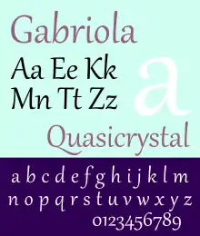
Gabriola is a display typeface designed by John Hudson for the Microsoft Corporation.[1] It is named after Gabriola Island, British Columbia, Canada.[1] Versions of Gabriola have been used in Windows 7, Windows 8 and Microsoft Office 2010.[2]
 | |
| Category | Display |
|---|---|
| Designer(s) | John Hudson |
| Foundry | Microsoft Corporation |
| Date released | 2008 |
Design
Gabriola was inspired by the calligraphy of Jan van de Velde the Elder.[1] Gabriola was developed with advanced OpenType features and has been optimized for ClearType rendering to improve legibility on screen. Hudson added a number of stylistic alternate characters and flourishes, which were grouped thematically by stylistic set into different styles of calligraphy.[3]
Distinguishing features
Easily identifiable and/or unusual features include:
- The flourish of capital "Q"s extend far below the following letter.
- The flourish of lower case "f"s and both lower and capital "j"s/"J"s extend far below the previous letter.
References
- Microsoft Typography - Gabriola
- Microsoft Typography - Gabriola Details
- Hudson, John. "Using stylistic variants in the Gabriola font". Gabriolan.ca (archived). Retrieved 22 May 2018.
External links
This article is issued from Wikipedia. The text is licensed under Creative Commons - Attribution - Sharealike. Additional terms may apply for the media files.