Optima
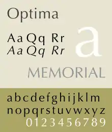
Optima is a humanist sans-serif typeface designed by Hermann Zapf and released by the D. Stempel AG foundry, Frankfurt, Germany in 1958.
 | |
| Category | Sans-serif |
|---|---|
| Classification | Humanist |
| Designer(s) | Hermann Zapf |
| Foundry | Stempel Linotype |
| Variations | Optima Nova |
Though classified as a sans-serif, Optima has a subtle swelling at the terminals suggesting a glyphic serif. Optima was inspired by classical Roman capitals and the stonecarving on Renaissance-period tombstones Zapf saw in Florence on a 1950 holiday to Italy.[1]
Zapf intended Optima to be a typeface that could serve for both body text and titling. To prove its versatility, Zapf set his entire book About Alphabets in the regular weight.[2] Zapf retained an interest in the design, collaborating on variants and expansions into his eighties.
History
Interested in calligraphy and the history of Italian printing and lettering, Zapf first visited Italy in 1950. While in Florence, Zapf was particularly interested in the design of the lettering in tombstones of the cemetery of the Basilica di Santa Croce in Florence, in which the strokes subtly widen as they reach stroke terminals without ending in a serif. He quickly sketched an early draft of the design on a 1000 lira banknote.[3][4] Zapf was to work on the development of Optima during most of the following decade.[5]
In his book About Alphabets, Zapf commented that his key aim in designing Optima's capitals, inspired by the Roman capital model, was the desire to avoid the monotony of all capital letters having a roughly square footprint, as he felt was true of some early sans-serif designs. Like the Roman capitals, Optima's 'E' and 'R' occupy about a half-square, the 'M' is wide and its sides are splayed.[6]
Upon the suggestion of Monroe Wheeler of the Museum of Modern Art in New York, Zapf decided to adapt his typeface to be used as a book type. “He thereupon changed the proportions of the lowercase, and by means of photography, he tested the suitability of the design for continuous reading application.” Zapf designed the capital letters of Optima after the inscriptions on the Trajan Column (A.D. 113). Optima is the first German typeface not based on the standard baseline alignment that had been used up until this point in time. Zapf states “This base line is not ideal for a roman, as it was designed for the high x-height of the Fraktur and Textura letters. Thus, too many German types have ascenders which are too long and descenders which are too short. The proportions of Optima Roman are now in the Golden Section: lowercase x-height equalling the minor and ascenders-descenders the major. However, the curved lines of the stems of each letter result from technical considerations of type manufacturing rather than purely esthetic considerations.”[7]
The development of Optima took place over the period 1955-1958. Optima was first manufactured as a foundry version in 1958 by Stempel of Frankfurt, and by Mergenthaler in America shortly thereafter. It was released to the public at an exhibition in Düsseldorf in that same year. If it had been up to Zapf, Optima would have been named New Roman, but the marketing staff insisted that it be named Optima.[7]
Zapf wrote later in his life of his preference for Optima over all of his other typefaces, but he also mentioned “a father should not have a favorite among his daughters.”[7]
Structure
Optima’s design follows humanist lines; its capitals (like those of Palatino, Hans Eduard Meier’s Syntax and Carol Twombly's Trajan) originate from the classic Roman monumental capital model, reflecting a reverence for Roman capitals as an ideal form.
Optima is an example of a modulated-stroke sans-serif, a design type where the strokes are variable in width. The design style has been intermittently popular since the late nineteenth century; Optima is one of the most lastingly popular examples of the genre. Optima was originally targeted by Stempel's Walter Cunz as a competitor to Ludwig & Mayer's Colonia design, which has not been digitised.[8][9] Shaw also suggests the little-known 1948 design Romann Antiqua, as well as Stellar by Robert Hunter Middleton as predecessors, and notes the existence of Pascal by José Mendoza y Almeida (1962) as a design with a similar set of influences.[2][10][11][12][13] Optima is however quite restrained in stroke width variation; more display-oriented predecessors such as Britannic show far more differentiation in stroke width than Optima does.
Optima's sloped version was originally an oblique or sloped roman, in which the letters do not take on handwriting characteristics. For Optima nova (discussed below) Zapf decided to create a new true italic with a greater slant angle.
At the same time as the late development of Optima, Zapf was also working on a non-modulated sans for Linotype, to be named Magnus and intended to compete with Gill Sans. It was ultimately never released.
Optima Greek (1973)
It is a Greek variant designed by Matthew Carter, based on sketches from Hermann Zapf.[14] Digital version has not been produced.
Optima Classified (1976)
It is a variant designed by Matthew Carter, based closely on Optima Medium. No digital versions have been produced.
Optima nova (2002)

Optima nova is a redesign of the original font family, designed by Hermann Zapf and Linotype GmbH type director Akira Kobayashi.[15][16] The new family contains seven font weights, adding light, demi, and heavy font weights, but removing extra black weight. Medium weight is readjusted to between medium and bold weights in the old family scale. Glyph sets are expanded to include Adobe CE and Latin Extended characters, with light to bold weight fonts supporting proportional lining figures, old style figures, and small caps.
The initial and most common release of Optima, like many sans-serif fonts, has an oblique style instead of an italic: the shapes are merely tilted to the right. In Optima nova, this is replaced by a true italic. (In interviews, Zapf has said that this was his original goal from the beginning, but the need to release Optima quickly forced him to settle for an oblique.)
Even in Roman fonts, letters such as Q, a, f are redesigned. The overall bounding boxes were widened in Optima nova.
Reviewing it, John Berry wrote that "its 'color' on the page comes much closer to that of the original metal version than any of the earlier photo/digital versions did" but that "ends of the strokes in the letters 'a', 'c', and 's' flare much more dramatically than they ever did in the older Optima — so much so that these letters almost look as though they have serifs...It’s a subtle difference, but it’s disturbing if you’re used to the understated elegance of Optima’s letterforms."[15]
Optima nova Condensed
It is a condensed variant which consists of light to bold weights, but no italic fonts. The glyph set does not support proportional lining figures, old style figures, or small caps.
Optima nova Titling
It is a titling capitals variant, which contains only capital letters, with restyled letterform. The glyph set is the same as Optima nova Condensed, but also includes extra ligatures. Berry writes in his review of the nova release: "it has softly curved joins and interior angles. Instead of the added crispness of detail that you might expect of a face designed for display use, this one looks more sculptural."[15]
In the tradition of hand lettering and lapidary inscription, the titling face shares similarities with the work of Zapf's friend Herb Lubalin, especially the exuberant ligatures (for which Lubalin's ITC Lubalin Graph and ITC Avant Garde are notable). Further influence of A.M. Cassandre and Rudolf Koch, whose work greatly inspired the young Zapf, can also be seen in Optima.
Optima Pro Cyrillic (2010)
In April 2010, Linotype announced the release of Cyrillic version of the original Optima family, in OpenType Pro font formats. Released fonts include Optima Pro Cyrillic Roman, Oblique, Bold, Bold Oblique.[17]
Derivatives
As with many popular fonts, knockoff designs and re-releases under different names are common, some created by Zapf himself. These all tend to copy the original release, rather than the Optima nova design which represents Zapf's final thoughts on his design. In the Bitstream font collection, Zapf Humanist 601 is provided as an Optima clone. Other Optima clones include Optane from the WSI Fonts collection, Opulent by Rubicon Computer Labs Inc., Ottawa from Corel, CG Omega and Eterna. Freely available implementations include URW Classico (available with URW Font package from Ghostscript). Linux Biolinum is a libre font inspired by it. Zapf's Palatino Sans is a more informal typeface in the same style, with a design reminiscent of brushstrokes or calligraphy.
Kontour Type designed the Utile Display typeface, inspired from the Optima typeface.[18]
In a memoir written for Linotype, Zapf commented:
The name "Optima" was not my idea at all. It is for me too presumptuous and was the invention of the sales people at Stempel.
Notes
- Haley, Allen. "Optima" (PDF). Monotype Imaging. Retrieved 9 October 2015.
- Shaw, Paul. "About More Alphabets review". Blue Pencil letter design. Retrieved 23 November 2015.
- Stone, Sumner. "Hermann Zapf". Typographics Conference. Archived from the original on 28 September 2015. Retrieved 22 August 2015.
- Siebert, Jürgen. "Fontshop - Hermann Zapf 1918-2015". Fontshop. Retrieved 22 August 2015.
- Nikolaus Julius Weichselbaumer (14 December 2015). Der Typograph Hermann Zapf: Eine Werkbiographie. Walter de Gruyter GmbH & Co KG. pp. 173–190. ISBN 978-3-11-041505-6.
- Standard], Hermann Zapf. [Transl. by Paul (1970). About alphabets : some marginal notes on type design ([Rev. ed.] ed.). Cambridge, Mass.: MIT Press. ISBN 9780262240109.
- Lawson, Alexander (1990). Anatomy of a Typeface. David R. Godine. pp. 329–330. ISBN 0879233338.
- "Optima". Linotype. Retrieved 22 August 2015.
- "Colonia type specimen". Flickr. Ludwig & Mayer. Retrieved 22 August 2015.
- "Joachim Romann" (PDF). Klingspor Museum. Retrieved 23 November 2015.
- Mendoza, José. "Pascal ND". Neufville. Retrieved 23 November 2015.
- "Stellar". Fonts.com. Monotype. Retrieved 29 August 2015.
- Speice, Jim. "Stellar". MyFonts. Speice Graphics. Retrieved 9 September 2015.
- magazine TYPO.18 December 2005 issue Archived March 19, 2009, at the Wayback Machine
- Berry, John D. "Optima nova — A New Take on Timeless Face". Creative Pro. Retrieved 15 June 2016.
- "Optima nova". issuu. Linotype.
- International typography gets a Cyrillic boost
- "Game, set, match: Utile aces all your type needs". kontour.typenetwork.com. Retrieved 14 April 2020.
References
- Margaret Re, Johanna Drucker, Matthew Carter, James Mosley. Typographically Speaking: The Art of Matthew Carter. Princeton Architectural Press: 2003. ISBN 1-56898-427-8, ISBN 978-1-56898-427-8.
- Blackwell, Lewis. 20th Century Type. Yale University Press: 2004. ISBN 0-300-10073-6.
- Fiedl, Frederich, Nicholas Ott and Bernard Stein. Typography: An Encyclopedic Survey of Type Design and Techniques Through History. Black Dog & Leventhal: 1998. ISBN 1-57912-023-7.
- Jaspert, W. Pincus, W. Turner Berry and A.F. Johnson. The Encyclopedia of Type Faces. Blandford Press Lts.: 1953, 1983. ISBN 0-7137-1347-X.
- Lawson, Alexander S., Anatomy of a Typeface. Godine: 1990. ISBN 978-0-87923-333-4.
- Macmillan, Neil. An A–Z of Type Designers. Yale University Press: 2006. ISBN 0-300-11151-7.
- Zapf, Hermann. Manuale Typographicum. The MIT Press: 19534, 1970. ISBN 0-262-24011-4.
External links
| Wikimedia Commons has media related to Optima. |
- Typowiki: Optima
- The story of Palatino and Optima from Hermann Zapf
- Linotype: Optima from Hermann Zapf
- Learn more about Optima nova from Hermann Zapf and Akira Kobayashi
- The Story of Linotype's Optima
- Alternatives to Optima - Stephen Coles
macOS typefaces | |
|---|---|
| Latin, Greek, Cyrillic |
|
| Non-alphabetic | |