RYB color model
RYB (an abbreviation of red–yellow–blue) is a subtractive color model used in art and applied design in which red, yellow, and blue pigments are considered primary colors.[1] Under traditional color theory, this set of primary colors was advocated by Moses Harris, Michel Eugène Chevreul, Johannes Itten and Josef Albers, and applied by countless artists and designers. The RYB color model underpinned the color curriculum of the Bauhaus, Ulm School of Design and numerous art and design schools that were influenced by the Bauhaus, including the IIT Institute of Design (founded as the New Bauhaus), Black Mountain College, Design Department Yale University, the Shillito Design School, Sydney, and Parsons School of Design, New York.
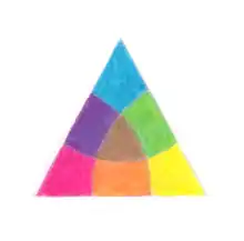
In this context, the term primary color refers to three exemplar colors (red, yellow, and blue) as opposed to specific pigments. As illustrated, in the RYB color model, red, yellow, and blue are intermixed to create secondary color segments of orange, green, and purple. This set of primary colors emerged at a time when access to a large range of pigments was limited by availability and cost, and it encouraged artists and designers to explore the many nuances of color through mixing and intermixing a limited range of pigment colors. In art and design education, red, yellow, and blue pigments were usually augmented with white and black pigments, enabling the creation of a larger gamut of color nuances including tints and shades.
The RYB color model relates specifically to color in the form of paint and pigment application in art and design.[2] Other common color models include the light model (RGB) and the printing ink CMY color model, the latter emerging in conjunction with the CMYK color model in the printing industry.
History
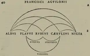
The first known instance of the RYB triad can be found in the work of Franciscus Aguilonius (1567–1617), although he did not arrange the colors in a wheel.[3]
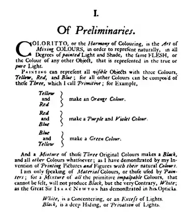
Jacob Christoph Le Blon was the first to apply the RYB color model to printing, specifically mezzotint printing, and he used separate plates for each color: yellow, red and blue plus black to add shades and contrast. In 'Coloritto', Le Blon asserted that “the art of mixing colours…(in) painting can represent all visible objects with three colours: yellow, red and blue; for all colours can be composed of these three, which I call Primitive”. Le Blon added that red and yellow make orange; red and blue, make purple; and blue and yellow make green (Le Blon, 1725, p6).[4][5]
In the 18th century, Moses Harris advocated that a multitude of colors can be created from three "primitive" colors – red, yellow, and blue.[6]
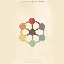
Mérimée referred to "three simple colours (yellow, red, and blue)" that can produce a large gamut of color nuances. "United in pairs, these three primitive colours give birth to three other colours as distinct and brilliant as their originals; thus, yellow mixed with red, gives orange; red and blue, violet; and green is obtained by mixing blue and yellow" (Mérimée, 1839, p245). Mérimée illustrated these color relationships with a simple diagram located between pages 244 and 245: Chromatic Scale (Echelle Chromatique).De la peinture à l’huile : ou, Des procédés matériels employés dans ce genre de peinture, depuis Hubert et Jean Van-Eyck jusqu’à nos jours was published in 1830 and an English translation by W. B. Sarsfield Taylor was published in London in 1839.[7]
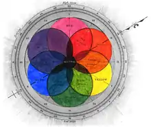
Similar ideas about the creation of color using red, yellow, and blue were discussed in Theory of Colours (1810) by the German poet, color theorist and government minister Johann Wolfgang von Goethe.[8]
In The Law of Simultaneous Color Contrast (1839) by the French industrial chemist Michel Eugène Chevreul discussed the creation of numerous color nuances and his color theories were underpinned by the RYB color model.[9]
Separate to the RYB color model, cyan, magenta, and yellow primary colors are associated with CMYK commonly used in the printing industry. Cyan, magenta, and yellow are often referred to as "process blue", "process red", and "process yellow".[10][11]
See also
- Color
- Color solid
- Color theory
- List of colors
- Primary colors
References
- Gage, John (1995). Colour and Culture : Practice and Meaning from Antiquity to Abstraction. London: Thames & Hudson. ISBN 978-0500278185.
- Gage, John (2000). Color and Meaning: Art, Science, and Symbolism. London: Thames & Hudson. ISBN 978-0520226111.
- "Franciscus Aguilonius". Colorsystem: Colour order systems in art and science. Archived from the original on 2014-02-13.
- Le Blon, Jakob Christophe (1725). Coloritto; or the Harmony of Colouring in Painting: Reduced to Mechanical Practice under Easy Precepts, and Infallible Rules; Together with some Colour'd Figures. Retrieved 4 July 2020.
- Mortimer, Cromwell (February 1731). "An Account of Mr. J. C. Le Blon's Principles of Printing, in Imitation of Painting, and of Weaving Tapestry, in the Same Manner as Brocades". Philosophical Transactions of the Royal Society, London. 37 (419): 101-107. doi:10.1098/rstl.1731.0019. S2CID 186212141. Retrieved 4 July 2020.
- Harris, Moses (1766). The Natural System of Colours. (Facsimile edition of 1963), New York: Whitney Library of Design.
- Mérimée, J.F.L. (1839). The art of painting in oil and in fresco: Being a history of the various processes and materials employed (translated from the French by W. B. Sarsfield Taylor. London: Whittaker & Co.
- Goethe, Theory of Colours, trans. Charles Lock Eastlake, Cambridge, MA: MIT Press, 1982. ISBN 0-262-57021-1
- Chevreul, Michel Eugène (1861). The Laws of Contrast of Colour. London: Routledge, Warne, and Routledge. p. 25. – English translation by John Spanton
- St. John, Eugene (February 1924). "Some Practical Hints on Presswork". Inland Printer, American Lithographer. 72 (5): 805. Retrieved 18 February 2019.
- White, Jan (2003). Editing by Design: For Designers, Art Directors, and Editors—the Classic Guide to Winning Readers. Simon and Schuster. p. PT460. ISBN 9781581159387. Retrieved 18 February 2019.
