Impossible color
Impossible colors are colors that do not appear in ordinary visual functioning. Different color theories suggest different hypothetical colors that humans are incapable of seeing for one reason or another, and made-up colors are routinely created in popular culture. While some such colors have no basis in reality, phenomena such as cone cell fatigue enable colors to be perceived in certain circumstances that would not be otherwise.

Opponent process
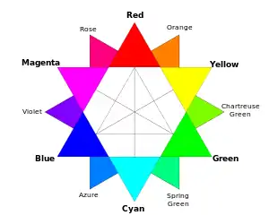
The color opponent process is a color theory that states that the human visual system interprets information about color by processing signals from cone and rod cells in an antagonistic manner. The three types of cone cells have some overlap in the wavelengths of light to which they respond, so it is more efficient for the visual system to record differences between the responses of cones, rather than each type of cone's individual response. The opponent color theory suggests that there are three opponent channels:
- Red versus green.
- Blue versus yellow
- Black versus white (this is achromatic and detects light-dark variation or luminance).
Responses to one color of an opponent channel are antagonistic to those to the other color, and signals output from a place on the retina can contain one or the other but not both, for each opponent pair.
Imaginary colors
An imaginary color is a point in a color space that corresponds to combinations of cone cell responses in one eye that cannot be produced by the eye in normal circumstances seeing any possible light spectrum.[1] No physical object can have an imaginary color.
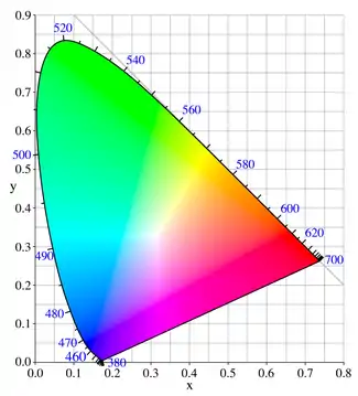
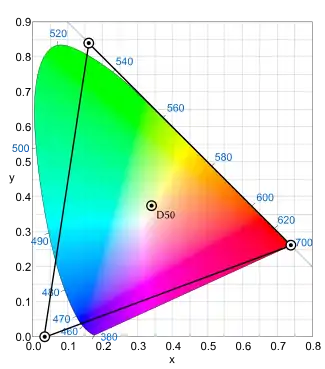
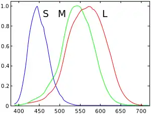
The spectral sensitivity curve of medium-wavelength ("M") cone cells overlaps those of short-wavelength ("S") and long-wavelength ("L") cone cells. Light of any wavelength that interacts with M cones also interacts with S or L cones, or both, to some extent. Therefore, no wavelength (except perhaps a bit of the far red) and no spectral power distribution excites only one sort of cone. If, for example, M cones could be excited alone, this would make the brain see an imaginary color greener than any physically possible green. Such a "hyper-green" color would be in the CIE 1931 color space chromaticity diagram (see the image below on the right) in the blank area above the colored area and between the y-axis and the line x+y=1.
Imaginary colors in color spaces
Although they cannot be seen, imaginary colors are often found in the mathematical descriptions that define color spaces.[2]
Any additive mixture of two real colors is also a real color. When colors are displayed in the CIE 1931 XYZ color space, additive mixture results in color along the line between the colors being mixed. By mixing any three colors, one can therefore create any color contained in the triangle they describe — this is called the gamut formed by those three colors, which are called primary colors. Any colors outside of this triangle cannot be obtained by mixing the chosen primaries.
When defining primaries, the goal is often to leave as many real colors in gamut as possible. Since the region of real colors is not a triangle (see illustration), it is not possible to pick three real colors that span the whole region. The gamut can be increased by selecting more than three real primary colors, but since the region of real colors is not a polygon, there will always be some colors at the edge left out. Therefore, one selects colors outside of the region of real colors as primary colors; in other words, imaginary primary colors. Mathematically, the gamut created in this way contains so-called imaginary colors.
In computer and television screen color displays, the corners of the gamut triangle are defined by commercially available phosphors chosen to be as near as possible to pure red and pure green and pure blue, and thus are within the area of real colors; note that these color space diagrams inevitably display, instead of real colors outside your computer screen's gamut triangle, the nearest color which is inside the gamut triangle. See page Gamut for more information about the color range available on display devices.
Chimerical colors

A chimerical color is an imaginary color that can be seen temporarily by looking steadily at a strong color until some of the cone cells become fatigued, temporarily changing their color sensitivities, and then looking at a markedly different color. The direct trichromatic description of vision cannot explain these colors, which can involve saturation signals outside the physical gamut imposed by the trichromatic model. Opponent process color theories, which treat intensity and chroma as separate visual signals, provide a biophysical explanation of these chimerical colors.[3] For example, staring at a saturated primary-color field and then looking at a white object results in an opposing shift in hue, causing an afterimage of the complementary color. Exploration of the color space outside the range of "real colors" by this means is major corroborating evidence for the opponent-process theory of color vision. Chimerical colors can be seen while seeing with one eye or with both eyes, and are not observed to reproduce simultaneously qualities of opposing colors (e.g. "yellowish blue").[3] Chimerical colors include:
- Stygian colors: these are simultaneously dark and impossibly saturated. For example, to see "stygian blue": staring at bright yellow causes a dark blue afterimage, then on looking at black, the blue is seen as blue against the black, also as dark as the black. The color is not possible to achieve through normal vision, because the lack of incident light (in the black) prevents saturation of the blue/yellow chromatic signal (the blue appearance)..
- Self-luminous colors: these mimic the effect of glowing material, even when viewed on a medium such as paper, which can only reflect and not emit its own light. For example, to see "self-luminous red": staring at green causes a red afterimage, then on looking at white, the red is seen against the white and may seem to be brighter than the white.
- Hyperbolic colors: these are impossibly highly saturated. For example, to see "hyperbolic orange": staring at bright cyan causes an orange afterimage, then on looking at orange, the resulting orange afterimage seen against the orange background may cause an orange color purer than the purest orange color that can be made by any normally-seen light. Likewise, staring at a bright magenta template may result in an impossibly highly saturated green afterimage.
Claimed evidence for the ability to see colors not in the color space

note: calibrated to 58mm separation, please use zoom if needed to adjust.

note: calibrated to 58mm separation, please use zoom if needed to adjust.
According to the opponent-process theory, under normal circumstances, there is no hue that could be described as a mixture of opponent hues; that is, as a hue looking "redgreen" or "yellowblue".
In 1983, Hewitt D. Crane and Thomas P. Piantanida performed tests using an eye-tracker device that had a field of a vertical red stripe adjacent to a vertical green stripe, or several narrow alternating red and green stripes (or in some cases, yellow and blue instead). The device could track involuntary movements of one eye (there was a patch over the other eye) and adjust mirrors so the image would follow the eye and the boundaries of the stripes were always on the same places on the eye's retina; the field outside the stripes was blanked with occluders. Under such conditions, the edges between the stripes seemed to disappear (perhaps due to edge-detecting neurons becoming fatigued) and the colors flowed into each other in the brain's visual cortex, overriding the opponency mechanisms and producing not the color expected from mixing paints or from mixing lights on a screen, but new colors entirely, which are not in the CIE 1931 color space, either in its real part or in its imaginary parts. For red-and-green, some saw an even field of the new color; some saw a regular pattern of just-visible green dots and red dots; some saw islands of one color on a background of the other color. Some of the volunteers for the experiment reported that afterward, they could still imagine the new colors for a period of time.[4]
Some observers indicated that although they were aware that what they were viewing was a color (that is, the field was not achromatic), they were unable to name or describe the color. One of these observers was an artist with large color vocabulary. Other observers of the novel hues described the first stimulus as a reddish-green.[5]
In 2001, Vincent A. Billock and Gerald A. Gleason and Brian H. Tsou set up an experiment to test a theory that the 1983 experiment did not control for variations in the perceived luminance of the colors from subject to subject: two colors are equiluminant for an observer when rapidly alternating between the colors produces the least impression of flickering. The 2001 experiment was similar but controlled for luminance.[6] They had these observations:
Some subjects (4 out of 7) described transparency phenomena—as though the opponent colors originated in two depth planes and could be seen, one through the other. ...
We found that when colors were equiluminant, subjects saw reddish greens, bluish yellows, or a multistable spatial color exchange (an entirely novel perceptual phenomena [sic]); when the colors were nonequiluminant, subjects saw spurious pattern formation.
This led them to propose a "soft-wired model of cortical color opponency", in which populations of neurons compete to fire and in which the "losing" neurons go completely silent. In this model, eliminating competition by, for instance, inhibiting connections between neural populations can allow mutually exclusive neurons to fire together.[6]
Hsieh and Tse in 2006 disputed the existence of colors forbidden by opponency theory and claimed they are, in reality, intermediate colors. However, by their own account their methods differed from Crane and Piantanida: "They stabilized the border between two colors on the retina using an eye tracker linked to deflector mirrors, whereas we relied on visual fixation." Hsieh and Tse do not compare their methods to Billock and Tsou, and do not cite their work, even though it was published five years earlier in 2001.[7] See also binocular rivalry.
In fiction
Some works of fiction have mentioned fictional colors outside of the normal human visual spectrum that have not been observed yet, and whose observation may require advanced technology, different physics or magic.[8][9][10] Introduction of a new color is often an allegory intending to deliver additional information to the reader.[11] Such colors are primarily discussed in literary works, as they are obviously impossible to visualize (when a new color is shown in the episode "Reincarnation" of the animated show Futurama, the animation for that fragment of the show is purposely kept in shades of gray[12]).[10]
One of the earliest examples of fictional colors comes from the classic science fiction novel from 1920, A Voyage to Arcturus by David Lindsay, which mentions two new primary colors, "ulfire" and "jale".[8] The Colour Out of Space, a 1927 story by H.P. Lovecraft, is named after an otherwise unnamed color, usually not observable by humans, generated by alien entities.[9] Philip K. Dick's 1969 novel Galactic Pot-Healer mentions a color "rej", Terry Pratchett in his Discworld series that begun with The Colour of Magic (1983) describes "octarine", a color that can be only seen by magicians; and Marion Zimmer Bradley in her novel The Colors of Space (1963) mentions "the eighth color" made visible during the FTL travel.[8][10] "Plueragloss" is the favorite color of a character who is a natural inhabitant of the afterlife in the television show The Good Place. In the show, plueragloss is described as “the color of when a soldier comes home from war and sees his dog for the first time.” [13]
See also
- Bastard color: in theatre lighting, typically in a color gel, a color blended with small amounts of complementary colors.
- Color – Characteristic of human visual perception
- Color mixing
- Color vision – Ability of animals to perceive differences between light composed of different wavelengths independently of light intensity
- False-color image – Methods of visualizing information by translating to colors, an image that depicts an object in colors that differ from those that a visible-colors-only photograph would show.
- Middle gray, a shade of gray used to adjust photographs to match perceptual brightness as opposed to absolute brightness as measured by a digital camera.
- Non-visible electromagnetic waves, such as radio waves, microwaves, X-rays, etc.
- Shades of Grey, a novel where social class is determined by the specific colors that one can see
- Spectral color – Color evoked by a single wavelength of light in the visible spectrum
- Tetrachromacy – Type of color vision with four types of cone cells, having four primary colors
References
- Margulis, Dan (July 2005). "Imaginary Colors, Real Results". Ledet Training.
- MacEvoy, Bruce (2005). "Light and the eye". Handprint. Retrieved May 5, 2007.
- Hunt, R. W. (1998). Measuring Colour (3rd ed.). England: Fountain Press. ISBN 0-86343-387-1.. See pgs. 39–46 for the basis in the physiology of the human eye of tripartite color models, and 54–7 for chromaticity coordinates.
- Churchland, Paul (2005). "Chimerical Colors: Some Phenomenological Predictions from Cognitive Neuroscience". Philosophical Psychology. 18 (5): 527–560. doi:10.1080/09515080500264115.
- Crane, Hewitt D.; Piantanida, Thomas P. (1983). "On Seeing Reddish Green and Yellowish Blue". Science. 221 (4615): 1078–80. doi:10.1126/science.221.4615.1078. JSTOR 1691544. PMID 17736657.
- Suarez J; Suarez, Juan (2009). "Reddish Green: A Challenge for Modal Claims About Phenomenal Structure". Philosophy and Phenomenological Research. 78 (2): 346–391. doi:10.1111/j.1933-1592.2009.00247.x.
- Billock, Vincent A.; Gerald A. Gleason; Brian H. Tsou (2001). "Perception of forbidden colors in retinally stabilized equiluminant images: an indication of softwired cortical color opponency?" (PDF). Journal of the Optical Society of America A. Optical Society of America. 18 (10): 2398–2403. doi:10.1364/JOSAA.18.002398. Retrieved 2010-08-21.
- Hsieh, P.-J.; Tse, P. U. (2006). "Illusory color mixing upon perceptual fading and filling-in does not result in "forbidden colors"". Vision Research. 46 (14): 2251–8. doi:10.1016/j.visres.2005.11.030. PMID 16469353.
- Gary Westfahl (2005). The Greenwood Encyclopedia of Science Fiction and Fantasy: Themes, Works, and Wonders. Greenwood Publishing Group. p. 143. ISBN 978-0-313-32951-7.
- Alexander Theroux (10 May 2017). Einstein's Beets. Fantagraphics Books. p. 640. ISBN 978-1-60699-976-9.
- Mark J.P. Wolf (12 May 2020). World-Builders on World-Building: An Exploration of Subcreation. Taylor & Francis. pp. 116–. ISBN 978-0-429-51601-6.
- Eric D. Smith (10 September 2012). Globalization, Utopia and Postcolonial Science Fiction: New Maps of Hope. Palgrave Macmillan. p. 74. ISBN 978-0-230-35447-0.
- Kurland, Daniel (2016-02-02). "That Time 'Futurama' Was Reborn as a Video Game, Anime, and More". Vulture. Retrieved 2020-07-14.
- https://tv.avclub.com/the-good-place-leaps-into-the-unknown-and-greatness-1798189378
Further reading
- Billock, Vincent A.; Tsou, Brian H. (2010). "Seeing Forbidden Colors". Scientific American. 302 (2): 72–7. doi:10.1038/scientificamerican0210-72. PMID 20128226.
- Takahashi, Shigeko; Ejima, Yoshimichi (1984). "Spatial properties of red-green and yellow-blue perceptual opponent-color response". Vision Research. 24 (9): 987–94. doi:10.1016/0042-6989(84)90075-0. PMID 6506487.
- Hibino, H (1992). "Red-green and yellow-blue opponent-color responses as a function of retinal eccentricity". Vision Research. 32 (10): 1955–64. doi:10.1016/0042-6989(92)90055-n. PMID 1287992.
External links
- Bradbury, Aaron (Mar 1, 2014). "Hyperbolic Orange and the River to Hell".
It is possible however to see colours that aren’t in reality. Impossible colours...
