Primary color
A set of primary colors is a set of colorants or colored lights that can be combined in varying amounts to produce a gamut of colors. This is the essential method used in applications that are intended to elicit the perception of diverse sets of color, e.g. electronic displays, color printing, and paintings. Perceptions associated with a given combination of primary colors are predicted by applying the appropriate mixing model (additive, subtractive, additive averaging, etc.) that embodies the underlying physics of how light interacts with the media and ultimately the retina.
Primary colors can be conceptual (not necessarily real colors), either as additive mathematical elements of a color space or as irreducible phenomenological categories in domains such as psychology and philosophy.[1] Color-space primaries are precisely defined and empirically rooted in psychophysical color matching experiments which are foundational for understanding color vision. Primaries of some color spaces are complete (that is, all visible colors are described in terms of their weighted sums with nonnegative weights) but necessarily imaginary[2] (that is, there is no plausible way that those primary colors could be represented physically, or perceived). Phenomenological accounts of primary colors, such as the psychological primaries,[3] have been used as the conceptual basis for practical color applications even though they are not a quantitative description in and of themselves.
Sets of color-space primaries are generally somewhat arbitrary, in the sense that there is no one set of primaries that can be considered the canonical set. Primary pigments or light sources are selected for a given application on the basis of subjective preferences as well as practical factors such as cost, stability, availability etc.
Elementary art education materials,[4][5] dictionaries,[6][7] and electronic search engines[8] often define primary colors effectively as conceptual colors that can be used to mix "all" other colors, and often go further and suggest that these conceptual colors correspond to specific hues and precise wavelengths. Such sources do not present a coherent, consistent definition of primary colors since real primaries cannot be complete.[9]
Additive mixing of light
The perception elicited by multiple light sources co-stimulating the same area of the retina is additive, i.e., predicted via summing the spectral power distributions (the intensity of each wavelength) or tristimulus values of the individual light sources (assuming a color matching context). For example, a purple spotlight on a dark background could be matched with coincident blue and red spotlights that are both dimmer than the purple spotlight. If the intensity of the purple spotlight was doubled it could be matched by doubling the intensities of both the red and blue spotlights that matched the original purple. The principles of additive color mixing are embodied in Grassmann's laws.[10]
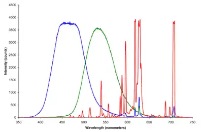
Additive mixing of coincident spot lights was applied in the experiments used to derive the CIE 1931 colorspace. The original monochromatic primaries of the wavelengths of 435.8 nm (violet), 546.1 nm (green), and 700 nm (red) were used in this application due to the convenience they afforded to the experimental work.[11]
Red, green, and blue light are popular primaries for additive color mixing since primary lights with those hues provide a large triangular chromaticity gamut.[12] Small red, green, and blue elements in electronic displays mix additively from an appropriate viewing distance to synthesize compelling colored images.[13]
The exact colors chosen for additive primaries are a technological compromise between the available phosphors (including considerations such as cost and power usage) and the need for large chromaticity gamut. The ITU-R BT.709-5/sRGB primaries are typical.
It is important to note that additive mixing provides very poor predictions of color perception outside the color matching context. Well known demonstrations such as The dress and other examples[14] show how the additive mixing model alone is not sufficient for predicting perceived color in many instances of real images. In general, we cannot completely predict all possible perceived colors from combinations of primary lights in the context of real-world images and viewing conditions. The cited examples suggest just how remarkably poor such predictions can be.
Subtractive mixing of ink layers
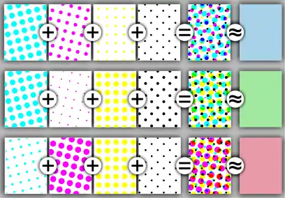
The subtractive color mixing model predicts the resultant spectral power distribution of light filtered through overlaid partially absorbing materials on a reflecting or transparent surface. Each layer partially absorbs some wavelengths of light from the illumination spectrum while letting others pass through, resulting in a colored appearance. The resultant spectral power distribution is predicted by sequentially taking the product of the spectral power distributions of the incoming light and transmissivity at each filter.[15] Overlapping layers of ink in printing mix subtractively over reflecting white paper in this way to generate photorealistic color images. The typical number of inks in such a printing process ranges from 3 to 6 (e.g., CMYK process, Pantone hexachrome). In general, using fewer inks as primaries results in more economical printing but using more may result in better color reproduction.
Cyan, magenta, and yellow are good subtractive primaries in that idealized filters with those hues can be overlaid to yield the largest chromaticity gamuts of reflected light.[16] An additional key ink (shorthand for the key printing plate that impressed the artistic detail of an image, usually black[17]) is also usually used since it is difficult to mix a dark enough black ink using the other three inks. Before the color names cyan and magenta were in common use, these primaries were often known as blue and red, respectively, and their exact color has changed over time with access to new pigments and technologies.[18]
Traditional painters' primaries
Since the 18th century at least, the use of red, yellow, and blue as chromatic primaries has been regarded by many painters as sufficient for paintings.[21]
There are hundreds of commercially available pigments for visual artists to use and mix (in various media such as oil, watercolor, acrylic, gouache, and pastel). There is no specific set of pigments that are primary colors – the choice of pigments depends entirely on the artist's subjective preference of subject and style of art as well as material considerations like lightfastness and mixing heuristics. It is well known that a limited palette of white, red, yellow, and black and/or blue pigment is sufficient for many paintings.[22]
The color of light (i.e., the spectral power distribution) reflected from illuminated surfaces coated in paint mixes, slurries of pigment particles, is not well approximated by a subtractive or additive mixing model. Color predictions that incorporate light scattering effects of pigment particles and paint layer thickness require approaches based on the Kubelka–Munk[23] equations. Even such approaches cannot predict the color of paint mixtures precisely since small variances in particle size distribution, impurity concentrations etc. can be difficult to measure but impart perceptible effects on the way light is reflected from the paint. Artists typically rely on mixing experience and "recipes"[24] to mix desired colors from a small initial set of primaries and do not use mathematical modelling.
Color-space primaries
A contemporary description of the color vision system provides an understanding of primary colors that is consistent with modern color science. The human eye normally contains only three types of color photoreceptors, known as long-wavelength (L), medium-wavelength (M), and short-wavelength (S) cone cells. The response of these photoreceptor types varies across wavelengths of the visible electromagnetic spectrum. The S cone response is generally assumed to be negligible at long wavelengths greater than about 560 nm, while the L and M cones respond across the entire visible spectrum.[25] The LMS primaries are imaginary since there is no visible wavelength that stimulates only one type of cone (i.e., humans cannot normally see a color that corresponds to pure L, M or S stimulation). The LMS primaries are complete since every visible color can be mapped to a triplet specifying the coordinates in LMS color space.

The L, M and S response curves (cone fundamentals) were deduced from color matching functions obtained from controlled color matching experiments (e.g., CIE 1931) where observers matched the color of a surface illuminated by monochromatic light with mixtures of three monochromatic primary lights illuminating a juxtaposed surface. Practical applications generally use a canonical linear transformation of LMS space known as CIEXYZ. The X, Y, and Z primaries are typically more useful since luminance (Y) is specified separately from a color's chromaticity. Any color space primaries which can be mapped to physiologically relevant LMS primaries by a linear transformation are necessarily either imaginary or incomplete or both. The color-matching context is always three dimensional (since LMS space is three dimensional) but more general color appearance models like CIECAM02 describe color in six dimensions and can be used to predict how colors appear under different viewing conditions.
Humans are trichromats and use three (or more) primaries for many applications.[26] Two primaries would be unable to produce even some of the most common among the named colors. Adding a reasonable choice of the third primary can drastically increase the available gamut, while adding a fourth or fifth may increase the gamut but typically not by as much.
Most placental mammals other than primates have only two types of color photoreceptor and are, therefore dichromats, so it is possible that certain combinations of just two primaries might cover some significant gamut relative to the range of their color perception. Meanwhile, birds and marsupials have four color photoreceptors in their eyes, and hence are tetrachromats. There is one scholarly report of a functional human tetrachromat.[27]
The presence of photoreceptor cell types in an organism's eyes do not directly imply that they are being used to functionally perceive color. Measuring functional spectral discrimination in non-human animals is challenging due to the difficulty in performing psychophysical experiments on creatures with limited behavioral repertoires who cannot respond using language. Limitations in the discriminative ability of shrimp having twelve distinct color photoreceptors have demonstrated that having more cell types in itself need not always correlate with better functional color vision.[28]
Psychological primaries

The opponent process is a color theory that states that the human visual system interprets information about color by processing signals from cones and rods in an antagonistic manner. The theory states that every color can be described as a mix along the three axes of red vs. green, blue vs. yellow and white vs. black. The six colors from the pairs might be called "psychological primary colors" because any other color could be described in terms of some combination of these pairs. Although there is a great deal of evidence for opponency in the form of neural mechanisms,[29] there is currently no clear mapping of the psychological primaries to neural substrates.[30]
The three axes of the psychological primaries were applied by Richard S. Hunter as the primaries for the colorspace ultimately known as CIELAB. The Natural Color System is also directly inspired by the psychological primaries.[31]
History
Historical accounts of primary colors can broadly be divided amongst those from philosophy, those related to the nature of light and color vision, and those that focus on pigments.
Philosophical writing from ancient Greece has described notions of primary colors but they can be difficult to interpret in terms of modern color science. Theophrastus (ca. 371–287 BCE) described Democritus’ position that the primary colors were white, black, red, and green.[32] In Classical Greece, Empedocles identified white, black, red, and, (depending on the interpretation) either yellow or green as primary colors.[33] Aristotle described an idea in which he thought white and black could be mixed in different ratios to yield chromatic colors; this idea had considerable influence in Western thinking about color.
Isaac Newton used the term "primary color" to describe the colored spectral components of sunlight.[34][35] A number of color theorists did not agree with Newton's work, David Brewster advocated that red, yellow, and blue light could be combined into any spectral hue late into the 1840s.[36][37] Thomas Young proposed red, green, and violet as the three primary colors, while James Clerk Maxwell favored changing violet to blue.[38] Hermann von Helmholtz proposed "a slightly purplish red, a vegetation-green, slightly yellowish, and an ultramarine-blue" as a trio.[39] Newton, Young, Maxwell, and Helmholtz were all prominent contributors to "modern color science"[40] that ultimately described the perception of color in terms of the three types of retinal photoreceptors.
John Gage's "The Fortunes Of Apelles" provides a summary of the history of primary colors[41] as pigments in painting and describes the evolution of the idea as complex. Gage begins by describing Pliny The Elder's account of notable Greek painters who used four primaries.[42] Pliny distinguished the pigments (i.e., substances) from their apparent colors: white from Milos (ex albis), red from Sinope (ex rubris), Attic yellow (sil) and atramentum (ex nigris). Sil was historically confused as a blue pigment between the 16th and 17th centuries leading to claims about white, black, red, and blue being the fewest colors required for painting. Thomas Bardwell, an 18th century Norwich portrait painter, was skeptical of practical relevance of Pliny's account.[43]
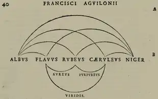
D'Aguilon's notion of the five primary colors (white, yellow, red, blue, black) was influenced by Aristotle's idea of the chromatic colors being made of black and white.[44] Robert Boyle, the Irish chemist, introduced the term primary color in English in 1664 and claimed that there were five primary colors (white, black, red, yellow, and blue).[45][46] The German painter Joachim von Sandart eventually proposed removing white and black from the primaries and that one only needed red, yellow, blue, and green to paint "the whole creation".[47]
| Year | Author | Color terms | Descriptive term |
|---|---|---|---|
| Ca. 325 | Chalcidius | Pallidus, rubeus, cyaneus | Generic colors |
| Ca. 1266 | Roger Bacon | Glaucus, rubeus, viriditas | Principal species |
| Ca. 1609 | Anselmus de Boodt | Flavus, ruber, caeruleus | Principal colors |
| Ca. 1613 | François d'Aguilon | Flavus, rubeus, caeruleus | Simple colors |
| Ca. 1664 | Robert Boyle | Yellow, red, blue | Simple, primary |
| Ca. 1680 | André Félibien | Jaune, rouge, bleu | Principal, primitive |

Red, yellow, and blue as primaries became orthodoxy amongst color theorists during the 18th and 19th centuries. Jacob Christoph Le Blon, an engraver, was the first to use separate plates for each color in mezzotint painting: yellow, red, and blue, plus black to add shades and contrast. Le Blon used primitive in 1725 to describe red, yellow, and blue in a very similar sense as Boyle used primary.[50] Moses Harris, an entomologist and engraver, also describes red, yellow, and blue as "primitive" colors in 1766.[51] Mérimée described red, yellow, and blue in his 1830 book on painting as the three simple/primitive colors that can make a "great variety" of tones and colors found in nature.[52] George Field, a chemist, used the word primary to describe red, yellow, and blue in 1835.[53] Michel Eugène Chevreul, also a chemist, also discussed red, yellow, and blue as "primary" colors in 1839.[54] [55]
Historical perspectives[56][57][58] on the earliest color order systems that were proposed in the 18th and 19th centuries describe them as using red, yellow and blue pigments as chromatic primaries. Tobias Mayer (a German mathematician, physicist, and astronomer) described a triangular bipyramid with red, yellow and blue at the 3 vertices in the same plane, white at the top vertex and black and the bottom vertex in a public lecture in 1758. There would be 11 planes of colors between the white and black vertices. Mayer did not seem to distinguish between colored light and colorant though he used vermilion, orpiment (King’s yellow), and Bergblau (azurite) in partially complete colorings of planes in his solid. Johann Heinrich Lambert (a Swiss mathematician, physicist, and astronomer) proposed a triangular pyramid with gamboge, carmine, and Prussian blue as primaries and only white at the top vertex (since Lambert could produce a mixture that was sufficiently black with those pigments). Lambert's work on this system was published in 1772. Philipp Otto Runge (the Romantic German painter) firmly believed in the theory of red, yellow and blue as the primary colors (again without distinguishing light color and colorant). His color sphere was ultimately described in an essay titled Farben-Kugel (color ball) published by Goethe in the book Farbenlehre in 1810. His spherical model of colors equally spaced red, yellow and blue longitudinally with orange, green and violet in between them and white and black at opposite poles. Runge's premature death prevented him from further investigation but his ideas are widely recognized as key insights that predated modern perceptual color models like the Munsell color system.
Albert Munsell, an American painter and creator of the aforementioned system , referred to the notion of red, yellow, and blue as primary colors as "mischief", "a widely accepted error", and underspecified[59] in his book A Color Notation first published in 1905.
Through the twentieth century and into the twenty-first, the RYB color model persists in traditional color theory (as opposed to modern color science), defining a designer's or painter's color wheel or color triangle; the secondary colors OGV (orange, green, and violet) make up another triad. Triads are formed by three equidistant colors on a particular color wheel; neither RYB nor OGV is equidistant on a perceptually uniform color wheel, but rather have been defined to be equidistant in the RYB wheel.[60]
Using red, yellow, and blue pigments or inks as primaries yields a relatively small gamut, in which, among other problems, colorful greens, cyans, purples and magentas may be impossible to mix. For this reason, modern three- or four-color printing processes, as well as color photography, use cyan, yellow, and magenta as primaries instead:[61] The cyan, magenta, and yellow used in printing are sometimes known as "process blue," "process red", and "process yellow."[62]
See also
References
- Beran, Ondrej (2014). "The Essence (?) of Color, According to Wittgenstein". From the ALWS Archives: A Selection of Papers from the International Wittgenstein Symposia in Kirchberg Am Wechsel.
- Bruce MacEvoy. "Do 'Primary' Colors Exist?" (imaginary or imperfect primaries section Archived 2008-07-17 at the Wayback Machine). Handprint. Accessed 10 August 2007.
- Goldstein, E. Bruce; Brockmole, James (2018). Sensation and Perception. Cengage Learning. p. 206. ISBN 978-1-305-88832-6.
- "Color". www.nga.gov. Retrieved 10 December 2017.
- Itten, Johannes (1974). The Art of Color: The Subjective Experience and Objective Rationale of Color. Wiley. ISBN 978-0-471-28928-9.
- "primary color | Definition of primary color in US English by Oxford Dictionaries". Oxford Dictionaries | English. Retrieved 10 December 2017.
- "Definition – primary color". www.merriam-webster.com. Retrieved 10 December 2017.
- "Wolfram|Alpha – Primary colors". www.wolframalpha.com. Retrieved 10 December 2017.
- Westland, Stephen (2016). Handbook of Visual Display Technology | Janglin Chen | Springer (PDF). Springer International Publishing. p. 162. doi:10.1007/978-3-319-14346-0_11. Retrieved 12 December 2017.
- Reinhard, Erik; Khan, Arif; Akyuz, Ahmet; Johnson, Garrett (2008). Color imaging : fundamentals and applications. Wellesley, Mass: A.K. Peters. pp. 364–365. ISBN 978-1-56881-344-8. Retrieved 31 December 2017.
- Fairman, Hugh S.; Brill, Michael H.; Hemmendinger, Henry (February 1997). "How the CIE 1931 color-matching functions were derived from Wright-Guild data". Color Research & Application. 22 (1): 11–23. doi:10.1002/(SICI)1520-6378(199702)22:1<11::AID-COL4>3.0.CO;2-7.
The first of the resolutions offered to the 1931 meeting defined the color-matching functions of the soon-to-be-adopted standard observer in terms of Guild’s spectral primaries centered on wavelengths 435.8, 546.1, and 700nm. Guild approached the problem from the viewpoint of a standardization engineer. In his mind, the adopted primaries had to be producible with national-standardizing-laboratory accuracy. The first two wavelengths were mercury excitation lines, and the last named wavelength occurred at a location in the human vision system where the hue of spectral lights was unchanging with wavelength. Slight inaccuracy in production of the wavelength of this spectral primary in a visual colorimeter, it was reasoned, would introduce no error at all.
- Fairchild, Mark. "Why Is Color - Short Answers - Q: Why are red, blue, and green considered the primary colors?". Color Curiosity Shop. Retrieved 4 September 2018.
- Thomas D. Rossing & Christopher J. Chiaverina (1999). Light science: physics and the visual arts. Birkhäuser. p. 178. ISBN 978-0-387-98827-6.
- Kircher, Madison Malone. "This Baffling Picture of Strawberries Actually Doesn't Contain Any Red Pixels". Ney York Magazine. Retrieved 21 February 2018.
- Levoy, Marc. "Additive versus subtractive color mixing". graphics.stanford.edu. Retrieved 4 November 2020.
On the other hand, if you reflect light from a colored surface, or if you place a colored filter in front of a light, then some of the wavelengths present in the light may be partially or fully absorbed by the colored surface or filter. If we characterize the light as an SPD, and we characterize absorption by the surface or filter using a spectrum of reflectivity or transmissivity, respectively, i.e. the percentage of light reflected or transmitted at each wavelength, then the SPD of the outgoing light can be computed by multiplying the two spectra. This multiplication is (misleadingly) called subtractive mixing.
- MacEvoy, Bruce. "subtractive color mixing". Handprint. Retrieved 7 January 2018.
- Frank S. Henry (1917). Printing for School and Shop: A Textbook for Printers' Apprentices, Continuation Classes, and for General use in Schools. John Wiley & Sons. p. 292.
- Ervin Sidney Ferry (1921). General Physics and Its Application to Industry and Everyday Life. John Wiley & Sons.
- Nyholm, Arvid (1914). "Anders Zorn: The Artist and the Man". Fine Arts Journal. 31 (4): 469–481. doi:10.2307/25587278. JSTOR 25587278.
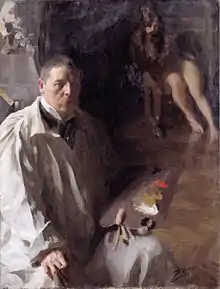
It is true that Zorn uses only a very limited palette, especially when he paints indoors, when he considers that black, white, red and yellow should be enough for all ordinary purposes, except when a very decided color is present, as, for instance, a light blue or a positive green in a drapery.
- Harrison, Birge (1909). Landscape Painting. Scribbner. p. 118.
The expert cannot be bothered with useless pigments. He selects the few that are really essential and throws aside the rest as useless lumber. The distinguished Swedish artist, Zorn, uses but two colors—vermilion and yellow ochre; his two other pigments black and white, being the negation of color. With this palette, simple to the point of poverty, he nevertheless finds it possible to paint an immense variety of landscape and figure subjects.
- Rood, Ogden (1973). Modern chromatics; students' text-book of color, with applications to art and industry (PDF). New York: Van Nostrand Reinhold Co. p. 108. ISBN 0-442-27028-3.
It is well known to painters that approximate representations of all colours can be produced by the use of very few pigments. Three pigments or coloured powders will suffice, a red, yellow, and a blue; for example, crimson lake, gamboge, and Prussian blue. The red and yellow mingled in various proportions will furnish different shades of orange and orange-yellow; the blue and yellow will give a great variety of greens; the red and blue all the purple and violet hues. There have been instances of painters in water-colours who used only these three pigments, adding lampblack for the purpose of darkening them and obtaining the browns and greys.
- Gurney. "The Zorn Palette". Gurney Journey. Retrieved 27 September 2016.
- Kubelka, Paul; Munk, Franz (1931). "An article on optics of paint layers" (PDF). Z. Tech. Phys. 12: 593–601.
- MacEvoy, Bruce. "Mixing Green". Handprint. Retrieved 24 October 2017.
- Stockman, Andrew; Sharpe, Lindsay, T. (2006). "Physiologically-based colour matching functions" (PDF). Proceedings of the ISCC/CIE Expert Symposium '06: 75 Years of the CIE Standard Colorimetric Observer: 13–20.
- Best, Janet (2017). Colour Design: Theories and Applications. p. 9. ISBN 978-0-08-101889-7.
- Jordan, G.; Deeb, S. S.; Bosten, J. M.; Mollon, J. D. (20 July 2010). "The dimensionality of color vision in carriers of anomalous trichromacy". Journal of Vision. 10 (8): 12. doi:10.1167/10.8.12. PMID 20884587.
- Morrison, Jessica (23 January 2014). "Mantis shrimp's super colour vision debunked". Nature. doi:10.1038/nature.2014.14578. S2CID 191386729.
- Conway, Bevil R. (12 May 2009). "Color Vision, Cones, and Color-Coding in the Cortex". The Neuroscientist. 15 (3): 274–290. doi:10.1177/1073858408331369. PMID 19436076. S2CID 9873100.
- MacLeod, Donald (21 May 2010). Cohen, Jonathan; Matthen, Mohan (eds.). Color Ontology and Color Science. MIT Press. p. 159-162. ISBN 978-0-262-01385-7.
Many color scientists, acknowledging that the color opponent signals observed in the pathway to cortex have no relation to the psychological primaries, do nevertheless take it for granted that a color opponent neural representation capable of accounting for the phenomenally simple or unitary quality of the psychological primaries must exist somewhere in the brain—in a region that is directly reflected in phenomenal experience, instead of merely conveying signals from the eye. This tenet was long maintained in the absence of neurophysiological evidence, and continues to be maintained even though current neurophysiological evidence does not support it.
- Maffi, ed. by C.L. Hardin [and] Luisa (1997). Color categories in thought and language (1. publ. ed.). Cambridge: Cambridge University Press. pp. 163–192. ISBN 978-0-521-49800-5.CS1 maint: extra text: authors list (link)
- Shamey, Renzo; Kuehni, Rolf G. (2017). Pioneers of color science. Cham: Springer International Publishing. p. 4. ISBN 978-3-319-30809-8.
- Shamey, Renzo; Kuehni, Rolf G. (2017). Pioneers of color science. Cham: Springer International Publishing. p. 8. ISBN 978-3-319-30809-8.
- Newton, Isaac (1730). Opticks: Or, A Treatise of the Reflections, Refractions, Inflections and Colours of Light. William Innys at the West-End of St. Paul's. p. 135.
Whiteness and all grey Colours between white and black, may be compounded of Colours, and the whiteness of the Sun's Light is compounded of all the primary Colours mix'd in a due Proportion
- Newton, Isaac (19 February 1671/2). "A Letter of Mr. Isaac Newton … containing his New Theory about Light and Color". Philosophical Transactions of the Royal Society (80): 3075–3087. Retrieved 19 November 2020.
The Original or primary colours are, Red, Yellow, Green, Blew, and a Violet-purple, together with Orange, Indico, and an indefinite variety of Intermediate gradations.
Check date values in:|date=(help) - Boker, Steven M. "The Representation of Color Metrics and Mappings in Perceptual Color Space". The Representation of Color Metrics and Mappings in Perceptual Color Space.
- MacEvoy, Bruce. "handprint : colormaking attributes". www.handprint.com.
The Scottish physicist David Brewster (1781-1868) was an especially pugnacious holdout, arguing as late as the 1840's that all spectral hues could be explained by red, yellow, and blue fundamental colors of light, which Brewster equated with three colored filters or transmittance curves that could reproduce the entire spectrum...
- Maxwell, James Clerk. The Scientific Papers of James Clerk Maxwell. Courier Corporation. p. 49. ISBN 978-0-486-78322-2.
The experiments with pigments do not indicate what colours are to be considered as primary ; but experiments on the prismatic spectrum shew that all the colours of the spectrum, and therefore all the colours in nature, are equivalent to mixtures of three colours of the spectrum itself, namely, red, green (near the line E), and blue (near the line G). Yellow was found to be a mixture of red and green.
- Alfred Daniell (1904). A text book of the principles of physics. Macmillan and Co. p. 575.
- Mollon, J.D. (2003). The science of color (2nd ed.). Amsterdam: Elsevier. pp. 1–39. CiteSeerX 10.1.1.583.1688. ISBN 0-444-51251-9.
- Gage, John (1999). Color and Culture: Practice and Meaning from Antiquity to Abstraction. University of California Press. pp. 29–38. ISBN 978-0-520-22225-0.
- "32". Pliny the Elder, The Natural History, Book XXXV. An Account of Paintings and Colours.
It was with four colours only, that Apelles, Echion, Melanthius, and Nicomachus, those most illustrous painters, executed their immortal works; melinum for the white, Attic sil for the yellow, Pontic sinopis for the red, and atramentum for the black; and yet a single picture of theirs has sold before now for the treasures of whole cities. But at the present day, when purple is employed for colouring walls even, and when India sends to us the slime of her rivers, and the corrupt blood of her dragons and her elephants, there is no such thing as a picture of high quality produced. Everything, in fact, was superior at a time when the resources of art were so much fewer than they now are. Yes, so it is; and the reason is, as we have already stated, that it is the material, and not the efforts of genius, that is now the object of research.
- Bardwell, Thomas; Richardson, Samuel; Millar, Andrew; Dodsley, Robert; Dodsley, James; Rivington, John; Rivington, James; Vivarès, François. The practice of painting and perspective made easy : in which is contained, the art of painting in oil, with the method of colouring ... and a new, short, and familiar account of the art of perspective, illustrated with copper-plates, engraved by Mr. Vivares. London : Printed by S. Richardson, for the author, and sold by him ... and by A. Millar ... R. and J. Dodsley ..., and J. and J. Rivington ...
How it really was, Time has put it out of our Power to determine : But if we ſuppoſe thoſe four principal Colours in Perfection, then, I think, it can be no longer doubted, but that from them might be made all the various Colours in Nature. For my part, I cannot believe, that the four capital Colours of the Antients would mix to that ſurpriſing Perfection we ſee in the Works of Titian and Rubens. And if we have no certain Knowlege of their Method of Colouring who lived In the laſt Century, how ſhould we underſtand theirs who lived near Two thouſand Years ago ?
- Shamey, Renzo; Kuehni, Rolf G. (2017). Pioneers of color science. Cham: Springer International Publishing. p. 87. ISBN 978-3-319-30809-8.
- Boyle, Robert. Experiments and Considerations touching Colours. p. 220.
But I think I may easily be excus'd (though I do not altogether pass it by) if I restrain my self to the making of a Transient mention of some few of their Practices about this matter; and that only so far forth, as may warrant me to observe to you, that there are but few Simple and Primary Colours (if I may so call them) from whose Various Compositions all the rest do as it were Result. For though Painters can imitate the Hues (though not always the Splendor) of those almost Numberless differing Colours that are to be met with in the Works of Nature, and of Art, I have not yet found, that to exhibit this strange Variety they need imploy any more than White, and Black, and Red, and Blew, and Yellow; these five, Variously Compounded, and (if I may so speak) Decompounded, being sufficient to exhibit a Variety and Number of Colours, such, as those that are altogether Strangers to the Painters Pallets, can hardly imagine.
- Briggs, David. "The Dimensions of Colour, primary colours". www.huevaluechroma.com.
- Gage, John (1999). Color and Culture: Practice and Meaning from Antiquity to Abstraction. University of California Press. ISBN 978-0-520-22225-0.
- MacEvoy, Bruce. "handprint : colormaking attributes". www.handprint.com. Retrieved 1 December 2020.
From a modern perspective, the most peculiar feature of d'Aguilon's theory is that these three "noble" hues were themselves created from the mysterious blending of white and black, or light and dark (upper curved lines in the figure), so that light and dark were the two "simple" or primary colors. The "composite" hues green, orange (gold), and purple (lower curved lines) were mixed from the "noble" triad colors. D'Aguilon's diagram was reprinted by the Jesuit scholar Athanasius Kircher in his optical treatise Ars magna lucis et umbrae (The Great Art of Light and Shadow, 1646). Both sources were widely read in the 17th century, and shaped the explanation of color mixing dominant during the Baroque.
- Shamey, Renzo; Kuehni, Rolf G. (2017). Pioneers of color science. Cham: Springer International Publishing. p. 108. ISBN 978-3-319-30809-8.
- Mollon, J.D. (2003). The science of color (2nd ed.). Amsterdam: Elsevier. p. 6. CiteSeerX 10.1.1.583.1688. ISBN 0-444-51251-9.
In 1725, however, he published a slender volume entitled Coloritto, in which he sets out the principle of trichromatic color mixing (Figure 1.4). It is interesting that he gives the same primaries in the same order (yellow, red, and blue) as does the anonymous author of the 1708 text, and uses the same term for them, couleurs primitives
- Harris, Moses (1766). The natural system of colours : wherein is displayed the regular and beautiful order and arrangement, arising from the three premitives, red, blue, and yellow, the manner in which each colour is formed, and its composition, the dependance [sic] they have on each other, and by their harmonious connections are produced the teints, or colours, of every object in the creation, and those teints, tho' so numerous as 660, are all comprised in thirty three terms, only. Laidler's office, Princes-Street, Licester-Fields.
- Mérimée, Jean-François-Léonor; Taylor, William Benjamin Sarsfield. The Art of Painting in Oil and in Fresco, Being a History of the Various ... Whittaker & co. p. 245.
Although painters usually have arranged on their palettes a good many pigments of various deno- minations, yet they do not always seem to know, that three simple colours (yellow, red, and blue) can, by proper combination, be made to produce that great variety of tones and colours that we find in nature. United in pairs, these three primitive colours give birth to three other colours, as distinct and as brilliant as their originals; as thus, the yellow, mixed with red, gives the orange ; the red and blue, violet ; and the green is obtained by mixing blue and yellow, and, according to the preponderance of one or other colour in the mixture, will the tint incline towards that colour ; and as these proportions are graduated, we pass progressively from one colour to another, and from whatever point we begin, we return to it.
- Field, George (1835). Chromatography; Or, A Treatise on Colours and Pigments: And of Their Powers in Painting. Tilt and Bogue.
The Primary Colours are such as yield others by being compounded, but are not themselves capable of being produced by composition by other colours. They are three only, yellow, red, and blue...
- Chevreul, Michel Eugène (1861). The Laws of Contrast of Colour. London: Routledge, Warne, and Routledge. p. 25. – English translation by John Spanton
- MacEvoy, Bruce. "handprint : colormaking attributes". www.handprint.com.
- Shamey, Renzo; Kuehni, Rolf G. (2017). Pioneers of color science. Cham: Springer International Publishing. ISBN 978-3-319-30809-8.
- MacEvoy, Bruce. "handprint : colormaking attributes". www.handprint.com.
- Kuehni, Rolf G. "Philipp Otto Runge's Color Sphere A translation, with related materials and an essay" (PDF). Retrieved 2 February 2021.
- Munsell, A.H. (1907). A Color Notation.
The wide discrepancies of red, yellow, and blue, which have been falsely taught as primary colors, can no more be tuned by a child than the musical novice can tune his instrument. Each of these hues has three variable factors (see page 14, paragraph 14), and scientific tests are necessary to measure and relate their uneven degrees of Hue, Value, and Chroma.
- Stephen Quiller (2002). Color Choices. Watson–Guptill. ISBN 0-8230-0697-2.
- "Development of the Idea of Simple Colors in the 16th and Early 17th Centuries". Color Research and Application. Volume 32, Number 2, April 2007.
- Cheap Brochure Printing – Process Blue / Process Red / Process Yellow / Process Black
Color topics | ||||||||
|---|---|---|---|---|---|---|---|---|
| Color science |
|  | ||||||
| Color philosophy |
| |||||||
| Color terms |
| |||||||
| Color organizations | ||||||||
| Lists | ||||||||
| Related | ||||||||
| ||||||||