Cerise (color)
Cerise (/səˈriːs/ or /səˈriːz/; French pronunciation: [səˈʁiz]) is a deep to vivid reddish pink.
| Cerise | |
|---|---|
| Hex triplet | #DE3163 |
| HSV (h, s, v) | (343°, 78%, 87%) |
| sRGBB (r, g, b) | (222, 49, 99) |
| Source | Maerz and Paul[1] |
| ISCC–NBS descriptor | Vivid red |
| B: Normalized to [0–255] (byte) H: Normalized to [0–100] (hundred) | |

Etymology
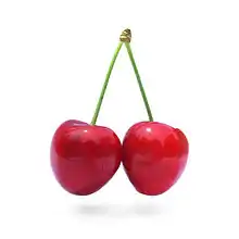
The colour or name comes from the French word "cerise", meaning cherry.

According to the Oxford English Dictionary, the first recorded use of cerise as a colour name in English was in The Times of November 30, 1858.[2] This date of 1858 as the date of first use of the color name is also mentioned in the 1930 book A Dictionary of Color.[3] However, it was used at least as early as 1845 in a book of crochet patterns.[4]
Variations of cerise
There are various tones of cerise.
Hollywood cerise
| Hollywood Cerise | |
|---|---|
| Hex triplet | #F400A1 |
| HSV (h, s, v) | (320°, 100%, 96[5]%) |
| sRGBB (r, g, b) | (244, 0, 161) |
| Source | Maerz and Paul[6]/Venus Paradise C.P.[7] |
| ISCC–NBS descriptor | Vivid purplish red |
| B: Normalized to [0–255] (byte) H: Normalized to [0–100] (hundred) | |
In the 1950s, a popular brand of colored pencils, Venus Paradise, had a colored pencil called Hollywood cerise which was this color. Before being renamed Hollywood cerise in the 1940s, the color had been known, since its inception in 1922, simply as Hollywood.[8]
Deep cerise
| Deep Cerise | |
|---|---|
| Hex triplet | #DA3287 |
| HSV (h, s, v) | (317°, 57%, 62%) |
| sRGBB (r, g, b) | (218, 50, 135) |
| Source | Crayola |
| ISCC–NBS descriptor | Vivid purplish red |
| B: Normalized to [0–255] (byte) H: Normalized to [0–100] (hundred) | |
Displayed at right is the deep tone of cerise called cerise in Crayola crayons (see the List of Crayola crayon colors).
The color name cerise has been in use for this color since 1993 by Crayola.
Irresistible
| Irresistible | |
|---|---|
| Hex triplet | #B3446C |
| HSV (h, s, v) | (338°, 62%, 70[9]%) |
| sRGBB (r, g, b) | (179, 68, 108) |
| Source | Plochere |
| ISCC–NBS descriptor | Moderate purplish red |
| B: Normalized to [0–255] (byte) H: Normalized to [0–100] (hundred) | |
The color irresistible is displayed at right.
The color name irresistible first came into use in 1948.
The source of this color is the Plochere Color System, a color system formulated in 1948 that is widely used by interior designers.[10]
See also
References
- The color displayed in the color box above matches the color called cerise in the 1930 book by Maerz and Paul A Dictionary of Color New York:1930 McGraw-Hill; the color cerise is displayed on Page 31, Plate 4, Color Sample J6.
- "Sign IN - Open University".
- Maerz and Paul, A Dictionary of Color New York:1930--McGraw-Hill See Cerise in Index Page 192
- Crochet Explained and Illustrated, by Cornelia Mee. London: David Bogue, Fleet Street (1845), p. 117.
- Forret, Peter. "RGB color converter - toolstud.io".
- The color displayed in the color box above matches the color called Hollywood in the 1930 book by Maerz and Paul A Dictionary of Color New York:1930 McGraw-Hill; the color Hollywood is displayed on page 33, Plate 5, Color Sample K5.
- This color matches the color called Hollywood Cerise in the Venus Paradise colored pencil set, widely sold during the 1950s.
- Maerz and Paul, A Dictionary of Color New York:1930--McGraw-Hill See Hollywood in Index, Page 196 and Color Sample of Hollywood, Page 33, Plate 5, Color Sample K5
- web.forret.com Color Conversion Tool set to hex code of color #B3446C (Irresistible):
- Plochere Color System Archived 2010-08-21 at the Wayback Machine
