Ascender (typography)
In typography and handwriting, an ascender is the portion of a minuscule letter in a Latin-derived alphabet that extends above the mean line of a font. That is, the part of a lower-case letter that is taller than the font's x-height.

For broader context, see Typeface anatomy.

Ascenders, together with descenders, increase the recognizability of words. For this reason, many situations that require high legibility such as road signs avoid using solely capital letters (i.e. all-caps).[1]
Studies made at the start of the construction of the British motorway network concluded that words with mixed-case letters were much easier to read than "all-caps" and a special font was designed for motorway signs. These then became universal across the UK. See Road signs in the United Kingdom.

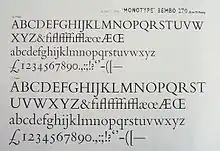
In many fonts intended for body text, such as Bembo and Garamond, ascenders rise above the cap height of the capital letters.[2][3][4][5]
References
- Sampson, Geoffrey (1985). Writing Systems: A linguistic introduction. Stanford, California: Stanford University Press. pp. 94–95. ISBN 0-8047-1254-9.
- Slimbach, Robert. "Using Acumin". Acumin microsite. Adobe Systems. Retrieved 6 January 2016.
- Warde, Beatrice (1926). "The 'Garamond' Types". The Fleuron: 131–179.
- Amert, Kay (April 2008). "Stanley Morison's Aldine Hypothesis Revisited". Design Issues. 24 (2): 53–71. doi:10.1162/desi.2008.24.2.53. JSTOR 25224167.
- Morison, Stanley (1943). "Early Humanistic Script and the First Roman Type". The Library. s4-XXIV (1–2): 1–29. doi:10.1093/library/s4-XXIV.1-2.1.