Typeface anatomy
Typeface anatomy describes the graphic elements that make up letters in a typeface.[1][2][3]
Strokes
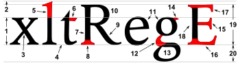
The strokes are the components of a letterform.[4] Strokes may be straight, as in k l v w x z, or curved, as in c o s. If straight, they may be horizontal, vertical, or diagonal; if curved, open or closed. Typographers also speak of an instroke, where one starts writing the letter, as at the top of a c f, and an outstroke, where the pen leaves off, as at the bottom of c e j k t y.[5]
A main vertical stroke is called a stem. The letter m has three, the left, middle, and right stems. The central stroke of an s is called the spine.[7] When the stroke is part of a lowercase[4] and rises above the height of an x (called the x height), it is called an ascender.[8] Letters with ascenders are b d f h k l. A stroke which drops below the baseline is a descender.[8] Letters with descenders are g j p q y. An arching stroke is called a shoulder as in the top of an R[4] or sometimes just an arch, as in h n m. A closed curved stroke is called a bowl in b d o p q D O P Q ; B has two bowls. A trailing outstroke, as in j y J Q R is called a tail. The inferior diagonal stroke in K is called a leg.[9] A short horizontal stroke, as in the center of e f and the middle stroke of E F, is called a bar. Strokes that connect, as in A and H, or cross other strokes, as in t, are also known as crossbars.[9] A longer horizontal stroke at the top or bottom, as in E T, is called an arm.[4] The bottom of the two-story g is called a loop; the very short stroke at the top is called the ear.[10] i j each have a dot, jot, or tittle.[10] The joining of two strokes at the top of a capital A is called an apex.[10]
The font shown in the example is stressed; this means that strokes have varying widths. In this example, the stroke at the top of the g is thinner at the top and bottom than on the sides – a vertical stress.
Terminals
The terminal (end) of an instroke or outstroke is often a serif. A seriffed terminal may be described as a wedge, bulbous, teardrop, slab, etc., depending on the design of the type. Typefaces may be classified by their look, of which the weight and serif style – whether serif or sans-serif – are key features.[9] Some designs also have spurs, which are smaller than serifs and appear on angles rather than at a terminal, as on e or G.
Space
Areas of negative space (white space) formed by straight or curved strokes are called counters. Closed counters are found in a b d e g o p q A B D O P Q R, and open counters in a c e f h m n r s t u. The closed counter in e is also named an eye.[9] Angles of white space, as in w, are corners (w has three corners); the term is not used for angles of strokes. The small corner formed by a serif, whether curved or angular, is called the serif bracket.
Proportions
A subtle change in proportion impacts weight, perception, measure, and legibility. The letterform height compared to its stroke width modifies the aspect ratio; a slight change in weight sometimes helps to create emphasis. The disparity between thick and thin strokes, known as stress, alters optical perception. As an example, the first sans serif typefaces used strokes of constant thickness, but subsequent technological advances permit drawing thinner strokes. Condensed type occupies less space than expanded type, so that a whole page of text can be reduced to half a page. The capline and x-height ratio improve or decrease word legibility.[4]
Metal type era
.png.webp)
During the late metal type period, many fonts (particularly in American typefounding) were issued to "common line".[11] This meant that they were made to standardised proportions, so that fonts of different typefaces could be mixed with no difficulty. This made it possible to mix typefaces from completely different genres such as sans-serifs and serifs and have the cap height, baseline and linespacing match perfectly, something not possible with most digital fonts. It even allowed mixing of different sizes of type with a consistent baseline. It however had the disadvantage of often forcing typefaces to be issued with cropped descenders compared to historical typefaces, to allow tight linespacing. A "script line" or "art line" was used for more delicate fonts with long descenders. Titling capitals, meanwhile, were issued taking up the whole space of the metal type area, with no room for descenders.[12][13]

References
- Studer, Anton (29 February 2016). "Is What I See What I Get? — Math & Optics in Type Design". Typographica. Retrieved 17 April 2016.
- "Typeface Anatomy". Issuu. FontShop. Retrieved 22 July 2020.
- Leonidas, Gerry. "Designing Greek typefaces". Medium. Retrieved 22 July 2020.
- Carter, Bob; Day, Ben; Meggs, Philip (2007). Typographic Design: Form and Communication. United States of America: John Wiley & Sons. p. 31. ISBN 9780471783909.
- Pecina, Martin; Březina, David (2008). "Type Anatomy 1.0". Typomil.
- "Introducing Ideal Sans". Fonts by Hoefler & Co. 4 May 2011.
- Bosler, Denise (2012-05-16). Mastering Type: The Essential Guide to Typography for Print and Web Design. F+W Media, Inc. p. 31. ISBN 978-1440313714.
individual parts such as the spine of the S
- Dean, Paul (11 April 2008). "eXtreme Type Terminology. Part Three: The 'Black Art'". I Love Typography.
- Coles, Stephen. “The Anatomy of Type: A Graphic Guide to 100 typefaces.” Harper Design, 2013.
- Dean, Paul (27 March 2008). "eXtreme Type Terminology. Part 2: Anatomy of a Letterform". I Love Typography.
- Wichary, Marcin. "Getting to the bottom of line height in Figma". Figma. Retrieved 5 February 2021.
- Stewart, A. A. (1918). Type – A primer of information about the mechanical features of printing types: their sizes, font, schems, &c. with a brief description of their manufacture. Chicago: The Committee on Education, United Typothetae of America. pp. 35+ix.
- Specimen book of American line type faces : American point line, point body and point set. American Type Founders Company. 1903.
Further reading
- Gaskell, Philip (January 1976). "A nomenclature for the letterforms of roman type" (PDF). Visible Language. 10 (1): 41–51.
External links
| Wikimedia Commons has media related to Typography terminology. |
- Armannsson, Sigurdur (6 July 2009). "Wallpaper: Font Anatomy". Font.is. Archived from the original on 11 October 2013.
- Full-size image (1920×1200) giving a more detailed list of typeface elements than in this article.
- Dean, Paul (2008). eXtreme Type Terminology – Part 1, Part 2, Part 3, Part 4 and Part 5
- Devroye, Luc. "Hoefler & Frere-Jones". Retrieved 21 January 2015.
- Frere-Jones, Tobias. "Typeface Mechanics: 001". Frere-Jones Type. Retrieved 17 April 2016.
- Frere-Jones, Tobias. "Typeface Mechanics: 002". Frere-Jones Type. Retrieved 17 April 2016.
- Coles, Stephen. "The Anatomy of Type". Blog for Coles' 2012 book The Anatomy of Type: A Graphic Guide to 100 Typefaces.
- "Glossary". FontShop. Monotype.
| Page | |||||||||
|---|---|---|---|---|---|---|---|---|---|
| Paragraph | |||||||||
| Character |
| ||||||||
| Classifications |
| ||||||||
| Punctuation | |||||||||
| Typesetting | |||||||||
| Typographic units | |||||||||
| Digital typography | |||||||||
| Related articles | |||||||||
| Related tables |
| ||||||||
| |||||||||