Panno (typeface)
Panno is a Latin sans-serif typeface designed by Dutch typeface designer, Pieter van Rosmalen. It is one of two typefaces specially designed for South Korean traffic signs. (The other being Hangil, the Hangul counterpart.)
 | |
| Category | Sans-serif |
|---|---|
| Designer(s) | Pieter van Rosmalen |
| Commissioned by | Government of South Korea |
| Foundry | CakeType, Bold Monday |
Variants
Panno Sign
Panno Sign is the first variant to be commercially released. Normal and rounded forms are available, and each form has two weights - Negative and Positive - to use against dark and bright backgrounds respectively.
Panno Text
Panno Text is another commercial variant. It has six weights, and each weight has an italic form.
Non-Latin letters
Currently, Panno has no glyph other than Latin letters and Hindu–Arabic numbers.
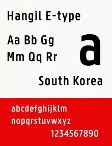
Hangil, a Hangul typeface designed for South Korean traffic signs, employs Panno for the Latin and numeral portion.
In use
Panno is one of the results of the South Korean traffic sign reform, along with Hangil. The typeface, called Hangil E-type (E as in English) within the package, also has a condensed form. It replaced a Latin grotesque typeface accompanied to Sandoll Gothic.
Cleveland Magazine uses Panno Text for their design.
Panno Text is the official font of Ghent University.